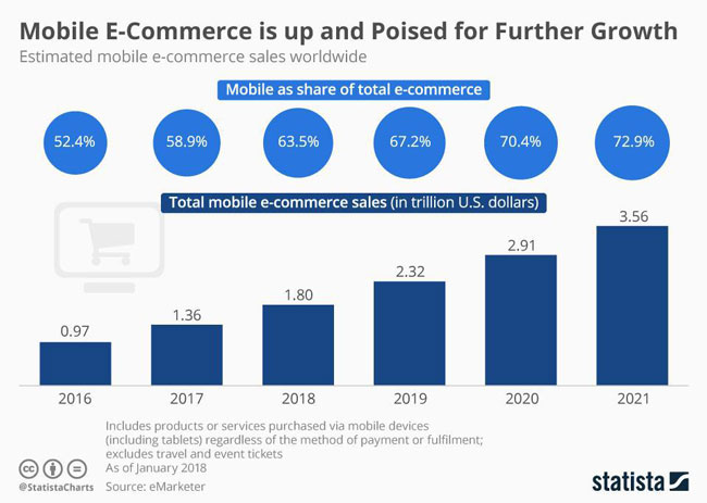
With the share of mobile users advancing exponentially, the number of users who shop via mobile phones is also increasing drastically. According to eMarketer, online sales through mobile devices would amount to $3.5 trillion by the end of 2021. It is a huge segment of total revenue and the total number of eCommerce shoppers.

Mobile commerce is on full boost, and people are preferring the ease with which they can shop without depending on their desktops or laptops. If you run an online store, you too can claim your share from m-commerce pie by-
– Launching mobile apps for your site or
– Making your online store mobile responsive
There are three ways to achieve a mobile-responsive online store
1. Port the existing website to mobile – Port your existing desktop site to the mobile-responsive architecture.
2. Mobile first development – Develop your mobile site first and then port it to desktop architecture.
3. Develop each separately – Develop mobile and desktop sites separately and host them on different domains or sub-domains. For example. Desktop: yoursite.com; Mobile: m.yoursite.com.
For any of the above-approaches, there are certain standards and best practices you should follow. In fact, these best practices also apply to the web and mobile app versions of your eCommerce touch points.
Before going to the mobile eCommerce best practices, let us first comprehend key aspects that define the objectives of having a mobile-responsive site. All the mobile UX best practices enlisted in this article align with the following objectives of UX enhancement:
– 1. Accessibility: Optimize the UX to let anyone use your app with the same fluency. E.g. One-handed use.
– 2. Communication ease: Allow the same level of communication channels across different versions of the site. E.g. Live chat integration.
– 3. Minimize Typing: Everyone hates typing on small mobile keyboards. Gives options like Auto-fill to minimize typing.
– 4. Hide pointless specifics: Even with a responsive adaptation, mobile screens are not always suitable for all kinds of content. It’s better to hide all the unnecessary details on the mobile adaptation to give breathing spaces.
– 5. Don’t hide important: Breathing spaces are crucial but they should not come at the cost of important details. Keep all necessary details visible.
Mobile eCommerce best practices to boost UX
1. Make the home page clutter free
A homepage is the center of attraction for both mobile and desktop sites. An efficient homepage always strikes the best first impression. It provides not only important details but guides the traffic to other pages of the site.
The best way to optimize your home page for mobile browsing is by making it clutter-free and showing a few conversions-friendly recommendations. You should optimize the following key elements to achieve a higher level of optimization for mobile, desktop, as well as mobile app shopping cart
– Featured: Highlight featured products in a separate block. You can choose best sellers, best-discounted products for this list. Keep this section above the first fold.
– Guide listings: This section can guide the traffic to all the major segments of your website. Put your best foot forward and help users to filter out their desired products through this section. You can do that by including the options such as Shop by Gender, Shop by Category, Shop by utility, and Shop by Brand.
– Thumbnails: Use personalized images for every option you put on the home page. Images can guide better than mere texts. Use the best suitable image for every category and listing.
– Banners on top: Designate a separate space for clickable-banners on top of the fold. You can use banners to highlight new products, big discounts, or any ongoing offer.
– Navigation: You need to guide users to other sections on your website. For this, you need a navigation shortcut you can embed in two ways. One- Embed categories as the top header menu. Two- embed categories and other menu items in side-bar.
2. Use clear call-to-actions
Be it a mobile site, desktop version, or a mobile app shopping cart, conversions come through Call-to-actions. We use CTAs everywhere on the site. Sometimes CTA button, sometimes clickable banners with CTAs guide shoppers into the conversion funnel. For either of the approaches, a clear and unambiguous text is critically decisive. The wrong choice of words can cause high bounce rates with users hopping-out from your conversion funnel.
You must cautiously decide the font-size, font-color, and text-length considering the scarcity of space on a small screen of mobile phones. Use the following best practices to make your CTAs as effective as possible
– Be direct: Don’t twist your words. Use clear and short texts and let users comprehend the output of the ‘Tapping’ action with no confusion. For example, if a button adds the product in the cart and simultaneously re-directs the user to the checkout page, then it should have a “Buy Now” CTA, not the “Add to Cart” CTA.
– Be clear: Instead of confusing users with generic words, use self-descriptive words or phrases. For example, avoid confusions like ‘Next’, ‘Continue’, ‘Go Ahead’, and use “Continue to checkout’, “Add to cart”, “Click to Buy Now” etc. They are self-explanatory.
– Icons: Some CTAs can be explained instantly using self-explanatory icons. For example, you can use a ‘Cart” icon on the “Add to Cart” button to stress on the sense.
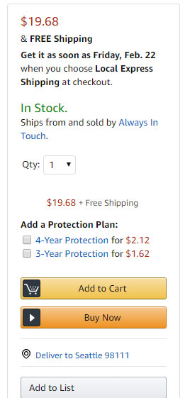
– Buttons size: Mobile screens are too tiny to hold big buttons. However, it is still a necessity to keep the buttons optimal with enough white spaces and correct button-size. You don’t want your users to get frustrated with taps.

3. Use Social login and Guest Checkout
There are two possible dilemmas here
– You need user sign-ups to offer a better UX.
– Users hate filling lengthy registration forms.
They hate typing and filling the account registration forms, but you need their sign-ups for an array of intentions. If you ask them to register an account for checking out, 37% of your potential customers will abandon the shopping cart. What could be the possible solution for this?
Well, there are two possible resolutions. Both minimize typing and maximize the UX at the same time. Moreover, you also get the sign-ups without asking them to fill-up those lengthy forms.
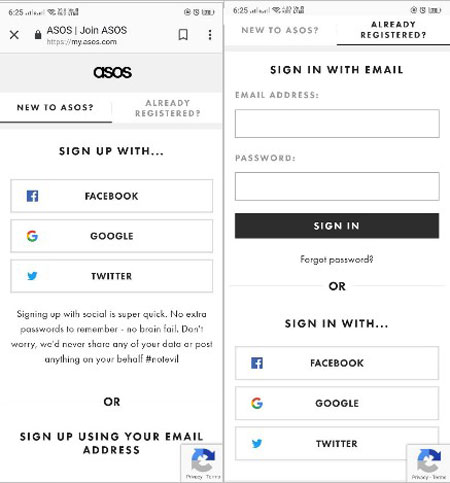
– Use Social Media Login: You can integrate multiple social login APIs to let users sign up on your site using their Facebook, Instagram, Twitter, or any other social media account. They will just have to fill their social media credentials to register the account, and you will get the user’s information too at the same time. You can take a cue from Asos. It gives both Sign-up and Sing-in options with social media.

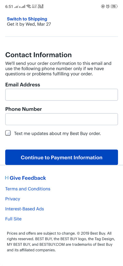
– Guest Checkout: Let them complete the purchase without registering a user account by using guest checkout option. A guest checkout lets users complete a purchase by mentioning a few details instead of filling a whole registration form. You can ask the details like Name, Email, and Contact number, which are enough for order tracking. Later you can use these details to create a user account post completion of the purchase. This is how Best Buy does.
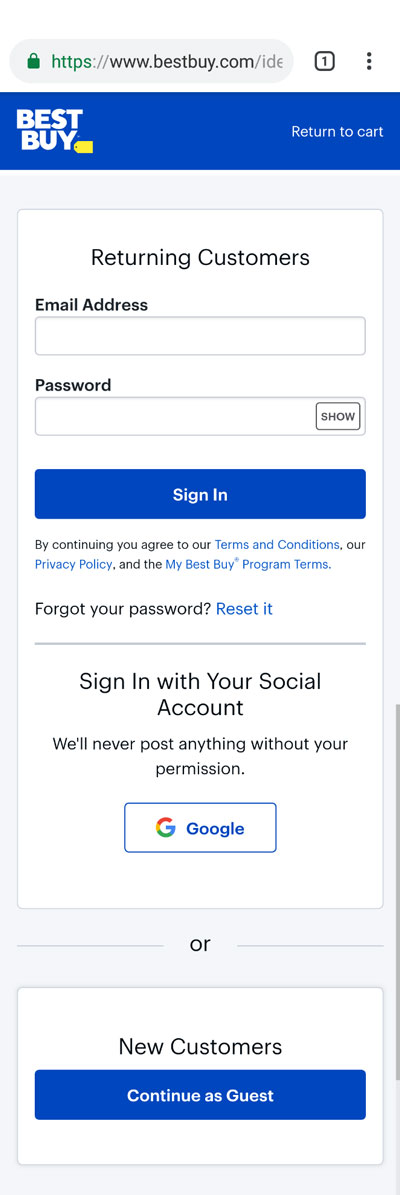
It just asks the users to provide the Name and Email to complete the checkout without signing up.
4. Auto-form filling
Avoid typing requirements as far as possible.
– Don’t ask the details you don’t require.
– Don’t ask the details you can fetch from other forms.
For example, Name, email, and contact numbers are enough to create a verified user account. Don’t ask for redundant details like Telephone number, Fax number. Next, you can use auto form filling to fetch the details from the user account or other forms already filled by the users.
For example, you can fetch the details like Name, Email, and contact number user account database for a registered user. You don’t need asking these details again at the checkout page. There many ways to use auto form filling and fetch information for auto-filling
– You can auto-fill the delivery address from shopping history.
– You can auto-fill City, Region, and Country by using the provided Zip-code.
– You can auto-fill credit card details using saved card history.
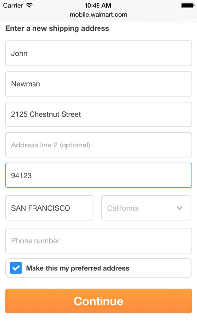
Note No need to ask these details again, but always provide the option to edit these auto-filled details in case users want to change them.
5. Avoid placeholder-only approach
I have seen this often. Many mobile UI designers use placeholders as a replacement for labels in the forms. No doubt, they do it for saving the space, but placeholders are not a replacement for labels. We use labels to make the forms informative and clear. These are two different HTML tags, which have different usage. They should not be interchanged.
For example, placeholders vanish once you type in the fields. If there is no label in the form, it would only confuse the users while filling in the lengthy forms. Users won’t even remember the placeholder in case they want to review the form information after filling it.
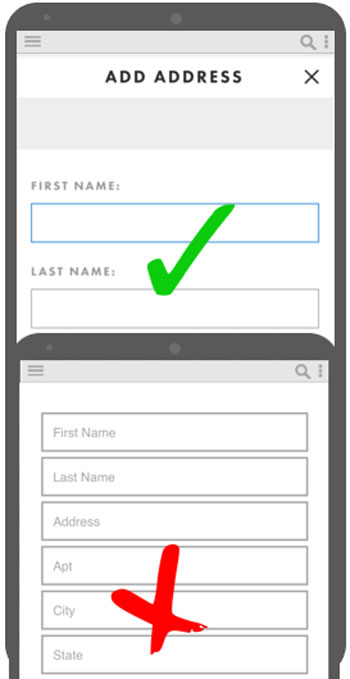
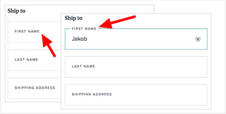
Keep your form labels intact, or use ‘Floating labels’ that move to the top of the field once you start typing. Something like in this form
To Conclude
User experience optimization is not a 5-step solution. It is continuous and evolutionary. As the trends change, the browsing style changes. The best UX is one that keeps up with the changing trends and browsing habits. For example, responsive UI was a trend not so long ago, but now is the time for Mobile apps. Keep your eCommerce business and its touch points updated and upgrade the elements that are in the trend.
Here are a few other optimizations to adapt besides the ones mentioned above
– Dynamic form validation: Use Ajax to validate the forms without refreshing the whole page or submitting the form.
– Zoom: Integrate Zooming features for product images. Use HD quality images for products.
– Advanced Search: Let users customize the search results by applying different filters like sorting, price, brand, size, color, specifications etc.
– Test: Always A/B test a modification before finally implementing it.
– Heat map: Track browsing behavior of your users using a Heatmap tool. It will help you comprehend what your users want.
– Payment options: Offer as many payment options you can. Ex-Net banking, card payment, wallet payment etc.
Author Bio: I am a professional blogger, guest writer, Influencer & an eCommerce expert. Currently associated with ShopyGen as a content marketing strategist. I also report on the latest happenings and trends associated with the eCommerce industry.
Follow me on Twitter: @Jessicabruc (https://twitter.com/Jessicabruc)
Quora: https://www.quora.com/profile/Jessica-Bruce-23