Competitor Analysis
From the competitors we looked at 2 key insights were found:
- The most effective way employees were keeping up to date with their referrals was through continuous updates. The preferred methods were through notifications e.g. HR email updates, live job boards updates, and newsfeeds.
- A few of the competitors we looked at also incorporated gamification into their platforms. Placing Real Links already ahead of those who didn’t. The most engaging gamification techniques were point-based systems, leaderboards, tasks and platforms that used engaging visuals e.g. badges.
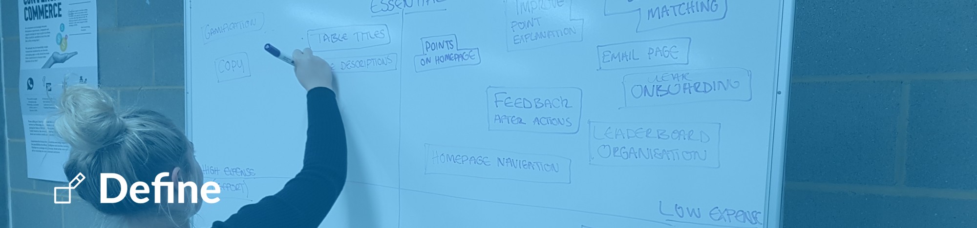
Moving into the define stage we used the key findings from our research to focus the sprint further. In this stage, we developed our primary persona Julie and we also identified 2 scenarios in which Julie would use the platform. This allowed us to prioritise the features we needed to develop and create a user flow.
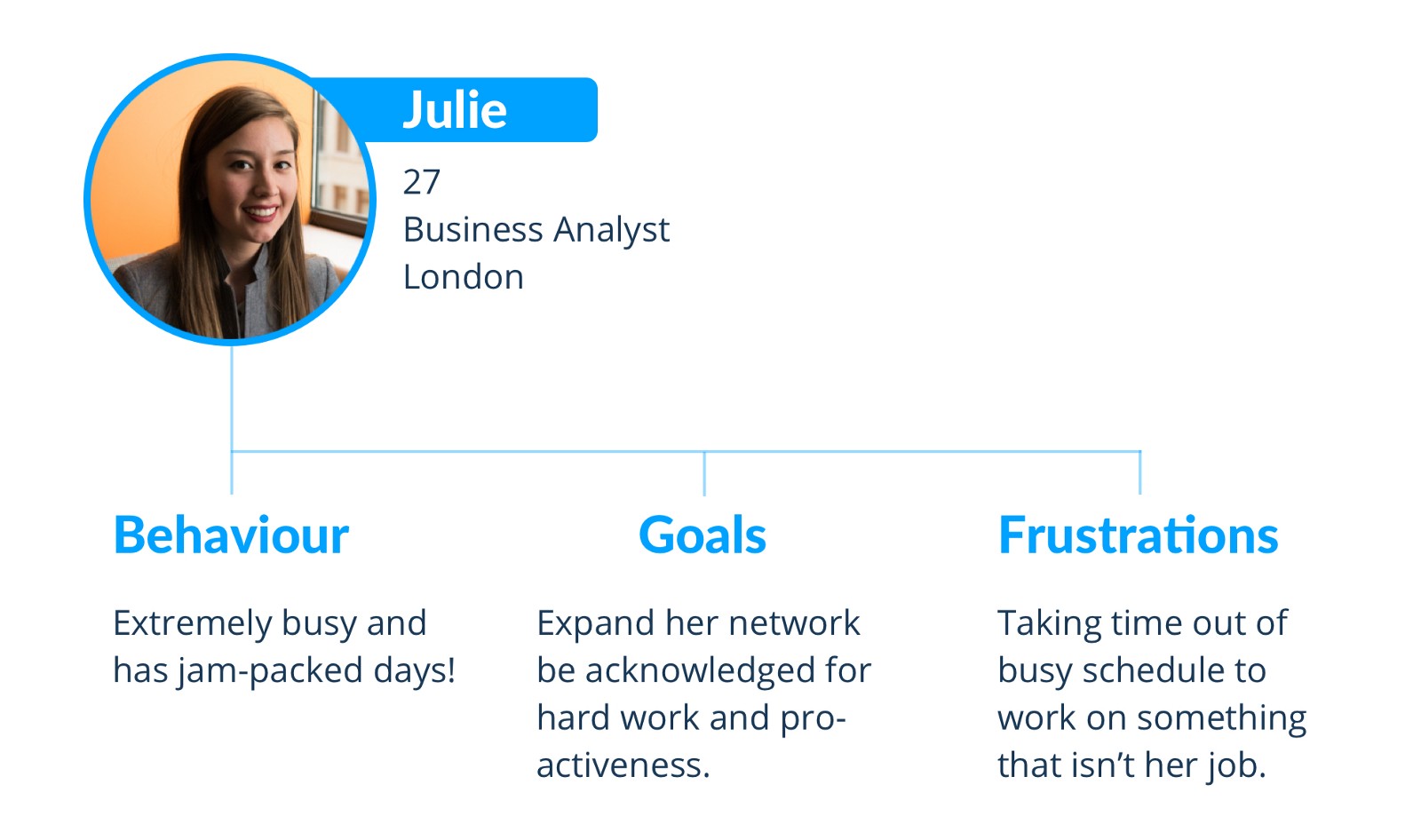
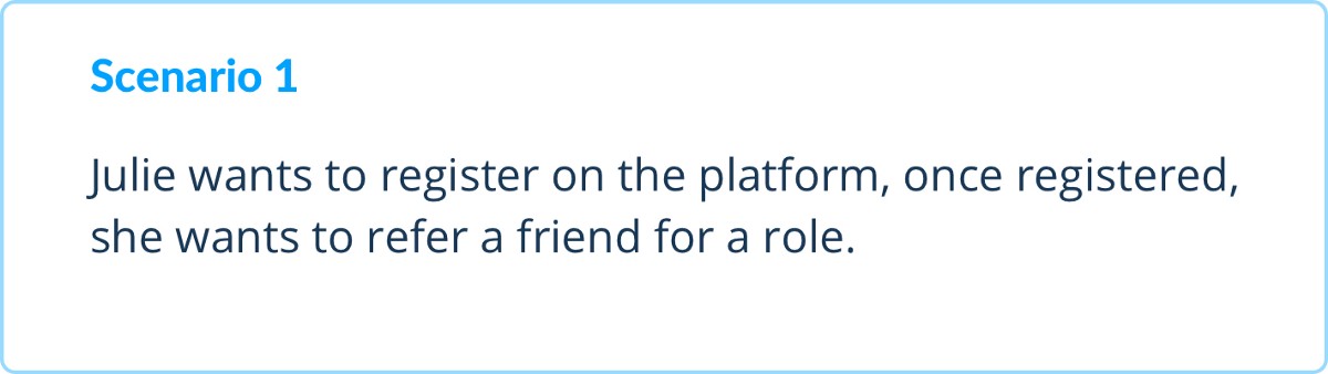
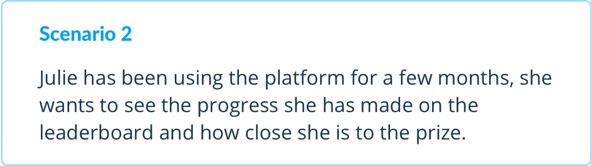
Meet Julie
Julie was our primary persona and she represented the key people that used the platform. Julie allowed us to concentrate on the needs of a users based off her behaviours, goals and frustrations.
Scenarios
Keeping Julie in mind we then developed 2 scenarios in which she would use the platform. These scenarios were based around utilising the main elements of the platform as well as focusing on the 3 areas identified from the brief (sign up, navigation & gamification).
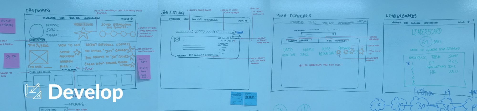
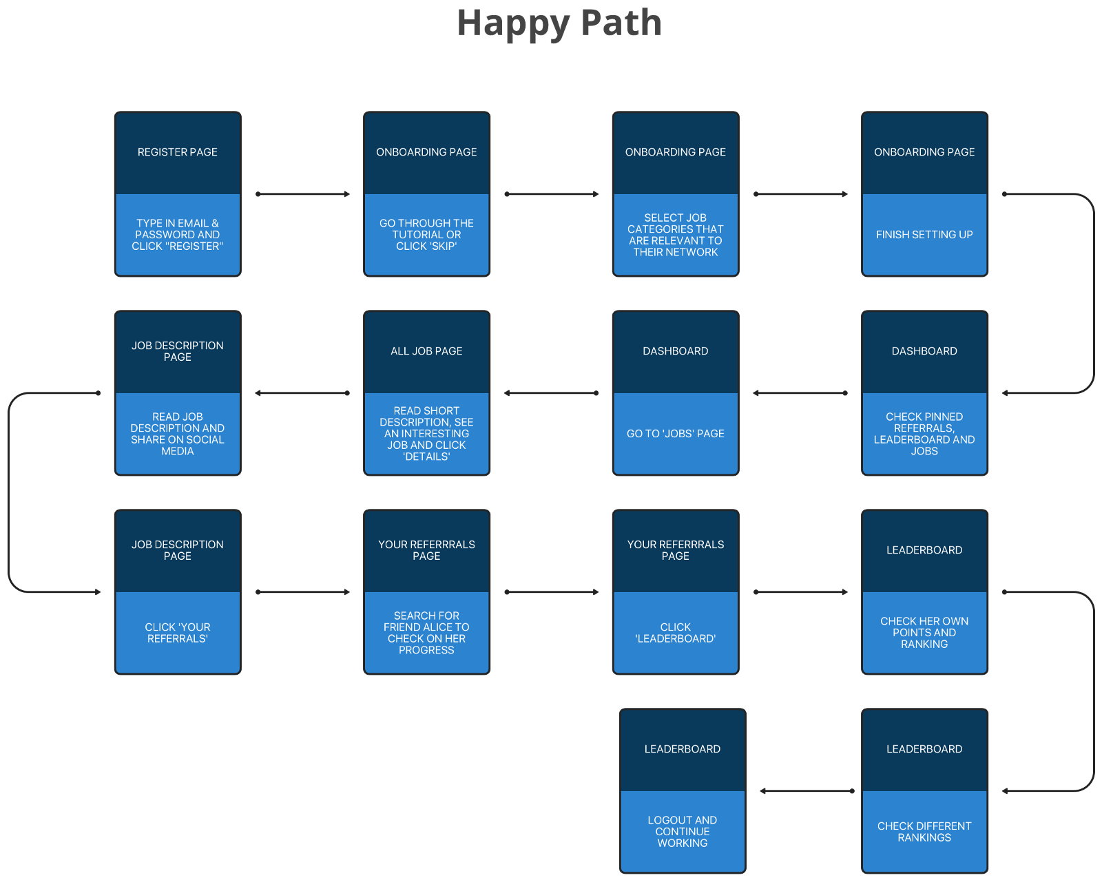
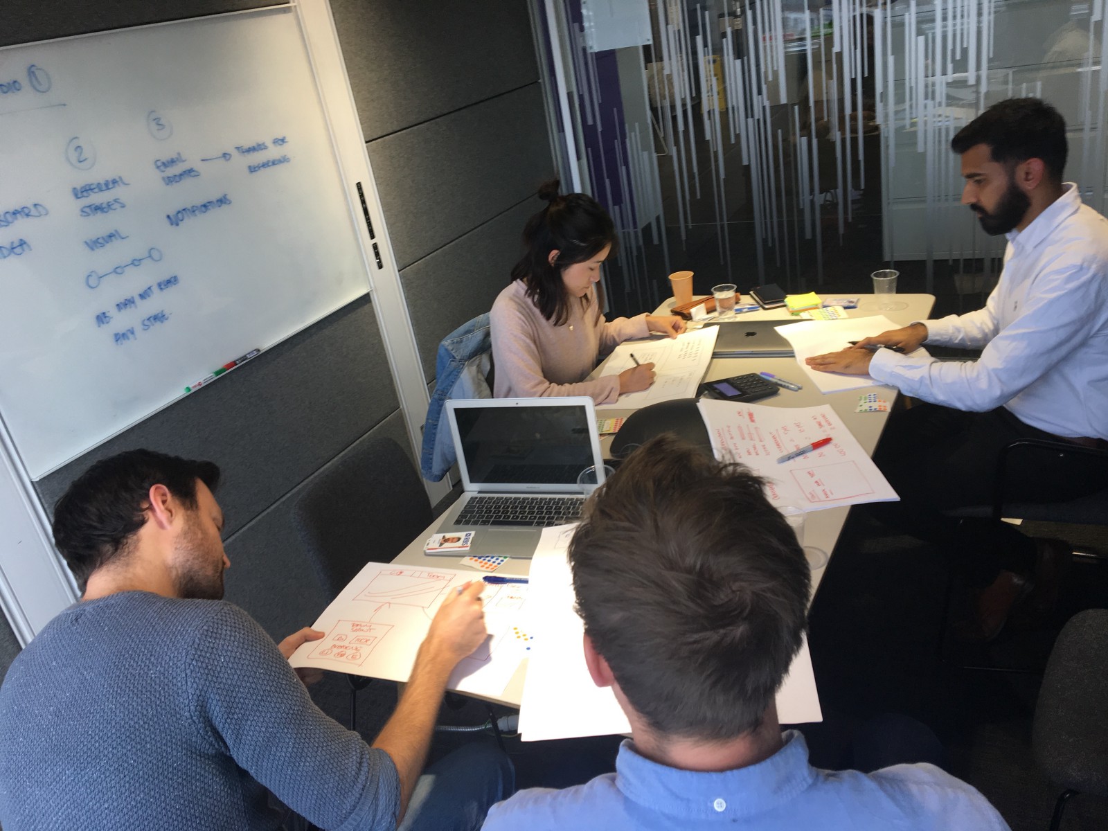
With Julie’s needs and the 2 scenarios in mind, we then created a user flow to plan the path Julie would take through the platform. This user flow then helped us prioritise the key screens that we needed to design.
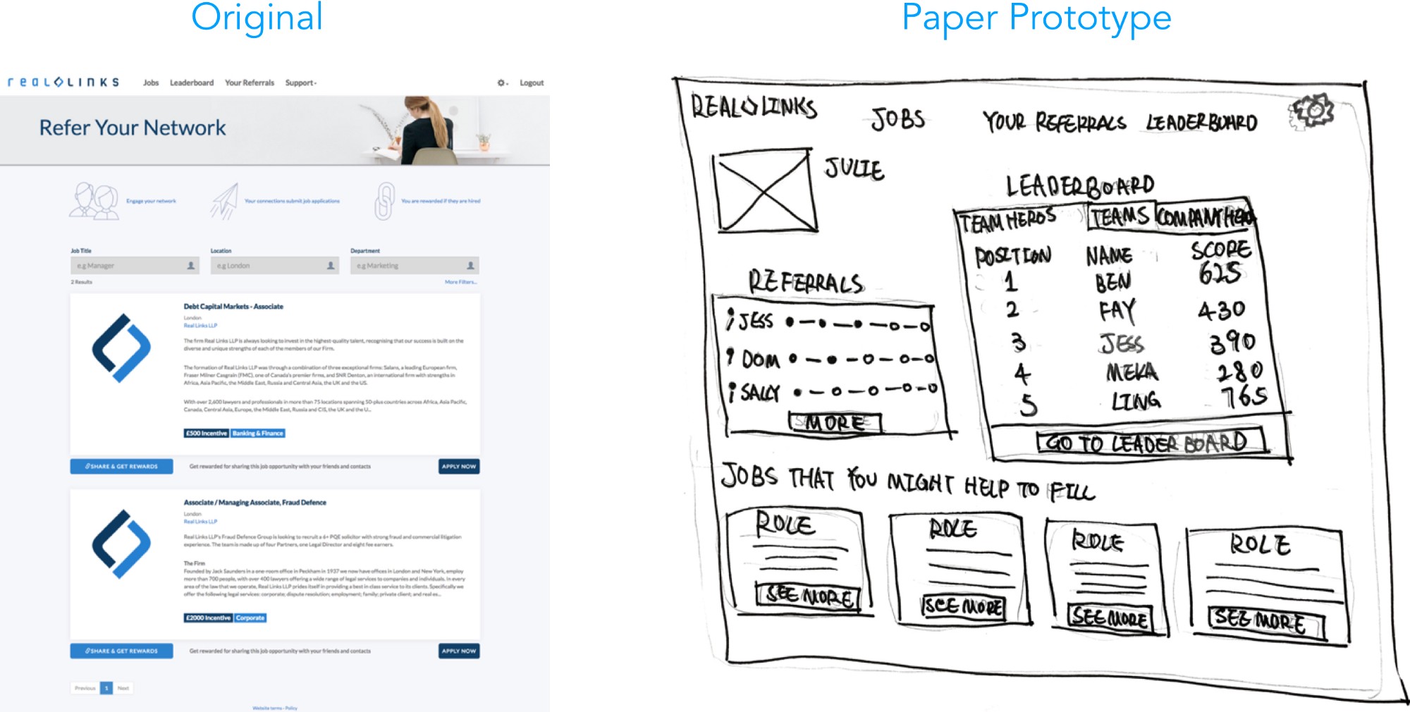
We started by developing a basic paper prototype which was then tested with users and developed further into an interactive mid-fidelity prototype (using Sketch & InVision). More usability testing was then carried out and these findings were used to produce another mid-fidelity prototype and this process was repeated until we finally produced a high-fidelity interactive prototype.
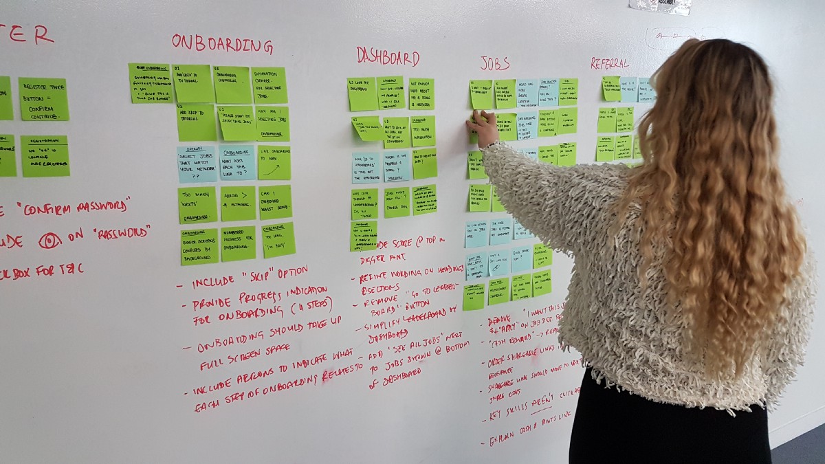
From each round of usability testing we had a wealth of user insights. The key insights and changes are below and are broken down into the 3 main areas identified for development in the brief, sign up, navigation and gamification.
Sign up
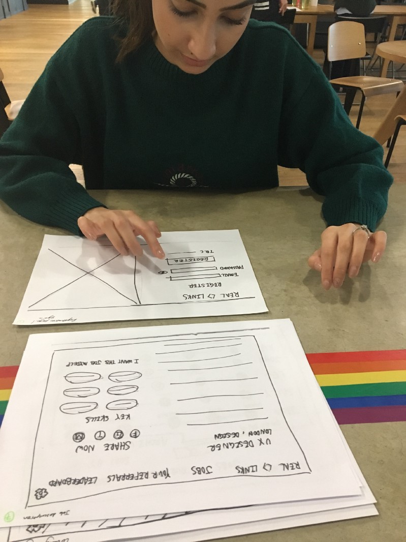
The original sign-up process we tested in our contextual enquiry involved the users entering their details and also leaving the platform to verify their email address before being able to enter.
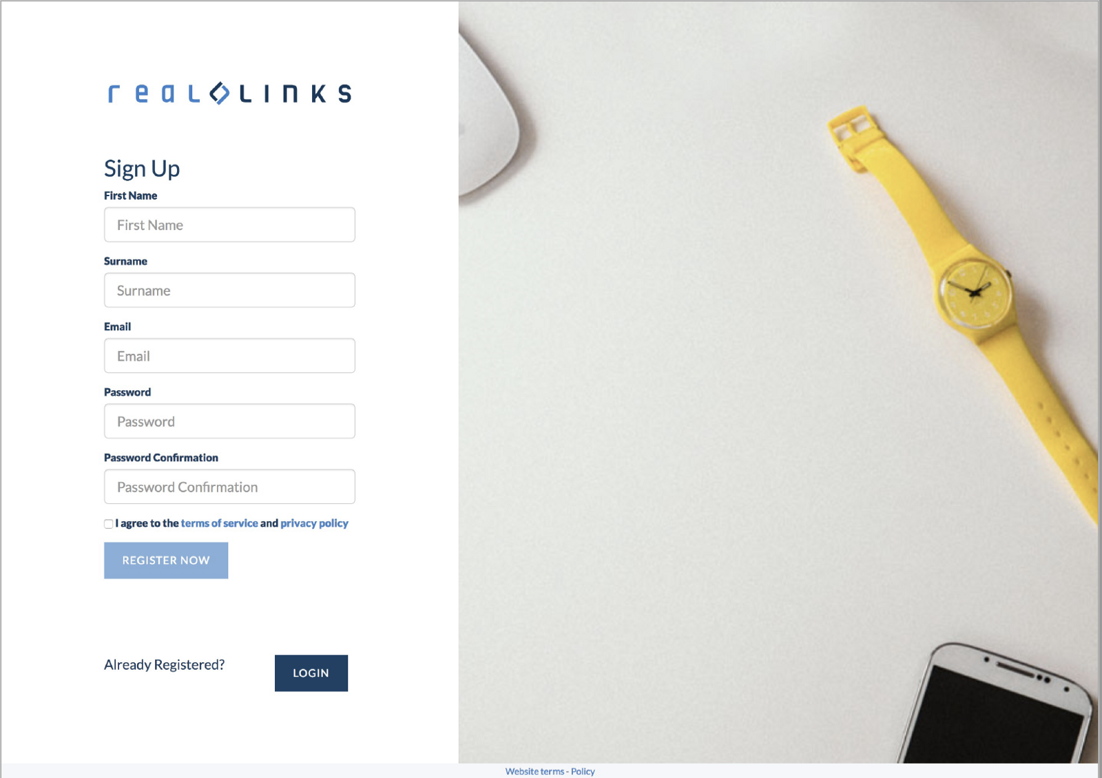
We knew the sign-up process needed to be quick and easy. The aim was to get users into the platform and using it as quickly as possible. We knew this because during our initial research we found people struggled to find extra time at work.
We firstly simplified the sign up by limiting it to 1 screen, where they only had to enter their details once. Then they were taken into on-boarding and were able to verify their account in their own time.
We found when we tested this idea users felt that the sign-up process could be quicker. They also thought it would be helpful to add some clarification as to where they should enter their details and whether they should link it to their personal or work email account. People preferred to use their work email account but then felt that as it was a work-related platform, their information should already be linked through the HR database. Following discussions with Real Links, they will now be offering single sign-on as part of their product which is a great way of solving the issue we identified.
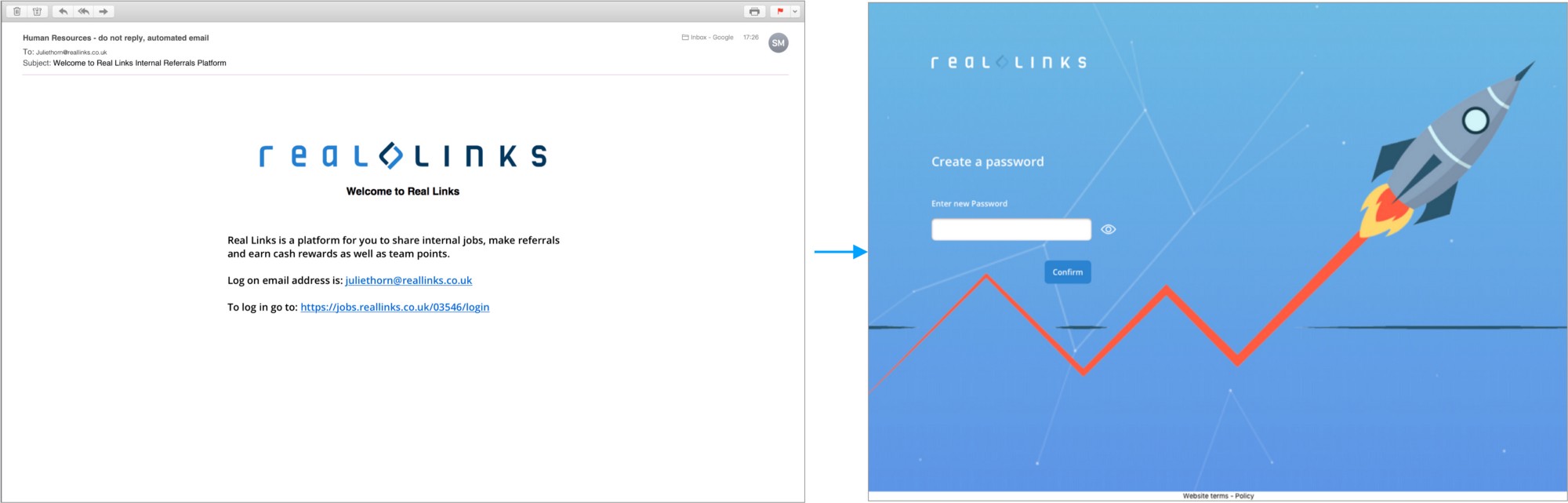
Therefore in our final prototype, we decided to completely scrap the sign-up process. Instead we designed a system where users would receive an email from HR with a personalised link to the site. This link then took them straight to a page where all they needed to do was create a password, then they were taken straight into the platform. When this was tested our users thought the process was really quick and easy and we received a lot of positive feedback. This meant the employees first impression of the platform was improved and their emotional journey started off positively.
Navigation and Flow
As well as the flow of sign up we also worked on other elements of the platform that were pain points with our user and that impacted Julie’s journey.
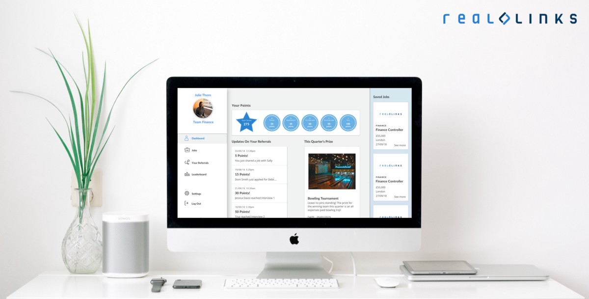
Firstly, with the original platform, when users logged in the first page they were taken to was the job listing page. This was so users would be able to see the jobs they could potentially refer to a friend. From testing several designs we went forward to incorporate a dashboard into the platform. This allowed users to see all the recent and relevant information to them in one place. For the users we tested the appeal of the dashboard was that it was personalised to them and it made them feel more engaged with the game aspects. The dashboard therefore became the first page users were taken to when they logged in. Going forward, Real Links will be incorporating a dashboard as part of their product which is great.