
This article is a retrospective piece for a project that was done as part of the User Experience Design Immersive Course in General Assembly (Singapore). Feel free to reach out to me at [email protected] if you’d like to chat more about this project. Thanks! :)
The Task
We had 10 days to:
- redesign the Information Architecture (IA) and key wireframes/pages of a university website to meet the needs of three user personas
- Create an interactive prototype to demonstrate the user journey of one of those personas
- Ensure that the redesigned website aligned with the school’s goals and brand guidelines
Our Client
The school that my partner Lorraine and I were assigned was ISTD, which is one of the 4 schools within Singapore University of Technology and Design (SUTD).
ISTD provides multi-disciplinary education in fields such as Computer Science, Information Systems and Computer Engineering. It prides itself on its flexible and highly relevant curriculum, as well as its faculty members who are at the forefront of their fields.
Our Methodology & Tools
Here are the techniques and tools that we used in this project:
- Cognitive Walkthrough
- Heuristics Evaluation (with UX Check)
- Content Inventory/Audit (with Google Sheets)
- Card Sorting (with OptimalSort by Optimal Workshop)
- Tree Testing (with Treejack by Optimal Workshop)
- Wireframes + Interactive Prototyping (with Axure RP)
- Usability Testing
The Redesign Process
Cognitive Walkthrough
“The cognitive walkthrough is a usability evaluation method in which one or more evaluators work through a series of tasks and ask a set of questions from the perspective of the user.” (Source)
Starting with a cognitive walkthrough enabled us to identify our assumptions from the very beginning, which we could then test against multiple sources of user feedback later on in the research process.
We quickly identified the pain points in our user flows through the website, and soon realised a chilling truth:
Most university websites are pretty badly designed.
Needless to say, it was going to be a long journey ahead…
Heuristics Evaluation
Moving forward, we deepened our analysis of the website by conducting a heuristics evaluation based on Jakob Nielsen’s Usability Heuristics.
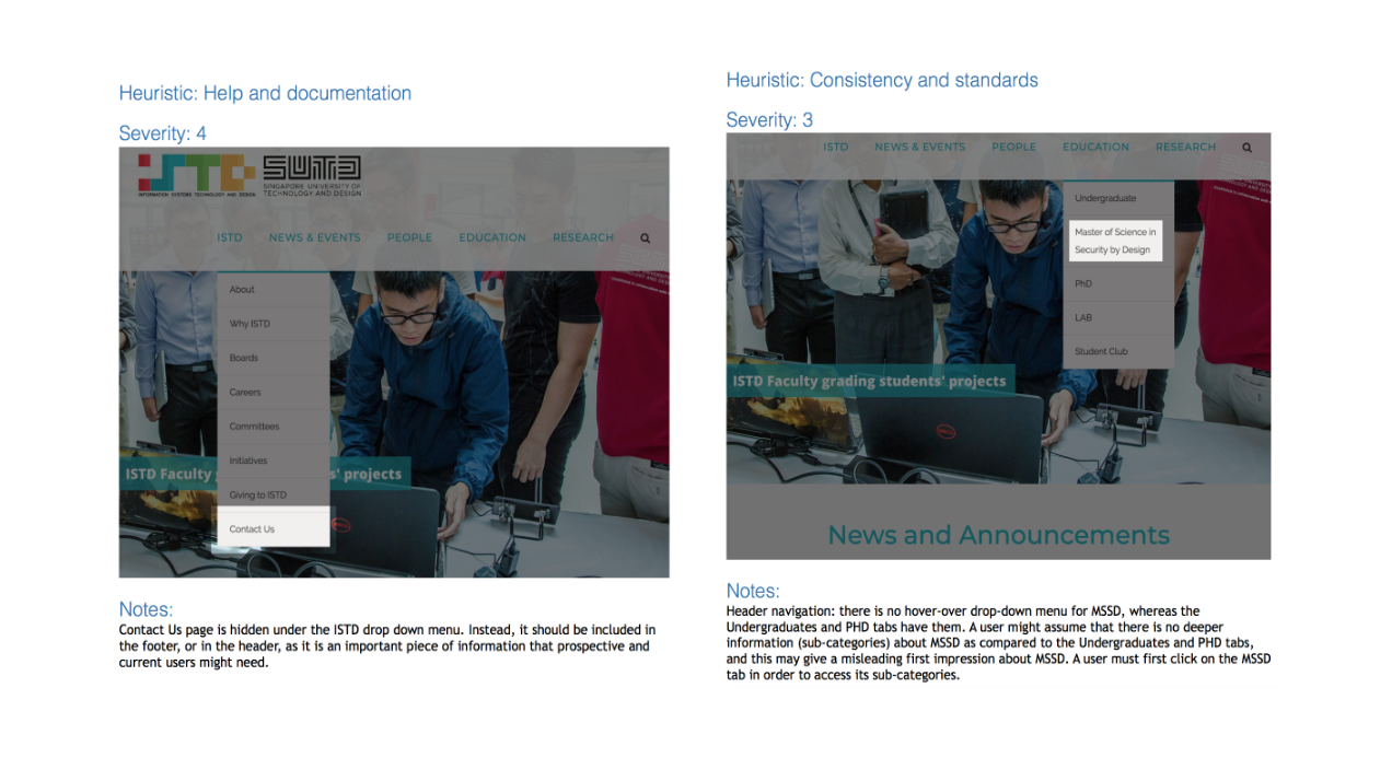
The two most commonly violated heuristics in our website were:
- Help and Documentation — key pages that offered students useful assistance such as “Contact Us” and Why ISTD were only accessible from a drop-down menu and not included more directly in the main header, homepage and/or footer.
- Flexibility and Efficiency of Use — there was no tailored experience for prospective students (e.g. an eye-catching Apply Now button on the homepage) or current students (e.g. a way to access their student portal). Every visitor was forced to navigate through a website that felt generic and slow to move through.
Content Inventory / Audit
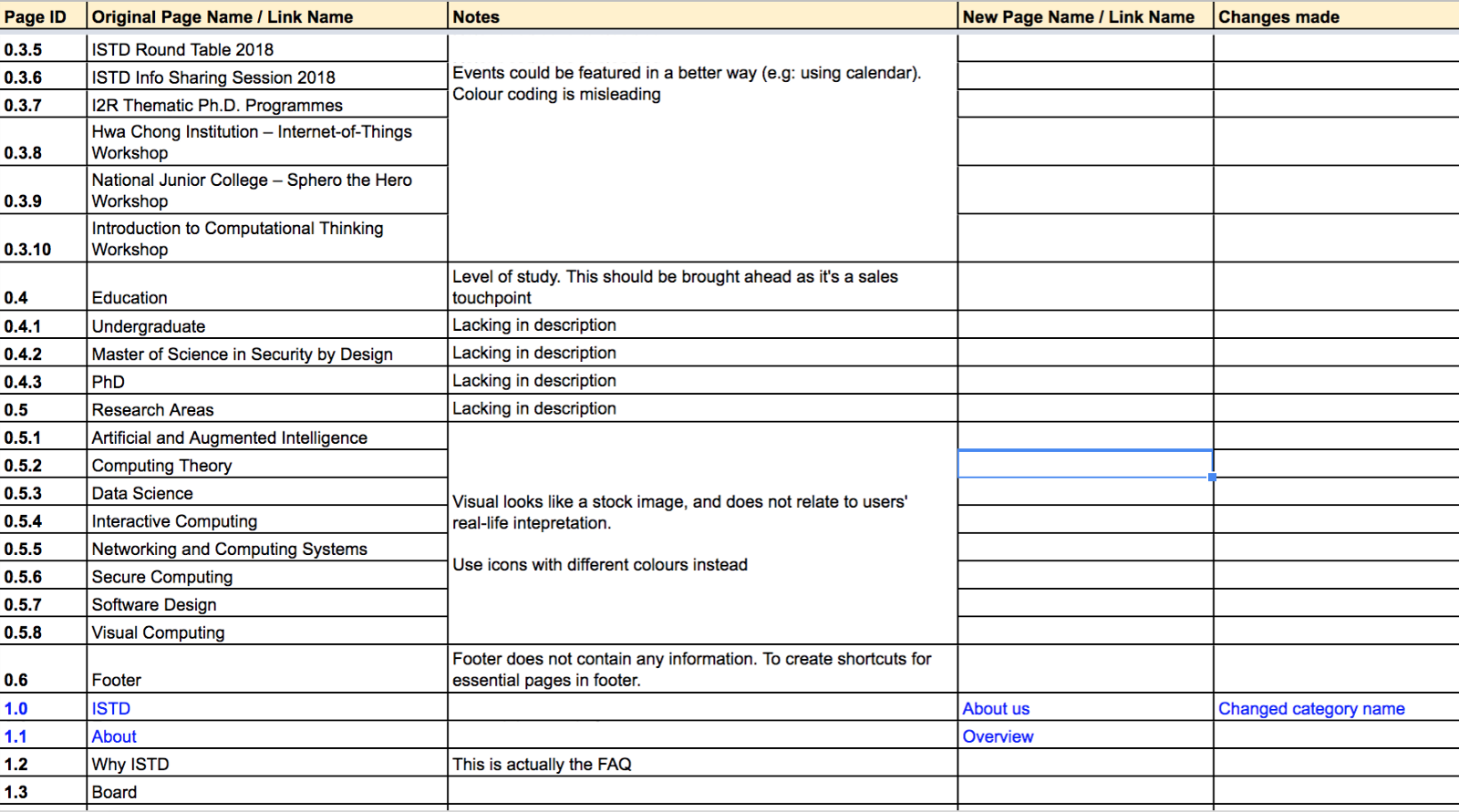
It was now time for one of the most tedious tasks of the entire redesign process — one that was notorious for being very time-consuming. Thankfully, ISTD is a microsite of a larger university website, which means we had less pages to capture than some of our classmates. However, it still took us a full day to complete the entire content inventory/audit.
Even though it was rather dreadful, the painstaking process allowed us to understand just how many pages there were on ISTD’s original website and what needed to be deleted, merged or added. This was essential in helping us to see the big picture of our website’s problem, and it was from here that our redesign ideas started to take shape.
Card Sorting
Although we had many redesign ideas bouncing around in our heads by this point, it was important to start getting out of our own minds and into that of our users — because as the old saying goes, “You are not your user”!
The first step of gathering user feedback was conducting a card sorting exercise using an online tool called OptimalSort.
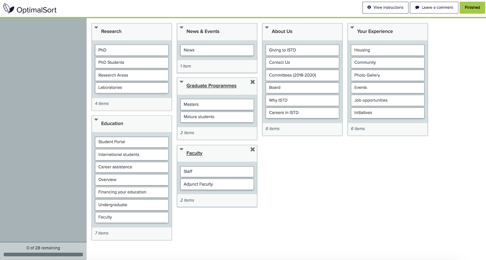
We decided to conduct a hybrid card sort which meant that:
- There were set categories that users could organise the cards into
- However, users were allowed to create their own categories if they wanted
This turned out to be a good decision as the option of creating categories allowed us to understand the user’s language, and incorporate that into our information architecture.
Tip 1: Try to limit the number of cards in your exercise because user fatigue is real and sets in quickly.
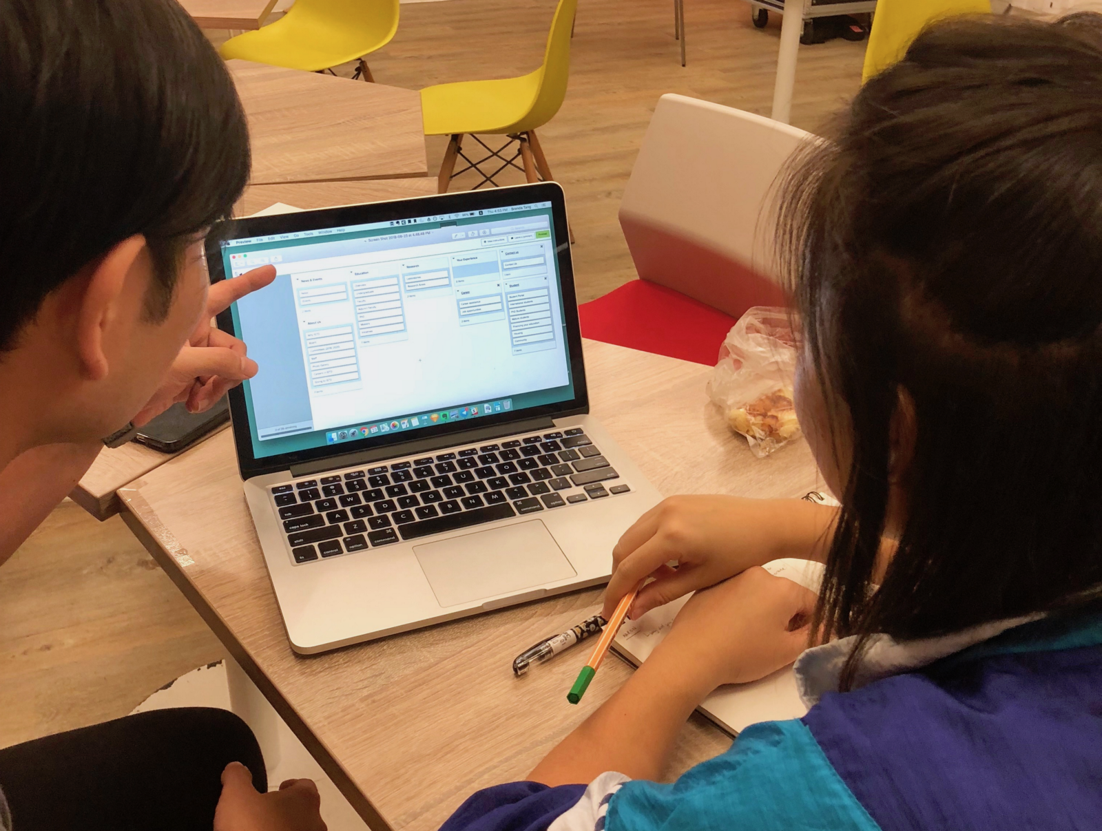
It was immensely helpful to observe some of our participants face-to-face while they did the card sorting, because it gave us a valuable opportunity to probe them on their decision-making process. This helped us to uncover key qualitative insights that couldn’t be deduced otherwise.
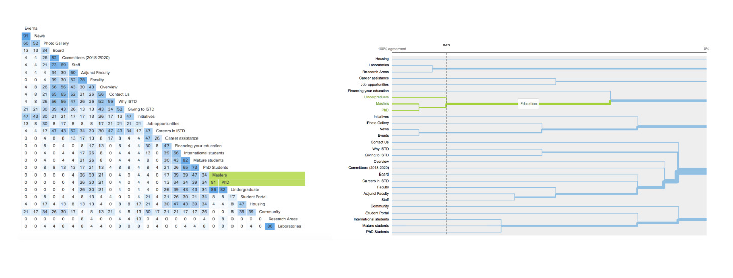
Nonetheless, the analysis clearly explained the trends by which our users categorised the cards (e.g. which cards were most commonly put together in the same category). It also showed us that some of our pre-set categories that we thought would work were actually confusing and under-utilised.
In summary, the card sorting exercise was crucial for testing our assumptions and gathering user feedback — all of which we could then incorporate into our draft IA.
Tree Testing
After creating the draft of our sitemap, we immediately went back to gather more user feedback — this time by conducting a tree test to see how easy or difficult it was for users to complete certain tasks based on our proposed IA.
An example of the tasks set is:
- You are a current undergraduate student who can’t decide which courses to take for the upcoming semester. Where would you go to compare between courses?
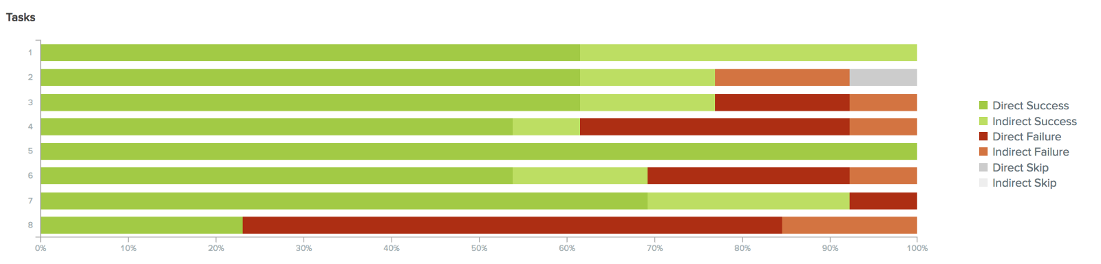
As you can see, Task 8 was the only major point of concern for us. It turns out that we had added in an obscure link that almost no users discovered, and they opting for a more conventional answer. From here, we decided to remove all redundant links in our IA and minimise confusion as much as we could.
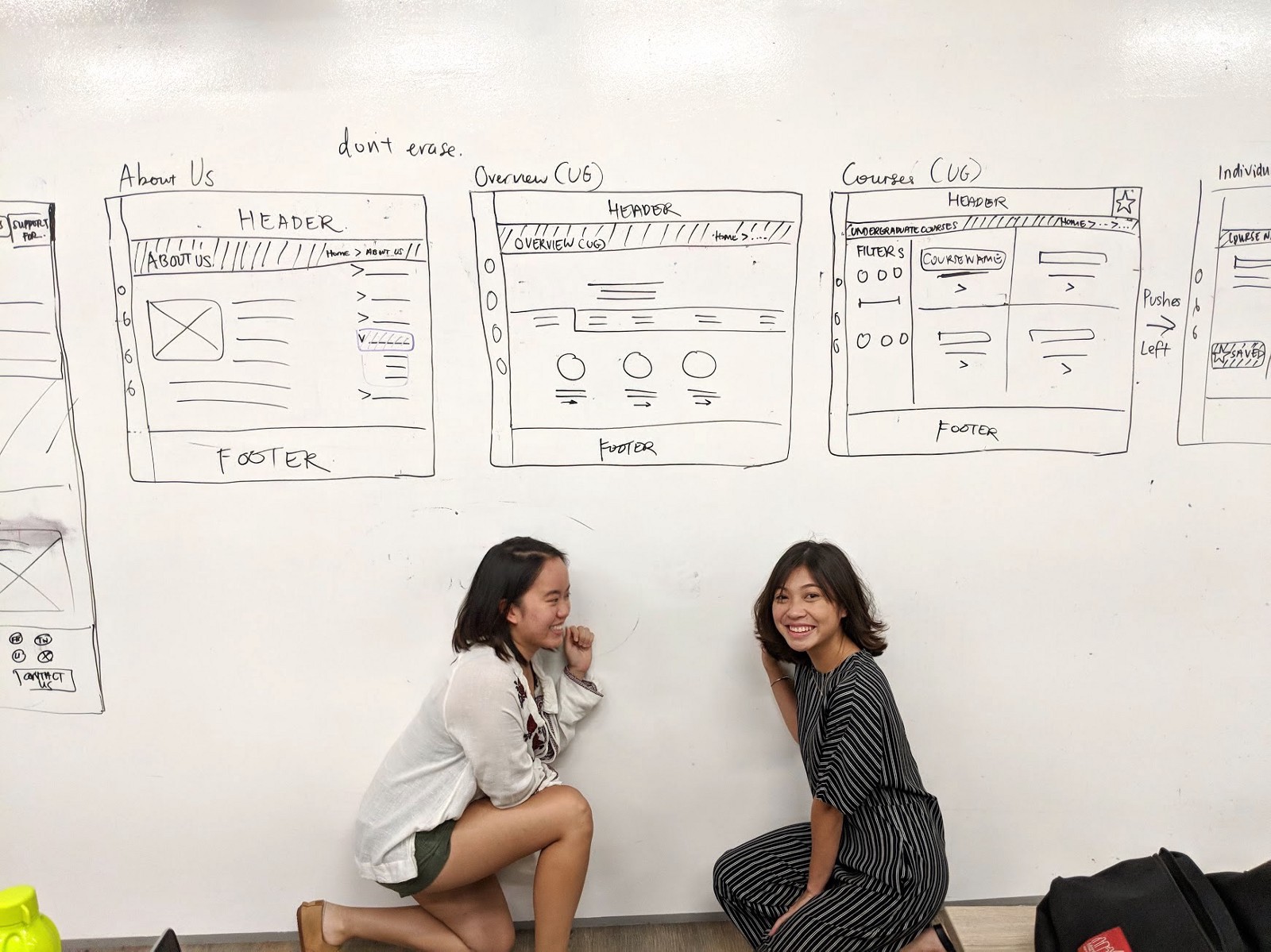
Wireframes → Lo-fi Prototype
With a bulk of the user research out of the way, it was time for Lorraine and I to get our creativity juices flowing and start sketching our wireframes.
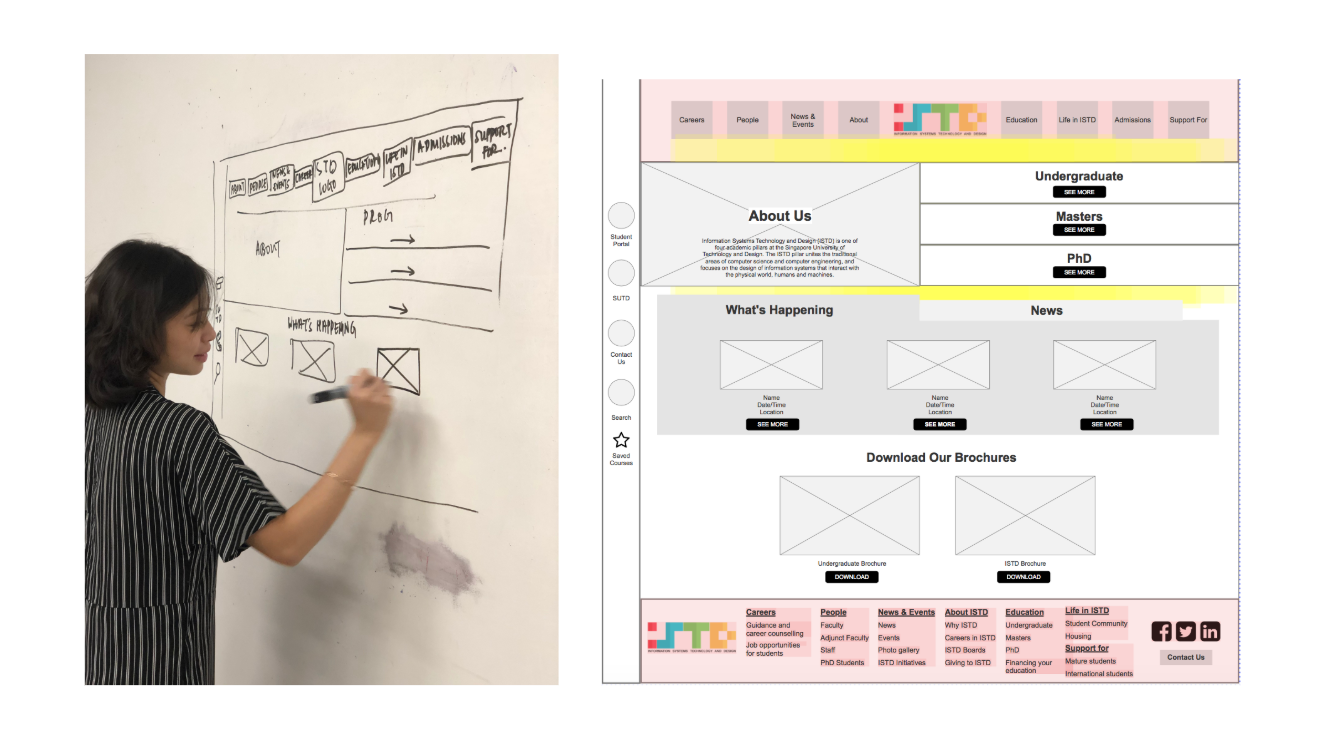
We then spent a full day creating a digital, interactive lo-fi prototype on Axure. Our teacher Nuno warned us that it was a software with a very steep learning curve and true to his word, it did take a lot of trial and error to figure out how to make our interactions work as we intended. However, it was definitely worth the pain as Axure turned out to be a highly powerful prototyping software!
Usability Testing
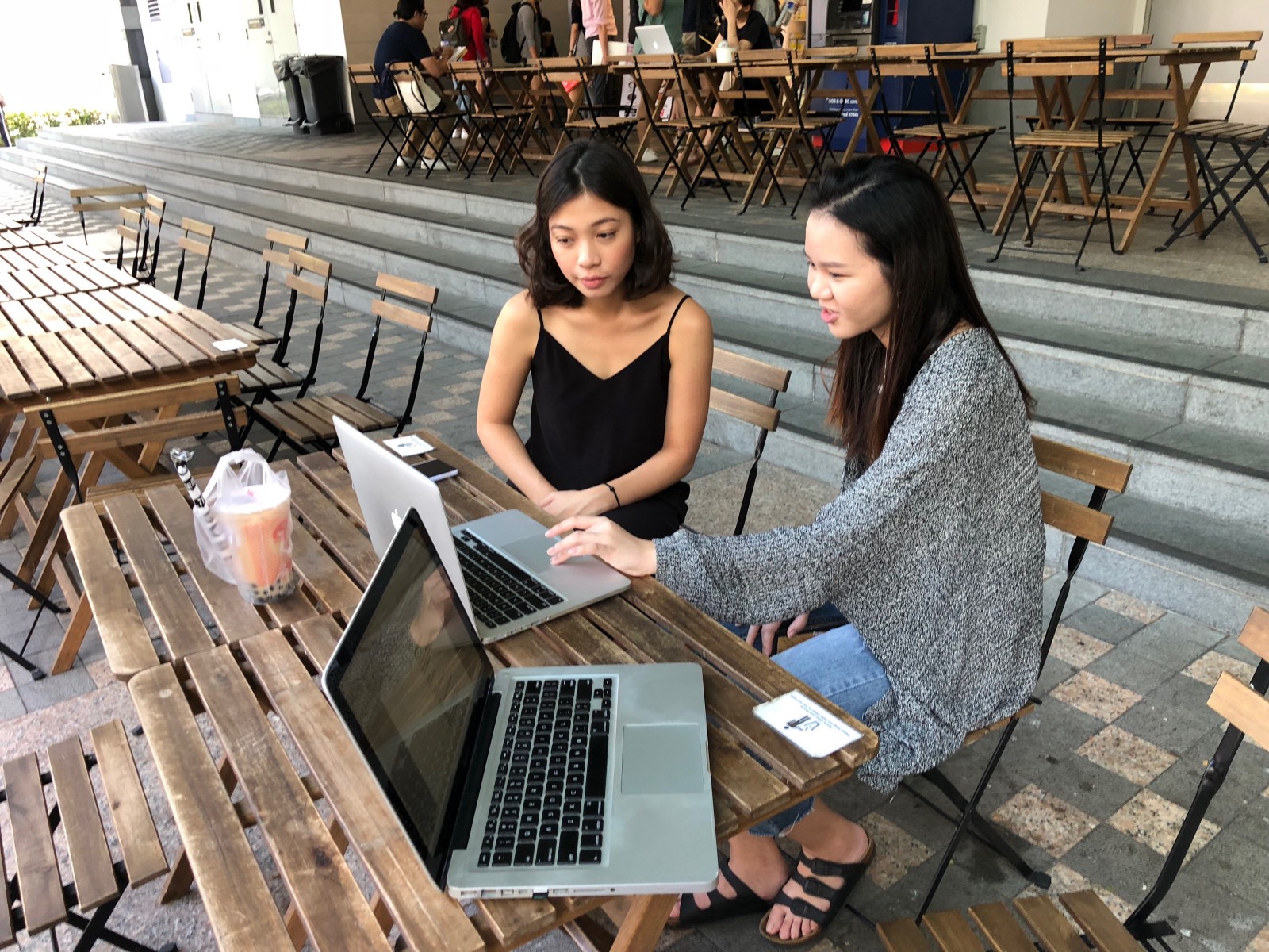
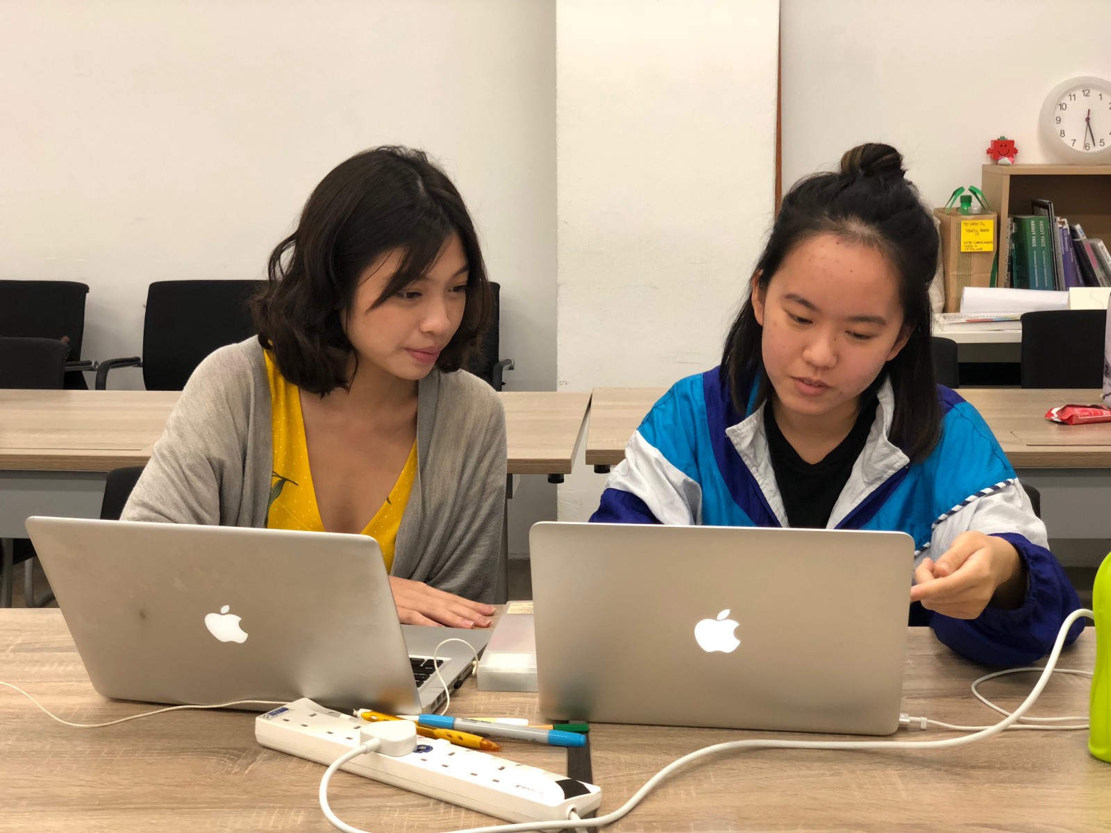
We decided to step out of our comfort zone and conduct our usability tests with random university students, instead of just interviewing our classmates at General Assembly. We believed that this would provide more unbiased and valuable responses, as our classmates were already primed with a UX perspective.
Tip 2: Little incentives (such as a free cup of bubble tea) go a long way in recruiting users for usability testing, especially if you’re out in the wild!
With all that we had done, the last step was to polish up our prototype and bring it to the next level of fidelity.
Creating the Hi-fi Prototype
In creating the hi-fi prototype, we made sure that we adhered to ISTD’s logo colours and used the font from the original website. Despite the large number of usability changes we made, it was important that users were still able to recognise the school’s identity clearly.
And finally..
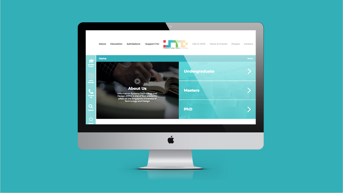
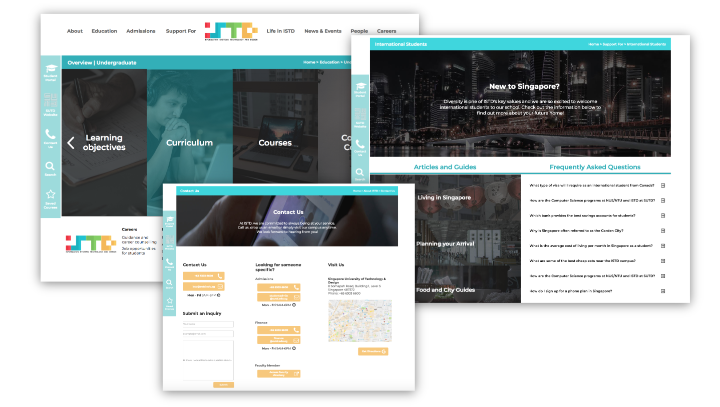
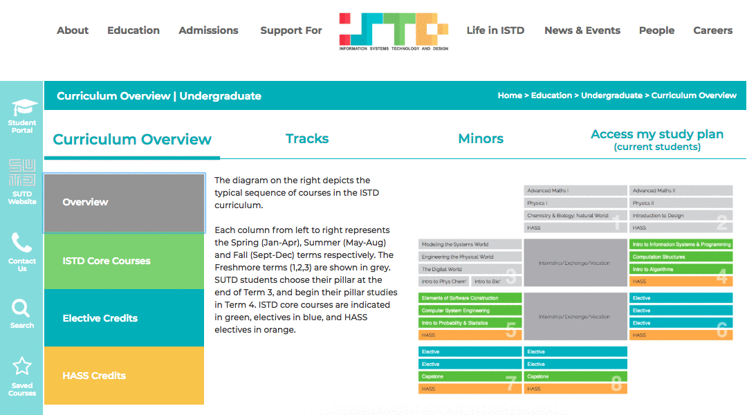
Introducing the Redesigned ISTD Website
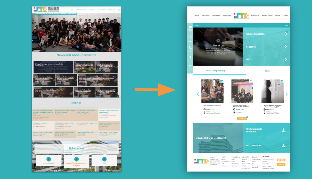
Click here to explore our interactive prototype!
Presentation Day
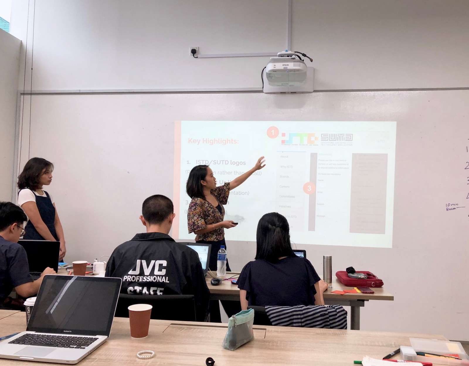
When we first started creating our presentation deck, Lorraine and I had slight disagreements over the content of the slides. I was initially fixated on documenting and explaining every step of our redesign process, but we eventually agreed that it would be more strategic to focus on a few key sections of the process so as to not overwhelm our clients and audience.
We were a bundle of nerves before our turn, but thankfully the presentation went smoothly and we managed to finish within the time limit of 10 minutes.
Tip 3: Rehearse adequately, but don’t obsess too much over nailing every single line in your script! Trust yourself and allow some wiggle room for flexibility. That way, you won’t be so stressed out during the presentation. :)
Reflections
Overall, I had a really enjoyable time doing this project despite the insanely stressful timeline and late nights hunched over our laptops. For that, I have to thank my amazing partner Lorraine who had an excellent work ethic pushed our project to completion with her strategic time management skills. It also really helped to start off by discussing our communication methods and working styles so that we could be on the same page from the get go.
Finally, here’s one major takeaway from this project that is now embedded firmly in my mind:
You are not your users.
You are not your users.
You are not your users.
We did violate this rule several times in project because it was just so easy and tempting to make assumptions on our users’ behalf. But as UX designers (in-training), it is our basic duty to place our users front and centre in the UX design process, no matter how difficult that may be. :)
Thanks for reading my story! Feel free to leave feedback or suggestions in the comments below or email me at [email protected]. Cheers!