After hearing many of my friends and co-workers talk about forgetting assignments or their problems balancing school with work, I made my next UX case study a daily planner app. As someone who lives with a bullet journal attached to her hip, I wanted to understand why the people around me didn’t use the myriad of free planner apps on the market. I also wanted to learn what factors would make someone quit using a planner app.
I decided to tackle this problem in two parts:
- Understand why students aren’t using the current planner apps on the app market.
- Understand what aspects of a planner app would appeal to a demographic of 18–22-year-old college students involved in extracurriculars.
Understanding the problem
I started this project by doing user research. I asked students about their experiences with planner apps and how they used them in their daily lives.
I felt this approach was important because most people already have a time management system, even if that system is just writing every down date on a sticky note and putting in on their wall. A system is a system, and I wanted this product to improve that system without hindering it with unnecessary requirements and add-ons. I wanted to facilitate ease of use and transfer of data from any prior system to this one.
Through user interviews, I found that students use daily planner and time management apps to accomplish these goals:
- View events happening that week including reoccurring events (class schedule, weekly meetings) and unique one-time events.
- Create reminders and alarms for repeated daily assignments.
“If you want to build something that’s truly viral you have to create a total mindfuck experience that you tell everyone about.” — Brian Chesky, co-founder and CEO of Airbnb
I asked students to describe an 11/10 star experience using a planner app, an approach taken from an interview with the co-founder of AirBnb Brian Chesky. Chesky used a thought experiment when thinking of the ultimate AirBnb experience which was really useful in my own investigation. Users generally wanted three things:
- AI assistance (reading out events after a morning alarm, etc.).
- Periodic check-ins during the day w/ reminders for incomplete tasks.
- A study timer that could calculate how much time they would need to achieve a goal by a deadline.
With these goals in mind, I also tested the daily planner/time manager apps TickTock and Any.Do, along with what I already use, Google Tasks.
These were the conditions I used when testing the app:
- I used each app for one week.
- I kept notes of my impressions of the app, noting things like usability and screen layout.
- I noted pain points I encountered in my user journey or smaller design choices (illustrations, copy) that added to the overall experience.
I changed apps every week. After three weeks, I compiled a master list of my observations and created criteria to follow when designing my app.
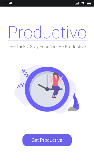
The Final Product
When designing Productivo, I wanted to retain some of the stylistic trends I saw in the apps I’d test while also making appealing to my target demographic. I retained the use of a monochromatic color scheme in my design, using a clean font with a clear yet entertaining copy.
In the initial prototype, I included three aspects of the app for user testers to interact with: creating tasks, setting timers, and calculating study times. Using the Adobe XD mobile app, I was able to show users the app on a physical phone. The ability to hold the prototype in their hands helped make the prototype feel “real” although sometimes this meant users would get annoyed if they couldn’t actually type something out on the mock keyboard.
I tested the prototype by giving the user a goal (“Walk me through how you would create a task, and add a reminder and location to the task.”) or I would simply give them the prototype and observe them clicking through it. Through setting goals, I found glaring flaws not only in the design of the prototype, but also in how the app transferred over to a smaller mobile screen. Although these flaws were important, I found more areas of improvement when I let users play with the app on their own. For example, I hadn’t included a button to “finish” adding options or reminders to a task, and as a result, people hesitated on that screen before hitting the “back” arrow. In the final product, I added a “done” button and “cancel” option beside it to ease any doubts users had on whether or not their task was going to be successfully added to the list.
Other improvements included the addition of simple vector illustrations at the bottom of a few pages, and the calendar page. The illustrations are from Katerina Limpitsouni, on unDraw. I included them to add more personality to the app, something I saw in the apps I had tested at the beginning of the project. I added a title page to give the app a more realistic appearance.
Click through the full prototype here.
Next steps
Overall, I’m pretty satisfied with the end product of this case study. I think I’ve built upon what I learned from my last project, and tackled new concepts and resources with this one.
Areas of potential development:
- Develop the personal assistant screens, which as of now would be similar to Google Assistant.
What I learned
- As a designer, you can learn more from unstructured testing than formal goal setting tests.
- Making higher fidelity prototypes may help with users’ understanding of the concept, but may also increase frustrations when they can’t perform complex actions.
- Understanding the problem, and the users affected by the problem, is more valuable than coming up with “cool” solutions.