During my bootcamp to learn UX/UI at Ironhack Paris, I had to create a digital solution in the wellness field. I decided to focus on tiredness at work.
In less than two weeks, my goal was to identify the problem regarding how to deal with tiredness at work & solve it. To do that, I used the Design Thinking Process.
Situation
When I began working on this project, there was no pre existing solution, I had to start from scratch & create one. There were few constrains: only create a digital solution & find a way to collect datas to give feedbacks to the users.
I was totally free to choose the device I wanted to develop the solution for. But I made my decision regarding the users I identified.
Design Thinking Process
EMPATHIZE
To better understand the situation & the target, I made some researches & gathered a lot of informations using different tools.
Market Research
To begin, I had to dive into the “wellness at work” area. I made a lot of researches, find some articles with some interesting stats such as:
- 85% of mammals are taking several naps during the day according to the National Sleep Foundation — So why aren’t human allowed to do it??
- A nap helps reduce stress & improve the immune system according the Journal of Clinical Endocrinology and Metabolism.
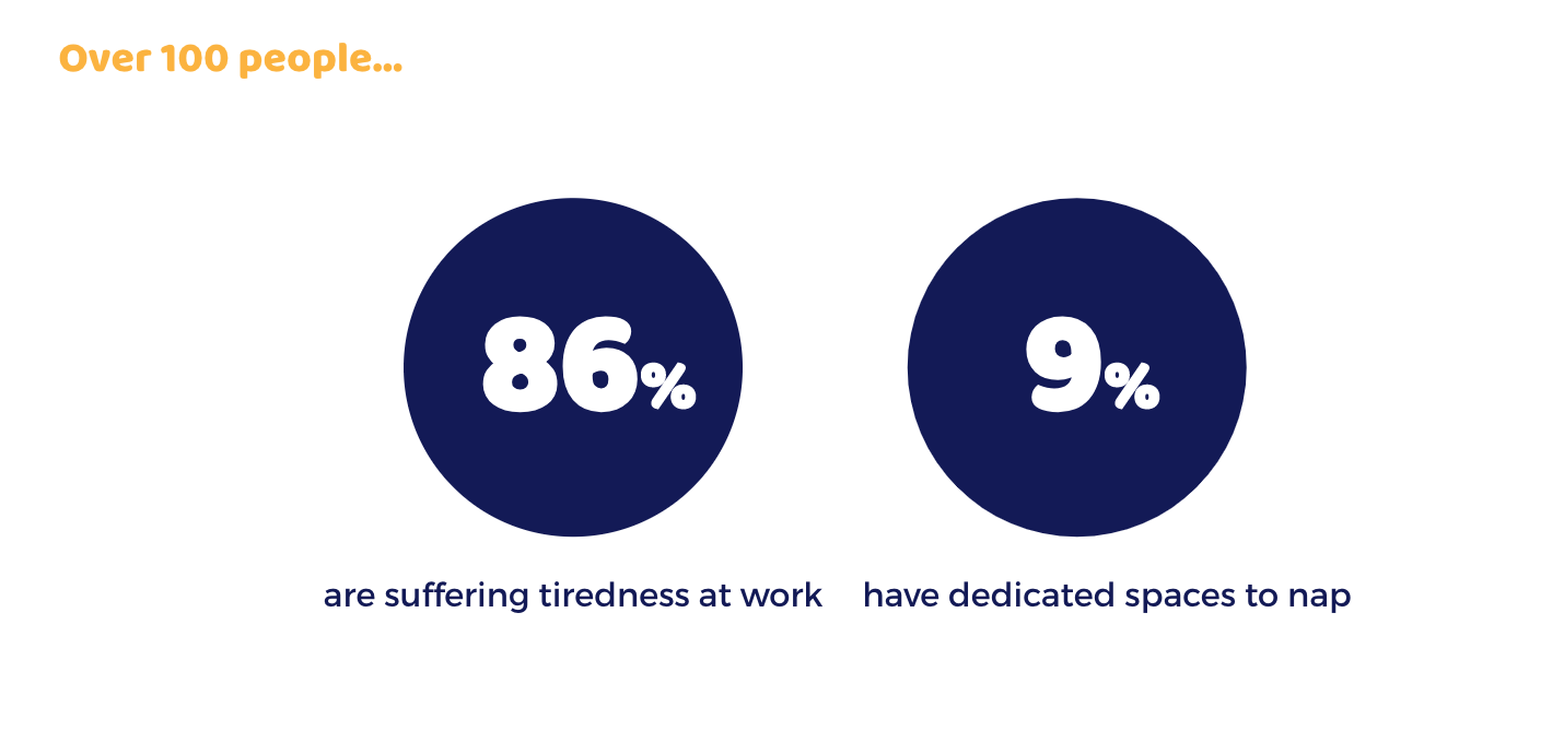
- 62% of french people have at least one type of sleep trouble (Source).
- Only 12% of the companies are favorable towards napping at work (Opinion Way Study, June 2016).
This helped me understand better what was the situation & summed it up with the next tool. My first conclusion was that there was a big work to do to help things change!!
UX Strategy Blue Print
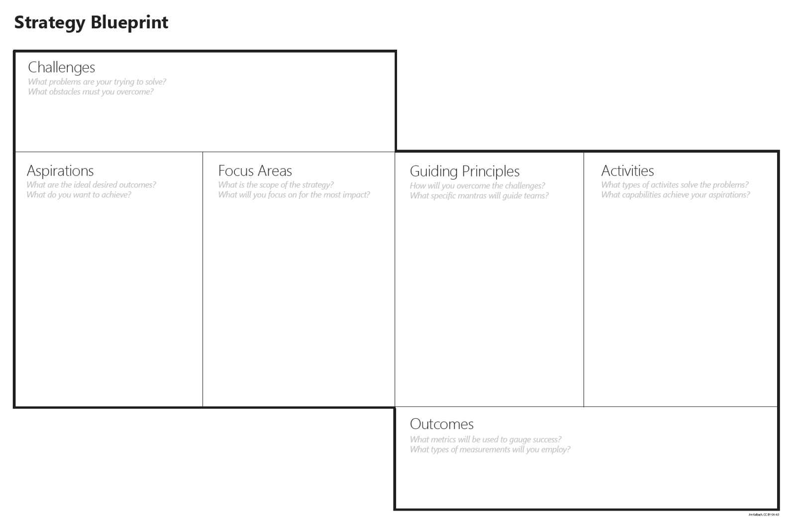
The goal of this tool is to make some assumptions & give some surroundings to the topic you are working on. It is really useful to help you see where to begin with your researches.
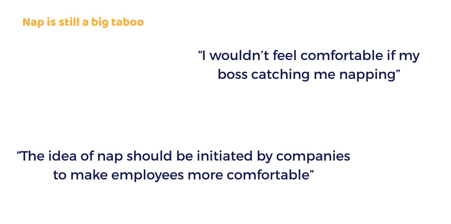
For example, I knew at the beginning of the project that there was a taboo about napping at work in France. So the challenges I was facing was that a lot of people were suffering tiredness at work but dealing with that tiredness through a nap for example was taboo.
My aspiration was to create a solution helping workers admit they were suffering tiredness & overcome their fear to nap at work.
I then thought I had to focus on finding a way to meet bosses & employees expectations at the same time to get rid of that taboo. To do that, my guiding principle had to be a solution that would satisfied both improving wellness at work & work competences.
To do that I may have to focus on short activities that will not disturb the company’s routine & I should use some metrics to provide a real outcome for head department & teams.
Competitive Analysis
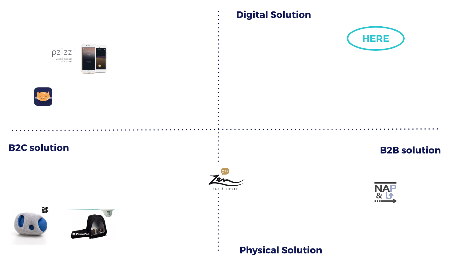
Then I made a competitive analysis to learn more about the existing offers on the french market. I realized that there was a lot of solutions. But none of them were B2B digital solutions.
Either the employee had to buy by himself a physical or digital solution to nap (often really expensive), either the company had to dedicate a space in its office to install a napping area & pay for it.
My first question was: would it be possible to create a solution that would get rid of this two constrains?
And that is why my goal was to fill this gap in the market, providing a digital B2B solution.
User Research
Then I had to go further with the analysis of the potential users.
That is why I made some quantitative & qualitative studies:
- a survey with 100 answers: to validate some assumptions & help me see what infos I had to dig in.
- five interviews: to go further on the points I identified with the survey & get more infos from people that could be my target.
And with those tools, I learned that:
DEFINE
After gathering all those infos, I had to sum them up & I began defining who was my target.
To do that, I also used some tools such as:
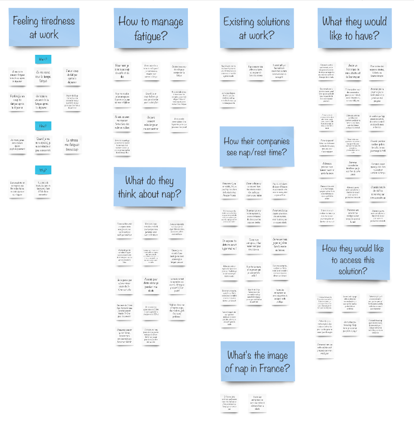
- Affinity Diagram: A “post-it” tool to gather all the infos you have learned from your user research & sort them by categories. This helps you a lot to understand what area of the problem you should focus on.
- Empathy Map: This tool helps you create your persona. With this canva, you can gather all the infos related to your typical user!
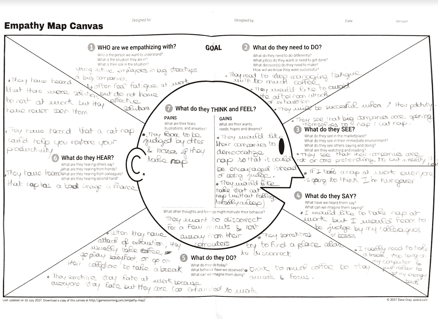
- Persona: Then after using the Empathy Map comes your persona. It is your typical user, the one you are designing for! So your product should help him/her solve perfectly the problem he/she is facing!
According to my research, I identified that I was designing for Elsa:
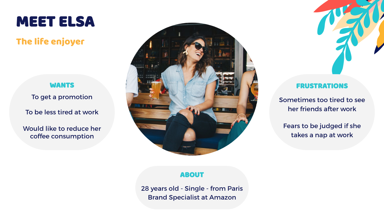
- User journey: After identifying Elsa, I had to make sure I knew when were the pain points she was dealing with & when could I find some opportunities to help her. That is why I created a user journey.
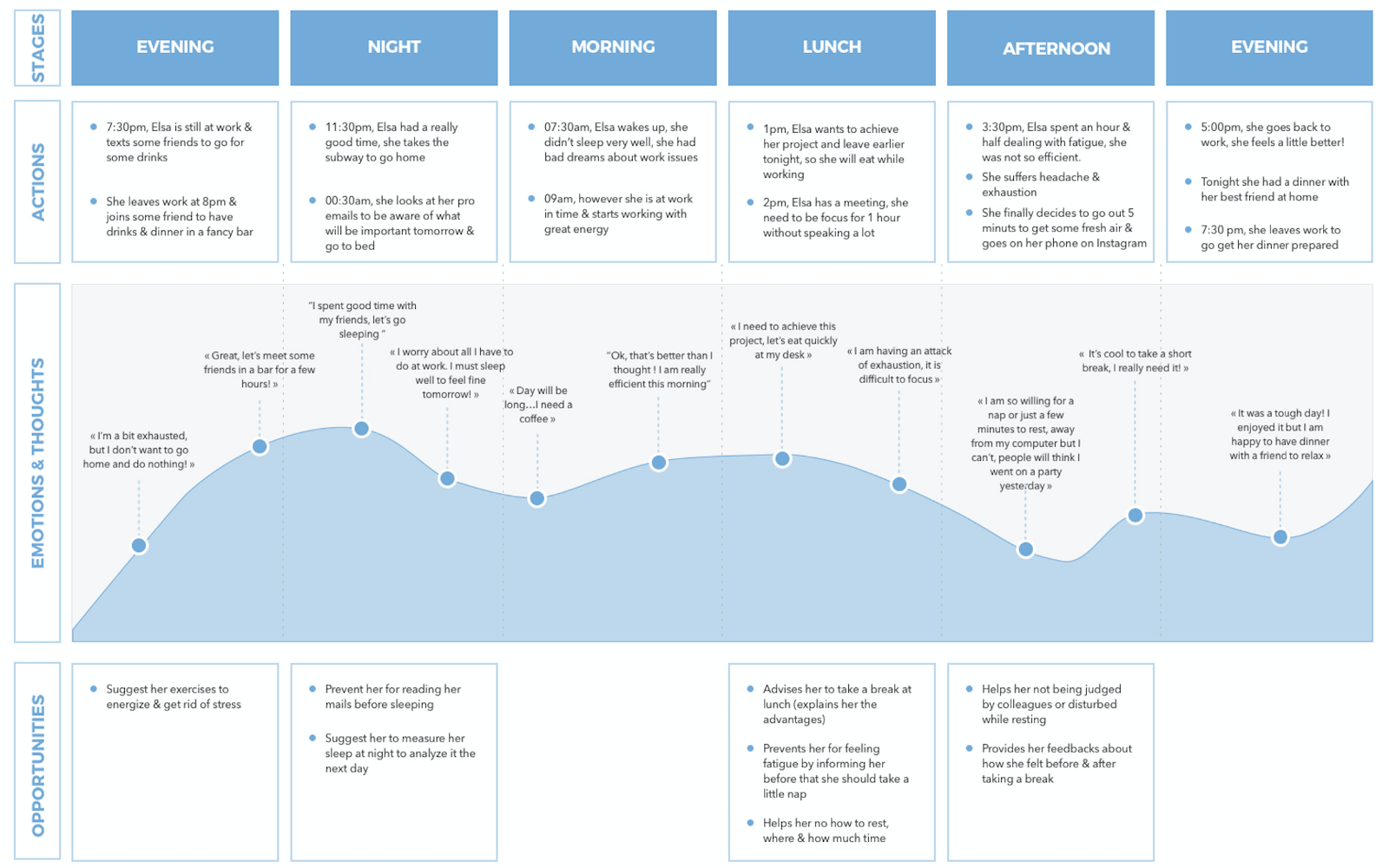
At first, I decided to focus on the lunch & afternoon opportunities because I had in mine that my goal was also to help managers & directors be more comfortable with napping for their employees so I had to focus first on work-times.
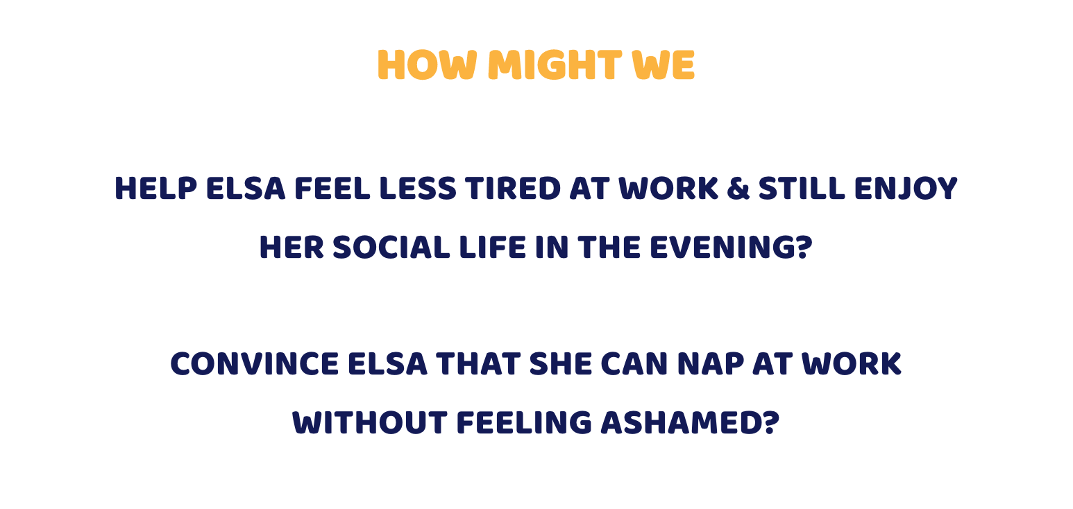
- Problem Statement: This is the last tool of the Defining phase. Its goal is to sum up the problem we are dealing with into one or two simple questions. Mine were the following:
IDEATE
To create the perfect solution, I had to go through a brainstorming process & generate lots of ideas using different tools:
- Crazy 8’s: This tool helps you generate many ideas in a few time (8 ideas in 8 minutes). I worked with two coworkers on this tool that I briefed on my topic. This way I could have 24 ideas & a fresh point of view.
- Round Robin: I selected 3 ideas I wanted to dig in & with that tool, my coworkers helped me add some details to the ideas, asked some questions to challenge the ideas.
- Vote: To end the ideation process, I presented the ideas to a group of people & asked them to vote for the one they thought was the best.
Introducing the solution
So I came up with a digital BtoB solution directly linked to the company intranet, so that we could:
- Initiate the idea of nap through the company
- Use existing free meeting room (no dedicated space needed! It is easy & fast to implement in your company)
But to also meet directors’ goals, I decided to create a power nap solution:
- No more than 20mn nap & sophrology methods (you don’t fall asleep, you just disconnect your brain for maximum 20mn to recharge your batteries!)
- A way to personalize your nap according to your goal: you can select a daily goal & the sophrologue voice & the nap atmosphere will adapt to help you improve creativity, efficiency, self-confidence or reduce stress!
PROTOTYPE
Before going to the prototype, I had two things to do:
- Define for what type of device I was going to design
- Identify the user flows I needed for Elsa
As I realized through my studies that my typical user was working in big companies or big startups but still, modern one such as Amazon (were my persona is working), I decided to first design for iOS devices. Why?
Because the people who answered to my studies were in majority iOS users. I also decided to create a mobile solution because it was easier for my users to go in a meeting room to take their nap with their phone rather than with their computer (not all of them have laptop at work)!
After that, I made my user flows to make sure the process was clear & Elsa would be comfortable using the app.
I had to design 3 user flows because the app needed to be use in 3 steps.
Here you can see combined, the screens I draw on paper to test the app & the user flows:
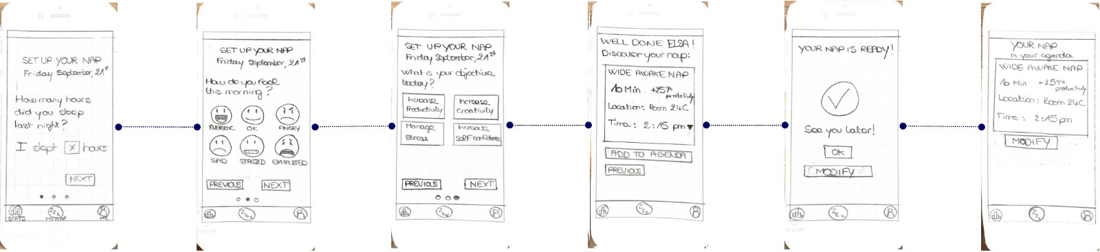
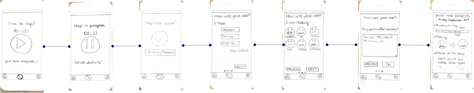
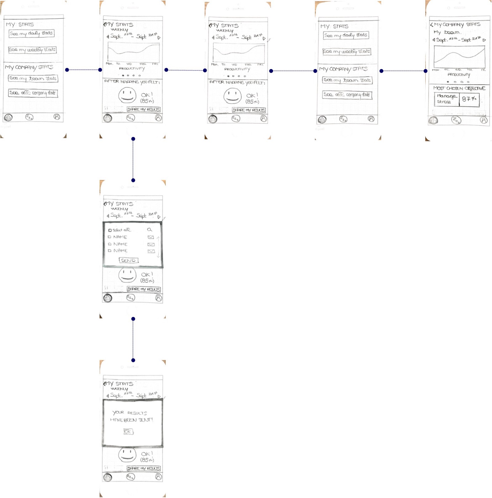
I tested my prototype on 5 persons & I learned that I had some things to improve. That is why it is so important to begin with a paper prototype: time is key, so don’t spent too much on a perfect version that will not fit your user needs!
Sometimes, you are so inside the project that you can miss some important things, that is why I was so glad to begin with a paper prototype & to share it with testers! They allowed me to see things that were not so efficient in my prototype & to improve them.
For example, after I made some tests, I learned that users found the concept really good but that I could:
- allow them to skip the feedbacks giving & do it later;
- reorganize the stats parts in a totally different way because there were too many clicks to access it;
So I worked again on my userflows & my design and I made a mid-fidelity prototype with those improvements before jumping to the high-fidelity & the graphic design!
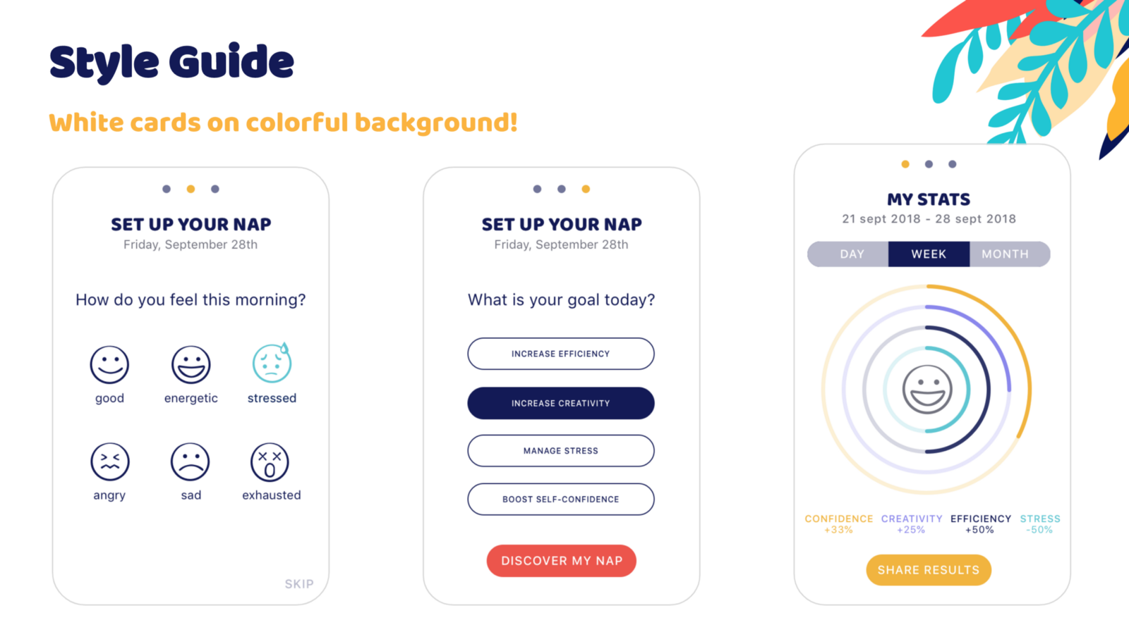
USER INTERFACE
As I started from scratch, I also had to create the entire graphic design & the brand name.
I came up with the name “Nappy” because I wanted my solution to be friendly & clear.
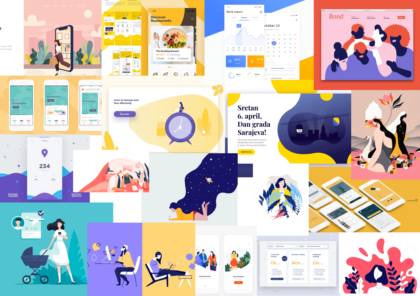
Then I made a huge moodboard phase to define the style tile of the application. I made a collage of different images that I liked for the colors, the shapes, the meaning, etc.
It was a good exercise to express what I was thinking about without words & help me clear my choices.
After this, I knew that I wanted to use rounded shapes, flat design (no shadows), plants illustrations & a lot of colors. I came up with this style tile:
But you may wonder why?
I used rounded shapes & flat design to give a friendly & clear aspect to my application.
Plants illustrations would help me express the idea of progress, wellness increase through napping.
I also choose my colors wisely. I wanted something colorful to express energy but I wanted my colors to have meanings. So I linked my colors’ choices to the goal you can achieve through the naps:
- Yellow: to increase happiness, self-confidence
- Blue: to express serenity but also intelligence
- Turquoise: for a refreshing aspect
- Purple: to express creativity
- Red: for energy, action
Finally, to increase the friendly aspect of the app & make the users feel comfortable with the idea of napping, I used a rounded typo for the titles, rounded buttons & also emoticons to help them figuring out what emotions they are feeling.
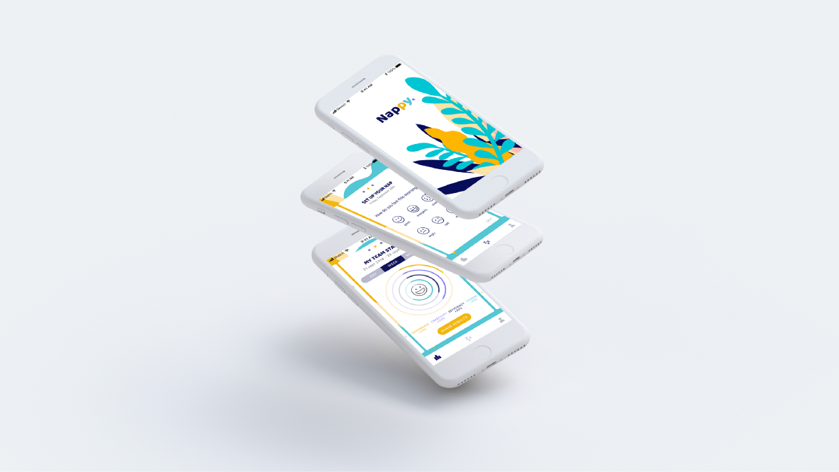
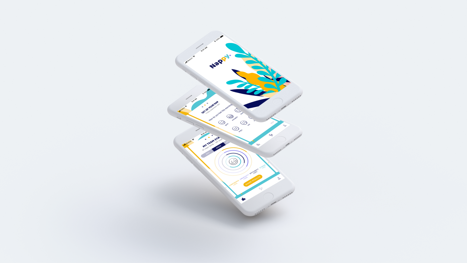
The Result
Here you can see some examples of the screens I created for Nappy.
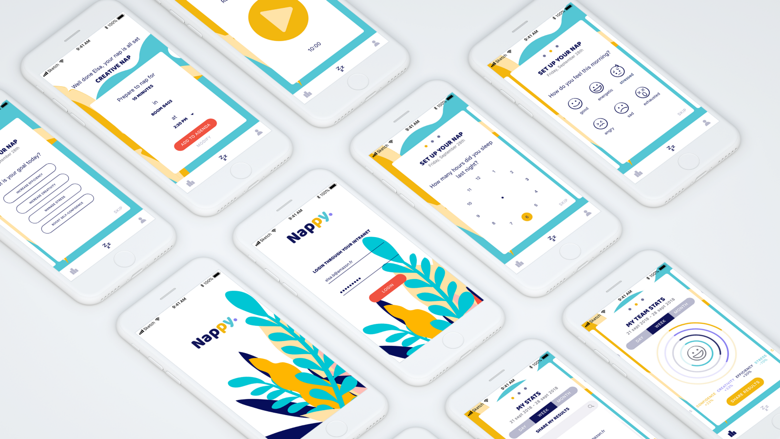
Now let’s dive into my prototype. I presented the three user flows with the call to action (notifications) that will help Elsa use the app. I grouped the second & third user flows into one video.
User testing
I made some desirability tests to test my design and I had the following results
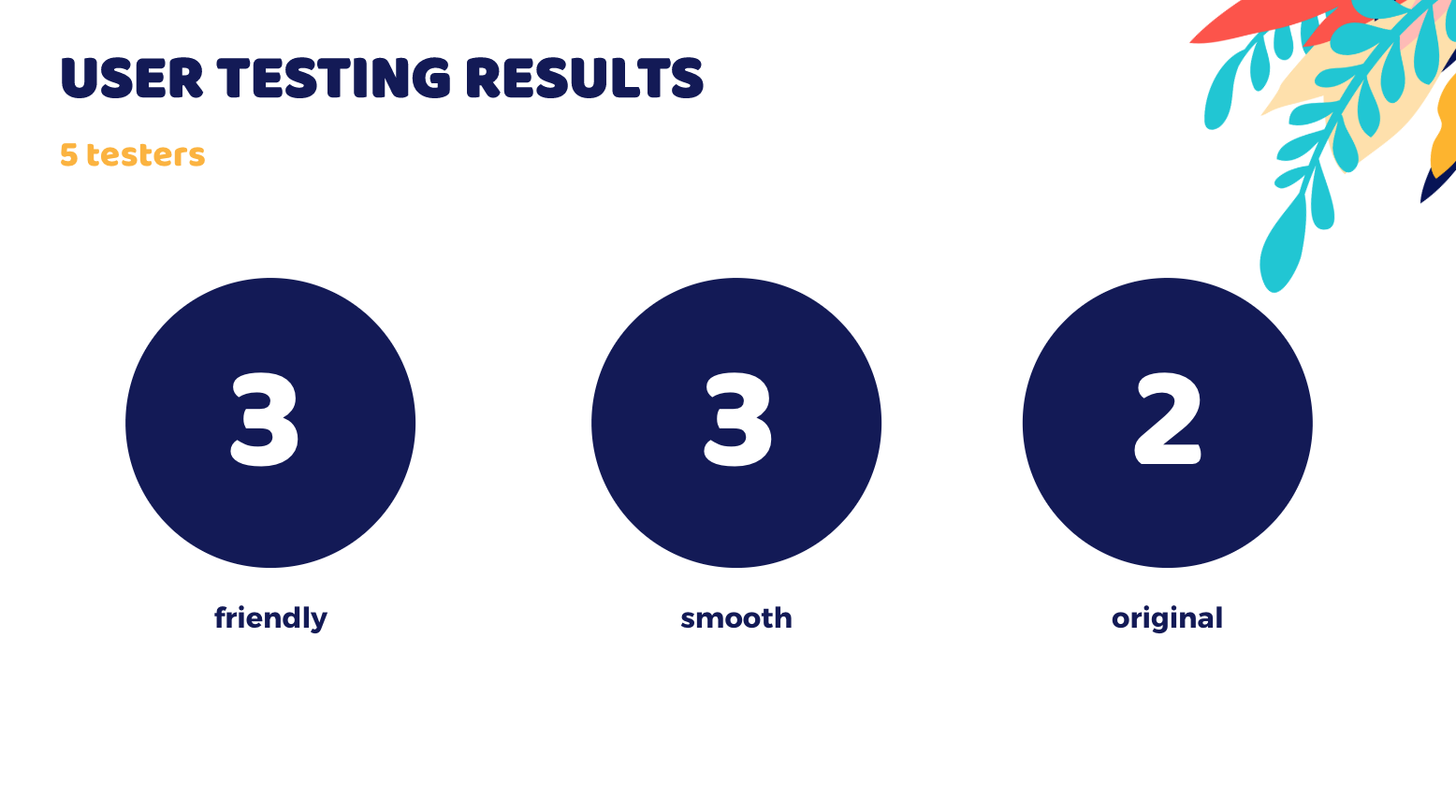
I was happy because my goal was to make a friendly & smooth design to make my users comfortable & make them feel great while napping.
What’s next now?
Now, I would like to improve my micro-interactions in the animated prototype, making smoothers animations between the cards & more playful animations in the stats part.
I also would like to make more tests on the concept to go further with it.