
In today’s world it is vital to have a mobile-ready website. A responsive jQuery slider plugin will allow your image sliders to adapt to the screen resolution of different viewing devices. These highly popular plugins will assist you in creating stunning responsive image sliders that feature awesome website transitions and effects. Image sliders in general… Continue reading 20+ Responsive jQuery Slider Plugin Compilation
Tag: Responsive
Cleanfolio: Free Responsive HTML5 Template

Today we’re pleased to bring you Cleanfolio, a Free Responsive HTML5 Template designed by Bloom Web Design and Coded by Glade Kettle. It’s works great on all devices including Phones, Desktop, Tablets and Laptops. All content is in a single HTML5 files making it quick and easy too edit. Cleanfolio Free Responsive HTML5 Template has… Continue reading Cleanfolio: Free Responsive HTML5 Template
21 Absolutely New Responsive Blog/Magazine Style WordPress Themes

We regularly check for new WordPress themes either free or paid and bring them together for WordPress users.Since the responsive design changed almost everything in blog design industry,theme designers and developers work really hard to present their new wordpress themes or update the existing ones. You can find hundreds of free and premium WordPress themes… Continue reading 21 Absolutely New Responsive Blog/Magazine Style WordPress Themes
Build a Freshly Squeezed Responsive Grid System

I’d like to talk to you about Lemonade. Not the refreshing citrus drink, but a grid system I created. Lemonade is a grid system that was built in order to give designers and developers the confidence to make fully responsive websites, eliminating the frustration of flicking between browsers looking for bugs and errors. Let’s look… Continue reading Build a Freshly Squeezed Responsive Grid System
25 Fresh Responsive Landing Page Templates

Designer Ledger – A web design blog for designers by designers Few days back we featured startup landing pages for your inspiration and in this post we showcased 25 fresh responsive landing page templates powered by HTML5 and CSS3. All these templates are published recently in 2013. Most of the templates are built using Bootstrap… Continue reading 25 Fresh Responsive Landing Page Templates
Recreate Google Nexus Menu

Recently I stumbled upon Codrops’ tutorial regarding the recreation of Google Nexus navigation menu. That was inspiring and such a creative navigation system from Google. So, I decided to create a jQuery version to challenge to myself. I have been playing with the original Google Nexus Menu for a while. Based on my observation, I summarised its… Continue reading Recreate Google Nexus Menu
A Simple Look Into Adaptive and Responsive Web Design

The decision for a developer to use an adaptive or responsive web design is dependent on the intended use of the web page. In a short comparison, an adaptive web design is made to deliver content accommodating to the type of browser enabled. While a responsive web design is designated to fit the original web… Continue reading A Simple Look Into Adaptive and Responsive Web Design
New Premium Responsive WordPress Themes

Many Premium WordPress themes are created so that they can earn money. A lot more effort goes into designing these themes and also most of the times premium themes use many features and elements that give a great platform to provide content through the web pages for the web owners. Moreover many times Premium web… Continue reading New Premium Responsive WordPress Themes
Weekly Design News Roundup – 21 July 2013

The week is coming to an end and that means it is time for us to look back on the week that passed, the best design news, resources and other goodies. This week we look at great Photoshop tutorials, Sand Textures, flat WordPress designs, beautiful parallax scrolling and much more. How to modify Bootstrap… Continue reading Weekly Design News Roundup – 21 July 2013
Free download: CORP responsive WordPress theme

10+ Mobile Friendly Responsive jQuery Slider Plugins

One of the hottest trends in the web design space, started by the popularity of mobile devices, is design of websites with responsive layouts. Indeed, if you are planning to build a website, it is an advantage, if not a must, that you go for a template design for your web page that can conveniently be viewed by mobile internet users whose number is increasing by leaps and bounds.
Collection Of Free Responsive HTML & CSS Website Templates
In digital designing, production should have two crucial potentials, quality and quantity. Your work should be exceptional and so should be your speed. Web development and designing are extensively challenging jobs in both concerns as they require skills and aesthetics to work in perfect coordination which sometimes, can be time consuming and painstaking. There are… Continue reading Collection Of Free Responsive HTML & CSS Website Templates
25 Free Tools for Creating Responsive Website Layouts
Free open source tools and resources have been getting online over these past few years. Many of these tools are geared directly towards responsive web design, handling CSS and other typical features. The performance of these tools can vary greatly which is why so many designers are hesitant to jump right into a new library.… Continue reading 25 Free Tools for Creating Responsive Website Layouts
10 Super Free Responsive WordPress Themes

45+ Best WordPress Themes – Want High Quality?

11 Amazing Responsive jQuery Sliders

jQuery’s launch was nothing less than a blessing for the designing and development community. JQuery has totally changed the way one used to create sites as it makes all the work extremely easy and quick. The best thing about jQuery is the availability of plugins which saves your precious time and energy as implementing them… Continue reading 11 Amazing Responsive jQuery Sliders
3 Top Responsive Web Design Traps You Should Avoid

No designer can ignore the call of the mobile. Mobile is the wave of the future and there is a tremendous surge in website designs that cater exclusively to the mobile. But separate mobile websites cannot stand firm against the onslaught of dozens of new mobile devices. Designers need to create designs that display attractively… Continue reading 3 Top Responsive Web Design Traps You Should Avoid
FROONT: Responsive Web Design in the Visual Way
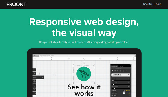
FROONT is a web-based design tool that runs in the browser and makes responsive web design accessible to all kinds of visual designers, even those without any coding skills. FROONT makes responsive web design visual. Design can be done in-browser with intuitive drag-and-drop tools. After all, humans judge design with their eyes therefore it seems… Continue reading FROONT: Responsive Web Design in the Visual Way
40+ High Quality Business Website Templates

Business website templates have become immensely popular today and this is not a coincidence. Venturing your business online is a critical move if you are a business administrator or a small business owner. It might seem like a overwhelming task to build or redesign your business website, however this is not always true. It can… Continue reading 40+ High Quality Business Website Templates
10 Powerful Responsive Lightboxes

Lightbox has always been one of the great method to display images without having to refresh a page. Nowadays, with the booming of responsive websites, lightboxes also have evolved to adapt nicely with the trendy responsive layout. Here we have 10 responsive lightboxes. Its modal window resizes itself to fit into the window viewport. We… Continue reading 10 Powerful Responsive Lightboxes
Free Responsive HTML5 + CSS3 Site Templates

HTML5 Up! is a small showcase of the free responsive HTML5 + CSS3 site templates that AJ put together while developing 5grid. All of them are clean, minimal, fully responsive site templates built on HTML5 and CSS3. They are licensed under the Creative Commons Attribution license. Requirements: Skel.js Framework Demo: http://html5up.net/ License: Creative Commons License
Create a Better Responsive User Experience

The mobile market is exploding with unprecedented growth, and marketers are no longer hesitating to embrace responsive web design. As more and more businesses choose to adopt this new approach, it has become crucial for anyone in the web industry to understand the implications of creating a responsive user experience. It’s become our responsibility as… Continue reading Create a Better Responsive User Experience
10 Awesome Responsive Websites for Your Inspiration

The Benefit There are also several good benefits of using a responsive design website layout, below are some of them: Responsive design is SEO-friendly You’ll have a single URL for all content, this would mean faster load times which will enhance SEO efforts. Furthermore, Google and Bing endorse responsive design according to this article. It’s… Continue reading 10 Awesome Responsive Websites for Your Inspiration
Responsive Retina-Ready Menu
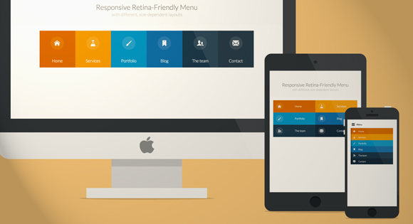
Today we will create a colorful Retina-ready and responsive menu inspired by the colors of the Maliwan manufacturer of the Borderlands game. The menu automatically changes to one of three different layouts depending on the browser window size: a “desktop” inline version, a two columns tablet-optimized version and a mobile version with a menu link to… Continue reading Responsive Retina-Ready Menu