The Benefit
There are also several good benefits of using a responsive design website layout, below are some of them:
- Responsive design is SEO-friendly
You’ll have a single URL for all content, this would mean faster load times which will enhance SEO efforts. Furthermore, Google and Bing endorse responsive design according to this article. - It’s cheaper
The single code concept of responsive web design eliminates the need for separate templates for iPhone, Android and other devices. So for those who want to maintain a single mobile presence (which is by the way a rising trend), only needs to pay for the development of one single website – a sort of one size fits all. - It’s easy to maintain
Since responsive design features a single template, it’s far much simpler to maintain compared to other methods that support mobile platforms. In the long run, it’s also cheaper. - Responsive design features a better user experience
Responsive design websites features easy navigation, easy to understand content layout and faster page load times. Furthermore it maintains the same brand image across all devices. All these results in better user experience which will in return result in higher customer conversions. - It creates design opportunity
Responsive design is a fast growing trend and is here to stay so more and more companies are scrambling to get into the bandwagon. This means there is an increased opportunities for sales for graphic designer who know responsive design.
Awesome Responsive Websites
However, not all responsive designs are created equal, so I’ve picked 10 of the best responsive websites I’ve come across to share with you – for your inspiration. Each site was checked using Matt Kersley’s Responsive Design Testing Tool.
Postheads
This clean design transfers well to most devices, which retain the video and the big free trial button.
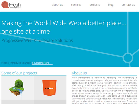
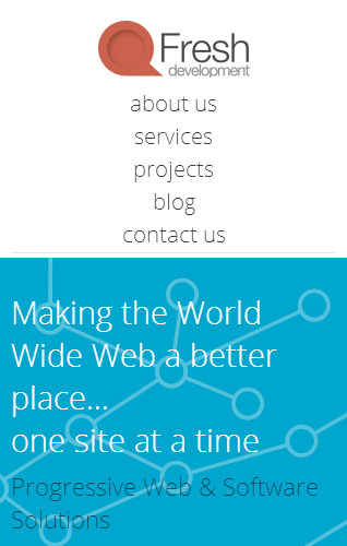
Fresh-Development
My favorite aspect of this website is how the content blocks tumble in from the sides when you scroll down. This feature is not retained for smaller devices, but the content blocks are still visible.
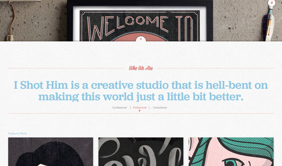
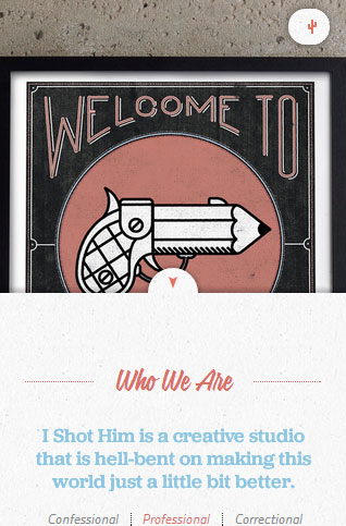
IShotHim
I love how the header image is layered underneath the content as you scroll down. Plus, an unforgettable name for a design firm!
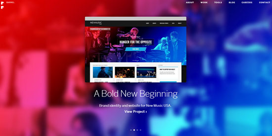
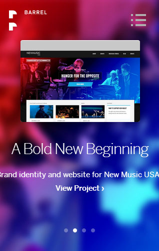
Barrel
The big, bold design features this company’s work front-and-center; a great way to impress potential clients right off the bat.
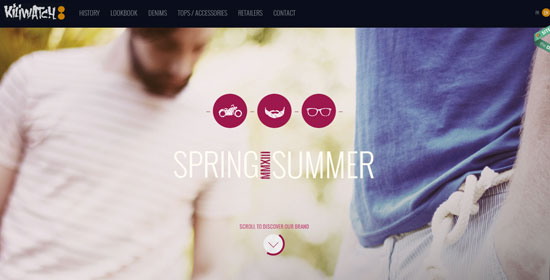
Kiliwatch
This responsive design features some of the coolest rollover effects I’ve ever seen. Try scrolling down and moving your mouse over the “history” and product categories.
Nineswiss
Most websites are designed for the desktop, and mobile devices are considered afterthoughts. This website design takes the opposite approach; when you’re on the desktop version, it feels as though you’re on a mobile site.
Contents
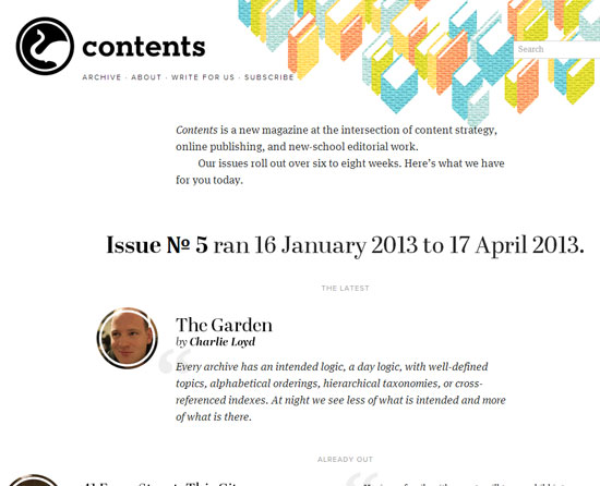
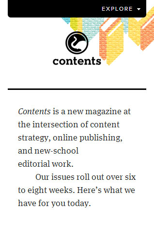
All too often mobile versions of content-heavy websites fail to deliver a clean user experience. The Contents website does an amazing job of matching the look and feel of its template to both desktop and mobile devices – without sacrificing the content display.
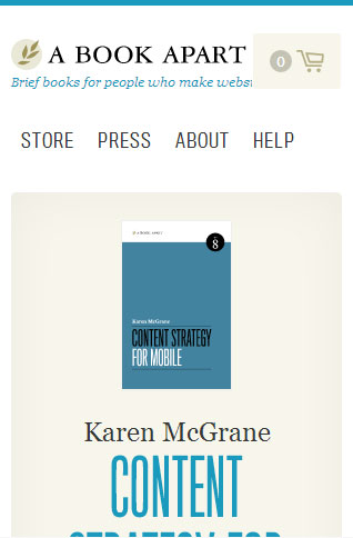
A Book Apart
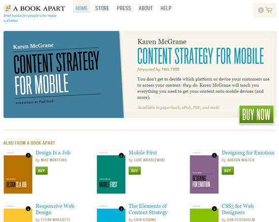
A Book Apart’s website features a scalable header that transfers perfectly to smaller devices.
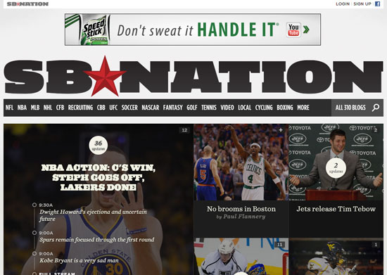
SBNation
This content-heavy mega-site had a unique challenge: making its 300-plus local sports website properties scalable across all devices. That means taking special consideration for specific logos, colors and other design elements. Job well done!
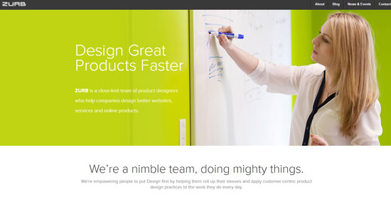
Zurb
I love the clean simplicity of this attractive website, which looks just as great on a mobile device screen as it does on a desktop machine.


