Credit: Nicola Gastaldi If you ask me what my design philosophy is, I’ll ask you, “for designing what?” Whether you’re playing in aesthetics, building systems, finding technical solutions, or just trying to get shit done — almost everything is a design challenge. My philosophy around this has been shaped by my experiences — which have… Continue reading Some things I’ve learned along the way…
Category: Design
Design is the method of putting form and content together. Design, just as art, has multiple definitions; there is no single definition. Design can be art. Design can be aesthetics. Design is so simple, that’s why it is so complicated.
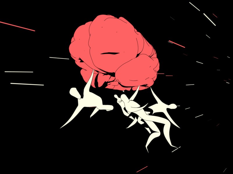
Thinking in experiments: Today’s winning mindset
[unable to retrieve full-text content] The old excuses for not engaging with customers more often simply don’t apply anymore. In fact they’ve been turned on their heads. Photo by Girl with red hat on Unsplash “For every good idea there are a thousand bad ideas it is indistinguishable from. The only real way to tell the difference… Continue reading Thinking in experiments: Today’s winning mindset
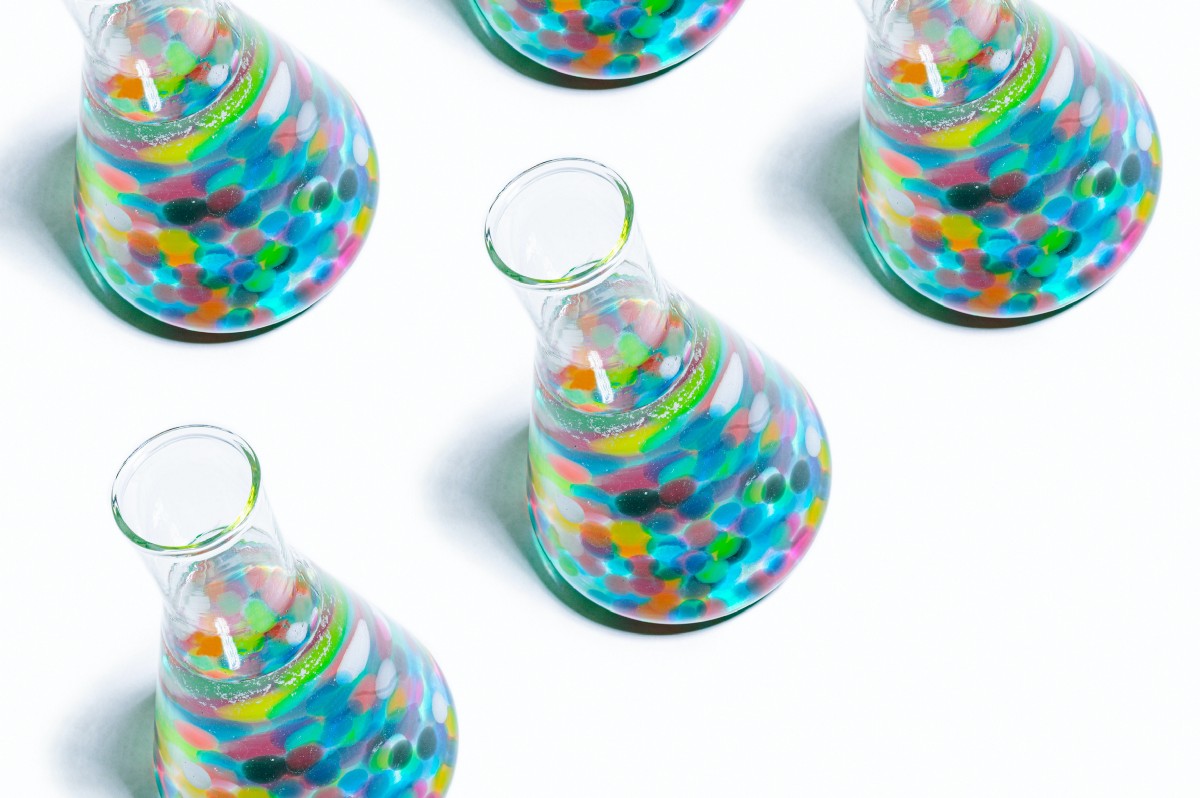
What creating a simple font taught me about font design
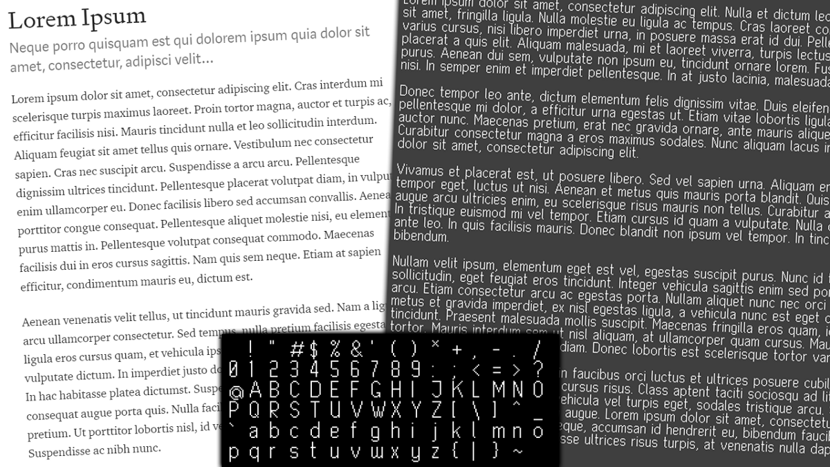
[unable to retrieve full-text content] I never appreciated font designers until I tried it myself Continue reading on UX Collective »
Writing about disability? A style guide can help
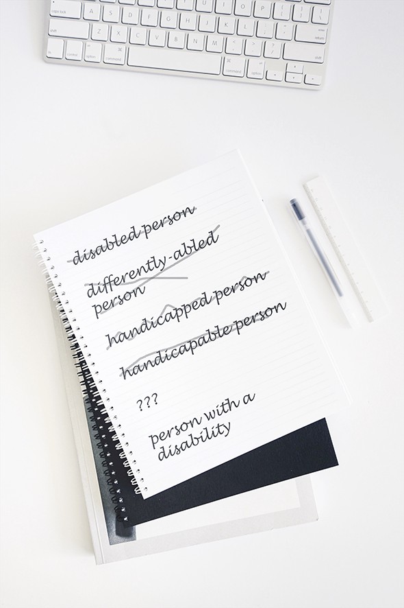
[unable to retrieve full-text content] I am a deaf person. Continue reading on UX Collective »
How 1/100th of a second changed the world
[unable to retrieve full-text content] I’m surprised how jolted I was by Charlie Watts death. Yes, he was the oldest, but (unrealistically) seemed like the least likely to die… Continue reading on UX Collective »
Replace your complex bar chart with a dot plot to make it better understood

[unable to retrieve full-text content] The alternative to bar charts that works well with complex data Continue reading on UX Collective »
Can design change the world?
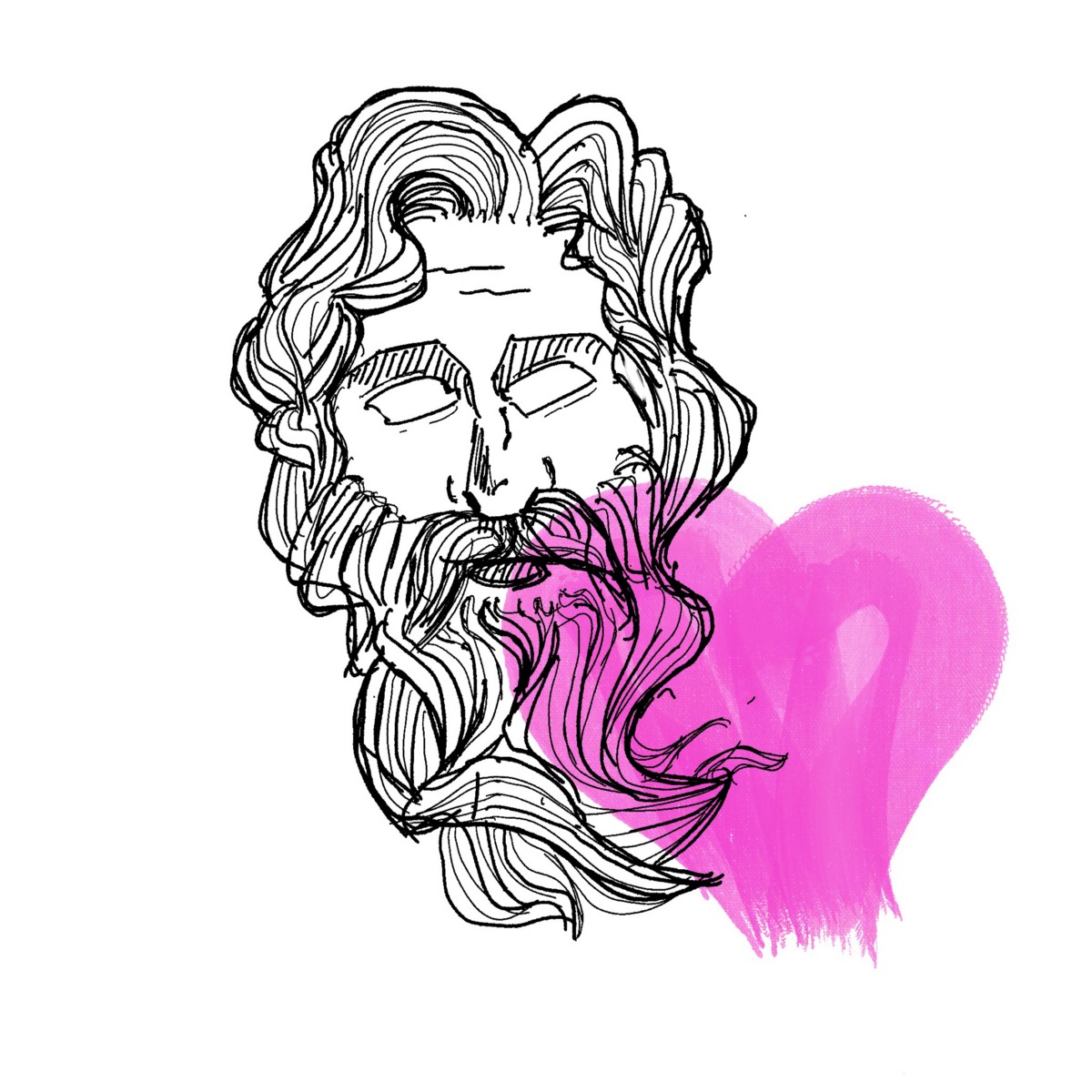
[unable to retrieve full-text content] Design won’t make the world a better place unless we make it happen Illustration of Design Evocatio, or falling in love with a new Roman God 1. Design Evocatio When Roman generals aimed to conquer a new city, they had plenty of technological tools and tactics, but one of the most interesting ones… Continue reading Can design change the world?
Creating a positive culture around accessibility

[unable to retrieve full-text content] Everyone wins when we build inclusive digital experiences. Here’s why we should be excited about (and not dread) accessibility. Continue reading on UX Collective »
Introvert designers: stop pushing your business uphill
[unable to retrieve full-text content] Mediocre work requires constant sales and marketing to maintain momentum. Exceptional work sells itself. Continue reading on UX Collective »
Enterprise UX insights & myths you should know

[unable to retrieve full-text content] Handle complexities When I started my UX career 3 & a half years back, I had always wanted to work on consumer UX extensively, because of the immediate references that we had around us in our day-to-day ecosystem. The current aspiration trend is also showing more UX designers wanting to… Continue reading Enterprise UX insights & myths you should know
Drawing a stunning landscape in Figma
[unable to retrieve full-text content] Figma is my tool of choice for designing user interfaces. Extremely simple to use, the learning curve is a fraction of what’s required for any given Adobe Creative Cloud software. But, that simplicity comes at a price: Figma’s primary focus is not illustration or graphic design, and many designers still… Continue reading Drawing a stunning landscape in Figma
User research and UX research: Any difference?
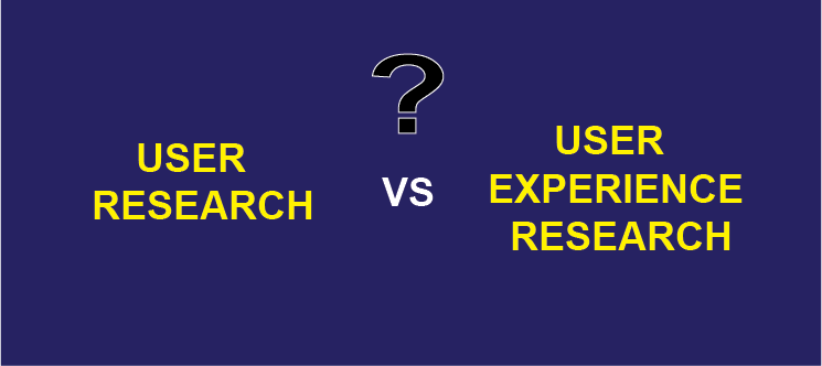
[unable to retrieve full-text content] On my first interview for a User Researcher role as an intern, I was asked this question by my mentor: Continue reading on UX Collective »
3D worlds and the future of UX: A review of “spatial interfaces”
[unable to retrieve full-text content] “Games and entertainment have pointed us toward a new way of thinking about interacting with software: spatial interfaces.” — John Palmer, Spatial Interfaces Spatial Interfaces presents a vision for the future of UX, in which “lots of the software we already use can be augmented by spatial interfaces”. Palmer envisions “spatial environments,… Continue reading 3D worlds and the future of UX: A review of “spatial interfaces”
The Olympics and the evolving ideology of sustainability
[unable to retrieve full-text content] Source: Karen Christoph on Dribble The Olympic Games, at least the ones held in the past, used to symbolise extravagance and wastefulness. That was until the 1992 Olympics held in Barcelona, where sustainability was a critical factor. Since then, there has been an increasing relevance to making sure this event was… Continue reading The Olympics and the evolving ideology of sustainability
How to increase conversion by looking at your e-commerce customer experience as a Hero’s Journey

[unable to retrieve full-text content] The amazing benefits of aligning each step in your e-commerce website customer journey to this time-tested story structure Continue reading on UX Collective »
Which is Best for Handwritten Notes? GoodNotes, Notability, or Apple Notes?
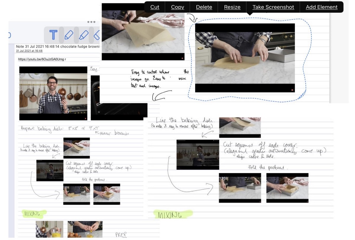
[unable to retrieve full-text content] Replacing pen and paper with an iPad? I try taking notes using two top iPad apps and Apple Notes on a video about making brownies Continue reading on UX Collective »
Pixel-perfect design — a question of doing the math
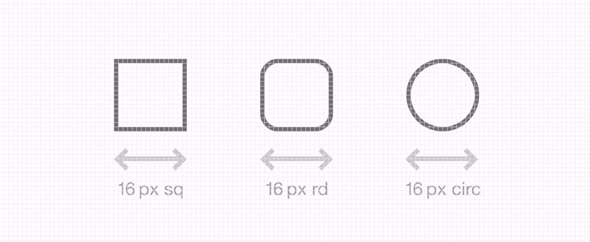
[unable to retrieve full-text content] Do you like counting pixels? Continue reading on UX Collective »
When you cannot run away from using tables on mobile
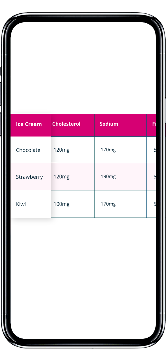
[unable to retrieve full-text content] Inspirational ideas to design tables you will want to bookmark Continue reading on UX Collective »
The advantages of the Apple iPad: Will we use Macs in the future?

[unable to retrieve full-text content] How Apple positions the iPad. Continue reading on UX Collective »
The typographic voice of London
[unable to retrieve full-text content] Edward Johnston’s diamond-shaped “tittle” and the origins of a classic typeface design Continue reading on UX Collective »
How to survive a design career and avoid burnout (Part 2)

[unable to retrieve full-text content] Hi, people in the UX Design and Product world. This post is the second in a series I’m writing, based on conversations I’ve had with Product and Experience Designers and leaders in the field, who prosper despite working in some really harsh environments. And when I say “harsh”, I’m talking… Continue reading How to survive a design career and avoid burnout (Part 2)
How to start and manage design systems
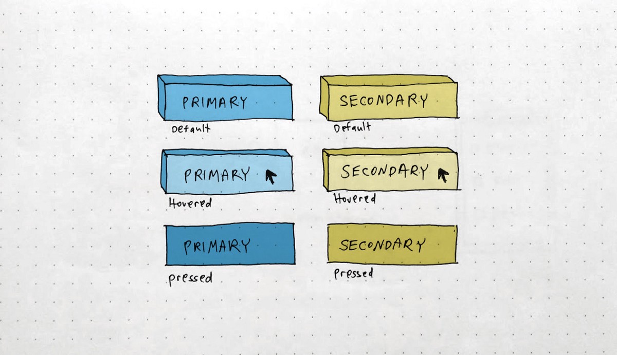
[unable to retrieve full-text content] So you want to start your own design system? Congratulations! That means you reached the point where you have a set of components, behaviors, rules, and principles that are ready to be wrapped as a “north star” for the design, product, and dev teams on future implementations. No more simultaneously… Continue reading How to start and manage design systems
Combining Agile, Lean, and Design Thinking — a layered approach

[unable to retrieve full-text content] A novel way to harness all three that works to combine their strengths in a concurrent and intertwined fashion. Continue reading on UX Collective »
Can design instinct survive modern UX methods

[unable to retrieve full-text content] Designers must embrace data and learn how to communicate effectively as UX research continues to drive design decisions Continue reading on UX Collective »