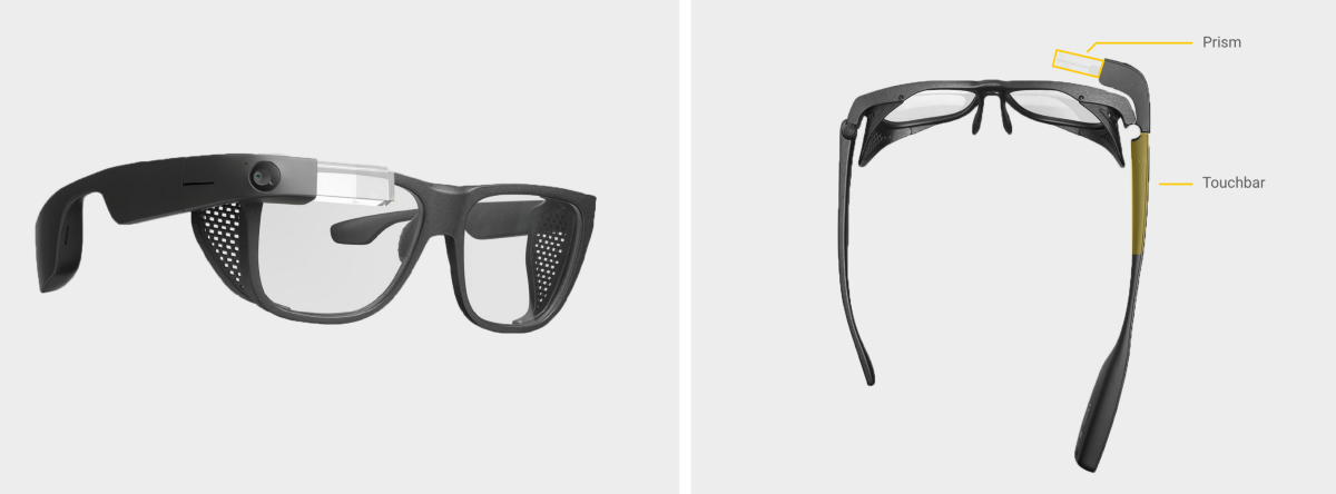
Since scheduling interviews with doctors proved challenging, I opted to test the prototypes internally. I recruited 10 employees with various levels of experience using Glass. The group’s experience level was similar to our doctor population. Each participant went through three prototypes.
Initially, some newcomers struggled with the swipe down gesture but eventually, they got it. Being used to Glass at that point, this finding was surprising. Looking back I should have captured their hand gestures along with the audio and Glass UI.

Intentional friction. In order to reduce faulty rating submissions, I introduced some friction into the rating process. Instead of tapping to submit the rating, I experimented with gestures such as the double-tap and tap and hold. Unfortunately, the double-tap gesture proved just as faulty.

For fun, I also had engineering build two more prototypes to see if we could use voice as a modality instead of touch.
As you might know usually there isn’t one concept that comes out on top. Rather, different parts from different concepts prove useful.
To analyze the data I noted where participants struggled and where the experience felt smooth. I paid attention to sentiments like “that’s cool” or “that’s annoying” which helped me isolate issues and discover opportunities for delight.
