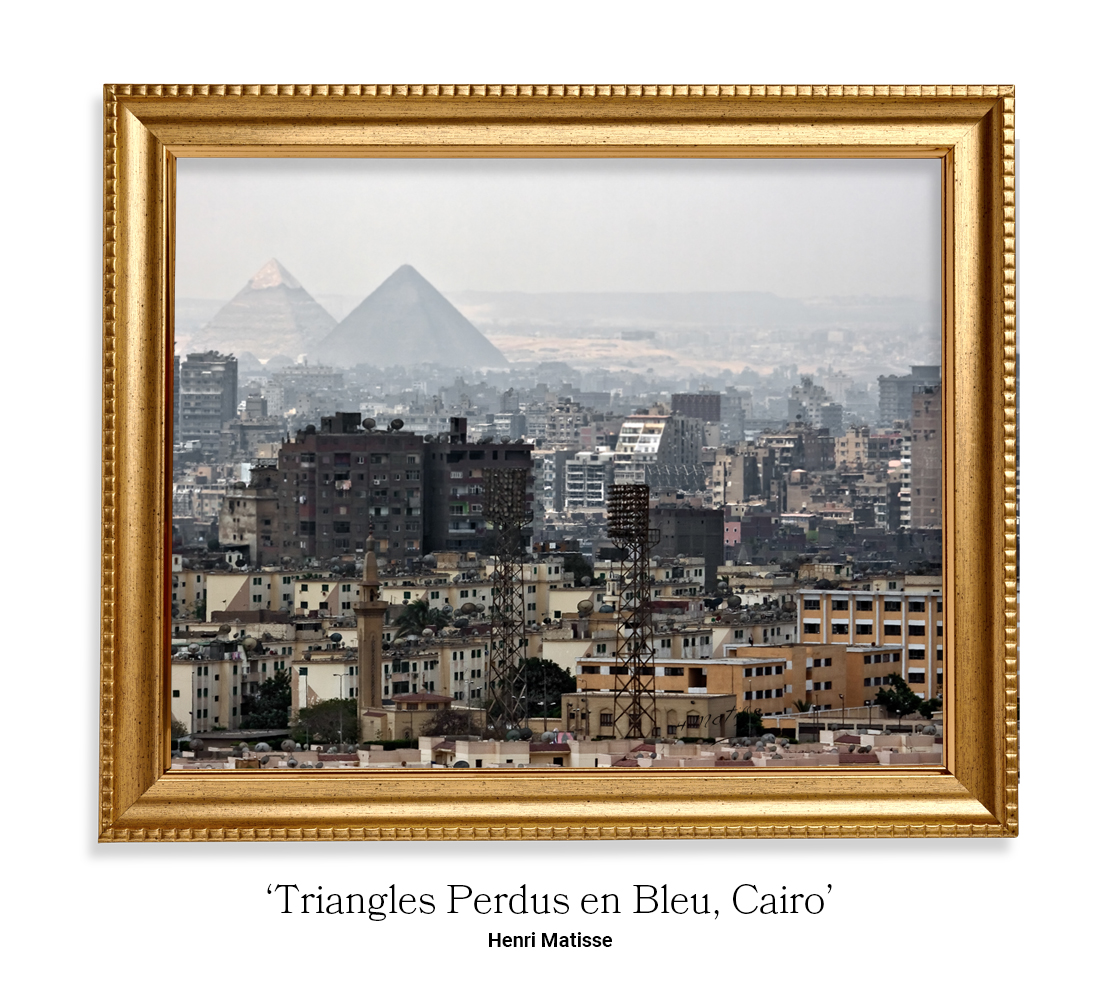
Cities are the main attraction for visitors worldwide. And while we adore the cities that we’ve grown up in, not all of them are pretty to look at. The architecture of historic buildings is beautiful, however, not all cities are blessed with a lengthy architectural history and our modern landscapes are starting to look somewhat industrial.
And, while we’d hate to call a city ‘ugly’, we must admit, some are less than appealing to look at.
Express Doors had an idea to turn what the public viewed as an ‘ugly’ city, into a beautiful work of art. Using the key design traits of famous artists, they were able to create a masterpiece that we want to share with you.
Charleroi, Belgium
Vincent Van Gogh
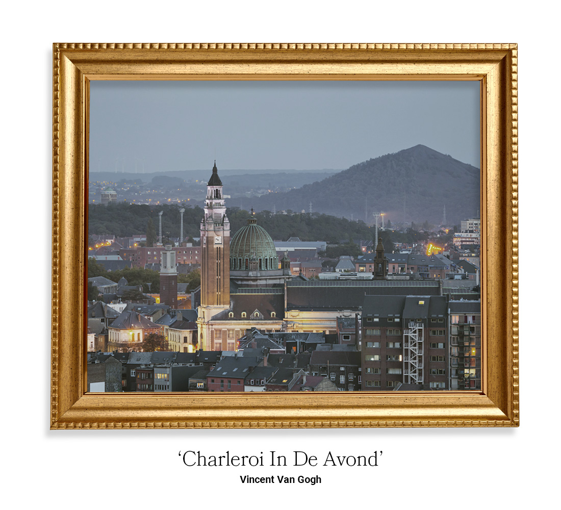
Belgium’s major city, Charleroi, has an unfortunate reputation. It’s known as ‘the most depressing city in Europe’. Not Belgium, Europe. Charleroi contains an abundance of derelict factories and square concrete buildings which are seen by its inhabitants as an eyesore.
By using the brush strokes and vibrant colours of Van Gogh, the city of Charleroi has been reborn. In the Van Gogh image, you can see the dark and dismal hues of grey have been transformed into tranquil shades of blue. The added yellow brings an uplift to the image that the city of Charleroi desperately needs.
Benidorm, Spain
Wassily Kandinsky
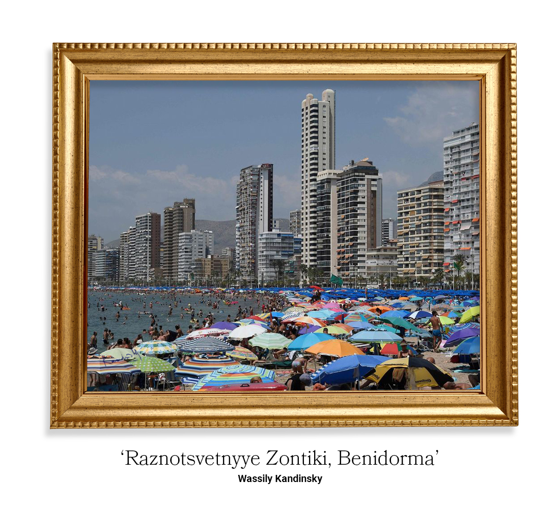
Benidorm is a major holiday destination for sun worshippers. Due to its popularity and cheap vacation prices, Benidorm has become dismal in its appearance. Its sky-high apartment buildings and concrete hotels have left the landscape looking pretty chaotic.
A Kandinsky-style painting is the perfect choice for what should be a beautiful Spanish city. Using vibrant, pastel colours, this Kandinsky-inspired painting really hits the mark for a beautiful sunny getaway.
Using hi trademark block colours and stand-out shading techniques, this industrial-looking landscape has been transformed into a breath-taking paradise.
Hull, UK
J.M.W Turner
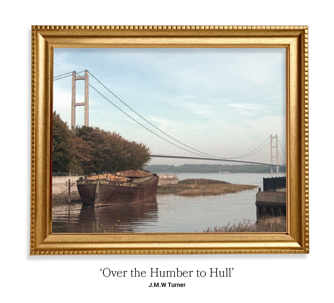
The city of Hull cannot compare to the heavily commercialised landscapes of Benidorm and Charleroi. But, over time, Hull has acquired a few eyesores by the way of large concrete bridges and buildings built for practicality, not viewing pleasure…
Using the romantic-style of Joseph Mallord William Turner, Humber Bridge in Hull has been transformed into a soft and dreamy piece of art.
J.M.W Turner is renowned for his light-handed approach to painting. Coupling this beloved technique with his use of warm, autumnal colours, this view of Hull is one that we’d love to go and visit.
Swindon, UK
Paul Cezanne
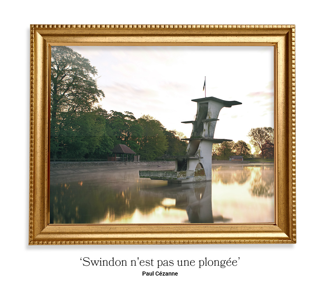
Much like the city of Charleroi, Swindon has been dubbed ‘the ugliest town in England’. Swindon is renowned for its derelict buildings and commercial office buildings and parking structures. People flock to Swindon to visit its famous landmarks, however many are left unsatisfied with their surroundings.
Cezanne has a very interesting way of portraying his artistic pieces. Using warm, autumnal colours – much like J.M.W Turner – and his famous ‘blur’ technique, this abandoned view of Swindon has been completely transformed. Cezanne’s use of soft edges creates a very serene atmosphere which is captured beautifully in this piece of artwork.
LA, USA
Claude Monet
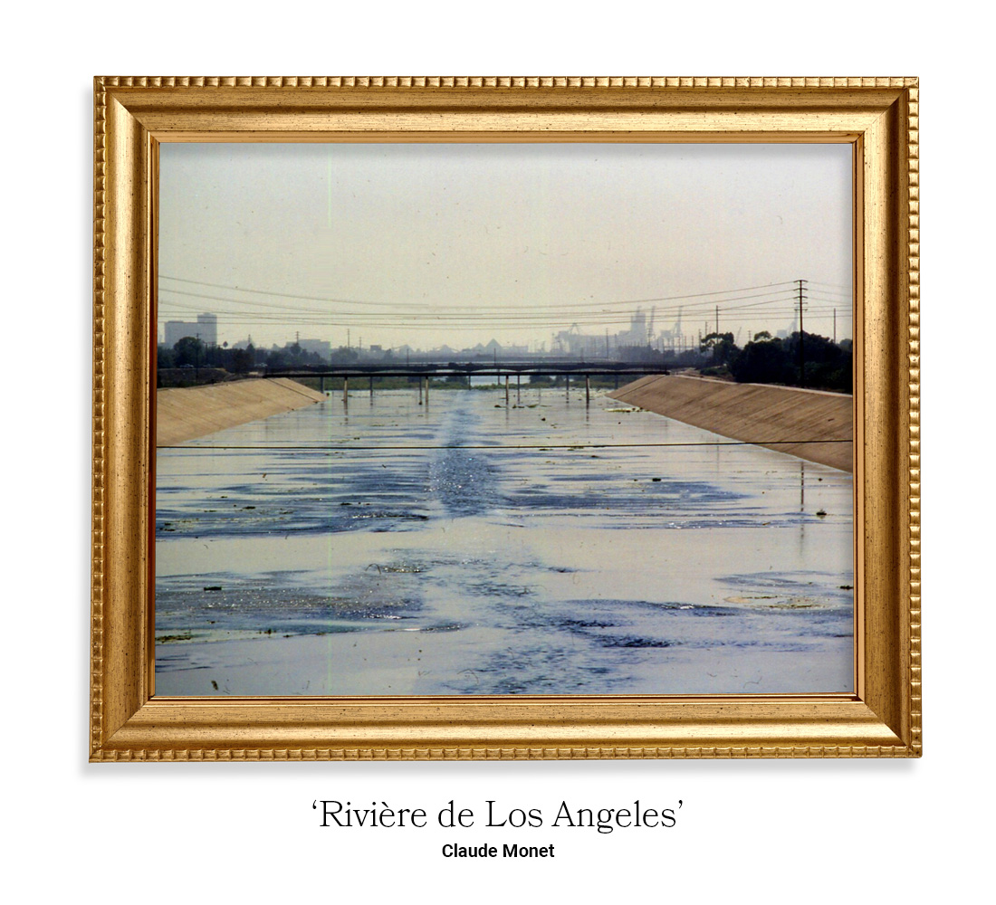
LA is a congested city, full of skyscrapers, concrete buildings, derelict properties and huge highway systems. Although LA is a desirable place to visit by many, this city provides very little in terms of idyllic scenery. With roads stretching for miles, downtown LA isn’t far from being the ‘concrete jungle’ that New York is dubbed.
This artwork has been created in the style of the famous Claude Monet. Monet is well-known for his use of light and airy colours, accompanied by his watercolour-esque finishes.
This landscape of LA has been truly transformed by using Monet’s techniques. The concrete skyline is still apparent, although subtly blends into the background. And, the water has been painted in such a way that it’s resembling a tranquil lake.
Detroit, USA
Joaquin Sorolla
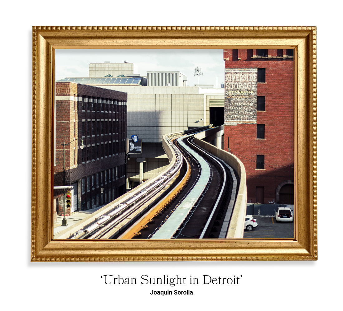
Detroit is well-known for its big, square buildings, highrises, transport links and dark colours all made worse by neglect and lack of serious development. Its lack of light, dimension and texture is what gives this city its ‘ugly’ name.
Sorolla is a Spanish painter who is well known for his use of vibrant colours. While painting Detroit in vibrant colours seemed a little too far-fetched, Express Doors were able to build upon some of the colour that already exists. By adding a brighter red to an already crimson building, they were able to bring a contrast of light into the artwork.
Focusing on the brush strokes, the ‘ugly’ city of Detroit has been removed of its harsh edges and a more subtle skyline was produced.
Baltimore, USA
Edouard Manet
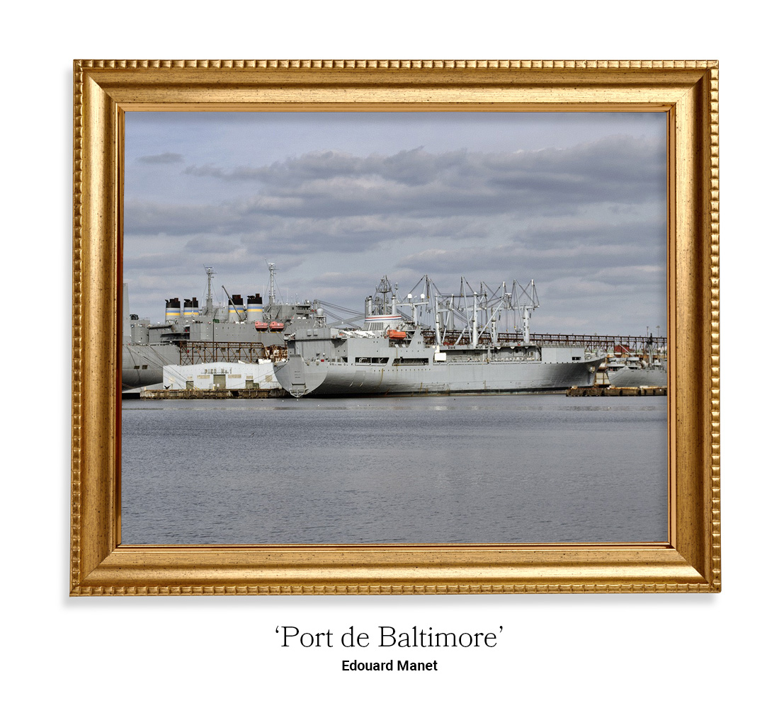
Baltimore is a very neglected city. It’s poorly maintained, over-populated, and filthy. It was no wonder this piece of artwork was such a struggle to produce. In the end, it was found that the work of Edouard Manet was the most applicable to this landscape.
Manet is able to capture and replicate movement through his brush strokes. When a famous harbour in Baltimore is the main landscape, being able to bring realism into the painting was needed in order to produce a beautiful work of art.
To capture the realism, Manet uses broad brush strokes and a diverse range of shades. Using similar colours throughout the painting allows this landscape to hide its ‘ugliness’, while also portraying the busy, working port of Baltimore.
Houston, USA
Frank Benson
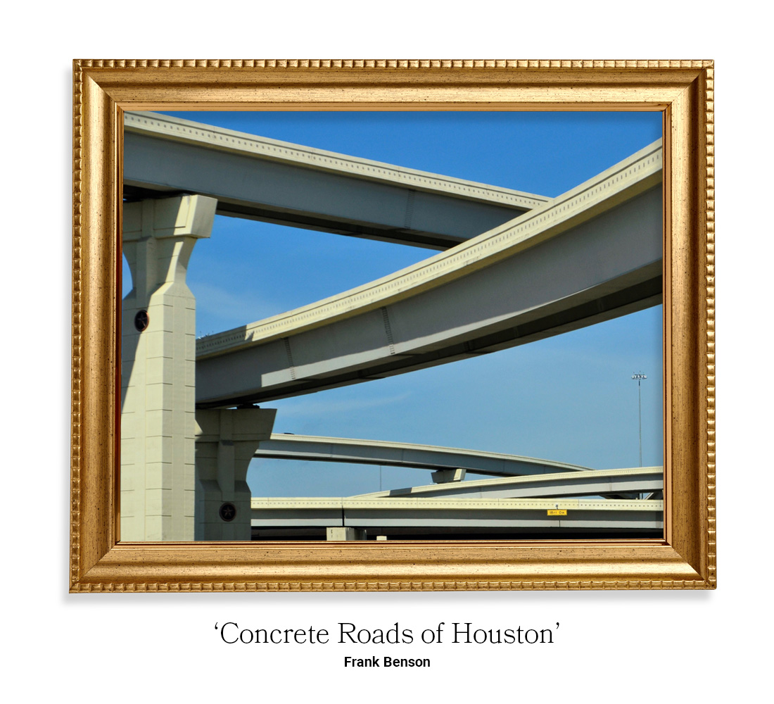
Houston is known for being overgrown. The city is full of large skyscrapers and vast stretches of highway. Having the highways on a pedestal, like they do in Houston, decreases the beauty of their landscape.
Frank Benson is vastly popular for capturing the true beauty within a landscape. No matter how dreary and unsightly it is.
When creating this piece of artwork using Benson’s techniques, it was evident that less is definitely more. In fact, by bouncing the sunlight off the concrete and using small, yet strong, brush strokes, they were able to achieve a concrete jungle worth looking at.
Amman, Jordan
Piet Mondrian
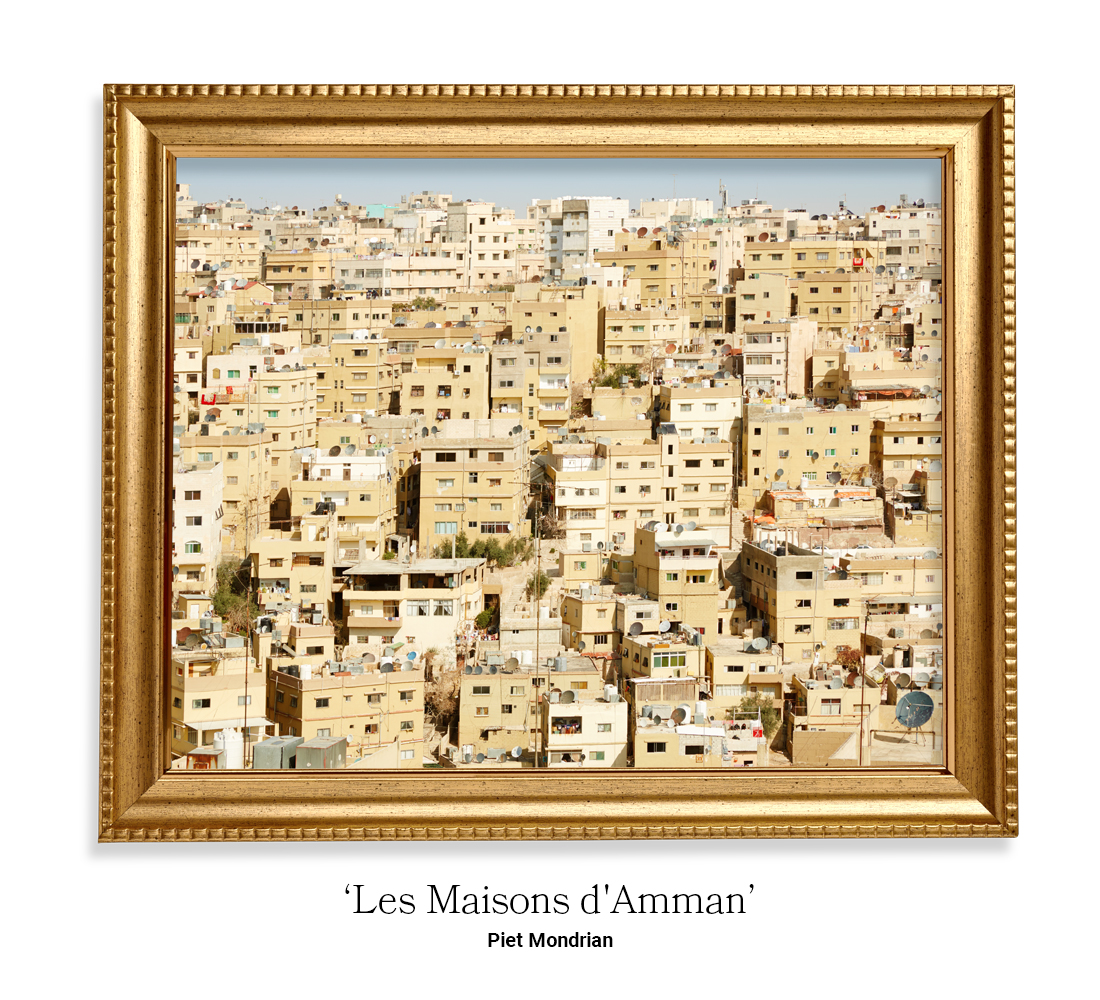
When looking out to Amman, you’re greeted by buildings. Hundreds of beige buildings. The city is overpopulated and rundown. Unfortunately, Amman is on the ‘ugly’ list for a number of reasons.
However, the landscape of Amman does lend itself perfectly to Piet Mondrian’s artistic style. Mondrian is renowned for geometric, block-colour designs and so, creating this piece of artwork was incredibly easy. By focusing on contrasting colours and block buildings, using his geometric style to carefully place each block, they’ve created a stunning piece of art that Jordan would be proud of.
Cairo, Egypt
Henri Matisse

Cairo is a densely populated and busy city in Egypt. Although its skyline contains the beautiful pyramids of Giza, its foreground is little to be desired.
Artist Henri Matisse found a passion for paper collages in later life. His finished artwork took the main features of any landscape and made them the prominent feature on the page. He used different shapes, styles and placements to pick apart a landscape and create his own.
To make Cairo a beautiful piece of art, we use Matisse’s techniques of contrasting colours and shapes to remove the ‘busy’ from the landscape, and create a much cleaner and simpler city.
Read: 30 Passionate Valentine’s Day Graphics & Illustrations
Author: Spyre Studios