[unable to retrieve full-text content] The TapChief experience of designing, building and launching a webinar listing platform side-project in a timeline of 3 days Continue reading on UX Collective »
Category: UX
Visual inspiration: the charm of Jamdani Weaving
[unable to retrieve full-text content] The art of weaving is exactly that — an art. It requires skill, precision and rhythm, which when repeated over and over, produces a delicate weave. Jamdani weaves, however, require more than this. Since the defining aspect of this textile are its rich motifs, which are all intricately added by hand, Jamdani… Continue reading Visual inspiration: the charm of Jamdani Weaving
The dangers of emotive writing in a post-rational era
[unable to retrieve full-text content] Hot damn! We writers never had it so good — and we all know the reason why: the written word has never been as pervasive, powerful or emotionally loaded as it is today. It doesn’t matter whether you’re a copywriter, UX writer, journo, speech writer, influencer, blogger, swivel-eyed Facebook ranter or whatever. You’re… Continue reading The dangers of emotive writing in a post-rational era
The ugly truth about being a woman in tech
From my early days, I felt there’s something wrong. It was in the little things. Things like how teachers sometimes approached female students. With prejudice. With the unbearable lightness. With indulgence. They are just girls. Just treat them with decency. Make them feel they are good with all this “tech stuff”. Don’t let them feel… Continue reading The ugly truth about being a woman in tech
Redesigning perceptions for speed and friction
[unable to retrieve full-text content] It is hardwired in our DNA to constantly compare. We might think that we have something that works great and fits the needs, but when we… Continue reading on UX Collective »
My journey as a thrill-seeking alpha
Sajjad Ahmed Follow Jul 20 · 9 min read Photo Credit: Almas Liaqat On Jan 3rd, 2019 I received a message on my LinkedIn from an unknown connection, asking me to share my work with him. I did that without knowing that one day I will be a part of his league (nevermind the 8… Continue reading My journey as a thrill-seeking alpha
8 not-so-obvious tips for remote workshop facilitation
Your goal is to use the time of participants wisely, to follow the plan and close with the expected outcomes. The least you want is to spend time in activities that do not add value to the end goal, like dealing with technical issues. But let me start with a story of the non-digital world.… Continue reading 8 not-so-obvious tips for remote workshop facilitation
Our industry needs more designers. Most importantly: a different type of designer.
For those reasons, Caio Braga and I decided to create a more structured guide for entry-level designers; a resource to address the needs of who’s starting now; selfishly, a single destination to refer to whenever we receive emails from designers looking for guidance. We want this guide to serve as a reminder that when it… Continue reading Our industry needs more designers. Most importantly: a different type of designer.
Exploring ‘AnimatedSwitcher’ in Flutter
Usman Khan Follow Jul 11 · 4 min read Animation example possible using AnimatedSwitcher Flutter SDK provides many inbuilt widgets for animations. Each widget of course is different from the other with each one having their own purpose. Today we are going to have a look at AnimatedSwitcher, a widget which animates the switching off… Continue reading Exploring ‘AnimatedSwitcher’ in Flutter
What is an Interface? — a conceptual deep dive
There are several important ideas she zeroes in on: In her review of the work of Anne Friedberg, these notions of the opaqueness are understood mainly in the dichotomy between the materiality of computer screens themselves and the perception of them as transparent thresholds (Hristova, 2017, p. 835). One might be able to digest this… Continue reading What is an Interface? — a conceptual deep dive
Dynamic content & colors in Figma
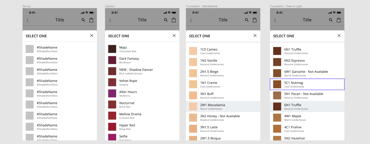
Disconnecting the layer name from the actual text Headers should match your layer name in Figma (i.e. the “Shade Name” header here matches the “#ShadeName” layer name in Figma) For colors, you need to add a /# in front of each hex code for the plugin to recognize it as a color instead of text.… Continue reading Dynamic content & colors in Figma
Storytelling: The relation between Advertising and UX
Sofia Aquino Gomez Follow Jul 2 · 5 min read Working in advertising for over ten years and switching to UX two years ago. I realized how storytelling is crucial for both areas and, at the same time, how similar and different it can be. In this article, I will try to show the importance… Continue reading Storytelling: The relation between Advertising and UX
How do I conduct UX Research for personal projects?
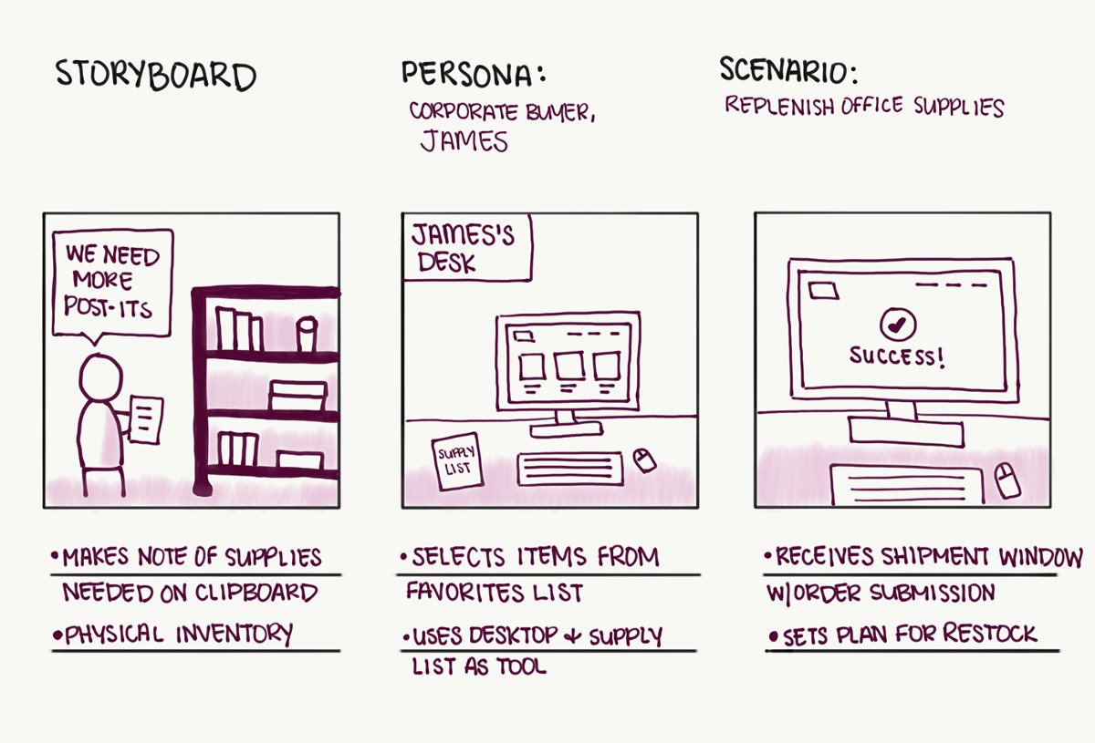
Visual Q’s: June 2020 Maddy Beard Follow Jun 29 · 6 min read This month I’m going to be answering SUCH a good question that I think anyone trying to break into UX will find helpful. The biggest difference between being a graphic designer and a UI/UX designer for me has been the research bit.… Continue reading How do I conduct UX Research for personal projects?
3 lessons learned as a product designer at Uber
“If I had an hour to solve a problem I’d spend 55 minutes thinking about the problem and 5 minutes thinking about solutions.” ― Albert Einstein Every problem is not the same, so our process to solving each of those problems should not be either. As designers, our approaches and processes to solving those problems… Continue reading 3 lessons learned as a product designer at Uber
What it means to be an architect
Andrea Arias Follow May 27 · 3 min read Illustration by Abstract Memento. When you start architecture at any college they will be quick to talk to you about Vitruvius. Vitruvius was an eloquent man with many talents, circa 1st century BC . He wrote “The Ten Books of Architecture”, which as far as we… Continue reading What it means to be an architect
My three questions before hiring a designer
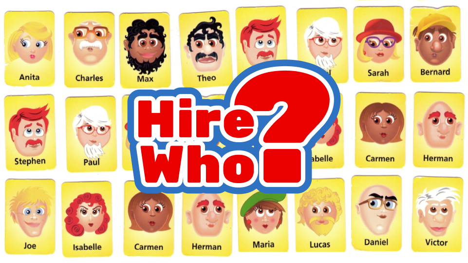
During a job interview, I need a simple fit-test to be sure that we have built the right connection in this very short time, that your credentials are honest and your intentions are sincere. It needs to be something practical and concrete. Because I will be facing direct consequences if the candidate is irresponsible, negligent… Continue reading My three questions before hiring a designer
Evaluating UX for Dementia UK, Part 2: Participants
Part 2: Choosing Test Participants A. Michael Kibedi Follow Jun 16 · 5 min read Introduction In my first article of this series, I talked through the process I followed to interpret my and define goals for my UX evaluation. With that established, I now move on to the process of deciding on participant recruitment.… Continue reading Evaluating UX for Dementia UK, Part 2: Participants
Moving into design leadership: 4 ways to create visibility for your work
In my previous piece “How do I become a design leader?”, I observed that leadership is typically recognized rather than anointed. The tl;dr on this is simple: if you are serious about exploring leadership, don’t wait for permission. Instead, look for opportunities to lead now from wherever you are in your organization. Once you’re starting… Continue reading Moving into design leadership: 4 ways to create visibility for your work
What I wish I knew, before I became a UX Designer?
Many junior designers & aspirants that I have interacted with, have asked me ‘what do you do in office?’ or ‘What is a typical day in the life of a UX designer?’ The answer varies a lot from person to person. For someone who is a lonely designer in a start-up, he might be doing… Continue reading What I wish I knew, before I became a UX Designer?
The state of the design job market in Helsinki — present, past and future
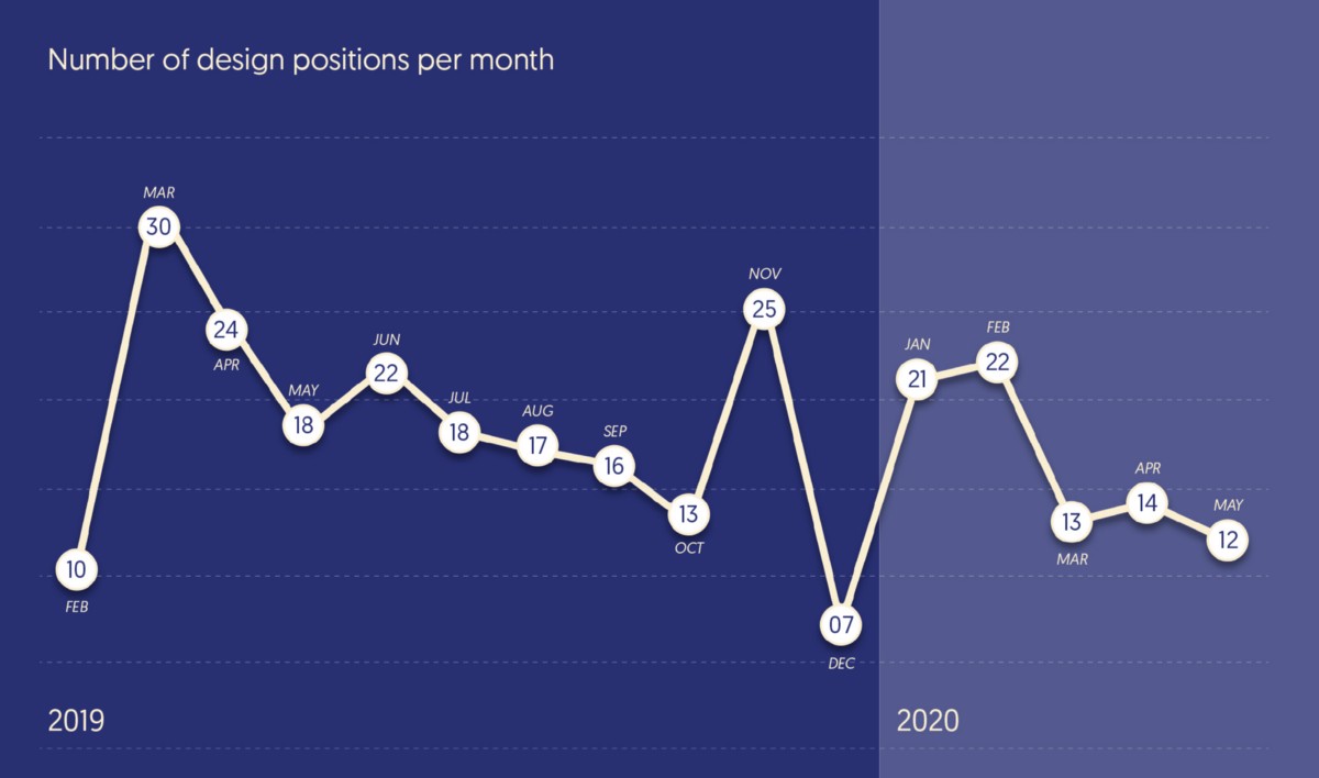
Let me start showing the numbers about what happened in the design job market in the last 16 months. I started the job board on 22nd of February, 2019. So it makes sense that there is very few positions posted in that month. A few questions that will help illustrate the findings: #1 — How… Continue reading The state of the design job market in Helsinki — present, past and future
A tool for ethics in digital design
There are very few boundaries of how designers decide to shape interactions with the Digital and how everyone can be affected by it. That is a huge possibility. And it can potentially be a problem — unless designers start taking the same ethical responsibility as any other professional should, in shaping other people’s reality. At… Continue reading A tool for ethics in digital design
Figma’s Auto Layout in action
Figma’s Auto Layout has been around for a while, but not everyone’s aware of the benefits it brings. It doesn’t replace constraints, they’re still very much needed. The trick is to use the right feature where necessary. I want to show you how to combine components, constraints, and Auto Layout for the best results. I… Continue reading Figma’s Auto Layout in action
Creating a unified payment system for a super-app
Super App in Singapore & SEA One app that breaks the design pattern monotony in the SEA super-app market is Grab. Grab is a fierce competitor of Go-Jek and has been battling it out on acquiring a bigger market share since 2012. Approximately 2 years after Go-Jek launched in Indonesia. Grab offers a bunch of… Continue reading Creating a unified payment system for a super-app
Are teams ignoring your user research? 6 keys to increasing impact
1. Depth of Observation Traditional Approach: Researchers conduct the research and share highlights and clips in a report and debrief. Result: Stakeholders gain a superficial understanding of users and their needs. Team Approach: The stakeholder team observes significant amounts of raw user research directly and in depth. Result: Stakeholders develop a deep understanding of users… Continue reading Are teams ignoring your user research? 6 keys to increasing impact


