
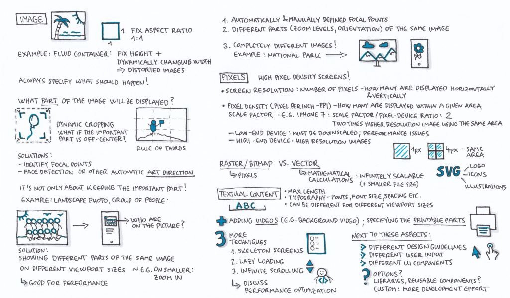
This is my second article on designing for different screen sizes and devices. In the previous part I outline the basics of fixed layouts, adaptivity, fluiditity and responsivity. In this article, I discuss some more important aspects, for instance responsive images, pixel density, responsive texts and some other related techniques like infinite scrolling.
First let’s talk about images.
One safe solution for including images in your layouts is using a fix aspect ratio, e.g. for many years Instagram only allowed users to upload square images with a 1:1 aspect ratio (and your photo grid screen still contains square images, it crops anything that is not a square).
Now, what happens if you are not working with a 1:1 aspect ratio? In case of a fluid container, the aspect ratio might change depending on the changes of the viewport size. And if you have a fix height, and a dynamically changing, fluid width, you might end up with a distorted image.
In the following example, both of these images have a fix and identical height.

Upon changing the viewport size, the image above gets distorted. On the contrary, the image below doesn’t get distorted, the biggest possible portion of the image is displayed without any distortion:

The key takeaway here is that you, as a designer should specify what should happen with the images upon viewport size changes, how these elements are displayed on different viewport sizes.
And how can we specify what part of the image will be displayed and what part will be cropped out?
Usually it’s handled by dynamic cropping — but what happens if the most important part of the image is off-center, e.g. if the rule of thirds was applied, and the subject of the image is placed at the intersection points nearer to the left or right side of the picture? In these cases, dynamic cropping might crop out the main subject. A possible solution is that you can identify focal points, and there are tools that include for instance face detection. So you can either address this issue by manually setting focal points, or there are solutions for automatic art direction (this is the specific term for this activity).
Btw. it is not only about keeping the important part. Let’s say you have a landscape photo with a group of people in the middle (e.g. a family or a group of friends). On larger viewport sizes, it might be easy to tell who is in the picture, you can see their faces very well. However, on smaller viewport sizes it might become hard to recognize someone on such pictures (at least without zooming in).
So another solution is that you can define different pictures for the different viewport sizes (e.g. in Bootstrap’s system, one for the small, one for the medium and so on), and these different images show different parts of the original picture, so for instance you can sort of zoom in (crop out the unnecessary parts), and only show the faces on a smaller viewport size. That way, you’ll be able to assign a good quality image to each size — e.g. your smaller picture’ll be good enough for a smaller screen, and it’ll positively impact the performance, it’ll load faster, so it’s great from a UX perspective. And at the same time, on a large screen, a big enough picture’ll be displayed.
Let’s take a look at an art direction example, as you’ll see on the landscape version of the photo, the main subject is off-center:

On smaller viewport sizes, the image is displayed in portrait mode — the person on the image is the main subject, he is the relevant part:

So until this point I talked about
- Automatically and manually defined focal points
- And using different parts, zoom-levels or orientations of the same image.
There is one more option: you can attach completely different images for the different viewport sizes (so not only different parts of the same image). For instance on a national park website you can include a detailed drone photo of the park for bigger viewport sizes, and a picture of a flower for smaller sizes.
Sn aspect I’d like to mention in connection with pixels is that there are high pixel density screens.
A screen resolution refers to the number of pixels: how many pixels are displayed horizontally and vertically. Now, pixel density [Pixels per inch (PPI)] tells you how many pixels are displayed within a given area of the screen.
For example this is one pixel on the left, and there are 4 pixels ond the right, and the size of the area is the same:

So what this means from a UX perspective is that in case of a cheaper, low-end device, it’s not a good idea to include a high resolution image, since it can’t be displayed in its original form, it must be downscaled first (and the bigger file size might also cause performance problems).
At the same time you should keep in mind that you need high resolution images to provide sharp, good-looking pictures on high-end devices. So this is another aspect you need to consider.
Until this point I mainly talked about raster or bitmap images. You surely know the difference between raster and vector images, to put it really simply, vector images are based on mathematical calculations, so these are infinitely scalable. On the other hand, raster images are made of pixels, and not scalable infinitely. Also, a vector file has a smaller file size, so it’s better for performance. A commonly used format is SVG, that is stands for Scalable Vector Graphics. So in case of a logo, icons, illustrations you should apply SVGs, these are great for all screen resolutions and pixel densities.
And of course you can define different SVG files for different screen sizes, e.g. a detailed infographic is not always the best solution for a smaller viewport size.
And what about textual content? It is a good practice to specify a maximum length for each textual element. Other aspects include typographic choices, like fonts, font sizes, spacing. And in many cases, the textual content itself is also different for different viewport sizes, for example you might want to display only some short paragraphs on a mobile device, while on larger viewport sizes you might want to include longer stories.
You should also discuss with developers how to add videos — e.g. a background video. And another aspect is that you should specify what should be the printable parts of a layout (so for instance you don’t want to include the menu bar or ads displayed next to the actual content).
Finally, I’d like to mention three additional techniques.
Applying skeleton contents or skeleton screens means that before the actual content, a low-fidelity mock-up or placeholder is displayed. It makes the perceived loading time shorter, so it increases the perceived performance.
The second technique is the so-called lazy loading. In this case the content is gradually loaded, and its loading is initiated by scrolling down. So the content outside of the viewport is only loaded if the user scrolls to them.
Infinite scrolling is a similar technique. It’s used by for example Facebook, Twitter or Instagram. There is no pagination, the content is continuously loaded as the user scrolls down.
When you create layouts for websites or for applications, you should keep these techniques in mind, consider using them. Of course there are many more ways and techniques for performance optimization, you should discuss the possibilities with the developers.
Next to these already mentioned aspects, here are some more things to keep in mind.
Different devices or platforms might involve…
- Using different design guidelines (e.g. Material Design, Human Interface Guidelines)
- Designing for different ways of user input, e.g. on handheld devices, you’ll design with the different gestures in mind; while on desktop, users apply cursors (e.g. you can use hover states)
- Using different UI components, UI design patterns, animations
The most important thing is that you should discuss what the available options are with the developers. For instance you should ask what libraries, reusable components, existing solutions should be used in their opinion. Creating custom solutions, for example custom UI libraries requires more development effort. Of course most of the existing libraries let you customize things to a certain extent, but you should certainly talk about these with the developers.
Let me know if you have any more tips & tricks for designing for different viewport sizes & devices!