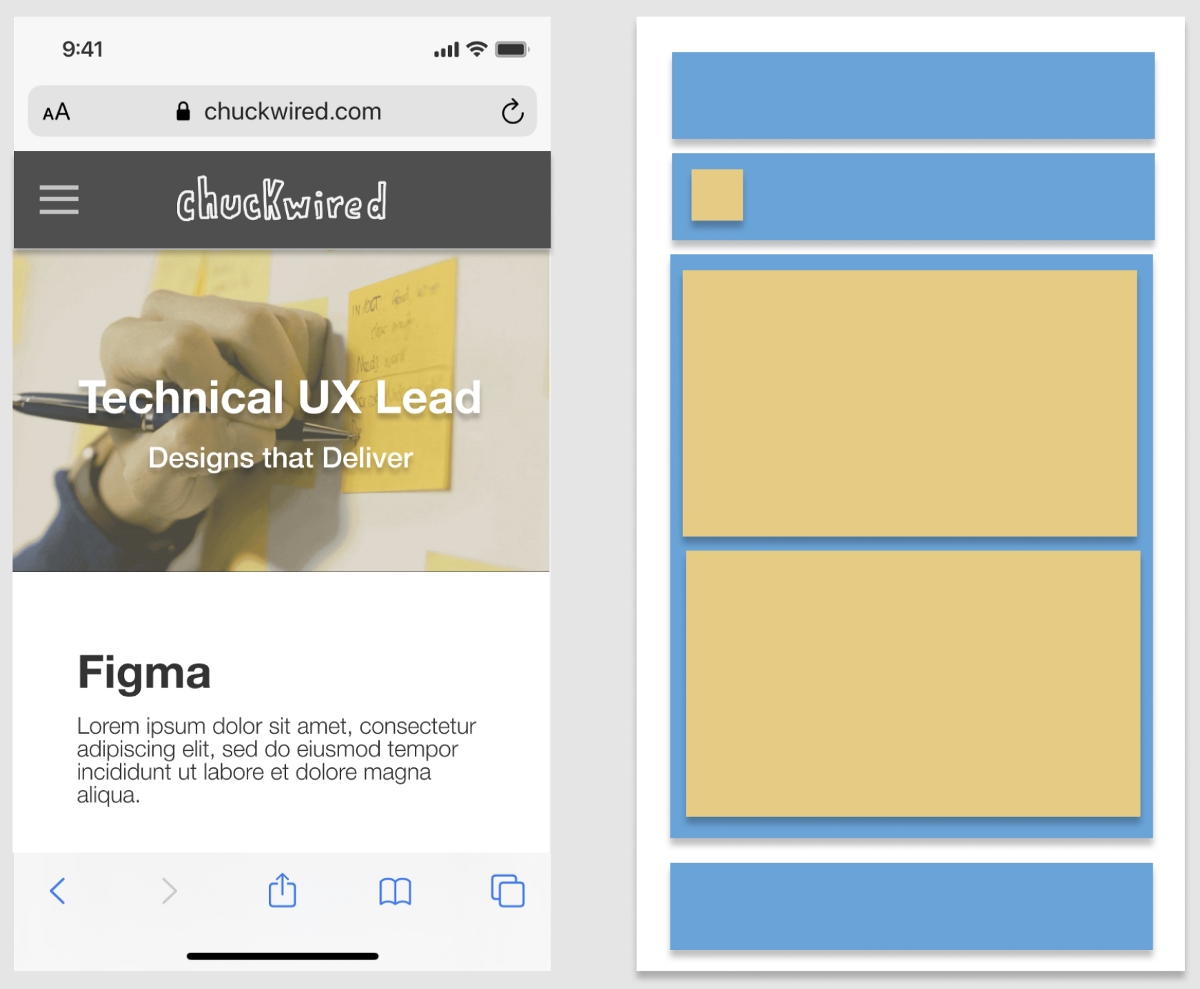
[unable to retrieve full-text content] Putting a Frame inside another Frame sounds like madness, but it’s a core prototyping technique required for true Figma mastery. Continue reading on UX Collective »
Category: UX
Information architecture challenges when designing voice interfaces
[unable to retrieve full-text content] When you ask Alexa to turn on your light or Google Home to check the thermostat, you are asking a device to think and act like a human. But how is it possible for these products to complete your requests and remember your preferences? The answer lies in information architecture… Continue reading Information architecture challenges when designing voice interfaces
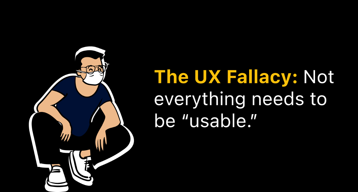
The UX fallacy that everything needs to be usable to be valuable
[unable to retrieve full-text content] To bend reality, you got to know reality. And it’s not all design. Continue reading on UX Collective »
The ABCs of attitude-based archetypes in design
[unable to retrieve full-text content] Much of our work as user experience designers is understanding the whys and why nots of our audiences’ decision making. In a previous post, I explored why people decide to switch or stay with products, focusing mainly on circumstances, the “where” and “when” of a job. The circumstances in which… Continue reading The ABCs of attitude-based archetypes in design
Rethinking the design of the race and ethnicity question on surveys
[unable to retrieve full-text content] Image courtesy of NASA via Unsplash: https://unsplash.com/photos/Q1p7bh3SHj8 Note to readers: I wish I had more resources and funding to really do justice to a project like this. For the time being, however, this was just a design challenge born out of getting annoyed by race and ethnicity questions. This work… Continue reading Rethinking the design of the race and ethnicity question on surveys
Building resilient DesignOps teams
[unable to retrieve full-text content] Photo — Jonathon Colman We live in difficult times… resilience is critical for all of us in our personal and professional lives. As DesignOps practitioners and leaders, we need to take care of the individuals in our teams, the teams we work with teams and the organizations. The curation team for the DesignOps… Continue reading Building resilient DesignOps teams
7 (more) tips to quickly improve your UIs
[unable to retrieve full-text content] More small and easy to put into practice tips to improve your designs. Continue reading on UX Collective »
Design with the web in mind
[unable to retrieve full-text content] Back button, URL design, keyboard shortcuts, and other things we often forget about. When designing an application, there are 3 major variations — mobile app, web app, and desktop app. *It’s actually more complicated than this, but we’ll ignore that for now. Check out my other post to find out more about the different… Continue reading Design with the web in mind
Spark AR: augmented reality playground for developers and designers
[unable to retrieve full-text content] This text aims to present the wonders of Spark AR. There is a lot of excitement around Virtual Reality(VR), Augmented Reality(AR) and Mixed Reality(MR). Spark AR Studio is a program provided by Facebook to develop Augmented Reality filters for social networks. The creative economy states that man’s ability to create… Continue reading Spark AR: augmented reality playground for developers and designers
You’re holding it wrong — How to blame your users
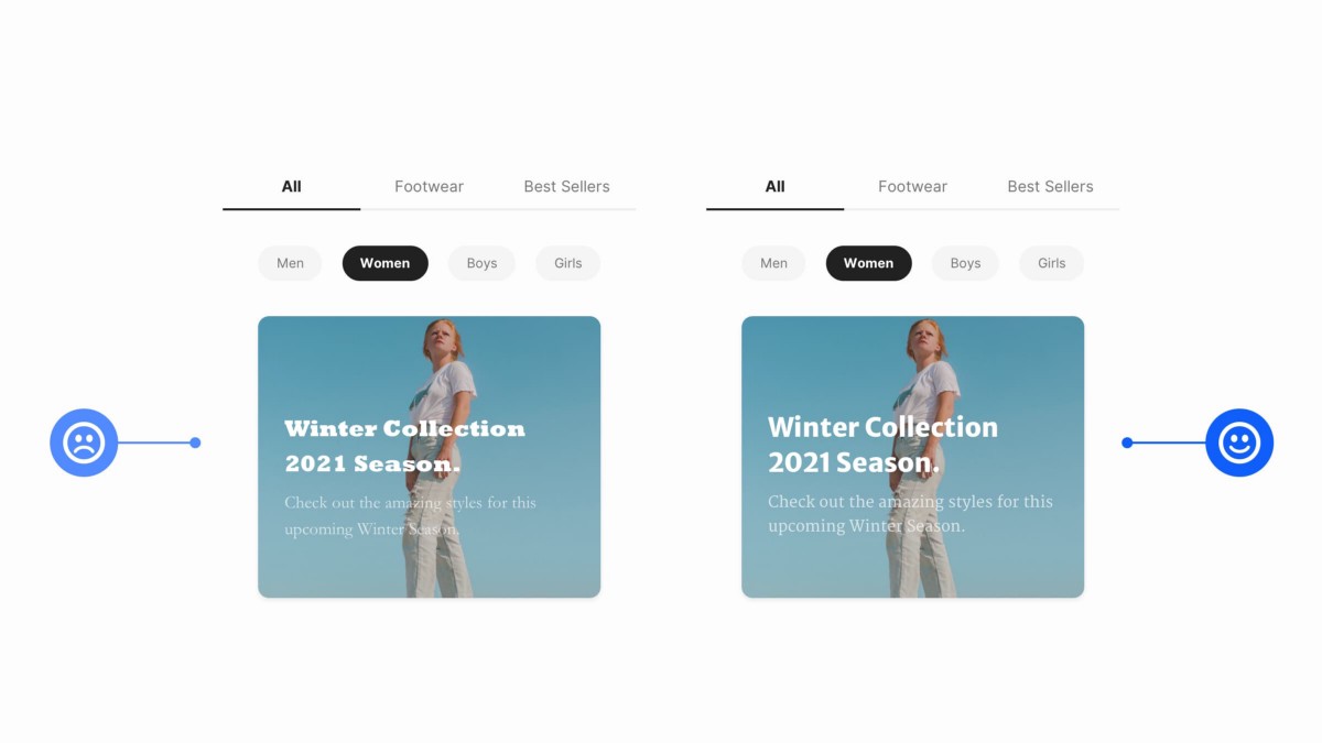
[unable to retrieve full-text content] You’re holding it wrong — How to blame your users The customer is always right. See that black line in the middle photo? If you touch it, you’re “holding it wrong”. The iPhone is a beautiful device. Every version of it has been, but my favorite was the blocky, squared-off shape of the iPhone 4… Continue reading You’re holding it wrong — How to blame your users
How to stand out on Twitter using color theory
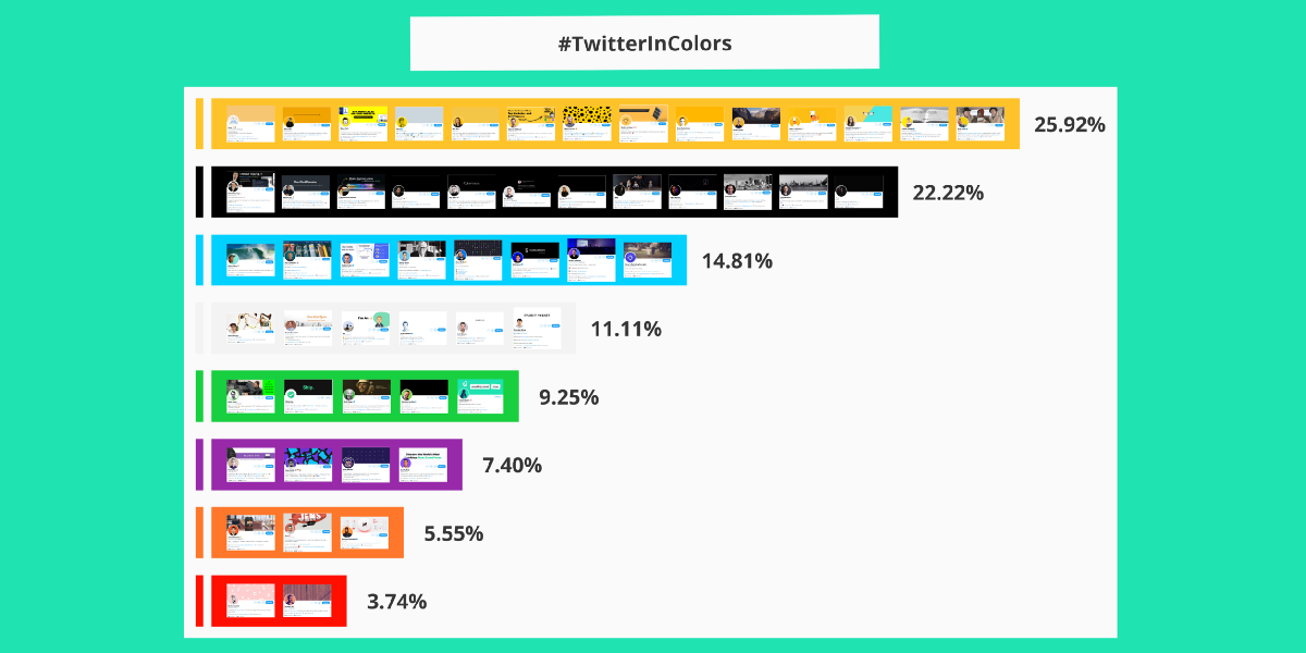
[unable to retrieve full-text content] Standing out on Twitter can be hard for newcomers. You can get better results by only choosing a color for your entire content. I analyzed +200 Twitter profiles to find what color performs better. What color should you choose? #TwitterInColors According to my research, this is the portcetange of usage: Yellow: 25.92% ||||| Black: 22.22% ||||… Continue reading How to stand out on Twitter using color theory
A semiotic perspective on product design
[unable to retrieve full-text content] Dealing with illness. The creativity and sensitivity of designers can be put at the service of the needs of particular categories of users such as people suffering from chronic diseases and subject to long-term treatments. I will demonstrate that through the analysis of a new object designed to facilitate the administration… Continue reading A semiotic perspective on product design
How to really understand humans
[unable to retrieve full-text content] Need-to-know theories, frameworks and tools for designers and researchers. Unsplash by Nijwam Swargiary Why it matters The proper study of mankind is the science of design. -Herbert A. Simon As a UX professional, looking deeply into how our minds, emotions, needs and behaviors co-exist can help us translate human insights into designs… Continue reading How to really understand humans
DIY SVG icons: build your own set with basic shapes
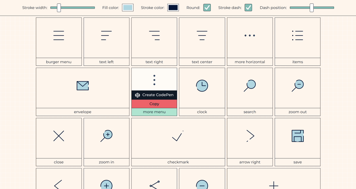
[unable to retrieve full-text content] Continue reading on UX Collective »
In which year is AI going to disrupt the UX industry?
[unable to retrieve full-text content] AI collaboration with humans is already happening and it has started to impact the routines of UX designers. Continue reading on UX Collective »
7 Figma plugins that you need in your life
[unable to retrieve full-text content] I wanted to share with you some of the plugins that have helped speed up my workflow in Figma. Continue reading on UX Collective »
Lessons from setting up an internal research participant panel at Atlassian
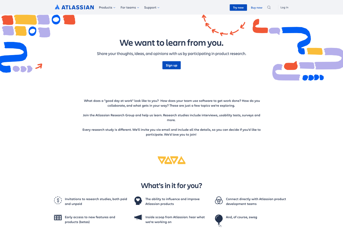
[unable to retrieve full-text content] Sign up page for the Atlassian Research Group My first UX Research role was at a small digital agency, where the discipline was still new. Sales teams would frequently sell clients research, without fully budgeting in participant recruitment. Shoestring budgets meant I often had to find my participants using creative, scrappy… Continue reading Lessons from setting up an internal research participant panel at Atlassian
The neuroscience of words and universal design
[unable to retrieve full-text content] The picture I placed above it’s there for a reason, and I’m going to go back to it later on. For now I don’t want you to pay attention too… Continue reading on UX Collective »
Taming ambiguity like a Designer for better problem solving
[unable to retrieve full-text content] What design thinking tells us about creatively working through ambiguity. Continue reading on UX Collective »
The evolution of style guides to AI writing assistants
[unable to retrieve full-text content] Style guides have a long history in the writing process. They’ve always affected more than what counts as good content. They affected our writing process and behaviors, our sense of community, even our egos. As AI pushes the style guide another step, how will it push us along too? Stacking style manuals… Continue reading The evolution of style guides to AI writing assistants
What leads Product Owners to failure?
[unable to retrieve full-text content] The three traps that hold Product Owners back from thriving Continue reading on UX Collective »
Are you an artist or a scientist UX designer?
[unable to retrieve full-text content] Imagine that you’ve just been assigned to a brand new project as the lead UX designer. You have a rough idea of what the project is, and… Continue reading on UX Collective »
Putting personal mastery back into Design Thinking
[unable to retrieve full-text content] In my previous article, How do we bridge the chasm between Design Thinking and Design Doing?, I looked at where and how design thinking skills and expertise should be located inside an organisation for maximum impact. In this article I would like to go beyond the how and into the… Continue reading Putting personal mastery back into Design Thinking
Deque Systems announces axe-con, a new, digital accessibility conference: March 10-11, 2021
Free, Multi-track Online Event Focuses on Helping All Professionals Build, Test and Maintain Accessible Digital Experiences Deque is excited to announce a brand-new digital accessibility conference: axe-con!! Axe-con is an open and inclusive digital accessibility conference that welcomes developers, designers, business leaders, and accessibility professionals of all experience levels to a new kind of accessibility… Continue reading Deque Systems announces axe-con, a new, digital accessibility conference: March 10-11, 2021
