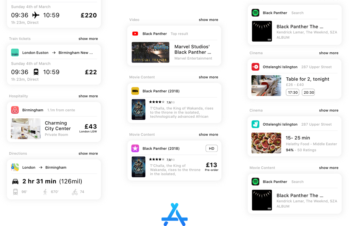
Kostja PaschalidisBlockedUnblockFollowFollowing Jun 21, 2018 Last year Apple redesigned their App Store app. The app is focused on curating featured apps and beautifully presenting them. Apple aimed to bring back the joy of finding new apps and build the new window display of the apple app ecosystem. The new app looked gorgeous, and at the… Continue reading How to fix the real problem of the App Store — a UX case study
Category: UX
Accessibility and user needs in Design — a UX case study
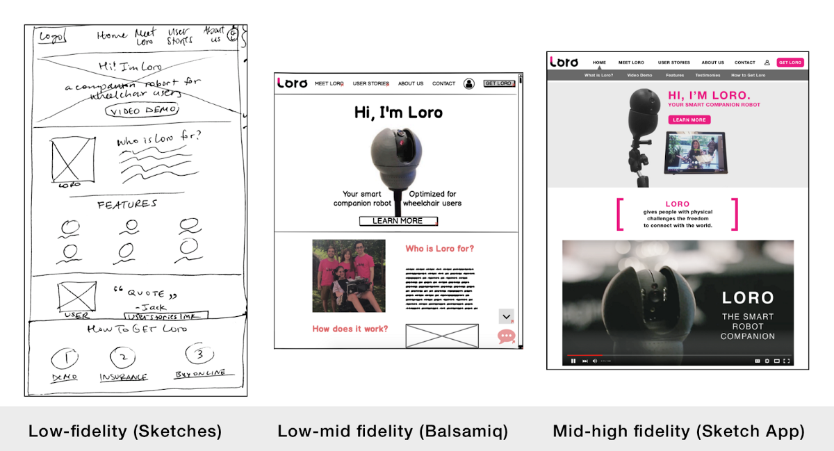
Kseniya KenkeremathBlockedUnblockFollowFollowing Apr 29 Background: This case study pertains to a joint project completed with Nicole Warden Le for DC-area startup Loro. Loro is currently in the process of bringing to market a companion robot featuring a 360-degree camera and accompanying app designed specifically for wheelchair users. The objective of the project was to redesign… Continue reading Accessibility and user needs in Design — a UX case study
Clients, constraints, and communication — a UX case study
Libby PorterBlockedUnblockFollowFollowing Apr 27 Some people think design is just about flashy colors and sleek animations. And while it is delightful to scroll through the pages of Dribbble, real design is messy. It is a process. Real design recognizes constraints, asks tough questions, forces you to make tradeoffs… but ultimately, it solves a problem and… Continue reading Clients, constraints, and communication — a UX case study
Design after technology? Technology after design?
John Maeda said in an interview; […] When technology is the thing you want, you don’t need design because you want better technology.When the technology matures, you don’t buy it just based on technology. In that case, the design comes into the foreground.d. These lines have been etched in my brain, and come back from… Continue reading Design after technology? Technology after design?
Work skills for the modern design workplace
#1 Power of synthesis Finding designers who are naturally curious is not that easy. Not only that, but people who know how to go incredibly deep when researching a certain topic, incorporating multiple sources and points of view into the same study. When the research is done, this is where they differentiate themselves from other… Continue reading Work skills for the modern design workplace
Connecting with mentors in UX
I know from my early endeavors in finding mentorship that it can be intimidating to reach out to people who may be older, more experienced, and more established in their careers — especially if you’re trying to get started in a new field. It’s also rare to find someone who will spare time to mentor a stranger.… Continue reading Connecting with mentors in UX
My take on language selectors
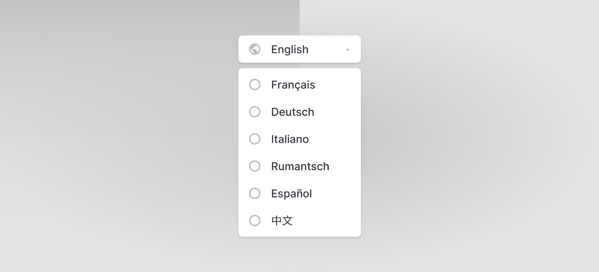
Zsolt SzilvaiBlockedUnblockFollowFollowing Apr 16 In the past couple of years, I was fortunate enough to work on many interesting products, some of which had to be designed in multiple languages. Recently, I’ve bumped into some new issues with language selectors that I found quite exciting to take a closer look at. So, I decided to… Continue reading My take on language selectors
UX yourself, or “What’s your story?”
As our cohort ended and a new group of young designers prepared to enter the field, I began to double-down on my efforts in terms of UX networking and projects. Recently, I had traveled to my parents for a quiet weekend at home. It was warm, sunny, and I was studying for upcoming interviews. I… Continue reading UX yourself, or “What’s your story?”
Efficiency and ethics in UX research
Maryna SamsykaBlockedUnblockFollowFollowing Apr 10 After writing my intro to UX research, I was about ready to stop. After all, I explained what design research is and why it matters as well as which methods and tools to use. What more could there possibly be? Well, design research is similar to any other type of scientific… Continue reading Efficiency and ethics in UX research
Designing type: a HackWeek diary
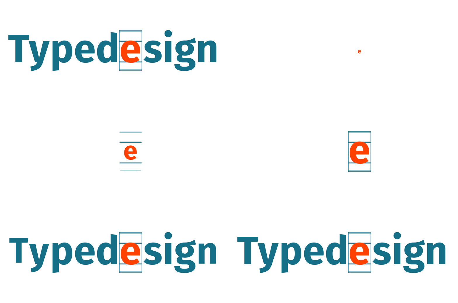
Florian GaefkeBlockedUnblockFollowFollowing Apr 7 At our company, we have this quarterly HackWeek, where employees from different backgrounds — developers, product managers, and UX designers alike — have the freedom to collaborate and work on self-initiated projects. The best thing is that there are no limitations. So — you can rethink existing products, conceptualizing something completely new. Various kinds of projects are… Continue reading Designing type: a HackWeek diary
Keeping fitness users motivated — a UX case study
Álvaro Alcaraz DelgadoBlockedUnblockFollowFollowing Apr 2 Welcome to my last project of the Ironhack Bootcamp. Yes, it has been REALLY hard to arrive here. So many coffees, nights without sleeping well, hugs with my classmates… but finally, I am here. But before starting with the story of my project I want to thank all the people… Continue reading Keeping fitness users motivated — a UX case study
9 Ideas for the future of digital dating
Whether you are a gen-Z, millennial or a recently separated 40-something, chances are you have heard of or used Tinder enough to understand how brutal dating can be. How many times have you heard comments like “I wish dating would be more natural, more real.” The problem of dating apps, however, is not that they… Continue reading 9 Ideas for the future of digital dating
Importance of designing easily discoverable features within products
Leena DeodharBlockedUnblockFollowFollowing Mar 27 What makes a product successful? Its Customers. And how do customers decide which product they want to use? The ease with which the product serves their purpose. Discoverability is an important aspect while designing easy to use products. It is the ability for users to locate something they need to complete a… Continue reading Importance of designing easily discoverable features within products
The DOs & DON’Ts of interviewing senior UX designers
Committing to a process You probably experienced it yourself; at the last minute, the HR department sends you an invite to join a job interview which will take place in the next hour. In your invite, you will find a few links to the candidate’s portfolio, CV and perhaps a LinkedIn profile. You take ten minutes… Continue reading The DOs & DON’Ts of interviewing senior UX designers
Mindful diversity and inclusion in tech
Contrary to how it’s often spoke about: Diversity does not equate to inclusion Diversity is not the same as equality Diversity does not imply equity Diversity is also not an old wooden ship Diversity is about representation and the mix of voices and faces that we see. Inclusion is about the behaviors, actions and intent… Continue reading Mindful diversity and inclusion in tech
Can we gain the user’s trust for digital apps through UX design?
The Fundamentals of trust in UX design In my previous article I described what trust exactly is, and what the fundamentals of trust are. Using these fundamentals (Benevolence, Integrity, Credibility, and Reliability) and knowing what UX contains, we can make a relationship between the Fundamentals of Trust and UX design. 1. Benevolence in UX “UX is, by… Continue reading Can we gain the user’s trust for digital apps through UX design?
Empathy – a key UX Design skill that no job description talks about
Surya Ravindran PillaiBlockedUnblockFollowFollowing Mar 17 “Pay attention to what users do, not what they say.” – Jakob Nielson. Today, let’s talk about a vital quality that a UX Designer must have, one that is often not included in UX Design job listings – Empathy. One often associates design projects with aspects like functionality, layout, look… Continue reading Empathy – a key UX Design skill that no job description talks about
How do you know when design is done?
Some questions just can’t have simple answers, can they? I have been dealing with this question, how do you know when design is done, for many years now. A deep observation of design from multiple angles had led me to appreciate assessments as tools to improve best practice. That led me to elaborate upon user… Continue reading How do you know when design is done?
How to stay resilient (and keep your sanity) as you face pressure
1. Unpack Your Emotions The first strategy I want to talk about is the importance of moving through your emotions. “It’s okay to not feel good. It doesn’t mean I’m bad. It doesn’t mean that I’m never going to succeed. It just means that I don’t feel right, right now, and I need to address that.… Continue reading How to stay resilient (and keep your sanity) as you face pressure
My passion for UX explained through my other life passions
Today, I had a mind-changing interview. And it all started with the simple question of… “What makes you stand out as a Designer?” I blurted out some cookie-cutter response like “I am someone who is extremely empathetic and detail-oriented.” Suffice to say, my interviewer was not impressed. Suffice to say, I did not stand out to him… Continue reading My passion for UX explained through my other life passions
One minute of silence for digital design
Am I a kind of ‘zombie designer’ then? Yep, those two holes in my trousers were probably for something.But how did I get here? I couldn’t say that I remember a specific moment… maybe it’s like Italy, my home country, in which everything gets a little worse every day, very very slowly, in a way that… Continue reading One minute of silence for digital design
Why I love IKEA’s customer experience
Liat AbadiBlockedUnblockFollowFollowing Mar 2 I just crave simple things that get the job done. But when it comes to IKEA, it’s not just the basic furniture that currently fits my needs (well-designed, functional, affordable and happily being abused by my cat and 3 little kids), it’s the holistic customer journey I’m always impressed by, feeling… Continue reading Why I love IKEA’s customer experience
3 things I wish UX designers would do when in a new job
Anirudh B BalotiaaBlockedUnblockFollowFollowing Jan 30 ONE: Be curious 24×7 Photo by Joseph Rosales on Unsplash If you are a parent, this is fairly easy. Just observe your child. If you have a child who is less than 3 years, you will be surprised how curious they are. When joining a new place of work, have this kind… Continue reading 3 things I wish UX designers would do when in a new job
The designer struggle, it be real
Coming of Age The Beginning: From 2014–2017, I was fortunate to have a stellar partner-in-design (crime) and mentor to work with, Scott Kiekbusch. Together, albeit unknowingly, we embarked on a design pilgrimage that transformed us from design practitioners working in the user experience space into digital product designers. And we would come to learn how to… Continue reading The designer struggle, it be real
