Jan 15
My love/hate (but mostly love) relationship with Medium continues. I write this with sincerity, not spite. All I want is to offer a few, hopefully valid, points from my perspective as an avid user.
I’ll start with some transparency: I have no idea what it takes to run an online publishing platform, or manage an app, or any other high-level tech stuff. I’m certain there’s business goals, objectives, and interests that soar waaay over my head, which should explain why I’m flummoxed by the current nature of clapping for Medium on iOS.
It’s just not fun, or enticing, or appealing, like it used to be.
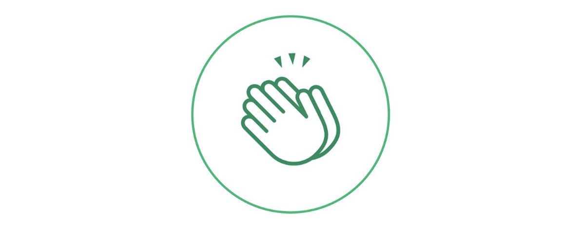
If I remember correctly, the clap button used to look like this:
First off, it actually looked like a button. It had a green livelihood with chameleon-like ability to compliment publication themes. The button sat prominently, and intuitively, within the display. Ooo, best of all, it would sparkle and dance and come alive when you touched it! Cool, right?
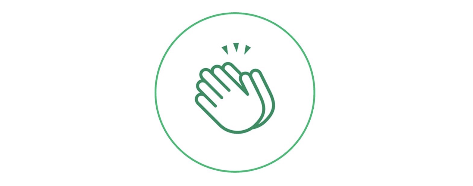
Well, all that changed some time near the end of last year. This is the current status of the clap feature, in proportion, as of January 2019:
Notice anything? You probably don’t and that’s precisely my point.
The new “button” is dull, uneventful, and colorless.
More critically, look at its placement on the screen—in the bottom left-hand corner. For crying out loud, 80% of people are right-handed! In other words, 4 out of 5 users navigate and scroll with their right thumb. Why move the button to a less comfortable / convenient spot?
I know, this sounds incredibly petty. But this matters. Anyone with a hint of design savvy understands that even slight changes in presentation can effect user behavior at large.
Also, bring your attention to the other features occupying the space along the bottom. Notice all of them are uniform in style which implies each of them have equal value.
Uhm, no? Last time I checked, nobody benefits from me changing the font size of a story. Also, “archiving” stories for later is a feature I use rarely (if ever). But one of those little symbols literally puts money in peoples’ pockets. And you’d never know otherwise!
Where is this coming from?
I’d be lying if I said “Digital Marketing” has nothing to do with it. I took this class last semester of college and we tackled this stuff. We discussed websites, advertising, usability — all this crap that relates to users and how they behave and interact with content.
The lessons are bleeding over.
I remember our talk about call-to-actions such as “Book now!” or “Buy Today!” If you pay any attention to those CTAs on websites and print copy, you’ll notice a few things:
- They are accessible at all times
- They are conveniently placed
- They stand out from everything else
Guess what? The clap button is a Medium writer’s call-to-action! Color me crazy for thinking these basic principles apply, but they do.