Dec 4
Website redesign for a non-profit neighbourhood house to increase the awareness about their programs and services as well as welcome everyone to the community.
I. Introduction
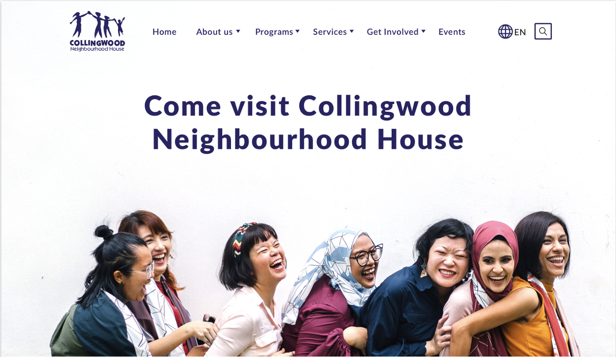
Collingwood Neighbourhood House provides services and community development initiatives aimed at improving the quality of life of residents in the Collingwood area of east Vancouver.
Activities provided by Collingwood Neighbourhood House are targeted primarily to low and middle income families. Services are delivered in a variety of languages with emphasis on building social connections, capacity, cross-cultural sharing and life-long learning. Residents of all ages participate in educational, cultural, social, health, economic and recreational services, as well as contribute towards building a safe and caring community through volunteer contributions, leadership and partnership development.
Timeline: 3 weeks.
Demographic: 35+ adults
Project Goal: To redesign the website to allow users to find the programs or services they are looking for easily; Invite more people to join the neighbourhood community
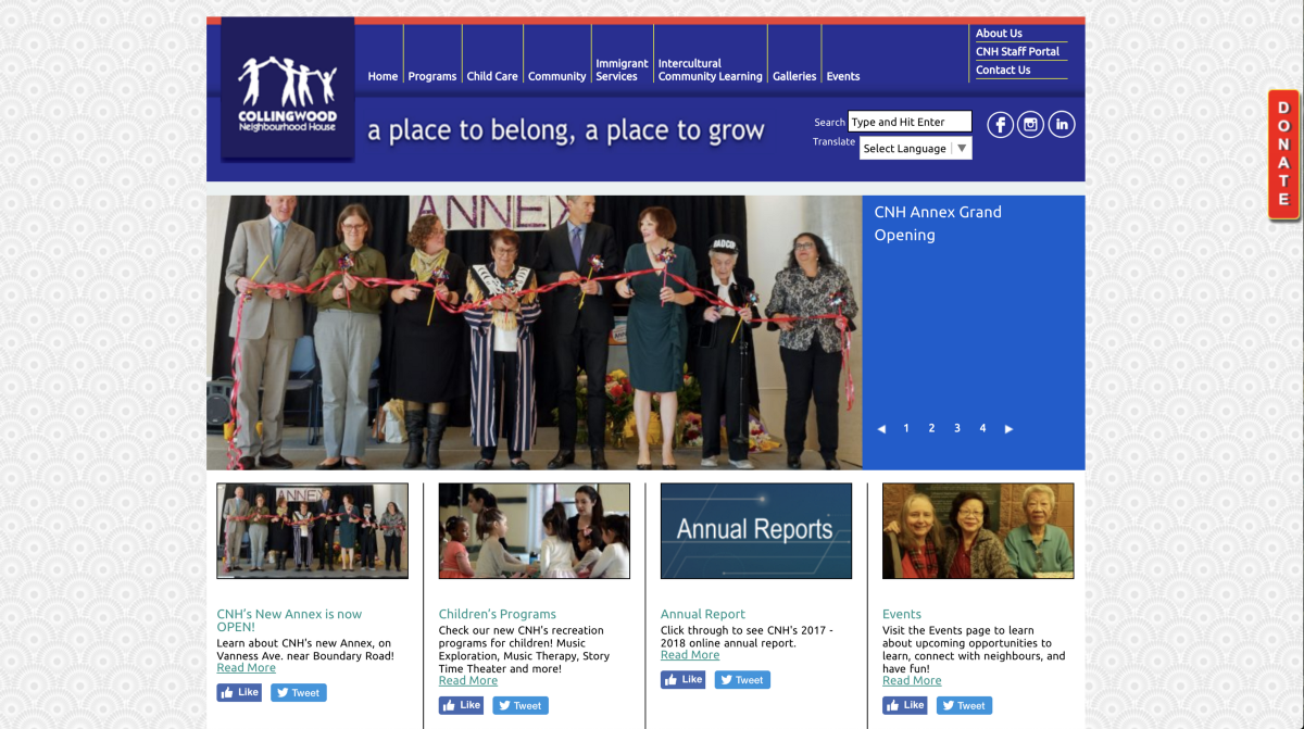
Challenges: From the kick-off meeting with the clients we found out that their original website contains a lot of information. The biggest challenge for this project is to reorganize the heavy content by categories. And to understand the user’s logic better.
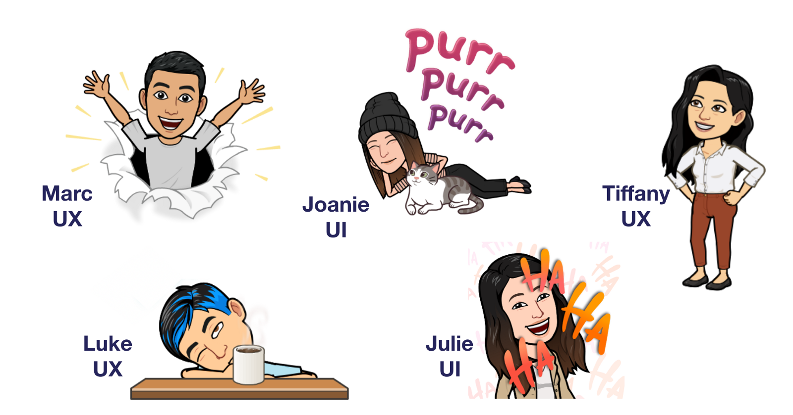
Our team consisted of 3 UX designer and 2 UI designers. Big thumb up to the awesome team!
For UI design, our goal is to provide visual support to the UX structure and make it consistent with the project goal, user goal and clients’ branding. It requires a good understanding of the user needs, curating icons and imagery to increase the legibility, making sure the layout, typography, buttons, and other visual cues attribute to the clarity and consistency of the website.
II. Client Kick-off Meeting
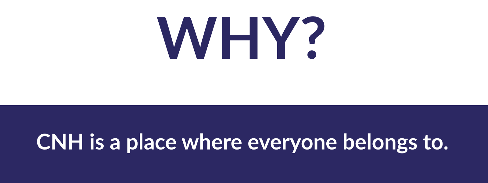
The purpose of the client kickoff meeting was to understand and learn about Collingwood Neighbourhood House and come up with our why.
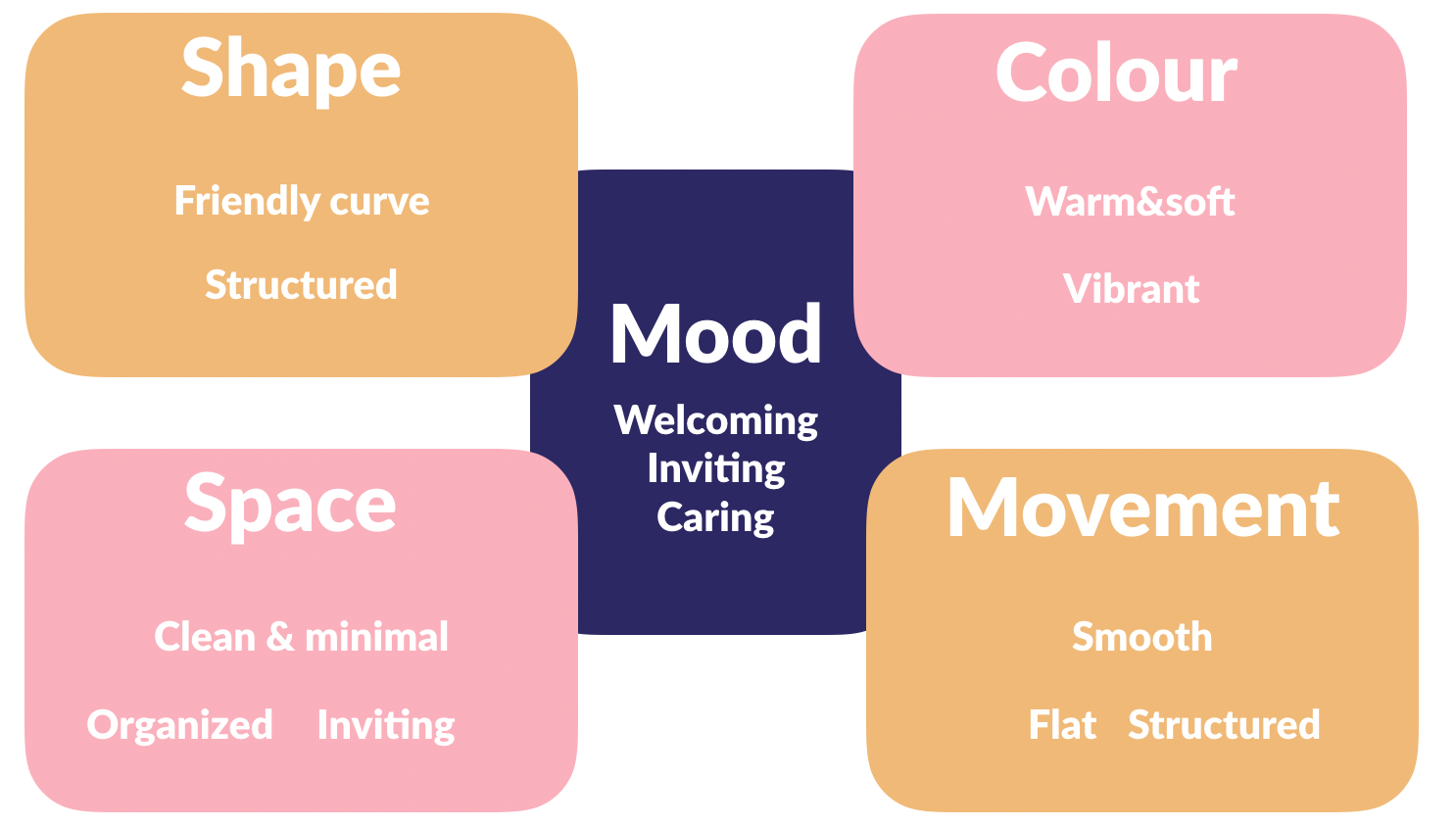
During the meeting, we asked our client to brainstorm some keywords associated with the branding and feeling of neighbourhood house.
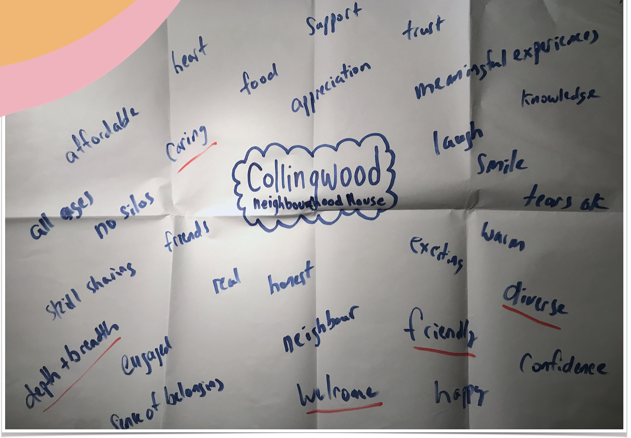
Our client highlighted a few words which are the most important keywords for the organization which associated with their mission.
Welcome, Friendly, Caring, Diverse, Depth+breadth
III. Gut Test
Based on the understanding of the business goal and project goal. We did our research of the association and their brand. And collected 20 screenshots which contained diversity in layout and design style. We conducted the gut test with 11 employees form CNH aiming to get a general idea of the design aesthetic for the CNH website. We showed 20 screenshots of existing apps and websites, and our clients rated on those screens from 1( definitely no) to 5 (absolutely yes).
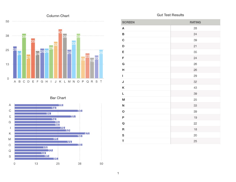
Based on the testing results. We pulled out the screens our clients like and dislike the most:
Our clients favoured the vibrant colour pallet which gives out a welcoming vibe.
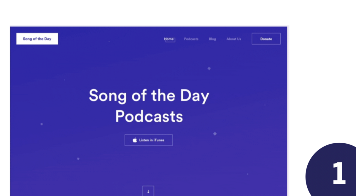
They also liked the clean and structured layout with the big hero banner. The image also emphasized people in a happy face which associated with CNH’s branding.
Our clients did not like the small design elements all over the place which make the screen messy. There was also no image showing in there.
They are not a fan of the gradient but prefer the minimal and professional look and flat colour.
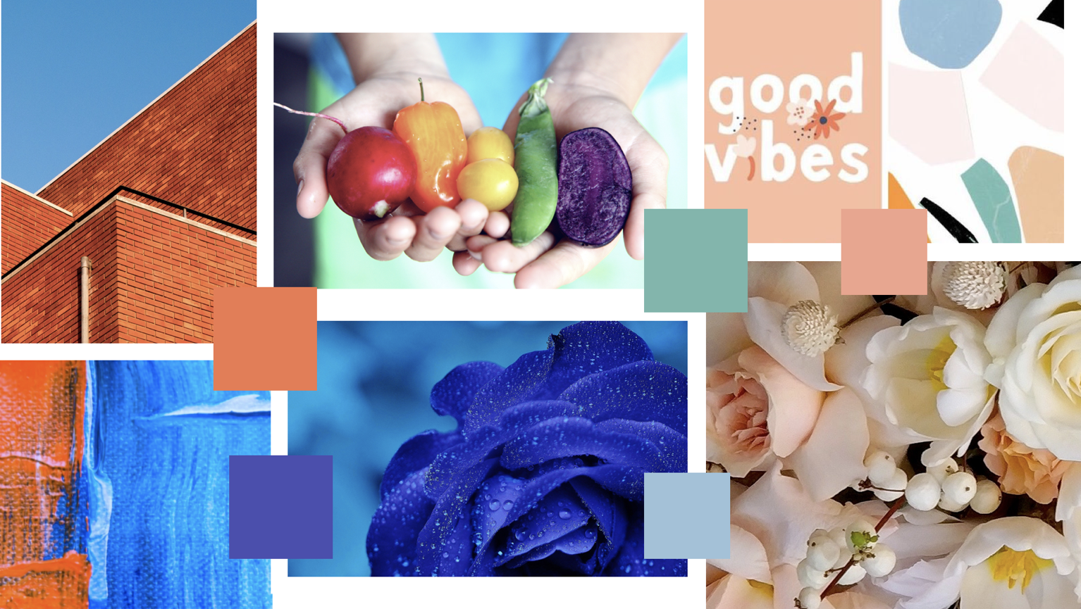
IV. Design Inception
With the initial brainstorm and the gut test in mind we came up with our why:
V. Design Direction
With enough information from the brainstorming, UI research, and gut test, we created our 2 design directions. Both directions started with the same WHY and followed the same mood: welcoming & inviting.
The challenge with these design directions was to keep them cohesive with CNH’s branding, while making the visual design calm and also cheerful. Due to the heavy text for the website, we utilized the white space with the minimal structured layout to bring out the professional feeling. Meanwhile, make it colourful to showcase the diversity and fun aspects of CNH.
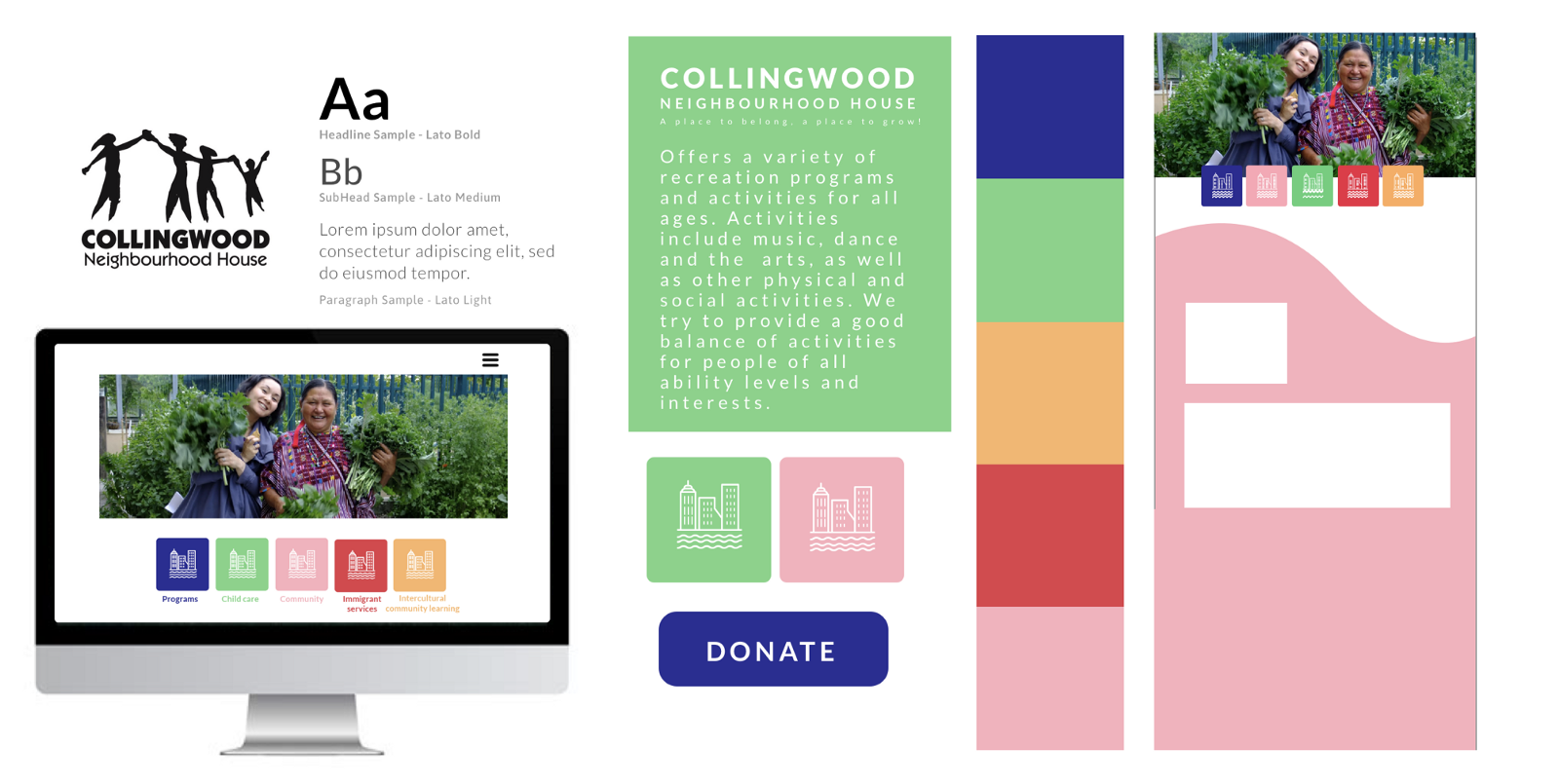
Design direction 1: Calm & Welcome
First design dereliction is calm and friendly, as well as organized and straightforward.
We chose soft tone colours to bring out the calm vibe. Also, make it colourful to reflect our why which is inviting everyone to CNH.
In order to showcase a soft and calm vibe, we used images with human interaction in the colour blocks.
We created the organized and structured layout with a geometric shape and linear movement to make the interface simple and clean. As well as to give it a professional look and feeling.
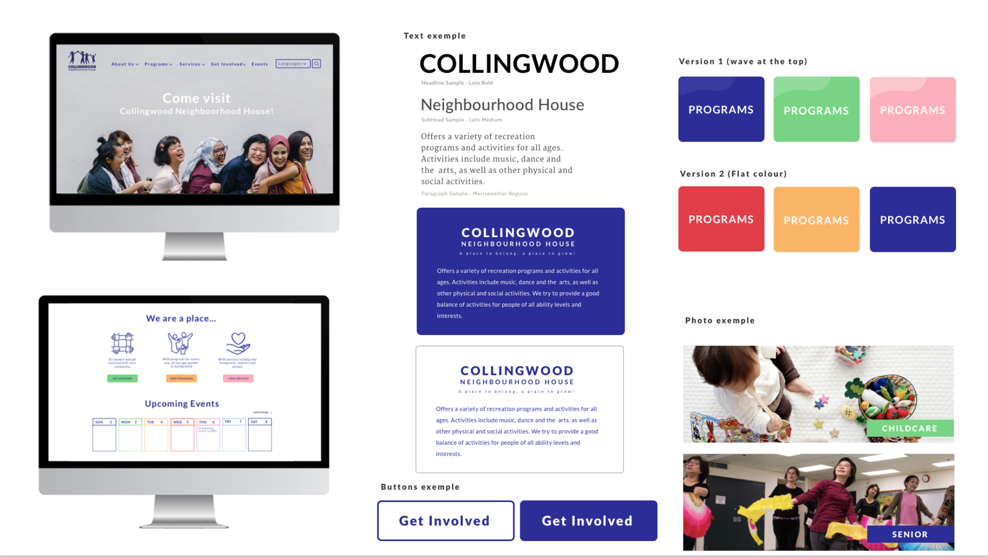
Design direction 2: Bright& Cheerful
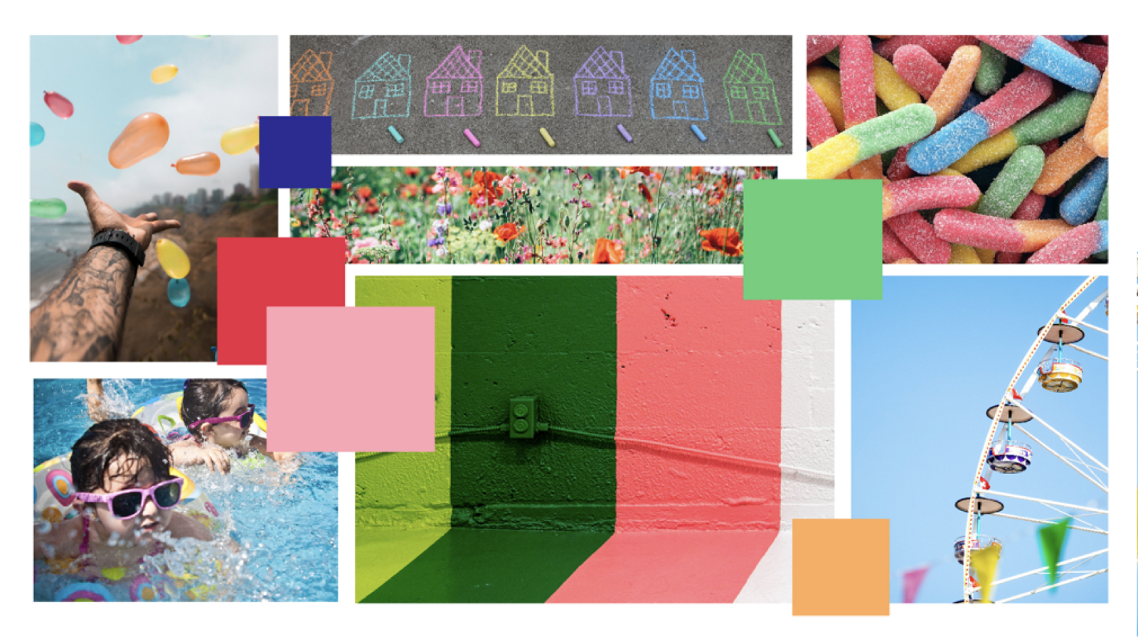
To be different from the first direction, we wanted to give a bright, cheerful and welcoming feeling to the user by using a vibrant colour.
Simplicity and modernity were also important elements that our clients mentioned. These were projected by using simple shape and lot of structure into our design.
Based on our mood board we started to visualize how our design could look like.
By using a lot of white space, structure and simple shape elements it will give a professional, modern and welcoming vibe to the website.
VI. Final Style Tile
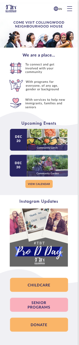
After presenting both directions to our clients, they choose the second direction: fun & modern.
We created the final style tile based on that direction. But after testing this concept with some user, we found out that people were getting a bit confused with the colours. People associated the colour to the different categories. Also by using images on each screen which contain a lot of colours, it was getting too messy. We wanted to keep the screen minimal & professional.
We adjusted our final direction base on those feedbacks.
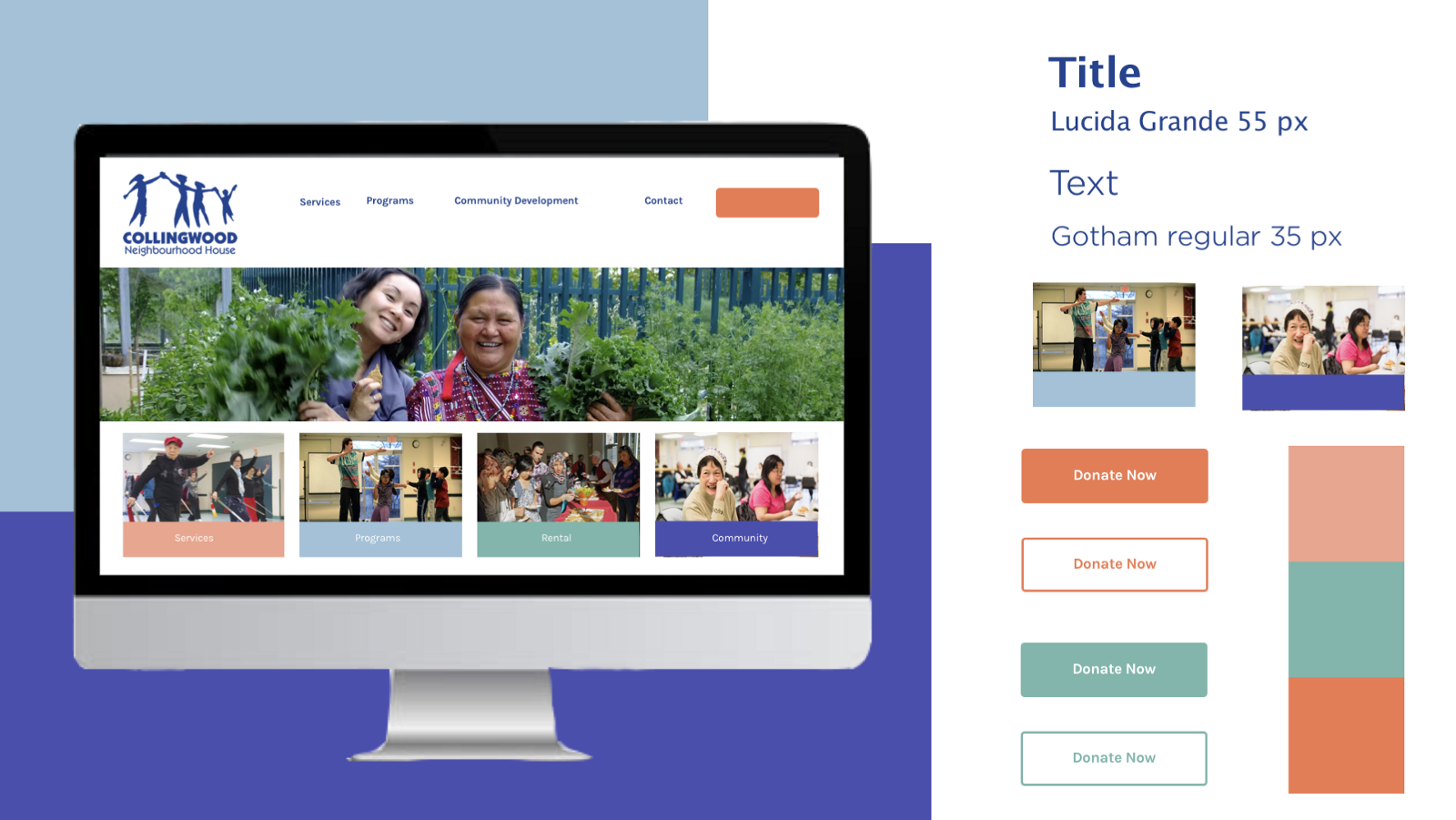
Adjusted final Style Tile
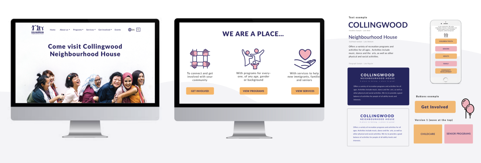
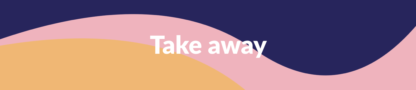
Colour wise, we kept the darker blue since it is the main colour of CNH in terms of their branding and logo. We also decided to pick 2 colours from the existing palette our clients chose: the yellow and pink which are the warmest, happy & welcoming colour, to represent the vision of the brand.
By reducing the colour amount, it helped to avoid confusion for the users and kept the site overlook clean & professional.
In terms of typeface, we chose Lato on all the site. It is a structured, easy to read and modern looking typeface. The colour of the button and icons will also help the user navigate through the site.
VII. Style Guide
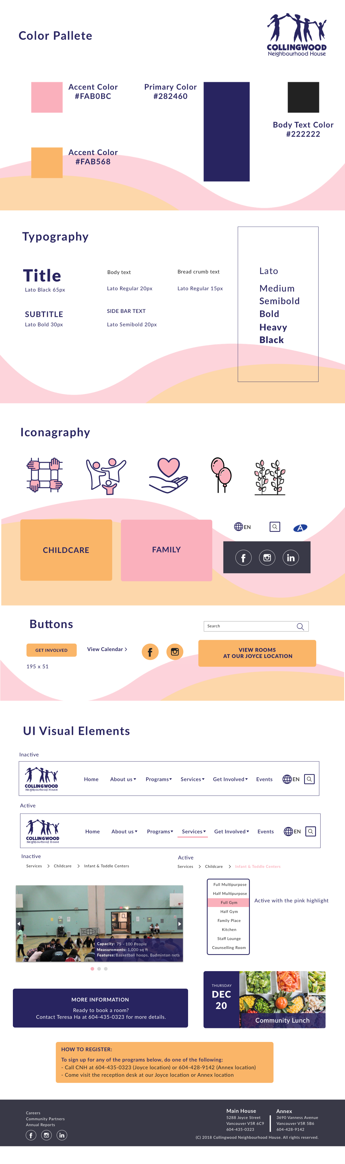
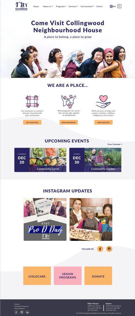
We used darker blue as the primary colour, pink and yellow as the accent colour. To add more contrast for the users easy to read, the black was used as the colour for body text.
Different weights of the typeface were used to create the hierarchy for the text-heavy contents in order to increase legibility.
We created icons using the same colour to be consistent with our design.
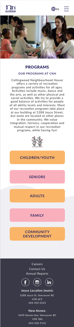
By adding more visually appealing for multinational users, it will help newcomers who do not speak English recognize the categories on the website more easily.
Yellow is used for the button. And pink is used to highlight to show contrast and make the CTA pop up. Easy for users navigate through the site.
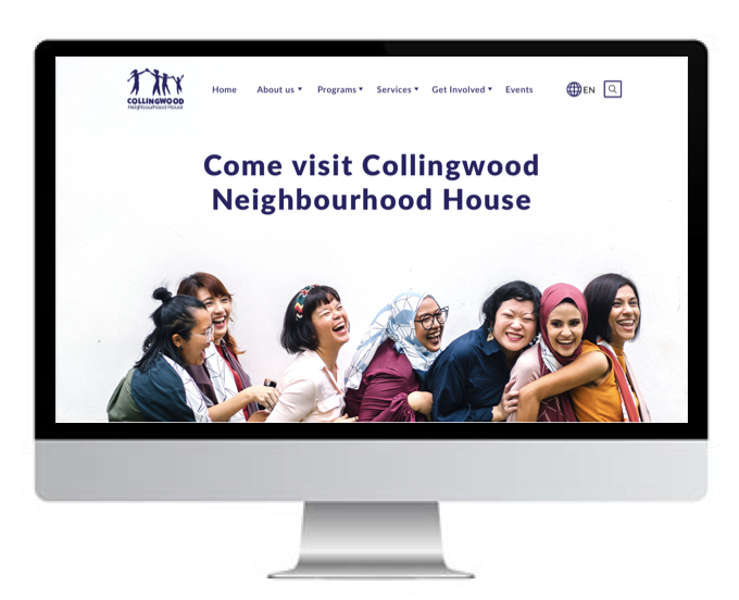
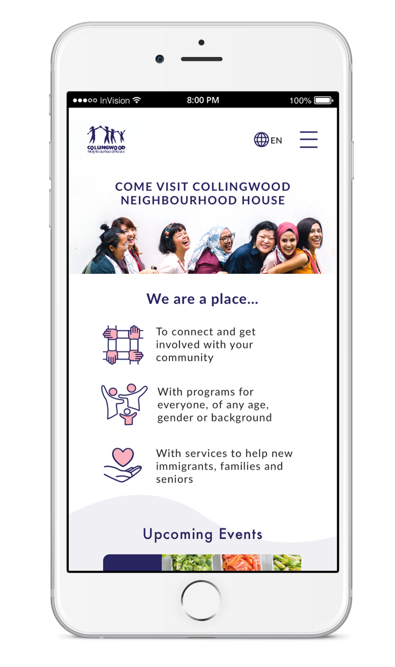
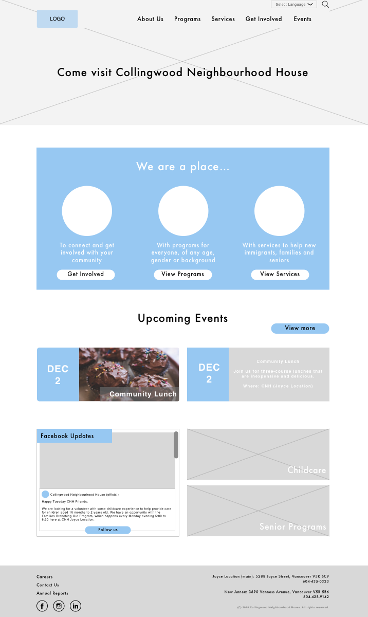
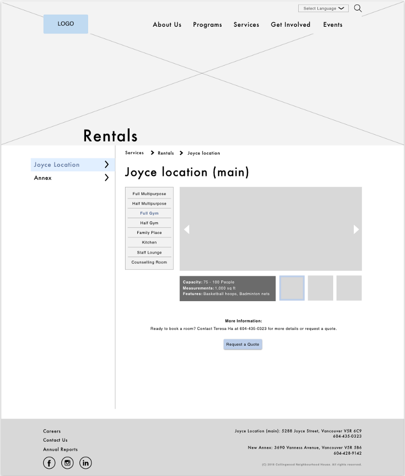
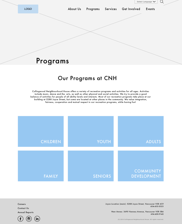
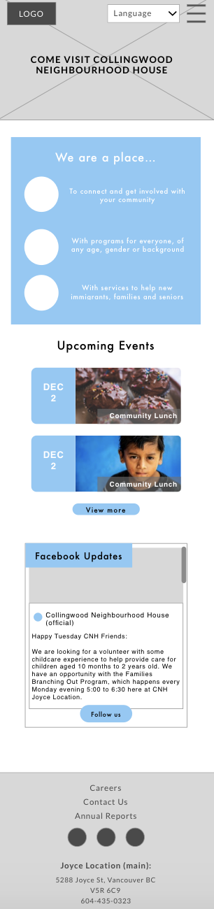
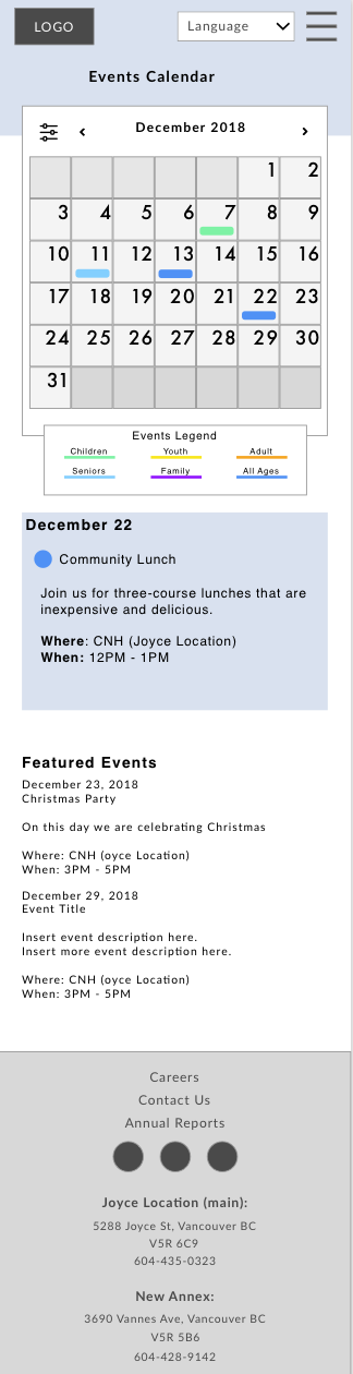
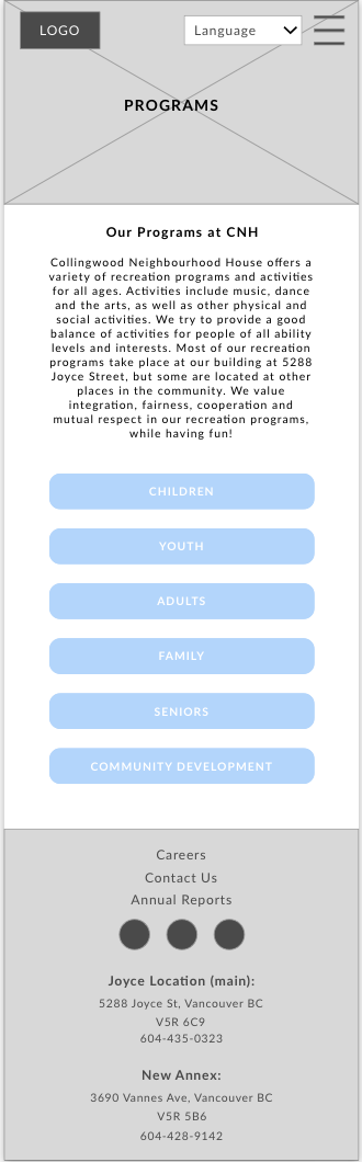
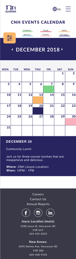
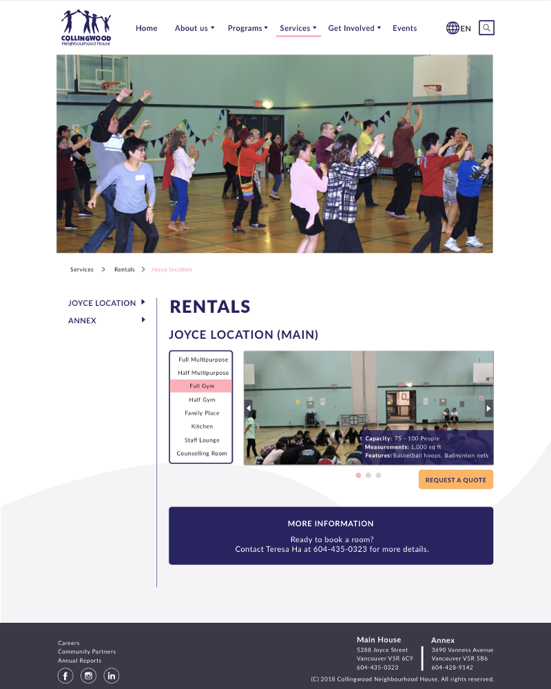
Below are some examples of the mid-fi screens from our UX designers based on the in-depth research of the users.
After UX handed out the wireframes, we applied our design styles to those screens.
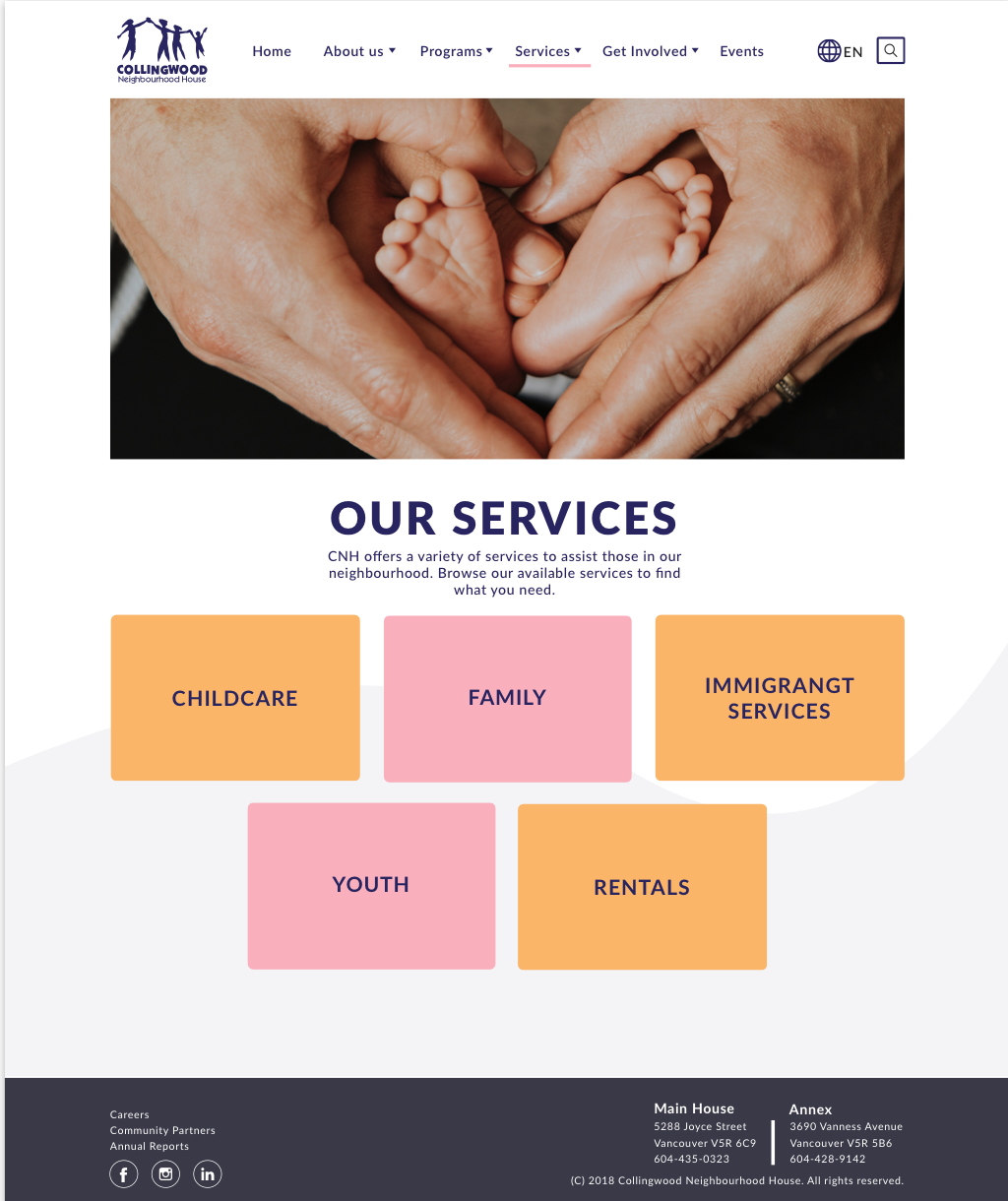
Click here for the full clickable prototype desktop version and here for mobile version
Due to time constraints, there were features we couldn’t implement. User testing showed that users wanted the following:
- Online registration for programs & membership
2. Engage user legibility by adding more icons
Thanks for reading!❤️