What does your logo say about your company — and does anyone really notice?
Rebranding can be a hefty task. If you’re looking to rebrand because you think you need a refresh, you’re likely planning to have a team working hard on a number of graphic options that truly embody the kind of company you want to represent. It’s possible you are considering paying a large consultancy to make tweaks and come up with complex reasons for the colors chosen or font treatments. Then you’ll spend countless hours arguing the nuance of one font or color over another.
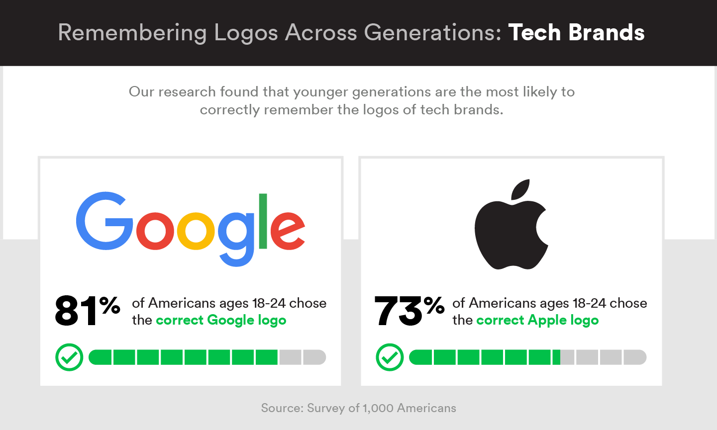
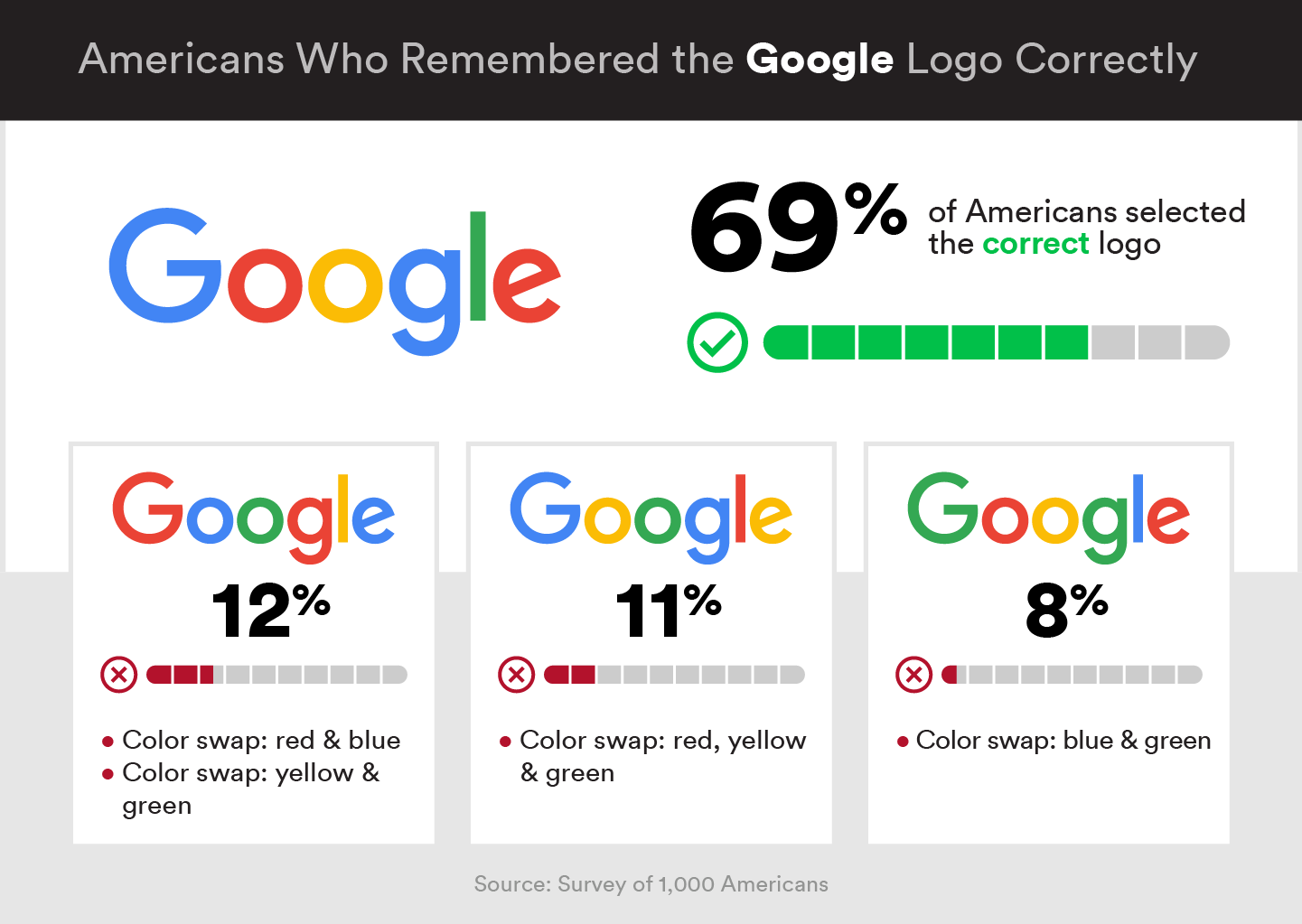
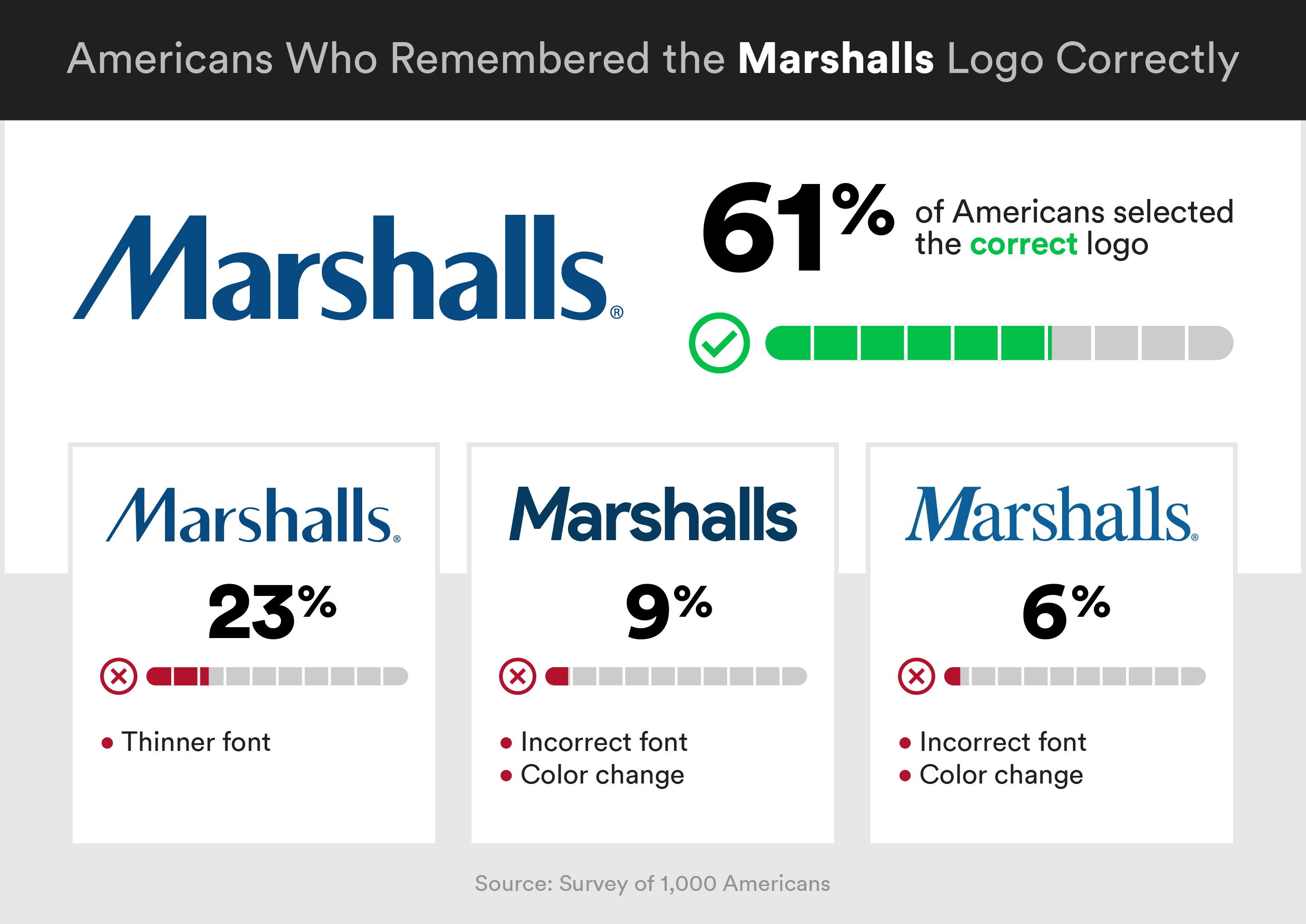
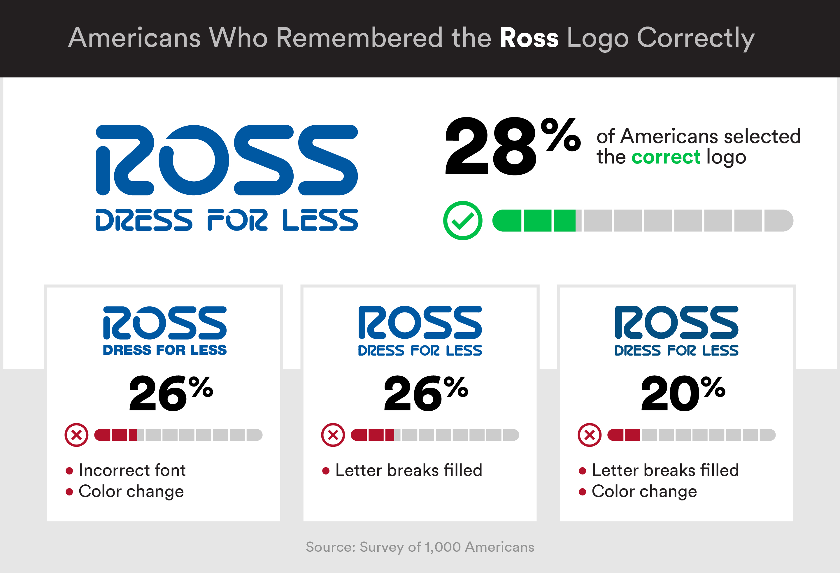
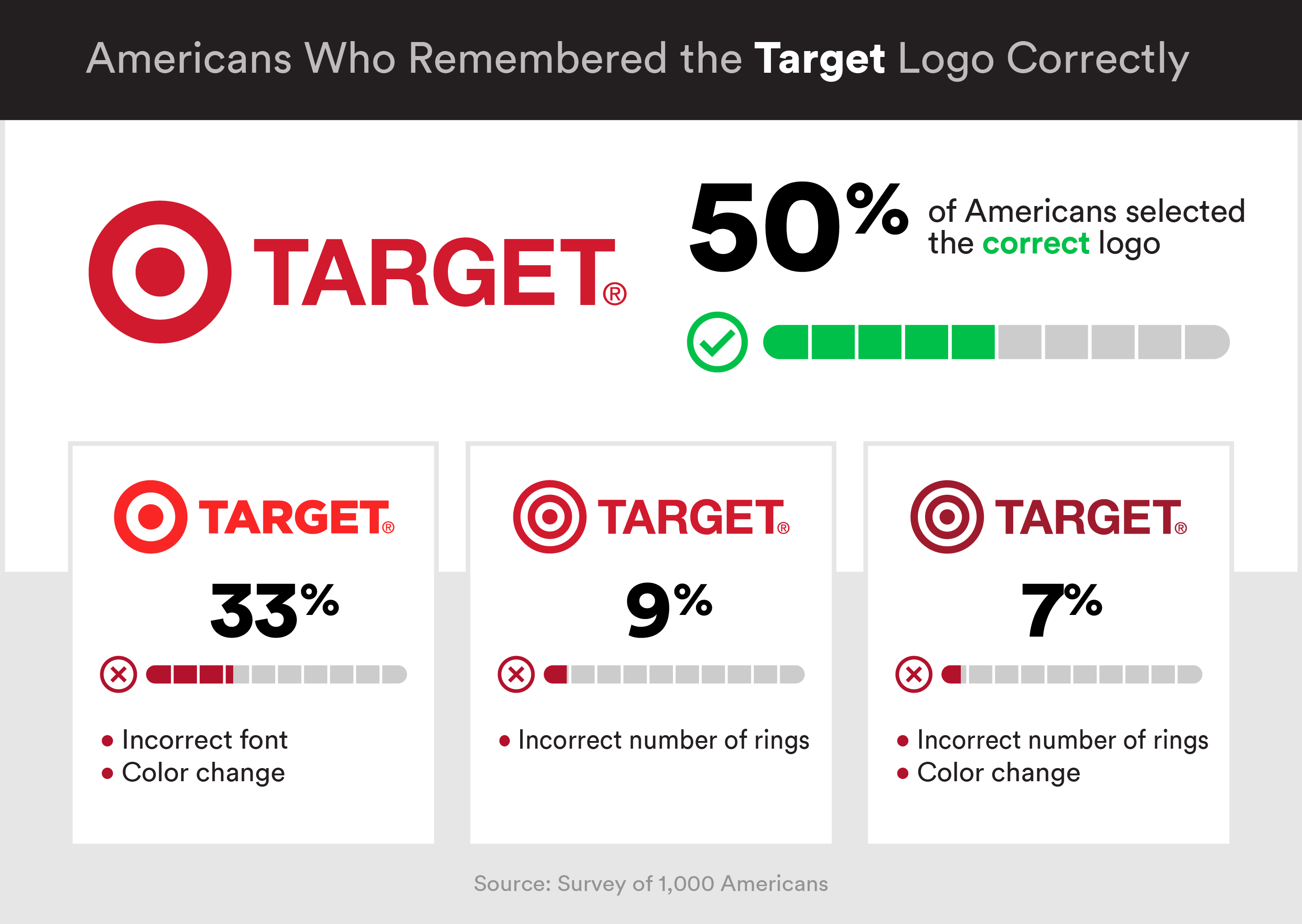
Before you put in too much time and money into your rebrand, consider this recent brand logo study from Wikibuy and what it says about consumer behavior. They took six logos from top brands in technology and retail and surveyed consumers to see if they really noticed the specifics behind their graphic representations. The results may surprise you.
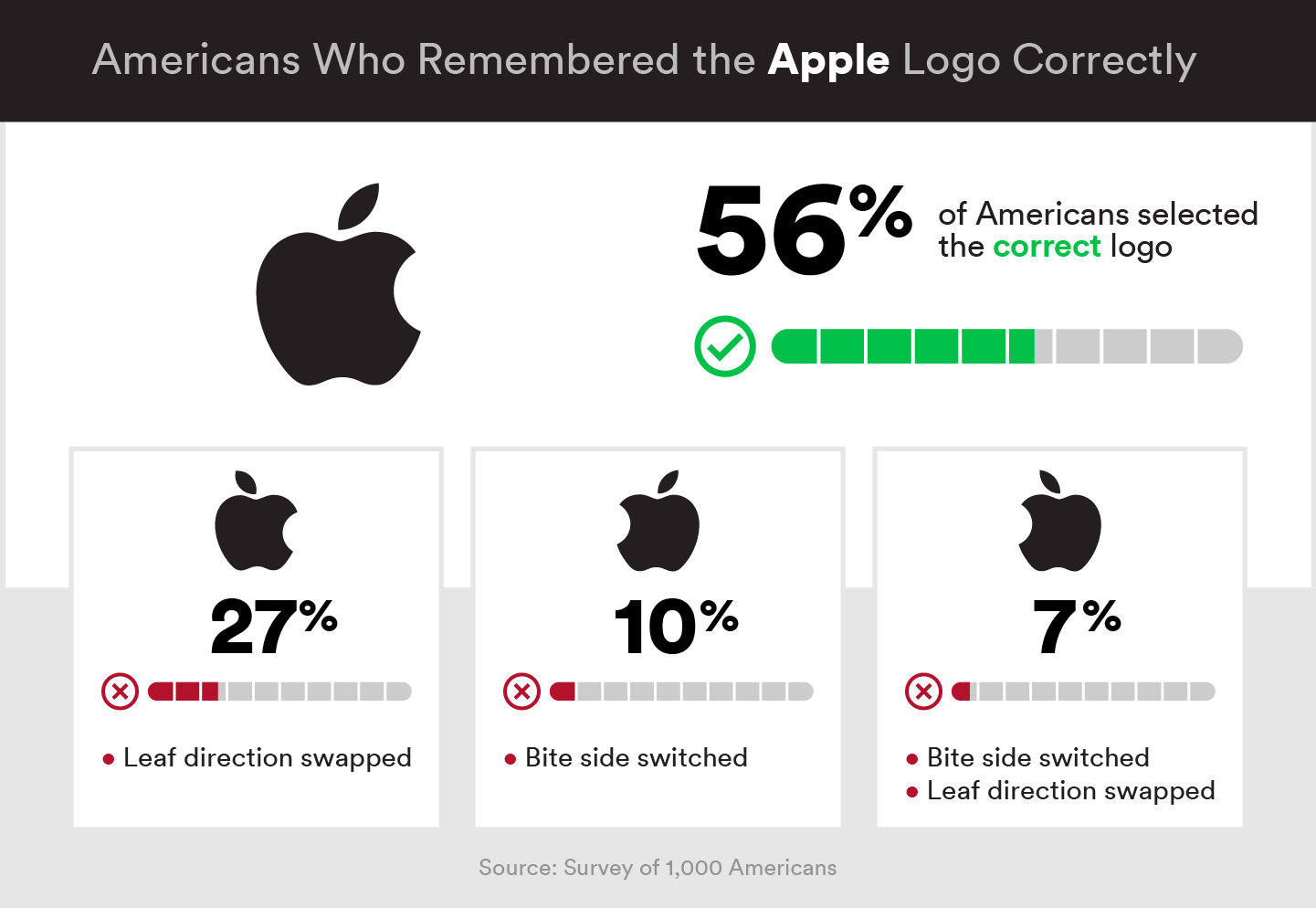
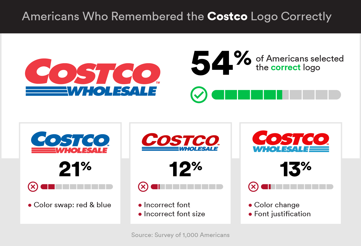
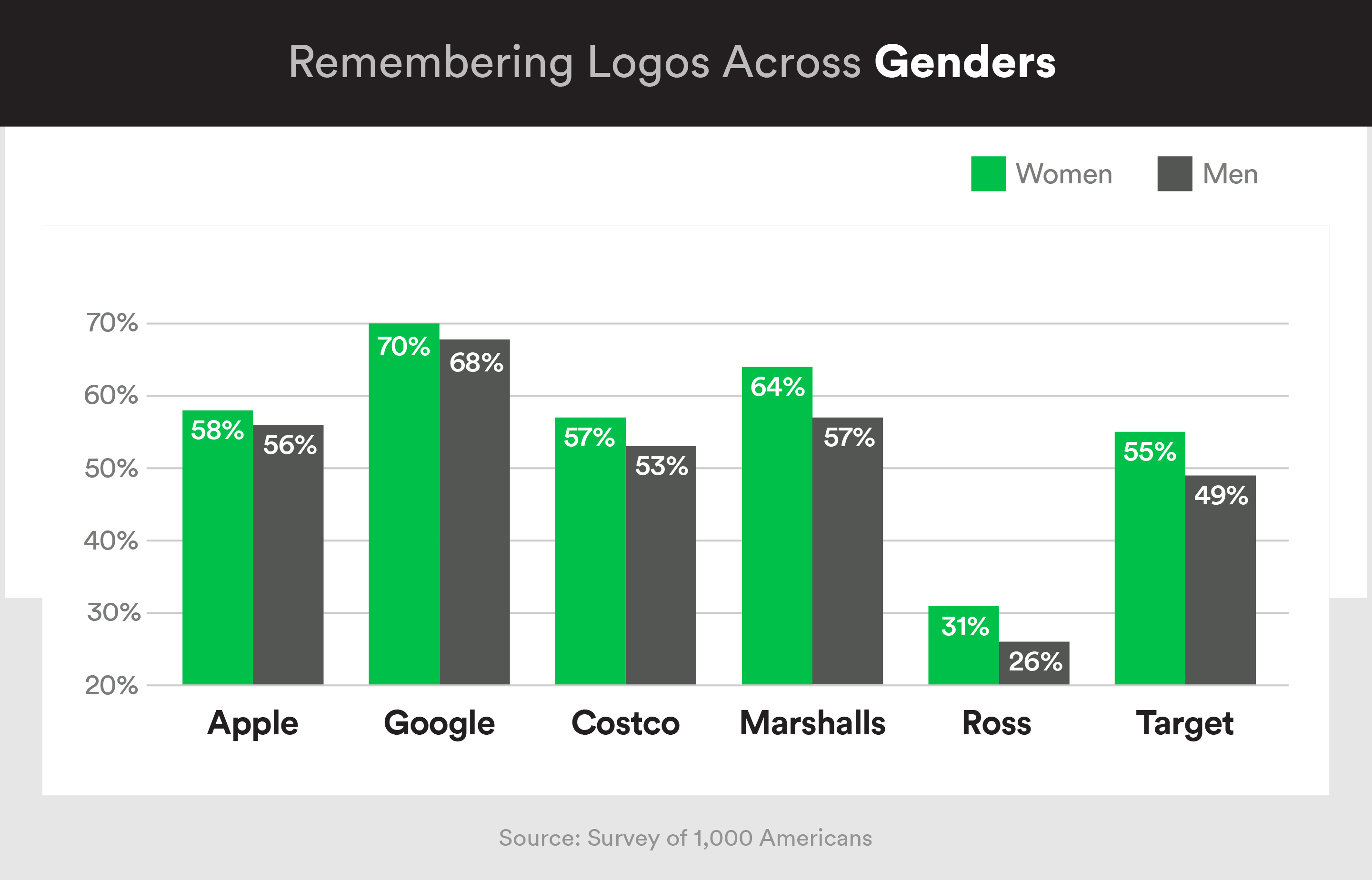
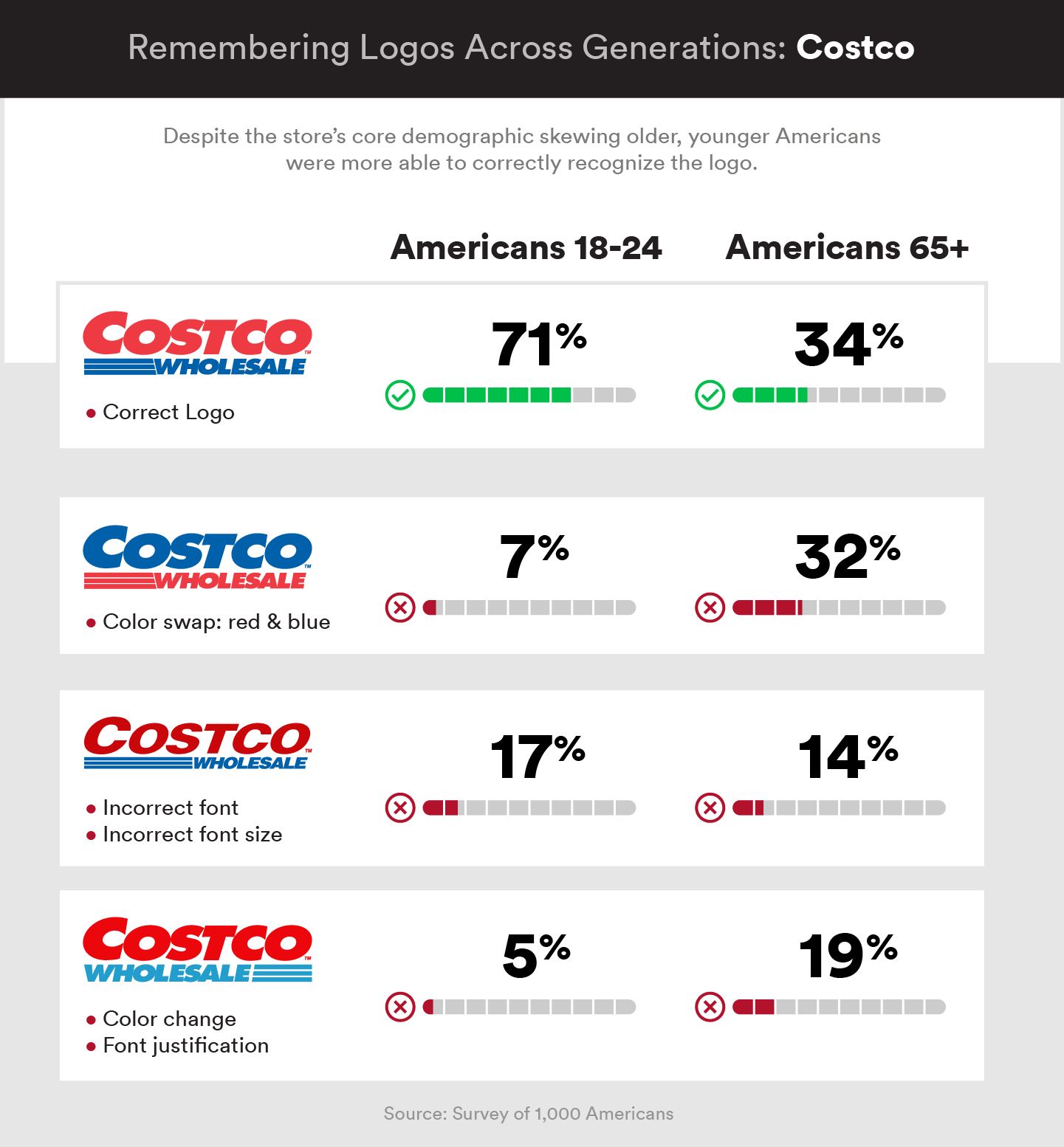
A large percentage of consumers (generally around 50 percent) couldn’t identify the correct logo when compared to logos that were slightly altered for aspects like font and color. For the Costco logo, for example, over 20 percent of consumers didn’t notice when the colors of the words were inverted. The survey also looked at demographics to get a good handle on exactly who notices what part of the branding.
What makes a good logo?
The results of the study suggest that it is possible to evolve to new, fresh and modern looks without losing your demographic or having customers revolt. This demonstrates that a company can adjust a logo slightly — even with colors and fonts, and not significantly confuse target demographics.
Pitfalls to avoid
Of course there have been poorly thought out rebrands in the past. Notably, large companies Gap and Pepsi underwent rebranding efforts that were seen as disastrous. The reason for this seems to point to the idea that customers don’t like rebranding that they don’t understand.
For this reason you must be careful not to rebrand simply for the sake of creating something new. There needs to be an underlying need to rebrand, either a shift in cultural or company focus (like the new Dunkin’ rebrand) or simply a need to evolve from a truly outdated design, that drives the change.
Take a look at some of the company logos below and what consumers didn’t properly identify and you’ll have a better idea of what to focus on for your own efforts.
Written by Luke Fernandez