Ready to level up your 2025 typography? From metallic retro font styles to liquid warped typography, these trending typography techniques are here to seriously liven up your designs in 2025.
Trending typography has never been more eye-catching and OTT than it will be in 2025, with a general move towards 1980s-inspired retro font styles, popping 3D text effects, and plenty of texture, color, and interest.
Read on to discover some mini Photoshop text effect tutorials to recreate some of the typography styles, so you can start using these font trends in 2025.
Take it back to the cyborg style of the 1980s with retro font styles and metallic font effects. These trending fonts are purposefully brash and brazen, with a distinctive vintage look that makes a nod to Blade Runner, making them the perfect match for movie poster designs, nostalgic brand identities, or event flyers.
The concept movie posters for recent horror flick MAXXXINE by Creepy Duck Design offer the perfect type style to emulate, with chunky sans serif lettering, blue and black reflective tones, and an ultra-glossy finish. The 80s never looked so good.

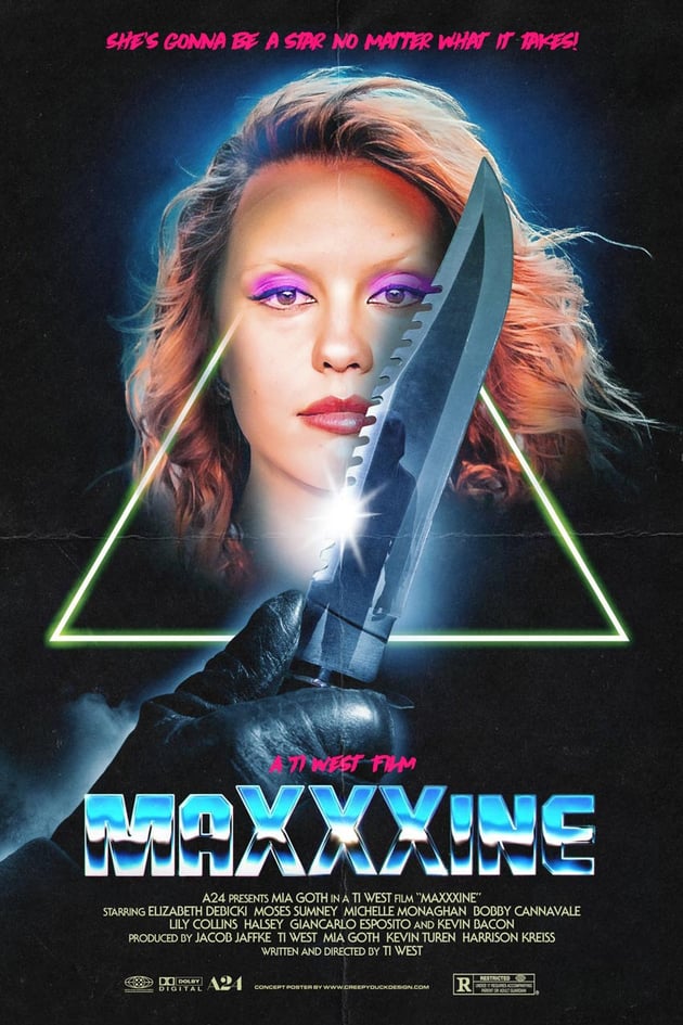
In your own designs, you can easily create a Photoshop text effect with a heavy metal flavor in no time. Let’s take a look.
Step 1
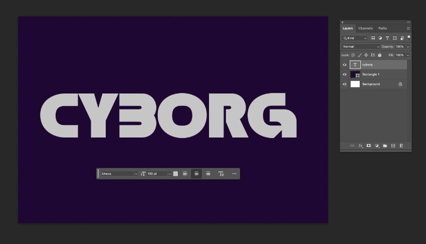
Choose a futuristic font or 80s-inspired typeface to begin your text effect. I’ve chosen Unesa and formatted this with a pale grey color on my Photoshop canvas.
Double-click on the text layer to open the Layer Style panel. Click on Gradient Overlay, and double-click on the Gradient color box to open the Gradient Editor.
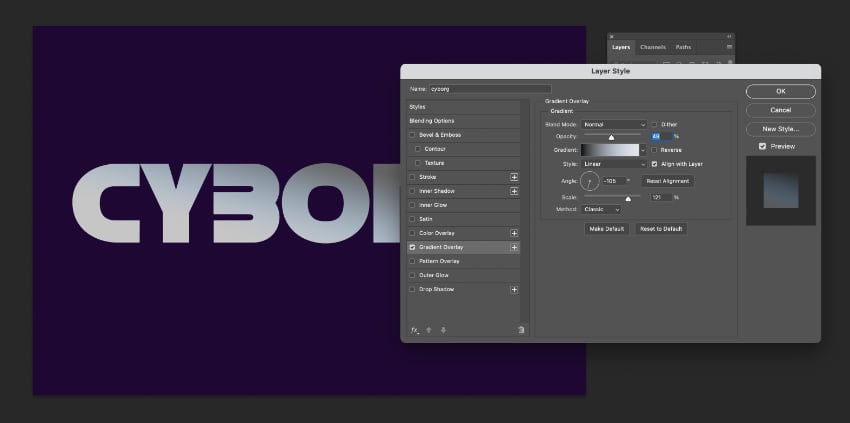
On the slider below, double-click on the bottom-left stop and choose a bright, neon pink color for this. For the bottom-right stop, choose a neon teal or aqua color.
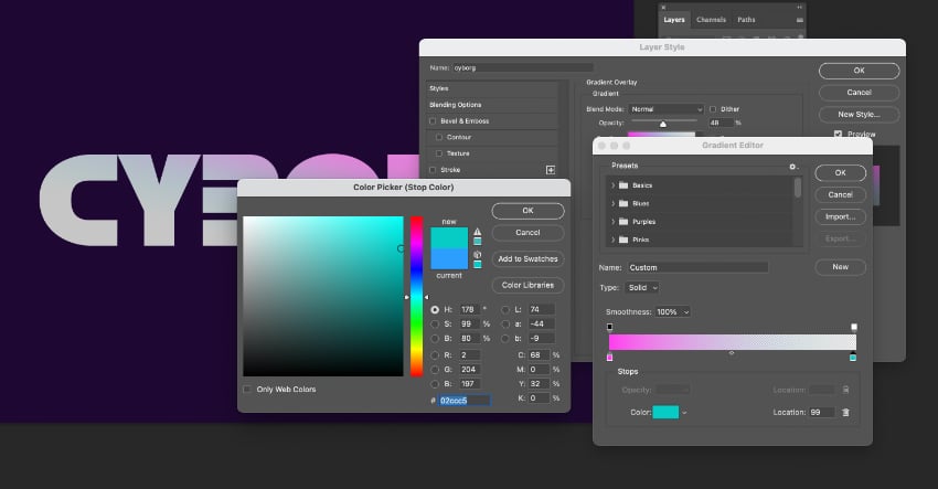
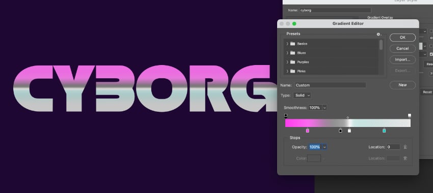
Back in the Gradient Editor, click on the slider to add two more stops close to the center point. The new stop at left-center should be Black, and the one on right-center can be set to White. Click OK to exit the Gradient Editor.
Step 2
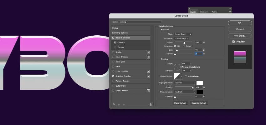
Click on Contour and set this to 100%. Then hop up to Bevel & Emboss, and set the Style to Inner Bevel and Technique to Chisel Hard. Increase the Depth to about 530%.
In the Shading section below, set the Highlight Mode to Screen and Opacity to 100%.
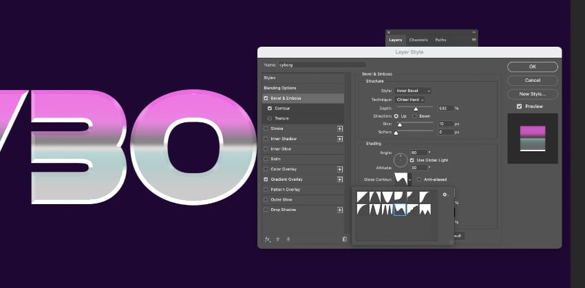
Click on the arrow next to the Gloss Contour image, and experiment with the different contour options. The idea is to bring more sharpness to the gloss, creating a more metallic look.
Step 3
Click on Inner Glow and set the Blend Mode to Normal and Opacity to around 40%.
Under the Elements options, choose Softer for Technique and click on Edge as the Source. Then choose a sharper Contour, like before, to bring a glossy, chiselled look to the text.
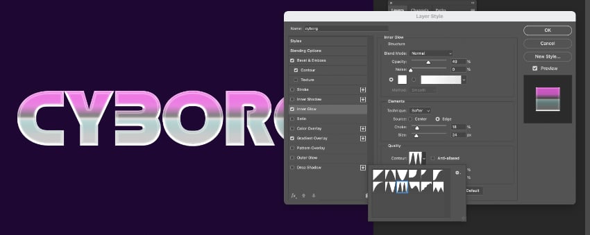
Click OK to exit Layer Styles and admire your quick and incredibly cool metallic text effect!
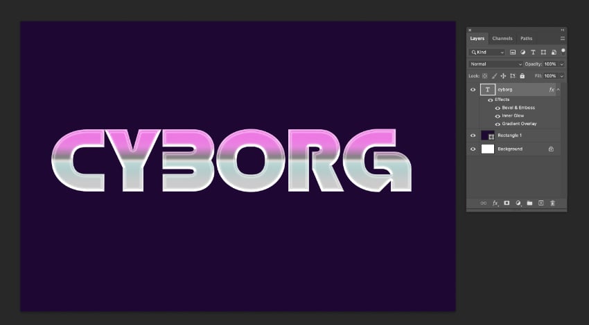
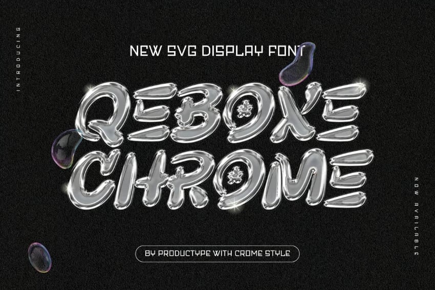
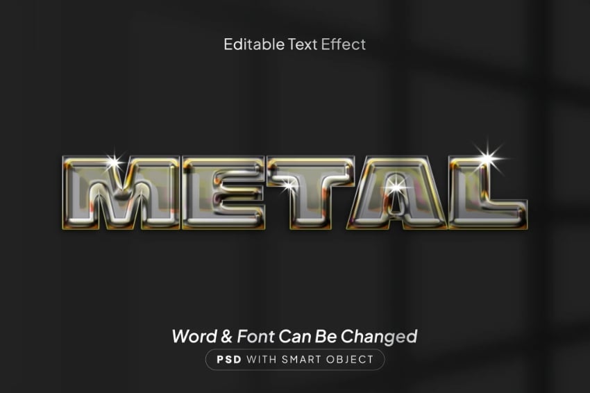
For a quick starting point to your 80s poster designs and other creations, you can alternatively use a ready-metallized text effect like the retro styles below.
Quebox Chrome metallic font
Metal text effect
2. Grainy retro font styles
Noisy, grainy textures have been an enduring trend in illustration for some time now, helping to bring a distinctively vintage look to graphics. Now we’re starting to see this macro-trend spill over into typography, with exaggerated noise combining with saturated pastel colors to tap into 2025’s eighties mood.
Binary Groove 80s-inspired typeface
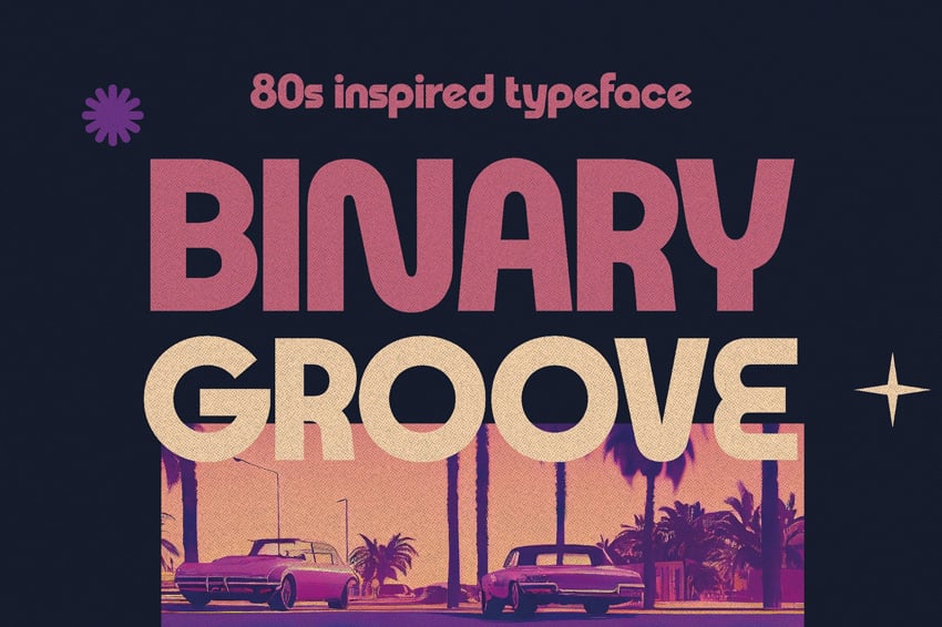
Adding noise texture to your type is a great way to bring more authenticity to retro font styles. Let’s look at how to create this text effect in Photoshop.
Step 1
Start with a base—choose a retro font style with curvy, chunky letterforms that will offer more space for the noise textures to shine. I’m using Retro Star set in funky pastel colors, alongside a cute retro cartoon character on the design.
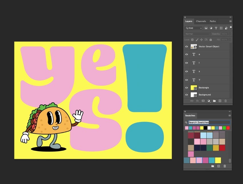
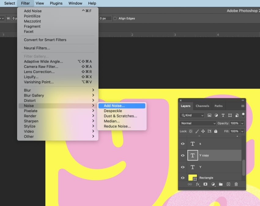
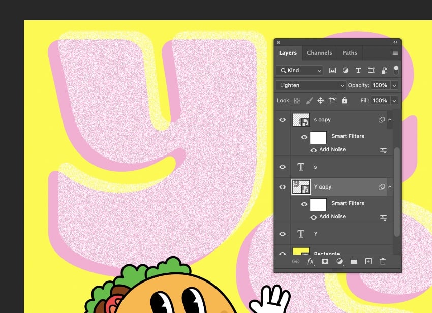
Focus on bringing texture into one letter at a time—you’ll get better results this way. Duplicate the letter layer, creating a copy directly on top. On this second copy, go to Filter > Noise > Add Noise.
Step 2
Set the noise Amount to the maximum level, and make sure Monochromatic is checked, before clicking OK.
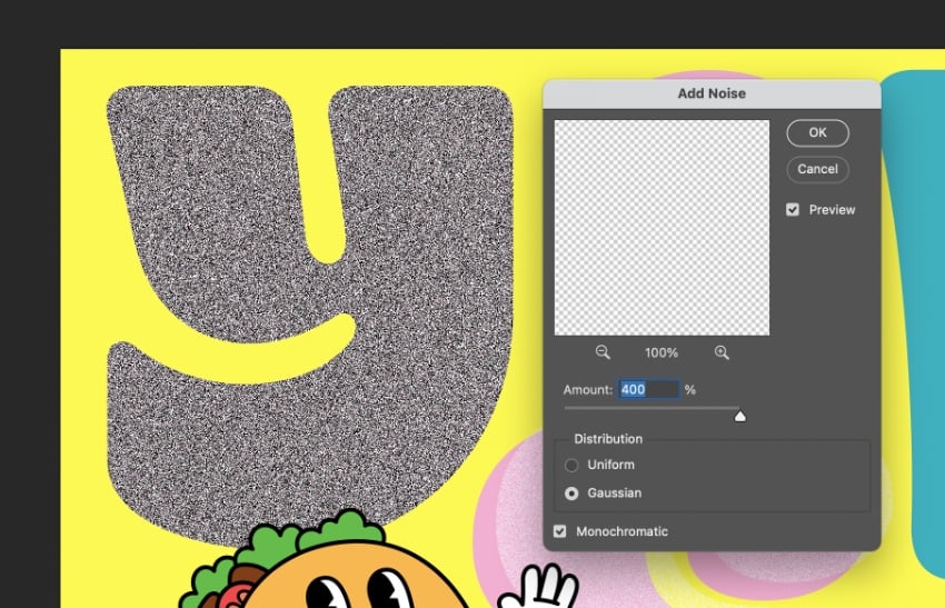
From the transparency options at the top of the Layers panel, set the noisy layer to Lighten. Then move the letter slightly off-kilter to create a retro screen-printed effect.
Step 3
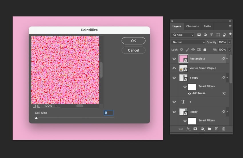
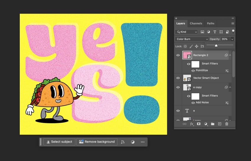
After applying the same effect to all the letters in your design, you can bring an even grainier texture by applying a Pointilize filter to the whole layout.
Create a rectangle shape over the whole canvas, setting the color Fill to a complimentary pastel swatch. I’ve gone for a pale pink shade.
Go to Filter > Pixelate > Pointilize. Set the Cell Size to around 9 for a moderately grainy effect, and click OK.
The final result is a suitably nostalgic and retro text effect, with plenty of trending noise texture.
3. Anti-design typography
Put aside readability for a moment—anti-design embraces imperfections, chaos, and expressive color to create an altogether very different style of typography. A reaction to the clean orderliness of 1960s modernism, anti-design really took off in the early 1990s under the influence of graphic designer David Carson, who favored an off-beat, anti-grid style in his designs for magazine Ray Gun.
Anti-design typography is seeing a well-deserved comeback in 2025, with anarchic type styles and grunge-inspired font trends making an edgy impact on designs for branding, social media, and websites.
Try incorporating trippy, hallucinogenic details and neon color into your designs to nail this trending typography style. Breaking the grid and placing your type sporadically across a poster layout or landing page, as well as distorting letters or using warped text, will also add to the anti-design effect.


The whole point of anti-design is that there are no rules, so it’s a really fun and experimental type style to design with. Nonetheless, there are some ways you can inject your type with an anti-design style in very little time. Let’s create a quick anti-design Photoshop text effect together.
Step 1
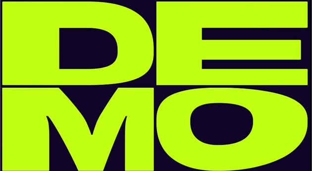
Anti-design is about reacting against accepted graphic design norms, so it gives the style some authentic rebel spirit if you use a font that has a traditional modernist look. This clean sans serif font, Cinemate, is perfect.
Set out your type message in black on your Photoshop canvas, against a neon lime background. It’s not looking very chaotic right now, but we’ll work on that.
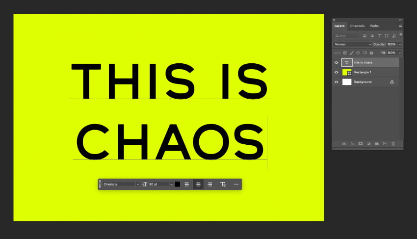
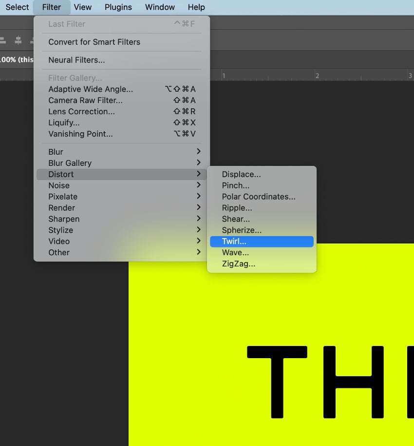
Go to Filter > Distort > Twirl.
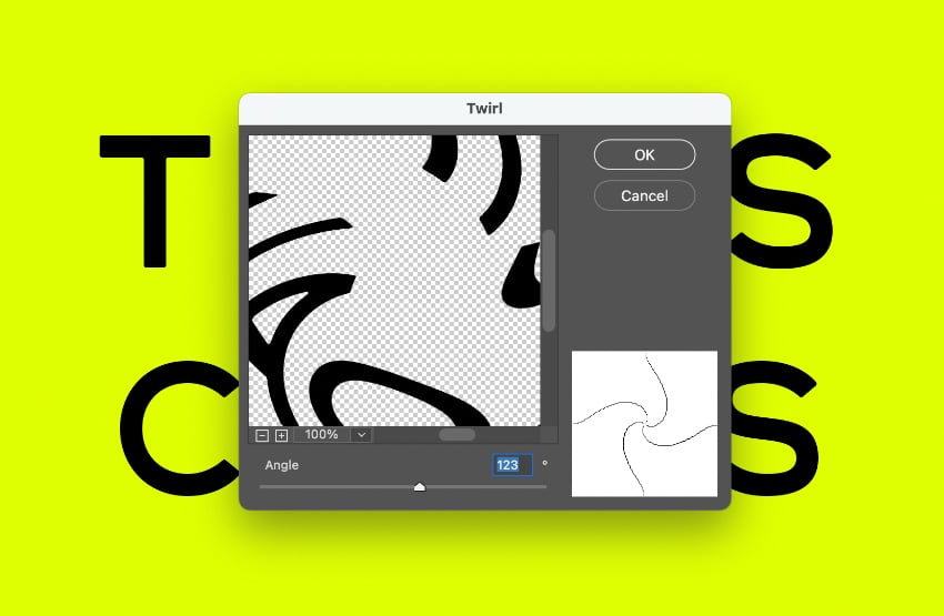
Pull the Angle up to around 120. You don’t want to go too far at this stage to make the text completely unreadable. Click OK.
Step 2
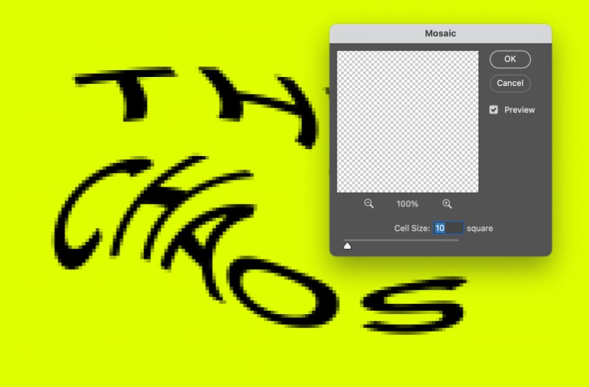
Go to Filter > Pixelate > Mosaic.
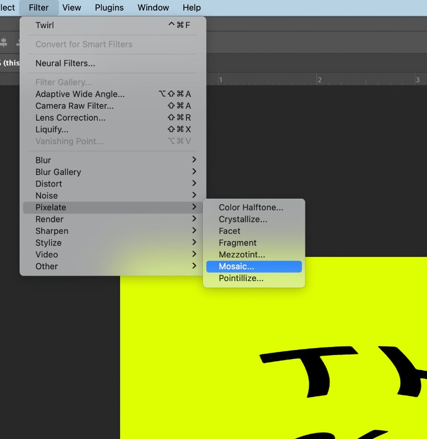
Increase the Cell Size to about 10 square, to bring in some pixelation, and click OK.
Step 3
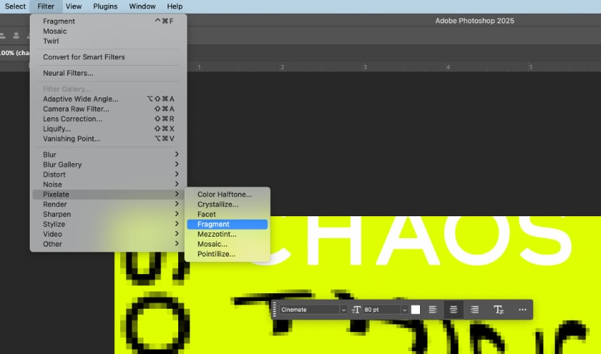
Start dropping in new pieces of text and trying out different positions and effects—the more off-beat and chaotic the result, the better!
On this white text, I go to Filter > Pixelate > Fragment to blur the edges.
Step 4
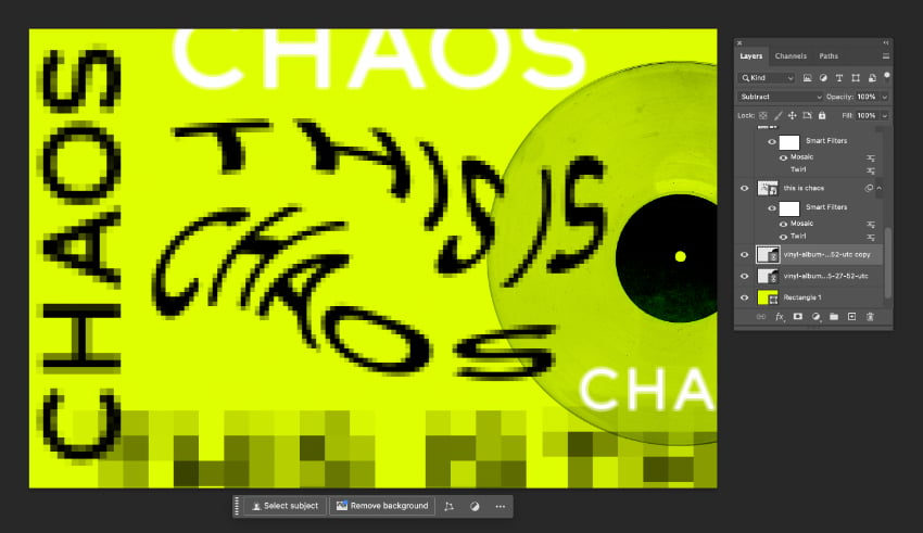
Build up your design like a typography collage, applying different filters and levels of filter to each piece of text. I also drop in a record photo, giving this a Subtract blending mode to add to the grungy, anti-design feel.
4. Warped fonts
Warped typography is one of the quirkiest 2025 graphic design trends, with distorted fonts and liquid letters giving websites and social media posts a dystopian style that makes a nod to AI and cyberhacking.
Mayego warped experimental font
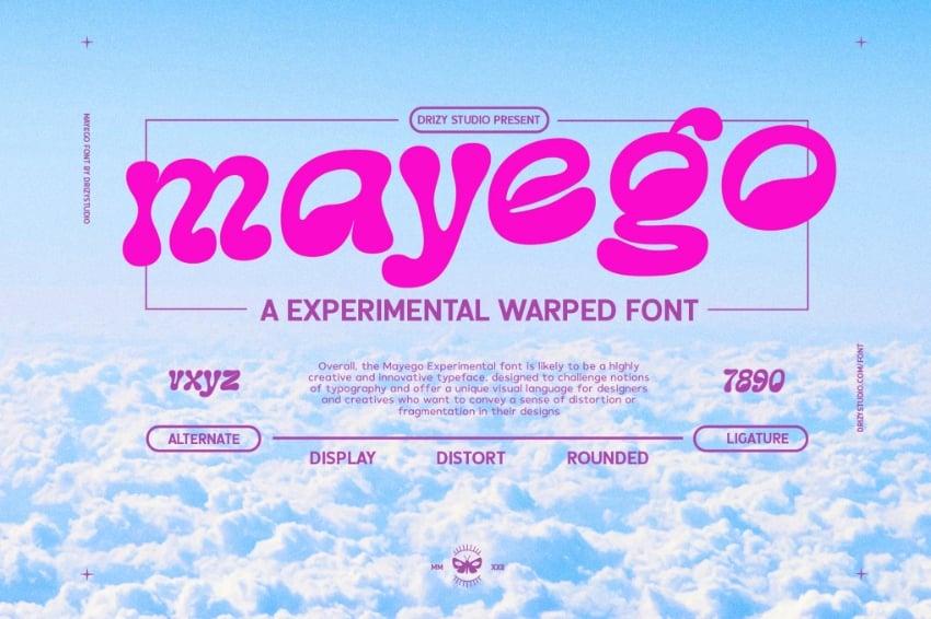
When animated, warped fonts take on an even more compulsively watchable character, moving in flux to create cool and kooky shapes.
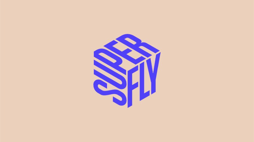


You can find distorted fonts with ready-made quirks, but creating your own warped Photoshop text effects is really easy, and gives you more control over the final result. Here’s how…
Step 1
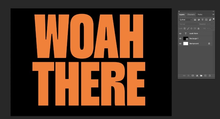
You can distort any text, but you’ll get the most effective results with a bold sans serif typeface. Serif fonts can work but can be less legible when warped. I’ve used Monigue, a condensed display font, and set this in a bold orange on my Photoshop canvas.
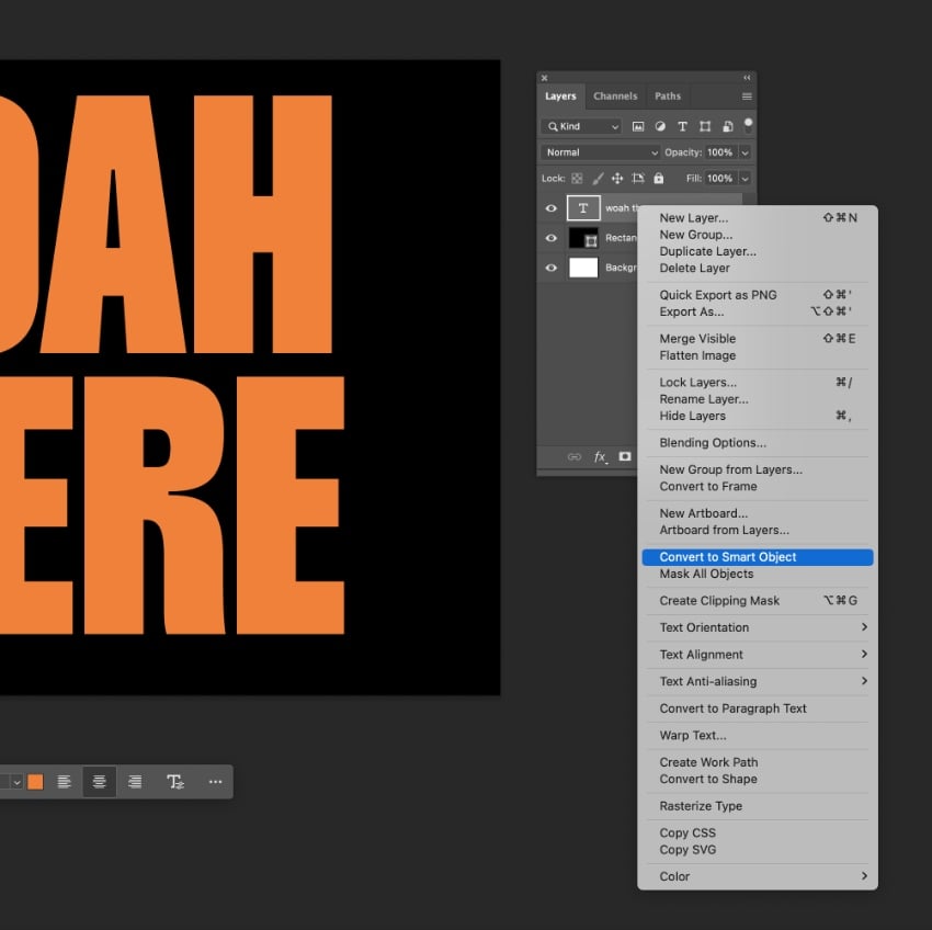
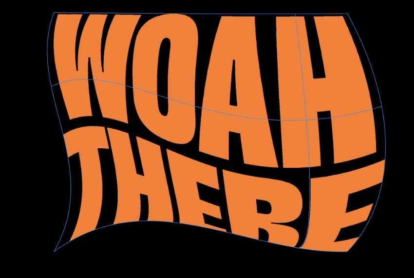
First, Right-Click on the text layer and select Convert to Smart Object.
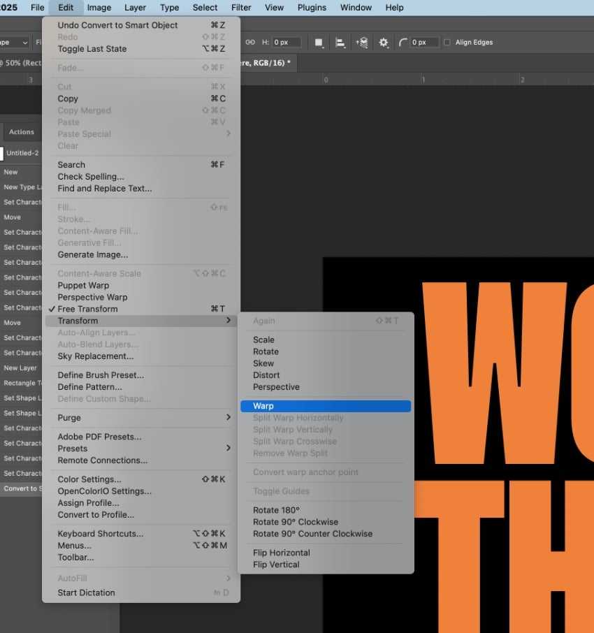
Go to Edit > Transform > Warp.
Pull the nodules to manipulate the grid and create a warped effect.
Step 2
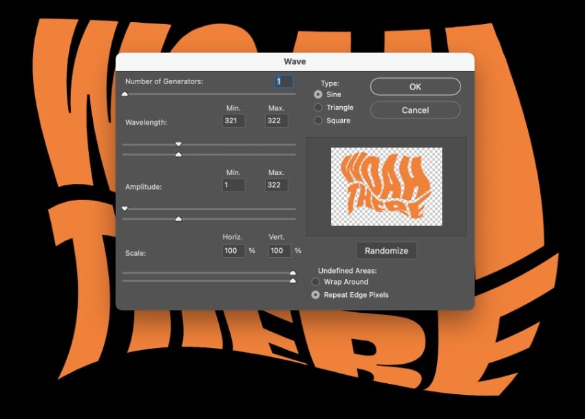
To create an even more distorted text effect, you can apply additional effects. Go to Filter > Distort > Wave and adjust the Amplitude and Scale to bring in more curves to your warped text effect.
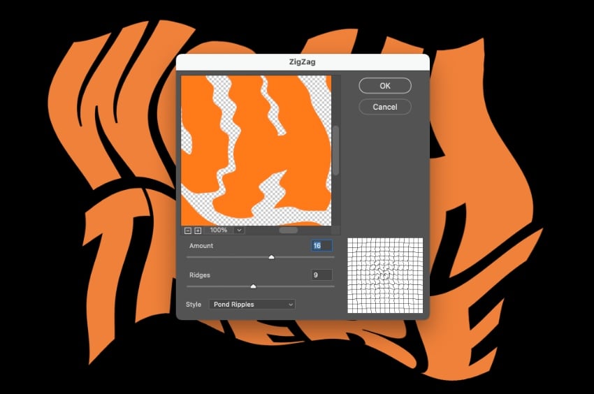
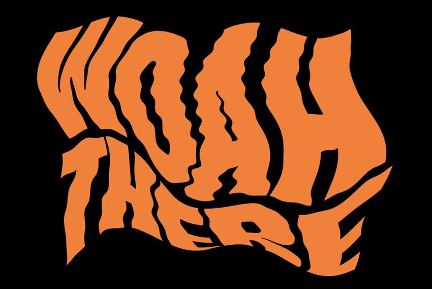
By adjusting the Amount and Ridges in Filter > Distort > ZigZag, you can bring in more texture to the distorted font, creating a really cool result.
5. 3D photographic
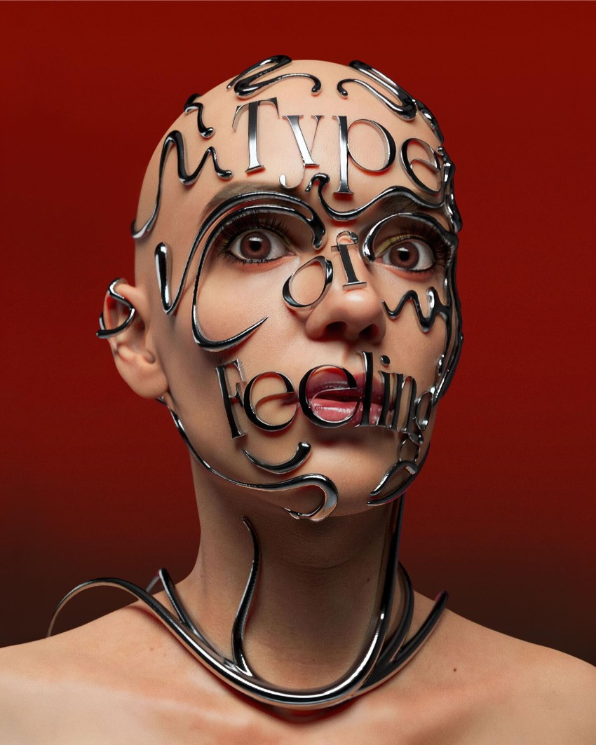
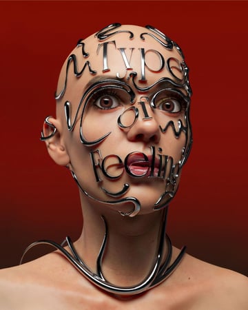
Transform mundane type into an eye-popping text effect with this trending 3D photographic type style. This is a popular style adopted in advertising to give text particular impact, and it’s a great way of tying visuals and type together into one seamless image.

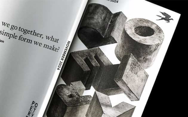
Each 3D photographic text effect is unique, tailored to the particular design or campaign, which makes this trending typography style really special. To recreate the look, you’ll need to get familiar with combining 3D CAD software, for building the three-dimensional text, and Photoshop, for bringing in photographic texture and colour.
Whatever idea you have in mind, make sure that your photographic type is the star of the show—this is a text effect that’s designed to take centre stage on a layout.

6. Cartoon text
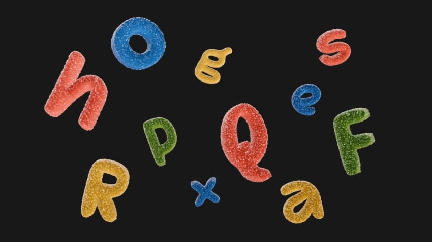
Unleash your inner child with this super fun and bubbly 2025 font trend. Cartoon text effects make your messages pop from the page, and they’re no longer the reserve of pulp fiction. Cartoon type has gone mainstream, with agencies channelling the font style’s optimistic energy into brand identities and drinks packaging.

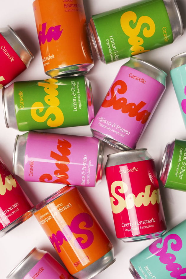
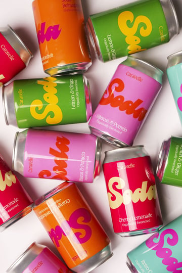
2025’s cartoon text is more polished than nostalgic, so put down the textures and grunge filters to make this text style feel more slick and commercial. Photoshop text effects in a cartoon style are simple to achieve and can be applied to just about any font for instant comic book appeal. Here’s how I like to do it.
Step 1
A good cartoon text effect begins with a fun font! I’ve opted for Sunwing, which has a playful script style.
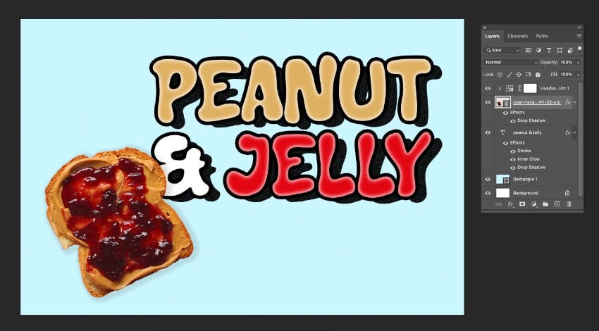
Begin in Photoshop by formatting your text and applying color. The shadow should contrast strongly with the color, so because I’m going to create a black shadow, I’ve opted for contrasting hues like red and white.
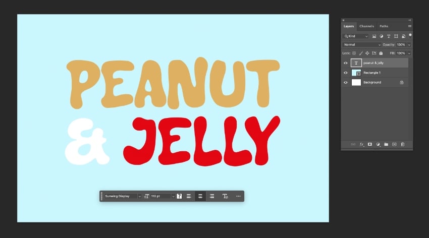
Go to Layer > Layer Style > Stroke.
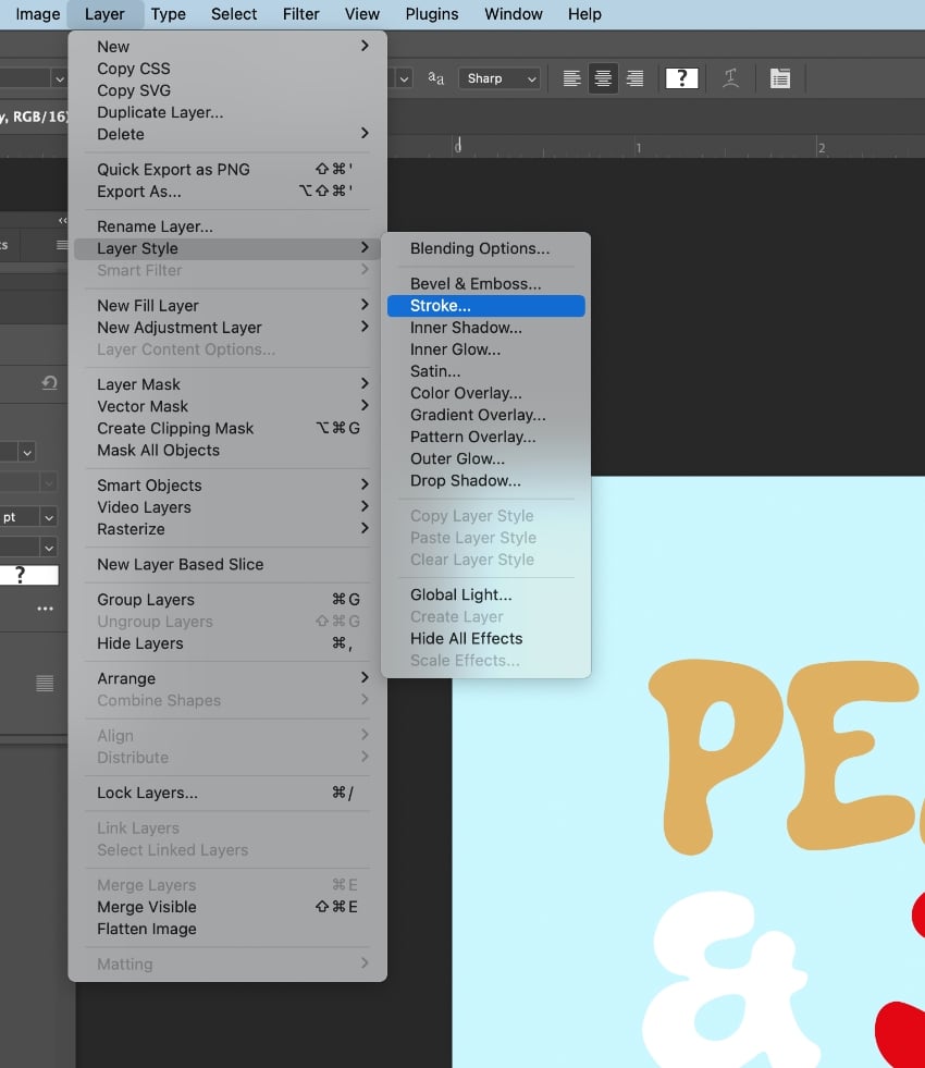
Set the Size to around 13 px, Position to Outside, and Opacity to 100%, with the Color set to Black.
Step 2
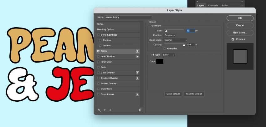
Don’t exit the Layer Style window just yet. Click on Drop Shadow in the left-hand menu.
Set the Blend Mode to Normal and Opacity to 100% to create a solid shadow effect. Increase the Distance and adjust the Angle to ‘swoosh’ the shadow down to the bottom-right of the text.
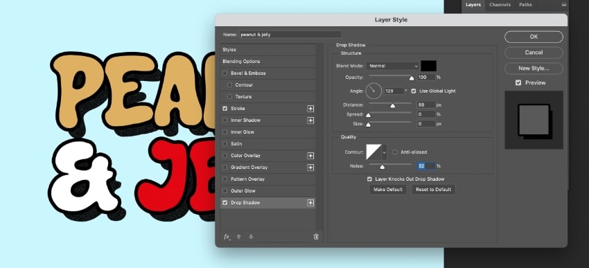
Then click on Inner Glow in the left-hand menu. Set the Blend Mode to Normal and Opacity to around 50%, and change the Color to White. Play around with the options to achieve the amount of shine you want to achieve. The idea is to give the text a cartoonish balloon effect.
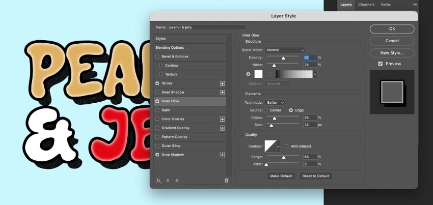
When you’re happy, click OK. I’ve dropped in a photo of a sandwich to complete the design.
Tapping into the best 2025 typography trends
In this article, we’ve looked at six must-know text effect techniques for bringing trending typography into your designs in the year ahead. From the chaos of anti-design to the nostalgic metallic font styles that will help you channel an authentic 1980s look, we hope these font trends and text tutorials have given you some inspiration!
Need more design in your life? Check out our creative graphic design trend predictions for 2025, and don’t miss this bumper selection of 100+ Photoshop effect tutorials to really flex those creative muscles.