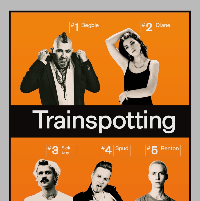
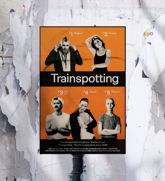
The Iconic Style of the Trainspotting Poster
Released in 1996 and directed by Danny Boyle, Trainspotting is based on the book of the same name by Irvine Welsh. Following the lives of a group of heroin addicts in Edinburgh, the film is a gritty escapade through the poverty-stricken neighborhoods of the Scottish capital.
Designed by Mark Blamire and Rob O’Connor of London-based agency Stylorouge, the original Trainspotting movie poster was intended to remind viewers of train timetables and hazard warnings on medical packaging.
Helvetica was chosen for the headline font, a clean typeface that was commonly used on railway signage and medical products. The stark color palette of black, white, and bright orange also emphasized the timetable theme of the poster campaign. Collage-style photographs of the cast members were added to the posters to create an ensemble effect on the design. Character posters featuring individual actors, such as Ewan McGregor and Robert Carlyle, were also designed as part of the movie marketing campaign.

Today, the Trainspotting poster remains one of the most iconic movie poster designs of the 20th century and is particularly notable for the simplicity of its design, as well as its memorability and gritty impact. A great example of both the minimalist and grunge design styles favored in the 1990s, the Trainspotting poster still looks as exciting and relevant today as it did in 1996.
Read on to find out how to create your own tribute to the Trainspotting movie poster, and make you or your friends the star of your own Danny Boyle film.
What You’ll Need to Create the Trainspotting Poster
The original Trainspotting movie poster uses some hallmark elements of 90s design, such as clean sans serifs and collage photography. To recreate the movie poster, you’ll need to download the following fonts, textures, and images.
Fonts:
Textures:
Character Photos*:
* Alternatively, why not ask your friends to dress up in their best 90s grunge outfits and take some studio shots?
We’ll be using Adobe InDesign to set up the poster layout and Adobe Photoshop to edit the photography.


1. How to Set Up Your Trainspotting Movie Poster in InDesign
Step 1
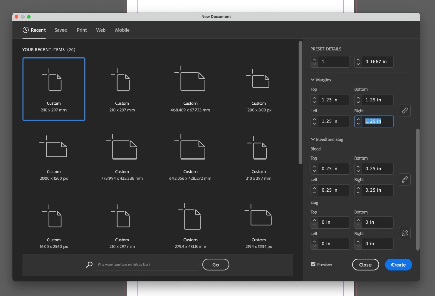
Open InDesign and go to File > New > Document. Set the Width of the document to 27 in and Height to 40 in to create a standard movie poster size.


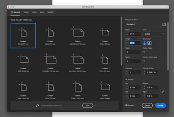
Set the Margins to 0.5 in and add a Bleed of 0.25 in, before clicking Create.

Step 2
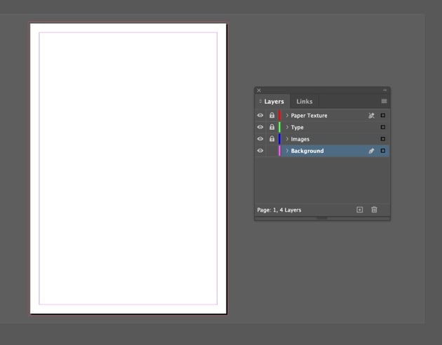
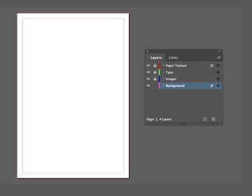
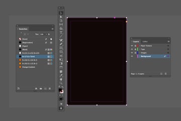
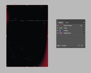
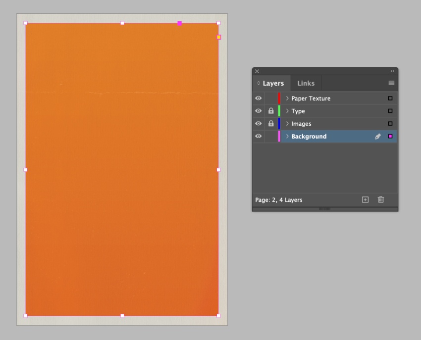
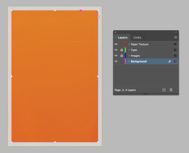
Go to the Layers panel (Window > Layers) and create four new layers, in the order: Background, Images, Type, and Paper Texture at the top.
Lock all of the layers except Background, which we’ll work on first.

Step 3
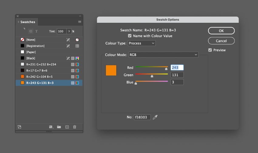
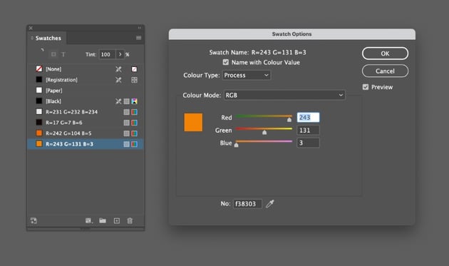
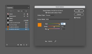
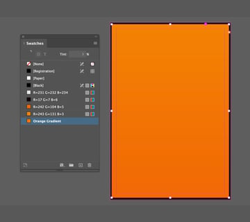
Next, we’ll create some color swatches to use on our Trainspotting poster. Go to Window > Color > Swatches, and choose New Color Swatch from the panel’s menu.
I’m going to create a digital poster for sharing online, so I will create RGB versions of the swatches. If you want to create a poster for printing, simply enter the RGB values below, then convert the Colour Mode of your swatches to CMYK.
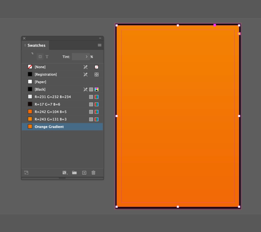
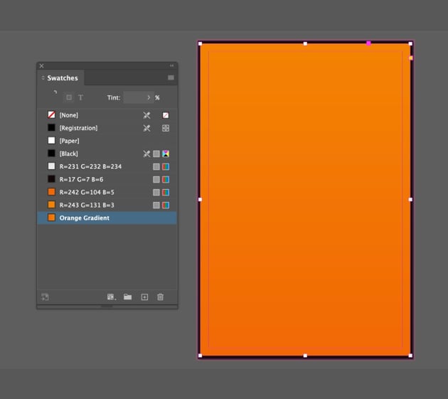
The first swatch is an off-white, R=231 G=232 B=234. Create three additional swatches: R=17 G=7 B=6 (off-black), R=242 G=104 B=5 (orange), and R=243 G=131 B=3 (pale orange).
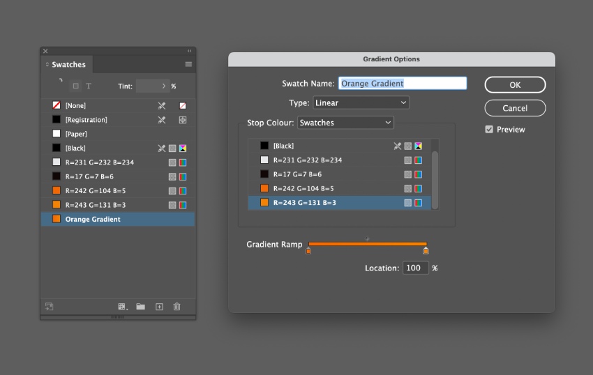
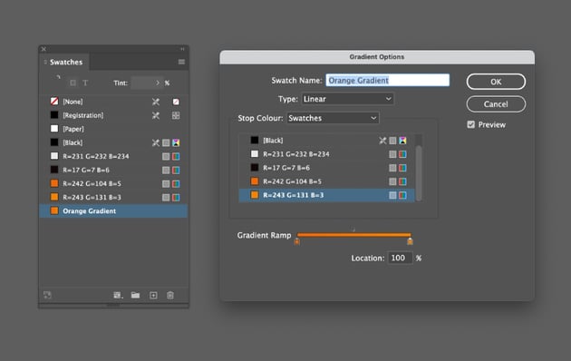
Then choose New Gradient Swatch from the Swatches panel’s menu.

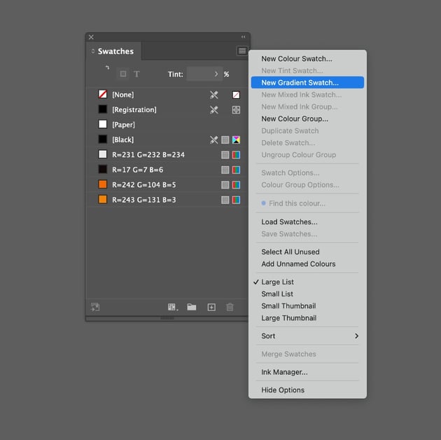
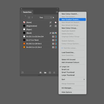
Name the swatch Orange Gradient, and click on the left-hand stop on the Gradient Ramp, setting this to the orange swatch. Click on the right-hand stop and set this to pale orange. Click Add and OK.

Step 4
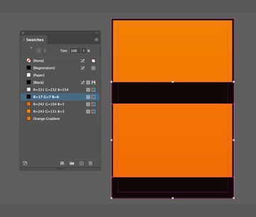
Working on the Background layer, use the Rectangle Tool (M) to create a shape across the whole page, setting the Fill to off-black.
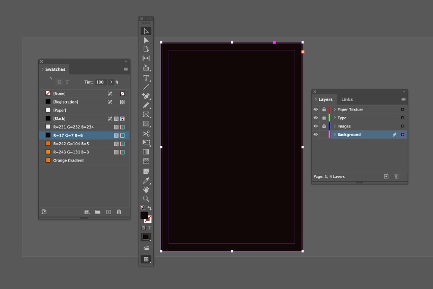
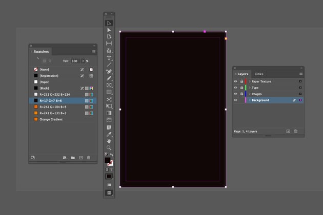
Create a second rectangle shape, smaller than the last, allowing for a small black border around the edge of the poster. Set the Fill of this to Orange Gradient.
Create two more rectangle shapes, narrower bars that can be placed across the bottom and just above the center of the layout. Set the Fill of these to off-black.


2. How to Add Minimal Typography to Your Poster Design
Step 1
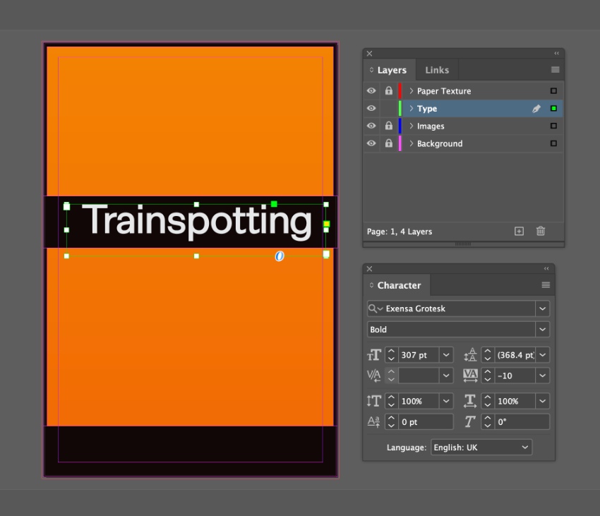
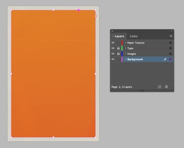
Lock the Background layer and unlock the Type layer.
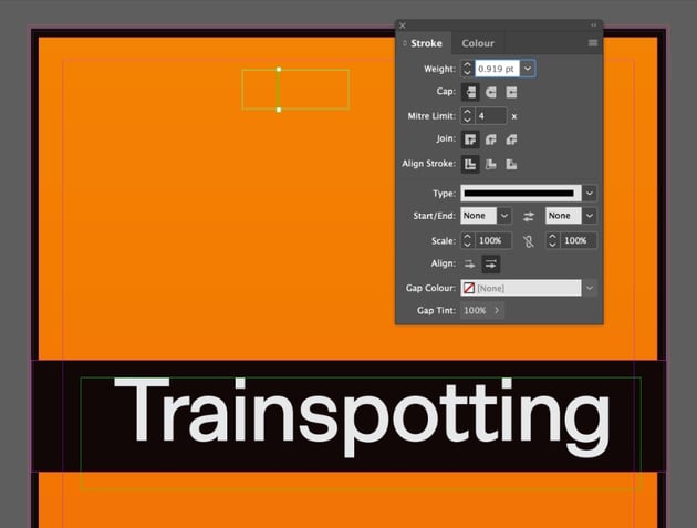
Use the Type Tool (T) to create a large text frame across the top of the central black bar, typing in the movie title and setting the Font to Exensa Grotesk Bold, around 307 pt. Set the Font Color to off-white.


Step 2
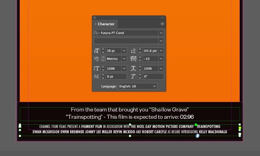
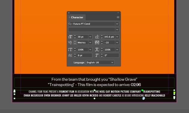
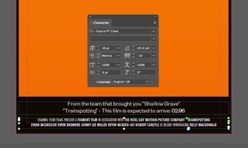
Create two more wide text frames and place these at the bottom of the poster, over the lower black bar. The upper text frame can contain the tagline for the movie, set in Exensa Grotesk.
The lower frame can contain the movie credits. Set these in Futura Condensed or a similar condensed sans serif like Borgund.
Step 3
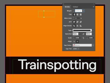
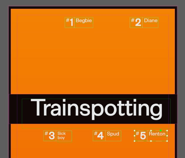
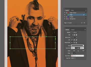
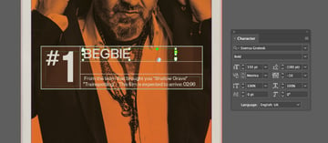
To create the character labels for each cast member, use the Rectangle Tool (M) to create a small rectangle with no color fill and an off-white Stroke Color. Set the Weight of the stroke to around 1.4 pt.


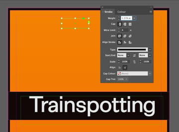
Add a vertical line about a third of the way across the shape using the Line Tool (), setting the Weight to around 0.9 pt.

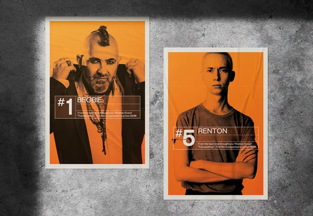
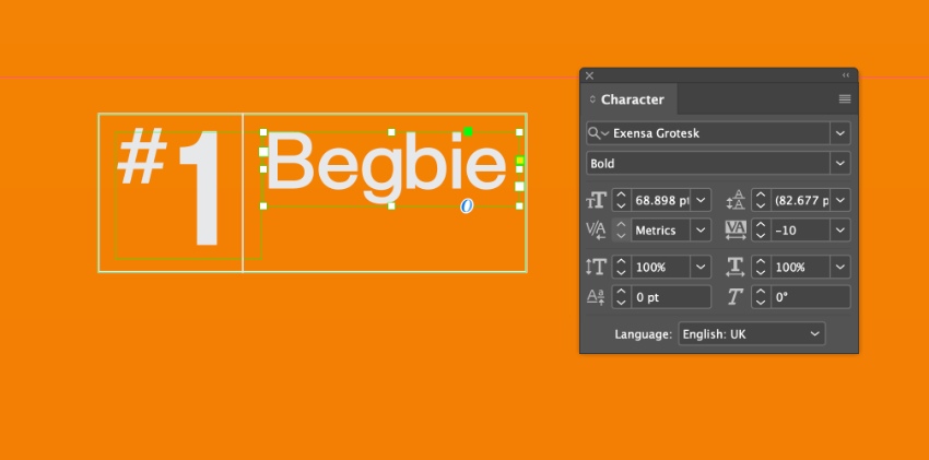
Use the Type Tool (T) to create text frames that fit within each section of the frame, the first one reading ‘#1’ and the second reading ‘Begbie’. Set the Font of these to Exensa Grotesk Bold and an off-white Font Color.

Step 4
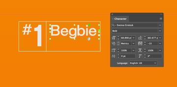
Select the rectangle, the vertical line, and the two text frames, and Right-Click > Group.
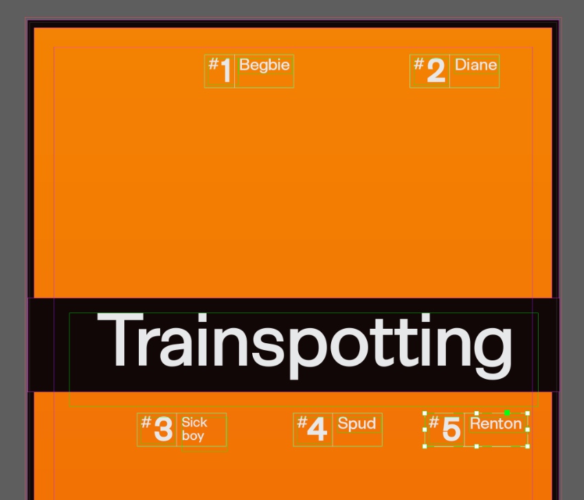
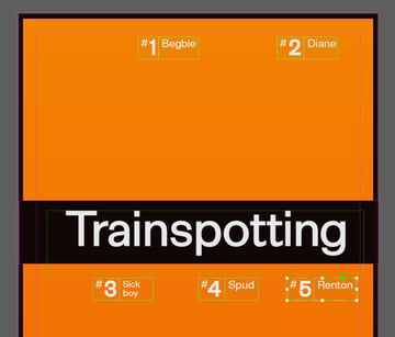
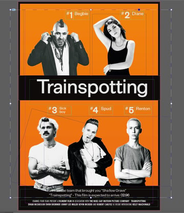
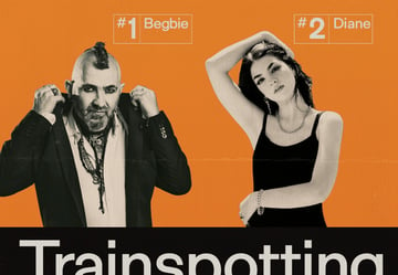
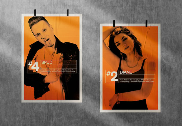
Now you can Edit > Copy, Edit > Paste this group to create more character labels. Scatter these around the poster layout, two above the title and three below, editing the numbers and character names.
3. How to Edit Grunge Photography for Your Trainspotting Poster
Step 1
Once you’ve gathered images for the characters of your poster, you can easily edit these to make them appear more grunge in style. For now, File > Save your InDesign document and minimize the window.
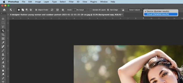
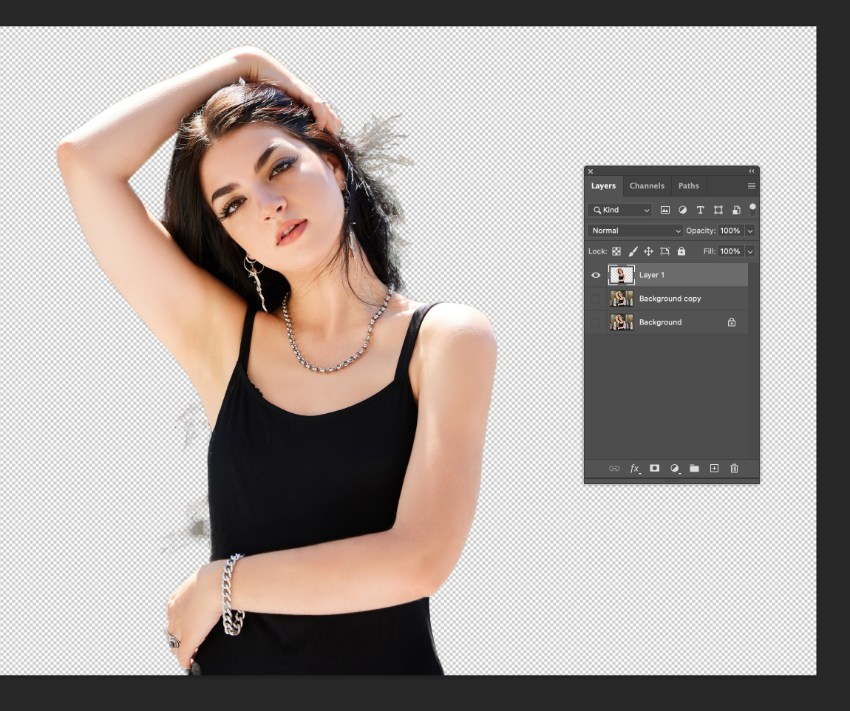
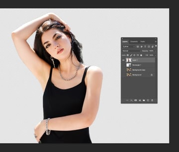
Open your first image in Photoshop, and from the Layers panel duplicate the Background layer. Lock the Background layer, and switch off its visibility.
Select the Object Selection Tool (W) and then click Select Subject from the top Controls panel. When you hover over the subject in your image, Photoshop will automatically select it.


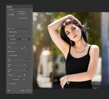
To refine the selection, click on Select and Mask in the top Controls panel. In the Properties window that opens, check Smart Radius and shift the Radius and Shift Edge sliders until you are happy with the result. Click OK to exit.


Copy and Paste the selected subject onto a new layer and switch off the visibility of the layers below.

Step 2
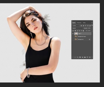
In this image, I want to get rid of any excess hair to try and keep the image looking clean and collage-like. Loop off sections with the Lasso Tool (L) and delete them to keep a strong silhouette.


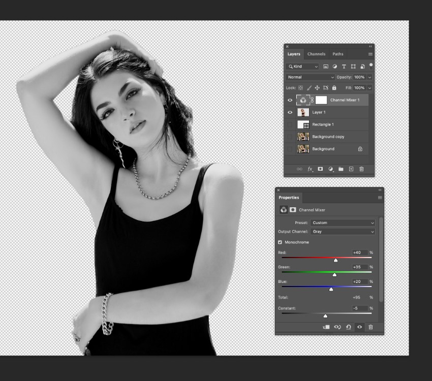
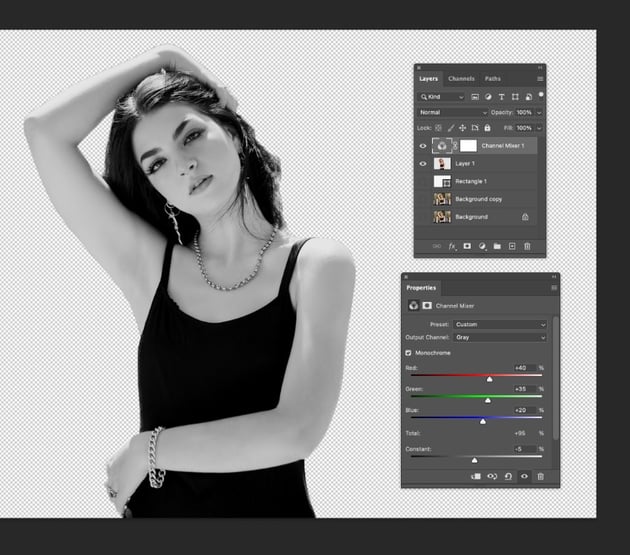
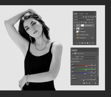
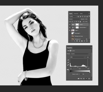
Step 3
Make sure all layers below the top isolated subject are switched off. Then select a Channel Mixer option from the Adjustment Layer menu at the bottom of the Layers panel. Check the Monochrome option in the panel that opens to switch the image to black and white.
Step 4
To improve contrast in the image, add a new Levels adjustment layer. Pull the light and dark sliders inwards to increase the contrast, creating a more black and white than gray image result.


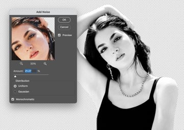
Finally, we can add a bit of vintage texture to the image by bringing in some noise. Go to Filter > Add Noise.
Increase the Amount of noise to around 20% and click OK.


Step 5
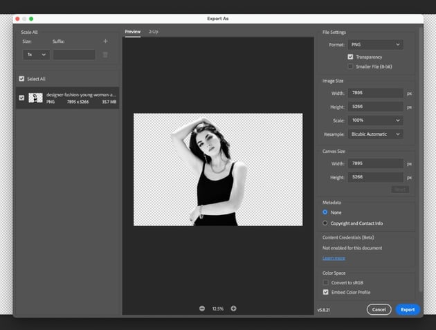
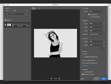
With your image edited, go to File > Export As. Choose PNG from the Format options and make sure that Transparency is checked. Then click Export.
Repeat the process in the five steps above with all five of your character images.

4. How to Populate Your Poster With Trainspotting Characters
Step 1
Return to your InDesign poster, and unlock the Images layer.
Use the Rectangle Frame Tool (F) to create an image frame at the top-left of the poster, above the movie title.
File > Place your first character image, allowing the subject’s torso, shoulders, and head to be visible in the frame.


Repeat to Place all five of your cast characters in image frames around the poster, two at the top and three below the title.
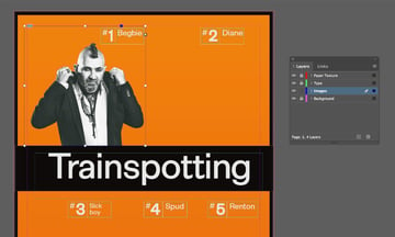
Once you’re happy with the placement of all five images, Right-Click > Group them all together.


Step 2
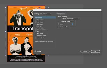
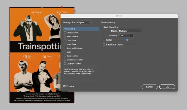
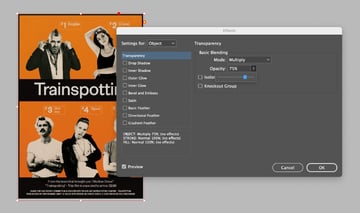
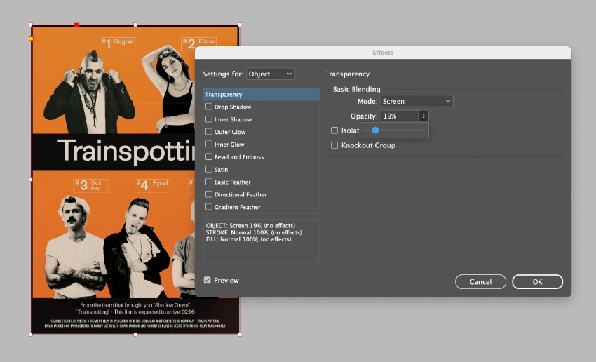
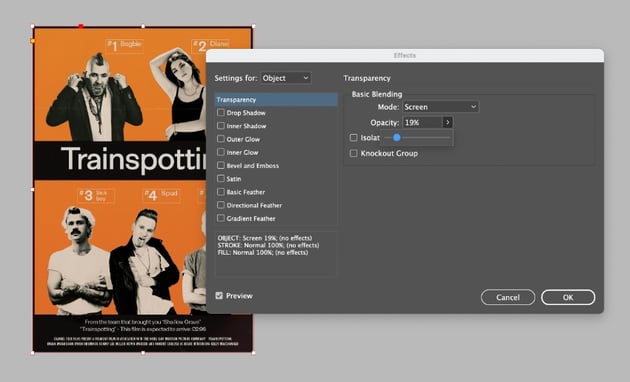
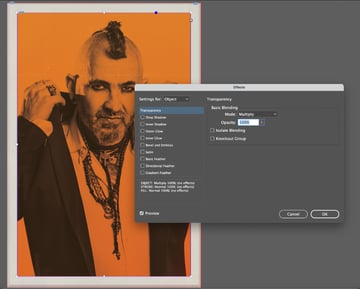
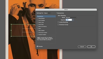
Select the image group and go to Object > Effects > Transparency.
Set the Mode to Multiply and Opacity to 100%, before clicking OK.

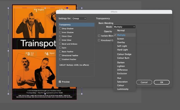

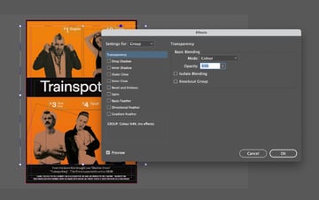
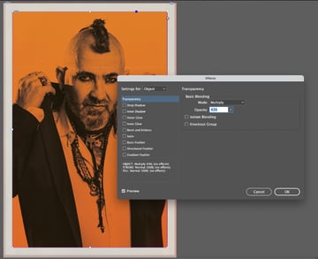
Select the group and Edit > Copy, Edit > Paste in Place. With this second group of images, we’ll apply a different transparency effect. So return to Object > Effects > Transparency. This time, choose a Color Mode, and bring the Opacity down to around 65%.


Edit > Paste in Place again to create a third group of images. With this group, we’ll try to bring more light into the collage. Go to Object > Effects > Transparency again and this time, choose a Hard Light Mode, and bring the Opacity down to around 80%.


5. How to Bring Vintage Texture Into Your Trainspotting Movie Poster
Step 1
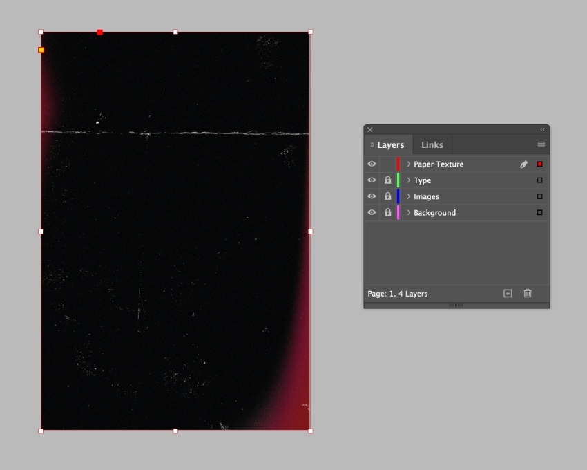
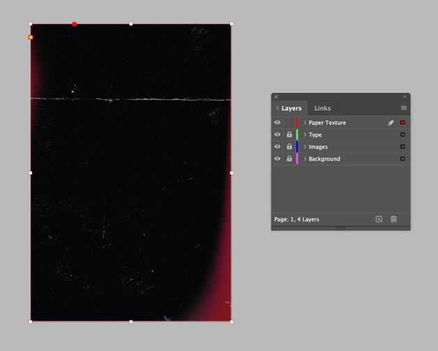
Lock the Images layer and unlock the top layer, Paper Texture.
Use the Rectangle Frame Tool (F) to create an image frame across the page and File > Place one of the textures from the Paper Texture Bundle. Allow the texture to fill the whole page.


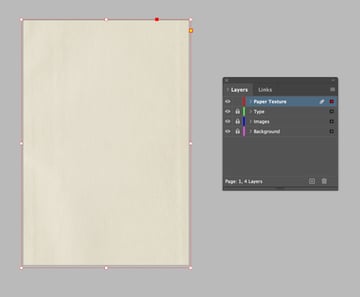
With the frame selected go to Object > Effects > Transparency. Set the Mode to Multiply and Opacity to 75%, before clicking OK.

Step 2
A film texture will give the poster authentic vintage vibes. Let’s layer up a second texture by creating a second image frame. File > Place, choosing one of the textures from the Film Grain Bundle.
Go to Object > Effects > Transparency. Set the Mode to Screen and Opacity to around 20%, before clicking OK.

Layering up these two images will bring more depth and vintage texture to the poster design.


Your poster design is now finished! You can skip ahead to 6.4 for tips on how to export your poster, or read on to find out how to create a dedicated character poster for the cast members.
6. How to Create a Character Poster
Step 1
The good news is that we have already prepped much of the background, color, photos, and textures in our first poster design, and we can reuse these for a high-impact character poster.
Create a second page in your InDesign document from the Pages panel (Window > Pages).
Select and Edit > Copy everything from the Background and Paper Texture layers on your original poster design. Scroll down to the second blank page, and Edit > Paste in Place.
Delete all of the black elements from the Background layer, and pull in the edges of the orange shape to sit on the margin line.
Step 2
Working on the Images layer, create a large image frame that sits neatly within the orange rectangle. File > Place, choosing your first character photo.
When you’re happy with the sizing of the image, go to Object > Effects > Transparency. Set the Mode to Multiply and Opacity to 100%, before clicking OK.


Select the image frame and Edit > Copy, Edit > Paste in Place. For this image, return to the Effects panel and bring the Multiply level down to around 45%.


Step 3
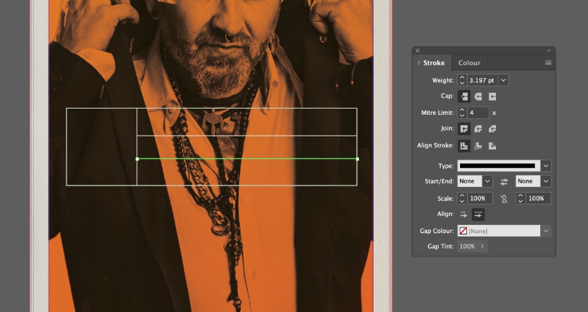
Working on the Type layer, use the Rectangle Tool (M) to create a wide rectangle across the center of the poster, setting the Stroke Weight to around 5 pt and giving it an off-white Stroke Color.


Add a vertical and two horizontal lines, also in off-white, with a slightly narrower Weight of around 3 pt, to create a label effect.


Create a rectangle with an orange Fill over the top of this label design. Right-Click > Arrange > Send to Back.
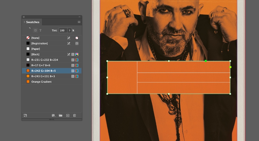


With the orange shape selected, go to Object > Effects > Transparency. Bring the Opacity down to around 20%, and click OK.


Use text frames to fill in the character number, name, and the movie tagline, setting the Font to Exensa Grotesk Bold and an off-white Font Color.


And that’s it! You can now duplicate the page to create further character posters if you wish.
Step 4
Once you’ve finished working on your poster(s), you can export the design as an image ready for printing or sharing online.
For print designs, go to File > Export and choose Adobe PDF (Print) from the Format options. Make sure to include the Bleed on your exported PDF for professional printing.
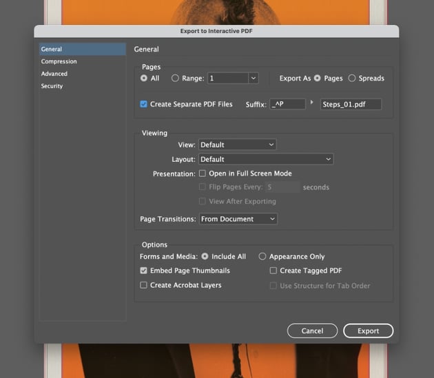
To create a digital image, we can also export the design as an Interactive PDF, which will preserve the vibrancy of the hazard-orange color palette. Go to File > Export and choose Adobe PDF (Interactive). In the window that opens, you can choose to export the posters as separate PDFs by checking the Create Separate PDF Files box.
Your Trainspotting poster is exported and ready to share. Great job!

You Finished Your Trainspotting Poster
In this tutorial, you’ve created a fitting tribute to the iconic grunge style of the original Trainspotting movie poster. You can’t miss this impactful poster design, complete with clean sans serif typography, collage-style photography, and eye-popping orange.


Discover Great Sans Serif Fonts From Envato Elements
A classic example of grunge minimalism at its best, the Trainspotting poster is a design lesson in how less is often always more. At the heart of its successful design is the use of a classic sans serif. For more 90s sans serif fonts, look to our pick of the best Swiss-style typefaces from Envato Elements.
1. Einer Grotesk Font (OTF, TTF, WOFF)

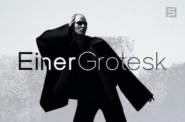
Clean and classic with 90s leanings, Einer Grotesk is the perfect font for pairing with stripped-back monochrome photography.
2. Herz Font (OTF, TTF, WOFF)

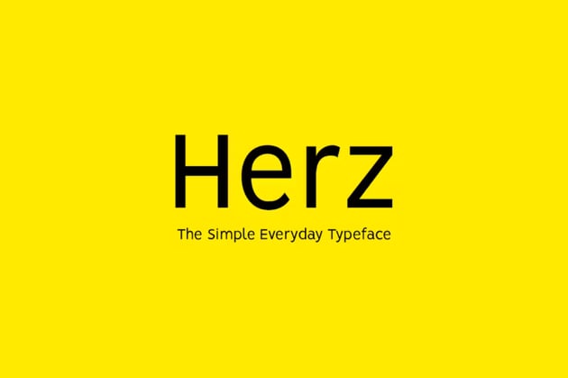

A simple sans serif with slightly heightened characters, Herz is a great all-round font for clean designs on print and web projects.
3. Lorin Font (OTF, TTF, WOFF)

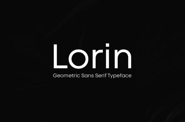

If you’re looking for a Swiss-style sans serif with more softness, Lorin is a great choice, with its rounded characters and highly legible style.
4. Mathelo Sans (OTF, TTF)
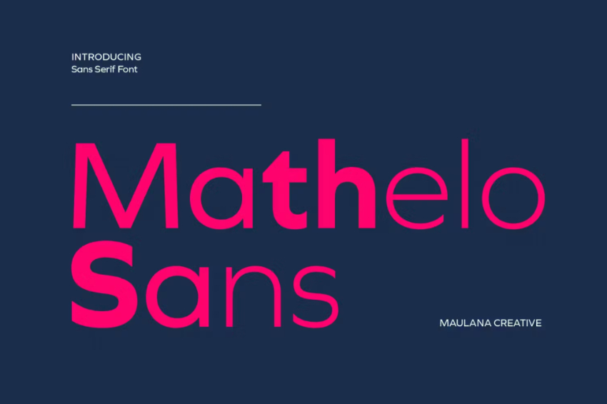

More humanist in style than other grotesk styles, Mathelo Sans is a thoroughly contemporary take on 1990s typography.
5. Visia Pro Font (OTF, TTF, WOFF)
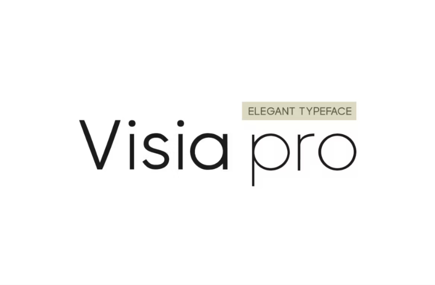


Stripped-back, clean, and elegant, while maintaining a friendly, rounded character, Visia Pro is the perfect font for boosting accessibility and clarity on product packaging or website designs.
Explore More Poster Tutorials and Resources
If you’d like to recreate more iconic posters or learn more about this amazing graphic design area, check out our resources: