Flexbox and CSS Grid are two CSS layout modules that have become mainstream in recent years. Both allow us to create complex layouts that were previously only possible by applying CSS hacks and/or JavaScript. Flexbox and CSS Grid share multiple similarities and many layouts can be solved with both. When to use which is another… Continue reading Which Should You Use and When?
Tag: Authors
Automatic responsive images with client hints
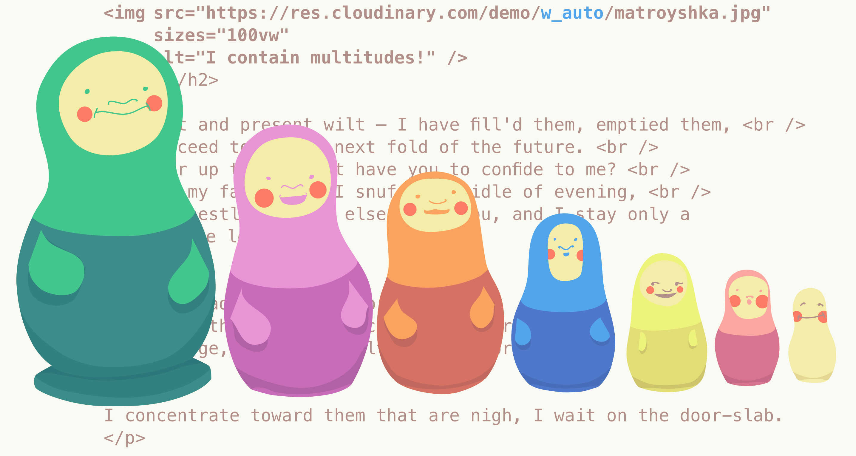
Over time, developers have wrestled with forcing images into responsive layouts. Media queries and fluid grids are constantly employed to achieve visually flexible images. Achieving such flexible images as pointed out by Ethan Marcotte in the seminal first edition of his book is as easy as: img { max-width: 100%; } The image resources being… Continue reading Automatic responsive images with client hints