Flexbox and CSS Grid are two CSS layout modules that have become mainstream in recent years. Both allow us to create complex layouts that were previously only possible by applying CSS hacks and/or JavaScript. Flexbox and CSS Grid share multiple similarities and many layouts can be solved with both. When to use which is another question however.
Industry Recap
The CSS Grid vs. flexbox debate is currently the hottest topic in the CSS community. If you follow industry news you will have seen many great articles appear lately, such as:
- Rachel Andrew blogged on the question already back in 2016 and later continued discussing it in more detail.
- Last month, Chris Coyier started a viral Twitter thread that ended up in a longer article with some cool code examples on CSS-Tricks.
- Michelle Barker also responded to Chris’ Twitter thread by authoring another excellent Grid vs flexbox article in her popular CSS {In Real Life} blog.
- The MDN Community has created some thorough docs on the basic differences between Grid and flexbox, which is currently the best available documentation on the subject.
You can also find many other related blog posts, articles, videos, and discussions all over the web. As the topic is likely to stay relevant in the future, I’d recommend reading some of the articles above and developing your own stance on the question, as nothing is set in stone yet.
Here’s another take.
One vs. Two Dimensions
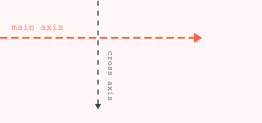
The most important thing to know is that flexbox is one-dimensional, while CSS Grid is two-dimensional. Flexbox lays out items along either the horizontal or the vertical axis, so you have to decide whether you want a row-based or a column-based layout.
A flex layout can also wrap in multiple rows or columns and flexbox treats each row or column as a separate entity, based on its content and the available space.
On the other hand, CSS Grid lets you work along two axes: horizontally and vertically. Grid allows you to create two-dimensional layouts where you can precisely place grid items into cells defined by rows and columns.
This is how W3C wants us to use flexbox and Grid, however practice frequently overrides theory and not everyone is fan of the one-dimensional vs. two-dimensional narrative. For instance, Chris Coyier made the following statement in his aforementioned article:
“I’m not the world’s biggest fan of the “1D” vs. “2D” differentiation of grid vs. flexbox, only because I find most of my day-to-day usage of grid is “1D” and it’s great for that. I wouldn’t want someone to think they have to use flexbox and not grid because grid is only when you need 2D. It is a strong distinction though that 2D layout is possible with grid though in ways it is not in flexbox.”
And, this is how CSS works in real life. In fact, we can create two-dimensional layouts with flexbox (due to its wrapping ability) and one-dimensional layouts with CSS Grid (due to its auto-placement ability), too.
Although flexbox is originally not for building grids, it’s frequently used that way. The best example is Bootstrap 4’s grid system which is based on flexbox. All Bootstrap 4 sites out there makes use of flexbox to accomplish two-dimensional layouts, consisting of rows and columns. And, there are other popular tools such as Flexbox Grid that do the same.
Use Cases
The most common misconception about the two layout modules is that Grid is for full-page layouts and flexbox is for smaller components. This is not the case at all. All the authors mentioned above warn against this approach, as it can seriously limit possibilities. You need to assess each layout individually on a case by case basis to pick the better option.
Focus on Content Placement: CSS Grid
CSS Grid focuses on precise content placement. Each item is a grid cell, lined up along both a horizontal and a vertical axis. If you want to accurately control the position of items within a layout, CSS Grid is the way to go. The W3 docs of the Grid module assert:
“It provides a mechanism for authors to divide available space for layout into columns and rows using a set of predictable sizing behaviors. Authors can then precisely position and size the building block elements of their application into the grid areas defined by the intersections of these columns and rows.”
With flexbox, it’s hard to predict behavior at certain viewports and you can get surprising results. Of course, you can set the widths and heights of flex items or make use of the calc() function but then you lose flexbox’s main appeal: flexibility.
This is not the case with CSS Grid. It has properties such as grid-template-rows and grid-template-columns and utilities like the fraction unit that let you precisely calculate everything. Hence, Grid is especially suitable for creating unusual layouts like broken, asymmetrical, and overlapping layouts.
CSS Grid also makes it possible to create responsive layouts without using media queries. The idea comes from Heydon Pickering who recently published a YouTube video about algorithmic layouts. He introduces a simple Grid technique that makes grid cells wrap and adapt to any viewport sizes:
.container {
  display: grid;
  grid-template-columns: repeat(auto-fill, minmax(15rem, 1fr));
  grid-gap: 1rem;
}
Although the layout wraps based on the available space, it’s still not content-aware like flexbox, as the content inside the items doesn’t flexibly stretch out:
Focus on Content Flow: Flexbox
Flexbox focuses on content flow rather than content placement. Widths (or heights) of flex items are determined by the content of the item. Flex items grow and shrink according to their inner content and the available space. This is how W3C’s flexbox docs explain the goals of the layout module:
“… (flexbox) gains simple and powerful tools for distributing space and aligning content in ways that web apps and complex web pages often need.”
In short, flexbox enables you to allocate space and align items flexibly. Let’s see how Heydon’s grid would look like with flexbox. The following code adds a margin of 0.5rem to each flex item (as flexbox doesn’t have a gap property, we need to use the negative margin hack).
.container {
  display: flex;
  flex-wrap: wrap;
  margin: -0.5rem;
}
.item {
  margin: 0.5rem;
}
As you can see below, the first flex item with the long content stretches out as far as needed:
Of course, you can make fix-width flex items using the width or flex-basis properties. However, if you do so you lose flexbox’s content-awareness which is the main reason for its existence. You can also see above that flexbox treats each row independently. Different rows align flex items differently, based on the amount of text inside of them. There are no columns here and this is not a grid but a one-dimensional layout.
Flexbox also allows you to decide how your content should behave when there’s too much space or not enough space on the screen. I wrote about the topic in detail in my article about flexbox sizing. Using the flex-grow and flex-shrink properties, you can achieve a completely fluid layout that optimizes the allocation of flex items at every viewport size.
There are other typical use cases of flexbox as well, such as centering items, adjusting the last item(s) of lists, sticking the footer to the bottom of the page, and creating responsive menus. You can find even more flexbox usage examples in the MDN docs.
Browser Support
Flexbox has fairly good browser support, while CSS Grid is not supported by IE11- and Edge 15-.


Articles frequently recommend using flexbox as a fallback for CSS Grid, however many developers consider it too much hassle and would rather create their layouts exclusively with flexbox.
But flexbox isn’t perfect, either. It has a couple of issues being collected in the Flexbugs repo on GitHub (with cross-browser workarounds for the bugs). If you bump into an issue while working with flexbox it’s worth having a look at this list, as you might find the solution to your problem.
Prepare for Battle!
The flexbox vs. CSS Grid question doesn’t have a clear-cut answer and depends on many different factors. Don’t stick to one or the other, but always think through which serves your goals better. You can also combine flexbox and CSS Grid to solve complex layouts like this cool card UI:
-
![]()
The “card” pattern has seen great success in recent times, but the way we build them is still limited because of the CSS available to us. Until now, that is….

To better understand your options, check out our flexbox and CSS Grid tutorials, too. We have articles about flexbox alignment, ordering, and sizing, plus a series about the CSS Grid Layout Module.