The flexbox layout module allows us to lay out flex items in any order and direction. Flexbox ordering is, in fact, easier than ordering with floats or CSS grid, even if you might not think so at first. As flexbox is a one-dimensional layout model, as opposed to CSS grid which is two-dimensional, you only have to pay attention to one direction. The rules are also clearly defined by W3C, so you don’t have to deal with the usual mess of floats and clearfixes.
By following this guide, you’ll learn how to use the following flexbox properties for ordering purposes:
flex-directionflex-wrapflex-floworder
Watch the Video: CSS Flexbox Ordering
Ordering Vs. Reordering
When talking about flexbox ordering, we need to make clear the difference between ordering and reordering.
What is Ordering?
When we set up a flexbox layout we first need to define the source order, meaning we have to decide how the axes of the flex container are positioned. I wrote in detail about how flexbox axes work in my guide about flexbox alignment.
In brief, each flex container has two axes: the main axis and the cross axis. The main axis will have one of four directions, and the cross axis will always be perpendicular to that:
- left to right
- right to left
- top to bottom
- bottom to top
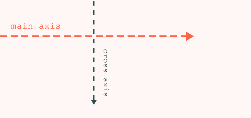

We set up the main axis with the flex-direction property, then we decide how flex items will wrap, using the flex-wrap property. These two properties determine how the browser will lay out the items within the flex container.
So What is Reordering?
Flexbox also lets us manipulate the default source order, effectively reordering, with the help of the order property. Reordering means that we change the visual rendering of the items, while the source order remains intact.
If we use the reordering capabilities of flexbox, we don’t have to change the HTML document structure just for the sake of visual presentation. So, screen reader users (and search engines) can get the content in a logically structured way (e.g. the sidebar won’t take precedence over the main content).
Flexbox Ordering
Flexbox ordering happens with the flex-direction and flex-wrap properties. Flex-direction specifies the direction of the main axis. It can take the following values:
-
row(default) main axis: left to right -
row-reversemain axis: right to left -
columnmain axis: top to bottom -
column-reversemain axis: bottom to top
Flex-wrap defines if flex items are laid out in a single line or wrap to multiple lines. It also controls the direction of the cross axis. It can have three values:
-
nowrap(default) lays out flex items in a single line; the cross axis stands in the default position -
wraplays out flex items in multiple lines; the cross axis stands in the default position -
wrap-reverselays out flex items in multiple lines; the cross axis is reversed
The default position of the cross axis is:
- top to bottom in case of
rowandrow-reverse - left to right in case of
columnandcolumn-reverse
In my previous article about flexbox alignment, you can find four detailed examples (with demos) about how to set up the main axis in four different directions using flex-direction. However, when discussing flexbox ordering, I think it’s more important to know how to use the flex-direction and flex-wrap properties together to achieve the source order we are looking for.
A Quick Code Example
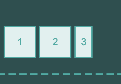
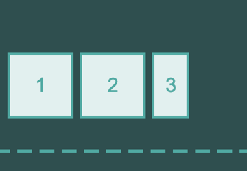
We’ll use a simple code example to see how flexbox ordering works. The HTML here consists of just a few divs:
<div class="container">
      <div class="item item-1">1</div>
      <div class="item item-2">2</div>
      <div class="item item-3">3</div>
      <div class="item item-4">4</div>
      <div class="item item-5">5</div>
      <div class="item item-6">6</div>
      <div class="item item-7">7</div>
      <div class="item item-8">8</div>
      <div class="item item-9">9</div>
</div>
The .container div will be the flex container and the divs with the .item class will be the flex items. We’ll use (almost) the same CSS in all examples, just the flex-direction and flex-wrap properties will change. Here’s how our CSS looks with the row and wrap values:
html {
  background: #fff7f6;
}
.container {
  display: flex;
  flex-direction: row;
  flex-wrap: wrap;
}
.item {
  font-size: 2rem;
  line-height: 1;
  text-align: center;
  padding: 3rem;
  background: mistyrose;
  border: 3px solid tomato;
  color: tomato;
  margin: 6px;
}
Here’s the same example in a CodePen demo:
Ordering With Row and Column
Now, we’ve reached the really interesting part! It’s not too difficult to understand flexbox ordering in theory, but using it in practice can certainly be a challenge. This happens because it’s difficult to see how different variations of flex-direction and flex-wrap compare to each other.
In the embedded pen below, you can see how the flex-direction: row and flex-direction: column layouts work together with different values of the flex-wrap property. Use the form controls to see different combinations.
As you can see, when flex-direction is row, flex items are laid out horizontally, from left to right. When we use wrap-reverse instead of wrap, flexbox starts laying out the items from the bottom, instead of from the top. This happens because wrap-reverse reverses the direction of the cross axis.
When flex-direction is column, items are laid out vertically, from top to bottom. And, when we use wrap-reverse instead of wrap, flexbox starts laying out the items from the right (now this is the starting point of the cross axis), instead of from the left.
Ordering With row-reverse and column-reverse
Now, let’s have a look at how flexbox lays out items when flex-direction is row-reverse and column-reverse.
As you can see in the demo above, flexbox starts laying out the items from the start of the main axis in both cases, just like before. The main axis of the row-reverse layout runs from right to left, so flexbox starts laying out the items from the right. And, the main axis of the column-reverse layout runs from bottom to top, so items start to flow from the bottom of the flex container.
When we use flex-wrap: wrap, flexbox starts to wrap the items from the top when flex-direction is row-reverse and from the left when it’s column-reverse, as these are the starting points of the cross axis in the respective cases.
When we flip the wrapping direction to flex-wrap: wrap-reverse, the cross axis will run in the opposite direction. It will point from bottom to top when flex-direction is row-reverse, and from right to left when it’s column-reverse.
Speed Things Up With the flex-flow Shorthand
CSS also has a cool shorthand for the flex-direction and flex-wrap properties. It’s called flex-flow. To use it, we need to list the two properties after each other in the following way:
.container-1 {
    flex-flow: row wrap;
}
.container-2 {
    flex-flow: column-reverse wrap-reverse;
}
Flexbox Reordering
It’s time to look at things a little differently.
The order property changes the default ordering of flex items that we define with flex-direction and flex-flow. It only affects the visual rendering of the items, so it doesn’t affect the way how screen readers and other non-CSS user agents read the source code.
As opposed to the properties mentioned before, we use order on the flex items, instead of the flex container. It can take any integer value, and its default value is 0.
The following example moves .item-3 to the starting point of the main axis. As all items have 0 as default value, it’s enough to use the order: -1 rule to make it the first item within the container:
.item-3 {
    order: -1;
}
You’ll notice that we can use the same logic to move .item-3 to the end of the main axis. We only need to define a positive order value for it.
Of course, we can reorder as many of these flex items as we wish (though keep in mind that reordering everything probably isn’t the most accessibility-friendly decision ever). The order properties of the different flex items are always relative to each other. Below, you can see how to reorder multiple items within the flex container.
.item-3 {
  order: -1;
}
.item-4 {
  order: -2;
}
.item-5 {
  order: 2;
}
.item-7 {
  order: 1;
}
Ordering and Accessibility
The most important thing to understand about all this is that the order property doesn’t affect the painting, speech, and sequential navigation orders. This means that when we modify the order of our flex items, users of non-visual media won’t experience the changes. For example, people relying on keyboard navigation will still move through the links in the original source order.
This flexbox behavior can come in handy in some cases. For instance, it’s possible to make the so-called “Holy Grail Layout” accessible with the help of flexbox ordering. The Holy Grail Layout is the popular blog layout with a header, a footer, and two sidebars: one on the left and one on the right of the main content.
In this layout, we usually put the left sidebar before the main content in the HTML code. However, from the point of view of accessibility, users of assistive technologies should encounter the main content first. Flexbox is perfect for this. We can place the main content before the two sidebars in our markup. Then, we only need to put the sidebar and the main content into the correct position using the order property:
.sidebar-left {
  order: 1;
}
article {
  order: 2;
}
.sidebar-right {
  order: 3;
}
Flexbox & Writing Modes
Everything said in this tutorial applies to the LTR (left to right) writing mode. Flexbox axes actually follow the document’s writing direction, which can be set up with the direction and writing-mode properties. This is why in LTR writing mode, the main axis runs from left to right when flex-direction is row. In RTL writing mode it runs in the opposite direction, from right to left, and everything else changes accordingly.
That’s a (Flex) Wrap!
This tutorial was the second part of my flexbox series. Make sure you read the first part about flexbox alignment, to learn how to align flex items along the main and cross axes. If you want to know more about flexbox ordering, MDN has a very informative article on the subject as well.
Learn More


