Web tables are antiquated technology. If you don’t know this, welcome to the club that everyone else joined in 2010. Tables as a layout tool are a hack, a corruption of HTML used to create layouts that the code hadn’t thought of yet. When tables were added in HTML in 1996, this was in the earliest days of CSS. While limited positioning tools were available, they were far from robust enough to handle the bursting creativity of the emerging World Wide Web.
Thanks to their stability, HTML tables became the de facto way to design any Web page beyond basic text. Tables were not use to display data, but to enforce grid-based layout patterns, which required fighting the natural desires of tables the entire way. They were poorly equipped for handling the layout of most of the web, and yet nothing better existing. It was a grim time. If you care to experience those halcyon days, ask anyone who stumbled down the almost-finished staircase that we called “the Internet” back then can tell you how bad it was.
The balsa wood frame of HTML quickly broke under the demands of a web cracked open to the common American by AOL and Netscape, despite dedicated and ongoing efforts, as well as substantial market pressure, to offer new tools and functionality as soon as they were available.
Yet despite the barely-papered house that was the World Wide Web in the late 90s, even con artists with non-existing services were raking in major dollars, and there was a push to be ready for financing as soon as possible. The boom was supported by exponential increases in users in the early days of the Internet, but that bustling excitement wasn’t to last. It was a gold rush, and eventually the gold ran out.
The tech bubble popped in the early 2000s and fundamentally changed the nature of the web as a business. It wouldn’t be for many more years that the web as a designed space was changed in kind.
What are Tables Good For
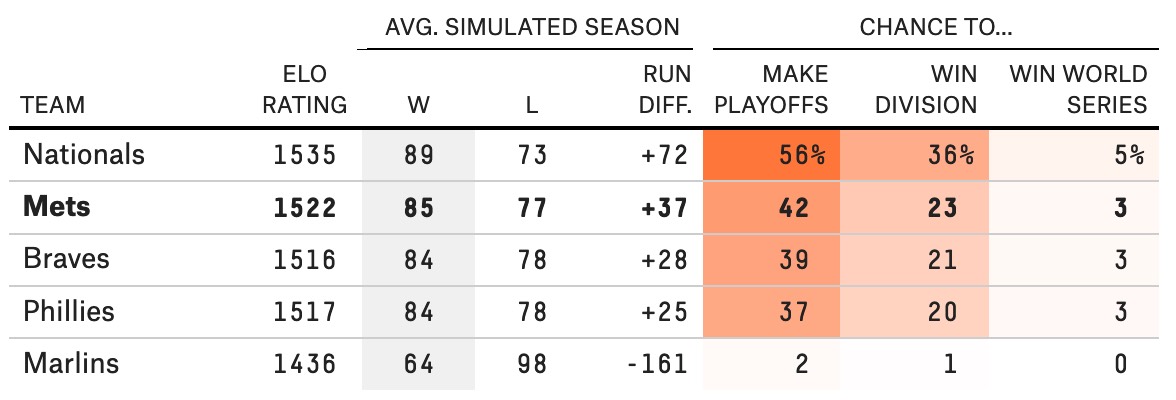
Tables should only be used for tabular data. Tables on the web are good for the same thing that tables in a book are good for: displaying detailed numerical data for a group of samples across multiple measured conditions.
That sounds like a mouthful, but it’s really quite simple. You have multiple samples. You put those samples in multiple “conditions” then measure some attribute. The measurement is the data. Of course, the word “conditions” is enormous vague, but that’s on purpose: these conditions are literally anything the researchers can imagine. The samples interact with the conditions, and the data is collected.
In short, tabular data has two basic qualities:
- All records share the same properties or variables; each sample has data for the same conditions
- Unique records are mapped to multiple variables, allowing data to be organized “by row.” (In general, if you can plausibly consider displaying the data by row, a table is likely a good choice.)
For a deep dive on the type of data best displayed in tables, jump into Jonathan Callahan’s exhaustive analysis on tabular versus relational data.
Tables Are For Multidimensional Data
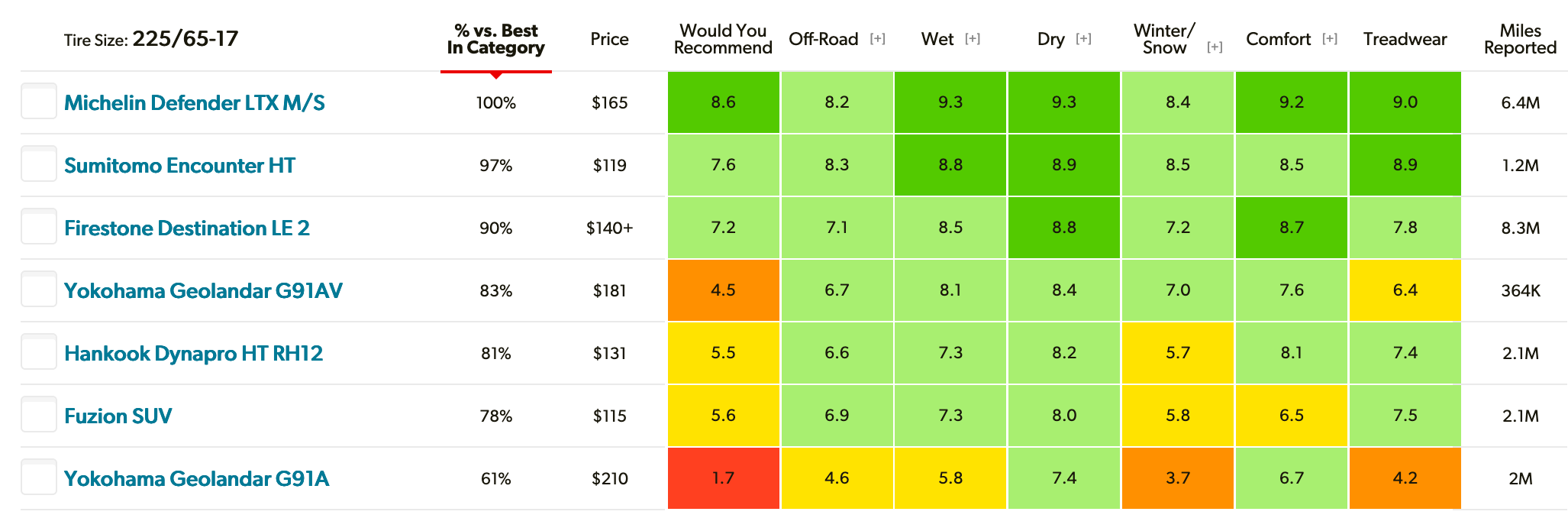
Use tables to display multi-variate change in data. For example, consider a table showing the customer rating for tire performance in various categories. Seven tires are tested and given scores from zero to ten in a variety of categories. Each tire is a unique record, creating it’s own row. The results of that record over multiple variables is recorded as the data.
This data set can be said to be multidimensional: it shows multiple dimensions over multiple conditions. The tires can be considered our records and the various rating categories can be considered our variables. A specific tire, i.e. a record, experiences a given variable, i.e. the weather condition. When these two conditions interact, data is created. That data is shown at the intersection of those columns and rows.
Tables Versus Grid Layouts
Calendars are often described as tables, but that’s backwards: all tables are grids, but not all grids are tables. Calendars are not tabular data. And if you remember your catechism, you’ll know that tables should only be used for tabular data.
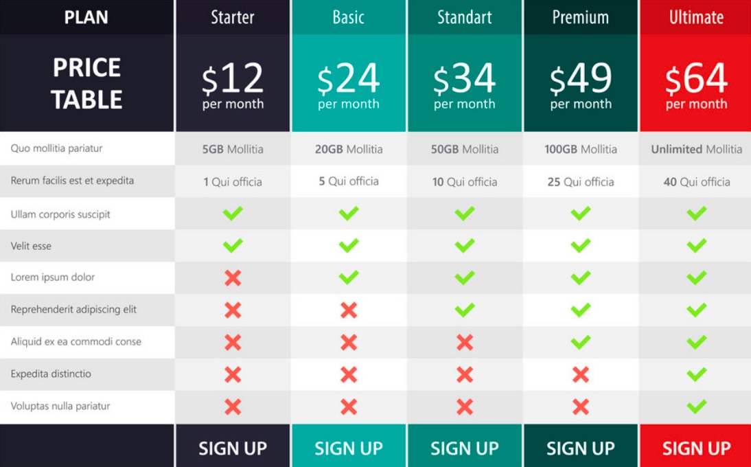
While this does use a grid layout, most pricing pages are actually side-by-side lists than they are tables. While these designs might superficially resemble tables, flexbox is better for these layouts than the <table> element.
But why? Tables are fundamentally excellent at portraying data. They can show detail in ways other data visualizations cannot. However, tables get this level of detail by being bad at displaying literally everything else. Small cells with a single value in each box are where tables are the most useful.
What constitutes data? It’s not just numbers. Not any kind of data can go in a table. A table requires a specific sort of statistical corpus to be the most effective.
What are Tables Bad For?
Tables are not good for data that could be better presented visually. Tables are excellent at capturing fine detail, since they show precise values for each data point. But they can’t do a great job of showing trends. That’s where line graphs excel.
Tables also aren’t great at comparing the relative quantities of things, like inventory, since there’s only one dimension for each sample. This is called single-dimensional data, and it’s better show in a line graph against time or a bar graph against other relevant categories.
Pie charts, though out of vogue, are typically used to describe percentages. But because they don’t allow the user to easily compare the relative size of any two quantities, they’ve become less popular among data designers. Better to use a bar graph, which includes a helpful feature: any two bars can be quickly compared to see which one is larger. Even across large data sets, users can make snap judgements about the relative sizes of two data sets. That’s brought bar graphs into vogue over the recent decade, and you’ll now see them employed even in situations where a table would be better suited.
Conclusion
In short, it you want to show precise values in multidimensional data, a table is your go-to tool. If you what to show change over time use a line graph. For relative magnitude, use a bar chart.
You might also like the following posts:
4 Examples of Bad UI and How to Avoid Them
Building Image-Rich Websites Without the Lag
How to Compress Video For Online Streaming
Author: Alex Fox