Summary:
People rely on menus to find content and use features. Use this checklist to make sure your menus do their job.
Too often, we observe users struggling with menus that are confusing, difficult to manipulate, or hard to find. Avoid common mistakes by following these guidelines for usable navigation menus.
Make Navigation Visible
1. Show Navigation on Larger Screens
This means that the hamburger menu (or any form of hiding the navigation categories under a single menu) is not appropriate for desktop websites and apps. Out of sight means out of mind. The hamburger menu is a necessary evil on smaller screens, where we must balance content and navigation with limited screen real estate. Menus shouldn’t be hidden when you have plenty of space to display them.
Navigation serves roles beyond wayfinding; it helps users to understand the scope of your resources or content. If your navigation is hidden, users lose out on those context cues that tell them who you are and what you do.
2. Put Menus in Expected Locations
Users expect to find specific menus in specific areas of the screen. Make these expectations work in your favor.
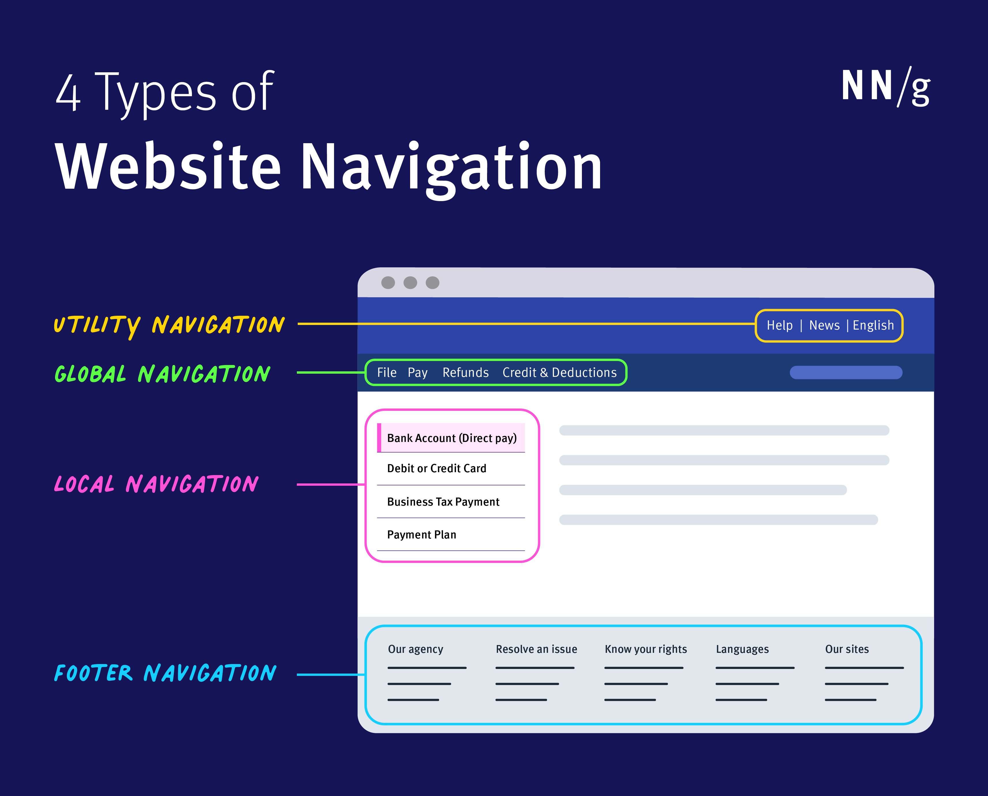
|
Menu Type |
Expected Location |
|
Primary navigation menu |
Websites: Header Applications: Left side of the screen |
|
Above the primary navigation and search, towards the top of the screen |
|
|
Along the left-hand side on desktop websites |
|
|
Bottom of the screen |
The footer should include additional categories for nonprimary personas (such as investor information, job lists, and so forth).
3. Use Link-Text Colors that Contrast with the Background
Menu links need to be immediately distinguishable from their backgrounds to be findable.
It’s amazing how many designers ignore contrast guidelines; navigating through digital space is disorienting enough without having to squint at the screen just to read the menu.
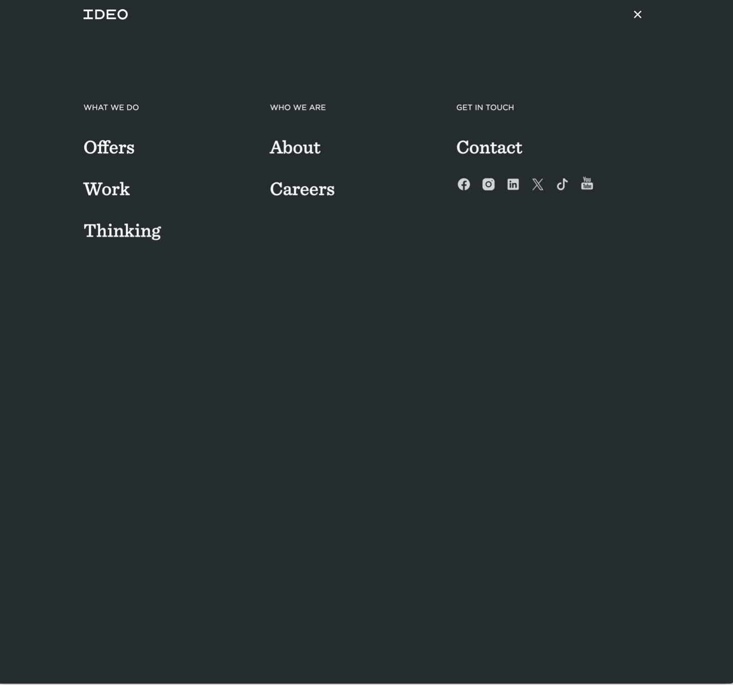
4. Don’t Cover the Screen with the Menu on Larger Screens
On large screens, don’t cover the entire screen when megamenus (or submenus) are open. While visibility and readability of the menu is important, the open menu should not take over the whole screen. An open menu is a dynamic, ephemeral UI element that sits on top of content, rather than a separate page, with its own URL.
Some users will experience temporary disorientation and mistakenly believe that they have accidentally navigated to a new page, rather than opened a menu. Others might have a harder time recognizing where they currently are in the site’s structure.
(Note that this guideline will probably need to be broken on mobile devices out of necessity.)
Communicate the Current Location
5. Indicate the User’s Current Location in the Menu
“Where am I?” is one of the fundamental questions users need to answer to navigate successfully. Users rely on visual cues from menus (and other navigation elements such a breadcrumbs) to answer this critical question.
One of the top jobs that navigation menus have is to orient users, since visitors often don’t enter from the homepage. Failing to indicate the current location is probably the single most common mistake we see on website menus.

6. Provide Local Navigation Menus for Closely Related Content
If people frequently want to compare related products or complete several tasks within a single section, make those nearby pages visible with a local navigation menu, rather than forcing users to ‘pogo stick’ up and down your hierarchy.

Communicate the Available Options
7. Use Clear, Specific, and Familiar Wording for Link Labels
Figure out what users are looking for and use category labels that are familiar and relevant. Menus are not the place to get cute with made-up words, internal jargon, or abstract high-level categorization. Stick to terminology that clearly describes your content, features, or resources.
8. Make Link Labels Easy to Scan
You can reduce the amount of time users need to spend reading menus by left-justifying vertical menus and by front-loading key terms.
9. For Large Websites, Show Several Navigation Tiers in Submenus
If typical user journeys involve drilling down through several levels, mega menus can save users time by letting them skip a level (or two). On mobile devices, sequential navigation can enable users to peruse a deep structure.

10. Use Visual Cues for Long Menus
Increase the information scent of long menus with visual communication (as an optional, additional signal). Images, icons, and limited use of color may help with comprehension (or differentiation) of unfamiliar options and aid scannability. But it’s important that these should be additional supportive elements, rather than replacing clear text labels. Both accessibility and usability demands that we provide clear text options.
Make It Easy to Manipulate
11. Make Menu Links Big Enough to Be Easily Tapped or Clicked
Links that are too small or too close together are a huge source of frustration for mobile users,and also make large-screen designs unnecessarily difficult to use.
12. Clearly Signify Submenus with a Caret or Arrow Icon
This signifier helps to distinguish between main navigation items that lead directly to a new page and. ones that expand into a submenu. Users may not even realize that there is a submenu if the category name doesn’t look clickable (or tappable).

❌ Note that the image-based background behind the menu decreases contrast (and thus readability).
13. Use Click-Activated (Rather Than Hover-Activated) Submenus
Hover is not universally available: users on touchscreens or those who interact primarily through a keyboard do not have access to content hidden under hover. If your menu is exposed on hover, you’ll need to provide these users with a backup way of accessing it.
It’s better to have a consistent, reliable interaction pattern across devices and input modalities. In addition, accidental triggering (and dismissal) of hover-activated menus is frustrating to all users.
14. Avoid Multilevel Cascading Menus; Use Mega Menus or Landing Pages Instead
A simple dropdown menu works well for one-tier navigation but becomes frustrating with two tiers. It is highly inadvisable for more than two tiers, as it increases the risk of accidentally selecting the wrong subcategory or of closing the menu altogether.
If your submenus have multiple levels of submenus, use either a mega menu (that can support 2–3 tiers of information reasonably well), or send users to routing pages with additional options.
15. Consider Sticky (or Partially Sticky) Menus for Long Pages
Users who have reached the bottom of a long page may face a lot of tedious scrolling before they can get back to the menus at the top. Menus that remain visible at the top of the viewport even after scrolling can solve that problem and are especially welcome on smaller screens.
16. Optimize for Easy Physical Access to Frequently Used Commands
For dropdown menus, this means putting the most common items close to the link target that launches the dropdown (so the user’s mouse or finger won’t have to travel as far — since, according to Fitts’s law, the travel time to the target depends on the distance to it).
17. Avoid Innovative or Gimmicky Patterns for Navigation
Attempting to impress your users with cool effects should not be one of your priorities when creating menus. While clients or stakeholders may be temporarily impressed by novel menu designs, users tend to be far more impressed by great content that is attractively presented and easily accessed with familiar menus.

Of course, sometimes new types of menus improve the user experience. (Hamburger menus are a great example of this phenomenon.) Or, sometimes new technologies are so different that some of these guidelines won’t apply. But these cases are few and far between, and most interfaces will be easier to use if they adhere to these principles.