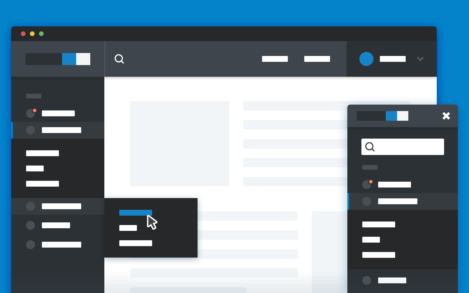
It should be noted that slide-out panels are indeed less accessible than fixed navigation options. They’re harder to discover and understand. Screen elements appearing and disappearing can confuse users and frustrate visitors. However, they’ve maintained their position as a consistently popular design choice, especially when screen space is limited, like on mobile devices. Their modularity… Continue reading Effective Examples of Useful Slide Out Panels and Sidebars
Tag: Kerning
Kerning, Leading, Tracking, and Everything You Need to Know About Text Spacing
The space between letters is just as important for legibility as the text itself. If your website is hard to read, don’t just consider the typeface: consider the white space as well. With kerning, leading, tracking, and other spacing tools, you can make your text more readable without a major design overhaul using these text… Continue reading Kerning, Leading, Tracking, and Everything You Need to Know About Text Spacing

