It should be noted that slide-out panels are indeed less accessible than fixed navigation options. They’re harder to discover and understand. Screen elements appearing and disappearing can confuse users and frustrate visitors.
However, they’ve maintained their position as a consistently popular design choice, especially when screen space is limited, like on mobile devices. Their modularity has made sidebars especially popular on mobile applications and the mobile versions of responsive websites.
Vertical Navigation
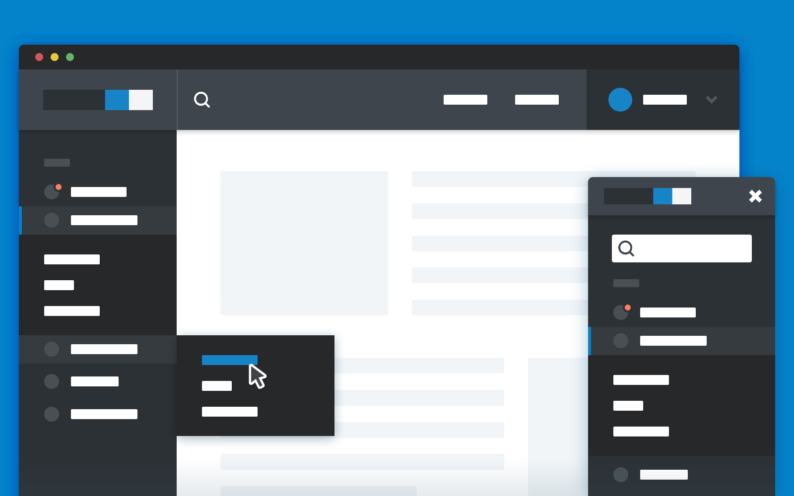
The single most popular use of the sidebar is undoubtedly for navigation. The pattern not only lends itself to the purpose, but it imitates several real-world design conventions for navigating printed material, like binder tabs, page flags, and quick-reference tabs on dictionaries.
Because navigation is a modal use of the site—basically, you need navigation at first but then you don’t want to see it—it makes sense to position detailed navigation options in a slide-out panel when screen space is limited. Mobile apps use this with the hamburger menu. While it’s far from our favorite design convention, it has become a standard part of the design language.
Employ Clear Language
Microcopy is one of those things most developers hardly think about. The standard language of web navigation has become so ingrained in our way of thinking that common navigation links seem obvious. But plenty of websites need links beyond the easy standards of Contact, About Us, Products, and Search. When you need to add additional navigation options, be smart about the language you employ. Always aim for concise, legible, and easily-comprehendible text.
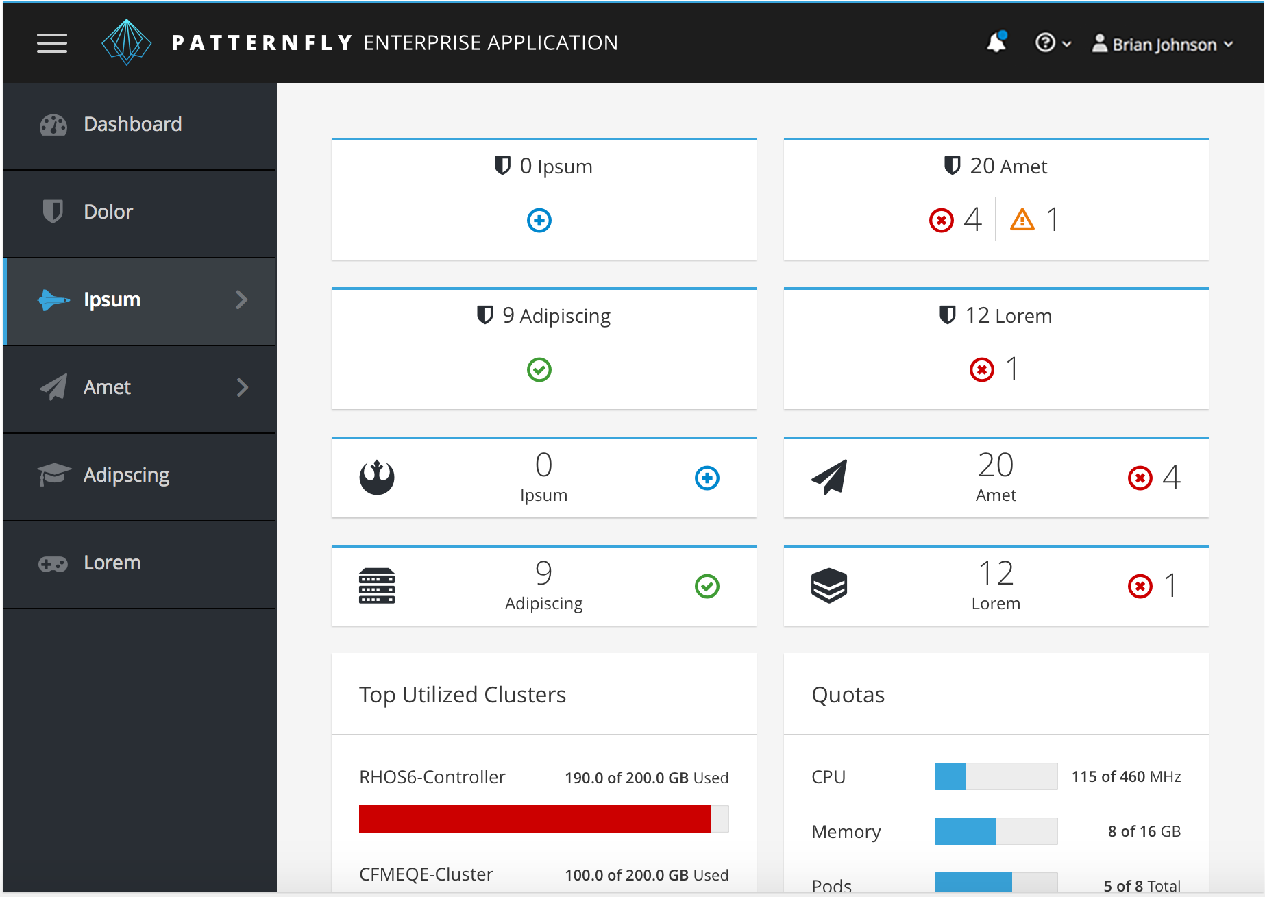
Use the Whole Space
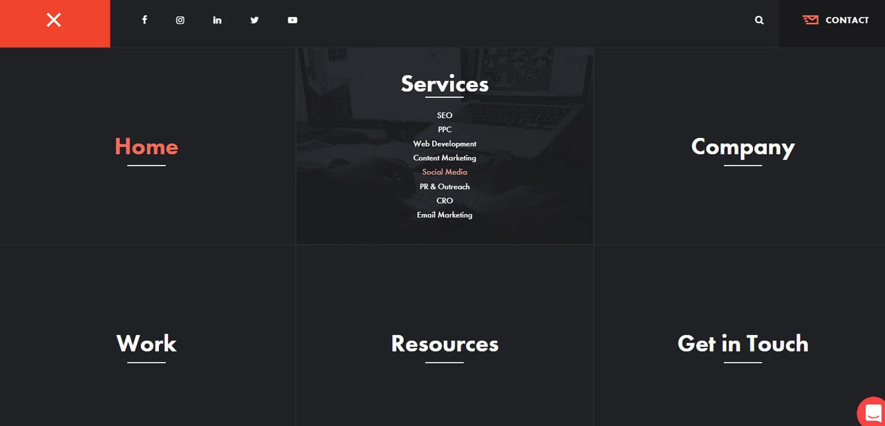
You need not limit yourself to only a small portion of the screen space. While your slide-out menus might not need to take up the entire width of the screen, expanded use does provide some winning design options.
And when the choices are large and clear, the user can navigate more efficiently. Provided the slide out panel hides quickly, and the user doesn’t need to see what page they’re currently on to understand their navigation options, a full-screen slide-out panel won’t hurt your site’s usability any more than a partial slide-out menu.
Animate Conservatively
While animation can be fun, on-brand, and energetic, it is unavoidably tedious when the user needs to wait for the animation before they can complete the task they intend to do. Imagine that every additional frame of animation is another user getting frustrated with your design. You get a number of free frames, of course, but once your animation takes more than a half-second, users will quickly grow irritated.
Productivity apps and websites should follow the strictest standards for animation, keeping them as short as possible. Apps for recreation or amusement have considerably more latitude, but that doesn’t mean they’re free to waste all day with fades in and out of user screens. This is especially true when the animation excessively or pointlessly lengthens the time required to accomplish a routine task like viewing inventory or consuming an item.
Avoid Mouseover Effects

While it might seem useful to expose a menu on mouseover, the effect is typically more annoying than it is appealing. There’s no way for a user to make the slide-out menu “stick” when it’s triggered by mouseover, making it easy to accidentally move the cursor outside the active region of the effect and inadvertently dismiss the menu.
To avoid this problem, use a clear system for showing and hiding the slide-out menu. On a mobile device, this is frequently a hamburger menu button that reveals additional options. For desktop visitors, the same approach can be used.
Show Menus in Widescreen
Always give desktop visitors the opportunity to see everything at once. While text needs to wrap at intelligent widths, don’t artificially limit the usable screen width on the user’s behalf. After the viewport expands beyond a certain point, show all the slide-out menus. There’s needs to be a master “reveal everything” view for desktop users, or they’ll be needlessly limited by a mobile-centric design.
The same goes for tablet users, especially if the device is on the larger side of the scale. Landscape phone users, on the other hand, probably don’t want to see fixed navigation menus. In general, landscape use of a scrolling app is a nightmare for the developer and the user. Clogging up most of the screen with fixed navigation won’t help what is already a strangely-dimensioned aspect ratio for a scrolling feed.
You might also like the following posts:
Kerning, Leading, Tracking, and Everything You Need to Know About Text Spacing
Dazzling Slow Motion Effects For Tomorrow’s Sites
Adding Customization Options to Your User Interface
Author: Alex Fox