The space between letters is just as important for legibility as the text itself. If your website is hard to read, don’t just consider the typeface: consider the white space as well. With kerning, leading, tracking, and other spacing tools, you can make your text more readable without a major design overhaul using these text spacing CSS properties.
Text Size/Font Size

Text size or font size is a measure of how much space the text takes up. It’s nominally a measure of the height of the character. Not every font manages height the same way. Nominally, the font size parameter sets the em height, or the distance between the lowest descender and the hightest ascender. It doesn’t have to measure that, of course, which is what leads to disagreements between different typefaces on what a specific font size means. You’ve surely noticed that some typefaces seem “smaller” at identical measurements: variance on what’s constitutes the em height is often to blame.
Kerning & Tracking
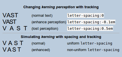
Kerning is the distance between letters in a word. In professionally-set display type, the spacing of individual letters is typically custom-tuned. This ensures a perfect display in large sizes, with pixel-perfect balance and organization. But not all text is so important. By percentage, in fact, very little text online is custom tuned. Instead, it’s handled with CSS properties like letter-spacing, which adjusts based on percentages.

It’s also managed by the typeface itself, which includes hinting and rules for displaying text. For example, take letter joining, performed by the text as needed. With double letters like tt and ff, crossbars are drawn as a single line, with no space in the horizontal point between them. Other letter pairs also get custom spacing rules. A g might have less space on the right than an h or n, for example, and an l will be thinner than an x. This allows text to flow in a balanced way, without a requirement for custom management. The computer, through the font, takes care of it all.
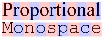
For an example of a font with poor kerning by design, look at monospace fonts like Courier New. These fonts are purposefully designed so that each letter occupies exactly the same space as the next. Therefore, thin letters like l take up comparatively too much space in the text, making it hard to read fluidly, especially in longer text blocks.
Setting Kerning and Tracking in CSS
In general, you don’t need to modify the default font spacing provided by the typeface itself. At least, not for body text. If the font is well-designed, it will naturally create space as needed.
Kerning between individual letters can’t be easily adjusted in CSS, at least not without creating a class for every pair of letters. Instead, we adjust tracking, which controls the space between letters as a whole. Because the adjustment happens across the entire element, not just individual letters, this is technically called tracking, not kerning. However, the two words are used interchangeably, even by designers that might know better.
Built-in font kerning can be disabled with font-kerning: none There’s no specific way to adjust tracking between individual letters in CSS. However, we can make wholesale spacing adjustments with letter-spacing. Positive values expand the spacing, while negative values decrease it.
For display text, which makes up headlines, titles, and section headings, you may need finer control. The letter-spacing CSS property allows for adjustment of the space between letters on a wholesale basis. A positive value adds that to whatever the default letter spacing is. A negative value subtracts from the default letter spacing. So, if you set letter-spacing: 0.2em, you’re adding 0.2em to the existing spacing between letters.
Leading
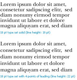
Leading is the distance between individual lines. This is typically measured in the same units as the text size is denominated. Whether in pixels, ems, rems, percentages, or points, leading measures the distance from baseline to baseline. The baseline is the imaginary line upon which the bottoms of most letters (and the bowls of letters with descenders, like g, p, and q,) rest. The distance between the baselines must be as large as or larger than the type in order to prevent overlapping lines.

The name for leading comes from the bars of lead that would be placed between typeset lines. The lead would create more or less space between lines of text, decreasing the words per inch. All text needs a little bit of leading for readability, though an untrained eye might not notice its absence until descenders and ascenders start to overlap.
Leading is set via the line-height CSS property, or more commonly applied in the font property shorthand like font: 1em/1.2em Helvetica, Arial, sans-serif. The spacing can be denominated in different unit from the font size, but it typically makes sense to match them.
Letter Width

Letter width is a measurement of how wide the individual letters are, based on a percentage. With all proportional fonts (that’s virtually all fonts, these days), the width of individual characters vary, with narrow character glyphs taking up less space that wider glyphs. Letter width adjusts those widths by a fixed proportion, enlarging them by whatever value you set. This can be adjusted bluntly with font-stretch, though it’s not very appealing visually.
CSS Properties for Spacing
These CSS properties can be used to set letter and word spacing.
/* LEADING/LINE HEIGHT */
font: 1em/1.2em Helvetica /* sets leading to 1.2 em */
line-height: 14px /* sets leading to 14 pixels *//* KERNING/TRACKING */
font-kerning: none; /* disables automatic kerning */
letter-spacing: 0.2em;  /* increase letter spacing */
letter-spacing: -0.1em; /* reduce letter spacing */
word-spacing: 3px; /* increase whitespace between words, not letters */
word-spacing: -5px; /* reduce whitespace between words, not letters /*font-stretch: expanded; /* increases the letter width by stretching the font */
Finding the Correct Text Spacing
Text needs enough room to breath. Without a minimum of sufficient space between words, lines, and letters, text becomes impossible to read. Text written on top of text is the most extreme consequence of improperly set leading and kerning, but most text display engines must be explicitly told to make that mistake.
In general, you’ll find that improperly spaced text feels dense and impenetrable or airy and hard to scan, depending on whether the spacing is too narrow or too broad. Display text should have liberal spacing, while body text should be closer and easier to follow from one word to the next.
When you’re testing spacing, be sure to try out multiple options. Use a trial section of the website to compare various spacings, not just at the letter scale, but across the whole page. Pick sometimes that makes reading comfortable, with enough space between letters and words to breath, but not so much space as to confuse the user as they read
You might also be interested in the following posts:
Author: Alex Fox