
Microcopy is a fundamental part of your site’s UX. Let’s check out some microcopy tips for a better user experience.
What is microcopy?
Microcopy is made up of the tiny snippets of text scattered around your website. It can include things like button texts, form labels, interaction prompts, tool tips and even error messages. As a rule, microcopy is short, isolated and typically functional.
At it’s core, microcopy should be clear. Since it’s mostly functional, it needs to clearly and concisely convey information to the user without unnecessary confusion. For example, if a user’s password isn’t strong enough, the microcopy needs to clearly explain why the password isn’t strong enough. “Weak password” isn’t enough to get the job done effectively. By the same token, a form’s labels need to be clear so the user knows how to submit the form.
But that doesn’t mean it has to be be boring! “Easily understood” is not a synonym for “dry as dust.” For many websites, microcopy represents an untapped branding resource that can be used to better convey your brand to new visitors.
What makes for good microcopy?

The best microcopy does its job while conveying a key element of the brand. It feels like a small treasure, a reward to observant users that actually read menus and prompts. It’s one of the little details that can help cement your user experience by unifying your and reinforcing your message and identity.
Food delivery hub Grubhub (and Seamless) is my favorite example of effective microcopy. After you’re submitted your food order, you can tick a box next to the following text: “Spare me the napkins and plasticware. I’m trying to save the earth.” This copy is equal parts functional and expressive. Users know what will happen if they check that box, but they also get a cute little joke that helps them better understand Grubhub’s slightly-snarky brand. It also gently encourages the user to opt to hold disposable cutlery. After all, don’t they want to save the Earth too? All this meaning in a dozen words!
Microcopy tips for good microcopy
If you want to improve your site’s microcopy, you can follow some of the microcopy tips below to spruce up your site.
1. Get inside your user’s head
The best microcopy gives a user the information they need just as they need it, without unnecessary confusion or complexity. If you want to do this right, you’ll need to understand how your user’s interact with your site or product.When you’ve been building a project yourself, it’s easy to assume the user knows more about your product or website than they do, and that can make for insufficient or sparse microcopy. This is why user experience pros interview users: they need to understand the user perspective.
If you’re running usability testing, pay special attention to user comments about intelligibility and clarity. If you’re not, get a uninitiated friend or colleague to stand if for a user. It’s not nearly as good as actual testing, but it’s better than nothing.
2. Talk to your user like a human
People want to be treated like humans, and they respond well when they are. Take advantage of this quirk and talk to your user like a person. Ditch stiff and overly formal language whenever possible, and try to avoid technical or complex verbiage.
3. Squeeze you brand in edgewise, but don’t overdo it
While you don’t want to overwhelm the user with branded messaging, you should always consider using your microcopy as a branding opportunity. Of course, you don’t want to muddle things like form labels, navigation or instructional text, which would be frustrating. For those kind of user communications, clarity is most important. But for things like 404 pages, confirmation dialogues and error messages, a tiny bit of branding can go a long way to improve the user’s impression of your brand.
4. Write clearly
By AJC1 via Flickr, used under CC BY-NC 2.0
Your microcopy should be easy for the user to understand. We don’t want to be fielding support requests from users that can’t understand error messages—at least not more frequently than we have to. So, to that end, we need to write microcopy clearly.
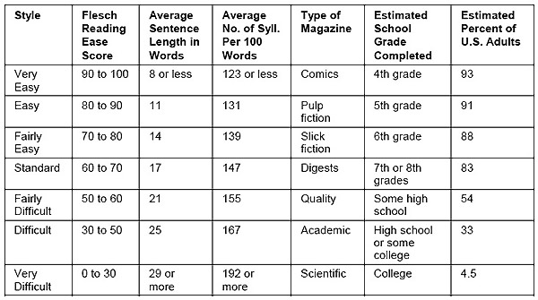
The Flesch Readability scale is a great tool for understanding how easy your copy is to understand. This scale grades your copy out of a 100 point system, with higher point values signifying simpler copy. In general, a score of about 60 is considered fairly easy to read, and that’s what we should aim for in our microcopy. For critical messages that must be understood, we might even shoot higher, aiming for a score of 80 or above. You can use a service like Readable to test your copy.
Conclusion
Whether you want it or not, your site probably need microcopy. And if it’s worth doing at all, it’s worth doing right! Make sure your microcopy is clear, intelligible, and useful to your user. Don’t skimp on opportunities to express your brand either. A little humanity and humor can go a long way.