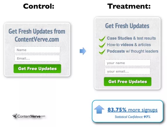
People often underestimate the power of their website, but great user design drives conversions. When we think of a user experience, a few things jump to mind: headlines, layout, font, color. Symmetry and visual cueing play a large role in how a user takes in content and even how they make decisions. This is the big stuff. And focusing on the big stuff is a good strategy.
On the other hand, you should also be paying attention to the small stuff. The littlest things can make the biggest impact – especially your microcopy. This little text is essential to your UX and your conversion rate.
What Is Microcopy?
As the name implies, microcopy is a term for small tidbits of copy on an interface that help users navigate your site. Examples might include contact form explainers, eCommerce hints, and error messages. At first glance, this microcopy might seem insignificant in the scope of your app’s overall design. In reality, it can have a huge impact on your conversions. Microcopy – these short snippets that inform, encourage action and validate readers’ thoughts – play a major role in guiding users on a site journey.
Why Is Microcopy Important?
Microcopy, when used properly, serves several important functions:
- It informs. At its core, microcopy helps eliminate confusion and guides users through the process of using your website. On a form, microcopy might explain what information a user should provide and why, for example. And this leads to its next function:
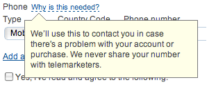
- It helps build trust. People are often wary about providing phone numbers or other personal information, for fear of bombardment by telemarketers. On a contact form, you might explain you only need their number if you need help with their order. This provides reassurance that may prove the difference between a sale and navigating away from your page. Microcopy assuages concerns about subscribing, purchasing, or registering.
- It adds personality. On the faceless and sometimes impersonal internet, users create interaction. An effective microcopy strategy can make users feel as though you’re dedicated to their needs.
- It speaks to your brand. Good microcopy reinforces your brand’s messaging throughout every interaction with your website – even the small ones. By eschewing bare bones prompts in favor of witty and engaging snippets, you’ll differentiate yourself and win them over from the beginning.
- It drives conversions. Lastly, good microcopy can be the driving factor in getting a user to fill out a form or hit “submit.” Microcopy can quell reservations and make your users ready to take the next step.
How to Create Winning Microcopy
Hopefully, we’ve made a compelling case for microcopy. Now that you’re ready to proceed, keep the following tips in mind when creating your site or application’s microcopy:
The User Knows Best
Obviously, if you want to reach your users, you must know them. Consider your user’s pain points, and keep them in mind as you create your copy. Throughout your website, show them you know what they’re thinking and you’re on their side.
Keep Your Brand in Mind
Good microcopy always reinforces brand messaging. It’s important to understand your users, but it’s equally important that they understand you. In other words, keep your messaging consistent throughout your copy to ensure there’s no confusion. Here’s a tip: consider creating an internal style guide to aid your content writers and web designers throughout the process.
Show a Little Flair
You want to be professional and authoritative, yes. This doesn’t mean, however, that you can’t show a little personality. Microcopy should always serve a function, but it’s also an opportunity to have a little fun. Consider injecting a little humor or irreverence into your copy to keep your users engaged.
Keep It Concise
Remember the golden rule of good microcopy: it’s called “micro” for a reason. People don’t want to read large chunks of copy – and that’s especially true when it’s small. Address the problem, avoid technicality, and present a solution.
Be a Problem Solver
On a similar note, microcopy serves an important function: it addresses a problem and offers a solution. For example, an error message states what the problem is and may suggest how a user can fix it (for example, when registering for an account with an email that’s already in use).
Be Persuasive
Lastly, build on the assumption that a user is on the fence about a decision at all times. They think you may have the solution to their problem, but they can’t be sure. Microcopy presents the perfect opportunity to provide reassurance. Encourage them to take action by making brief mention of how many satisfied customers you’ve helped or one problem you solve better than everyone else.
When Should I Use Microcopy?
Previously, we cited a few examples. Knowing how to create it is one thing, but knowing where to place it on your site is another. You might need better microcopy if your site is suffering from low conversion rates or high rates of user error. Here are a few common opportunities to apply microcopy that can address both of these problems:
In Form Fields
All websites use form fields to gather information from users. Unfortunately, forms can be confusing, and users may make errors when completing fields, leading to frustration. Microcopy can not only provide reassurance about what you do with personal information but also information about how to rectify errors. Compelling error copy can make the difference between a user signing up and deciding it’s not worth the effort.
On CTAs
Call to action buttons are perhaps the best opportunity to leverage good microcopy. In fact, it will be the last thing they see before they decide to act – or leave your website. The key here is to think beyond the “click this button” trope. Instead, think of what your users will be getting when they take the next step, and use that to guide your copy.
To Answer “Why?”
Users may be uncomfortable with giving out personal information or posting their financial information online. A box like “why do we need this information?” with an explanation can provide valuable reassurance and help users understand why you’re asking for certain information.
Make an Impact with Microcopy
Your microcopy holds more weight than you might think. These valuable tidbits of information can help guide a user through your website or application, creating a user experience that drives conversions. It can build trust, engage users, and even add personality and stylistic flair to your work. While form, color, symmetry and flow will always be valuable to a website, it’s the details that will make your work truly shine. In this case, it seems appropriate to sweat the small stuff – because even the littlest facts can make a big impact.
This post was written by Stephen Moyers, an online marketer, designer and avid tech-savvy blogger. He is associated with Los Angeles-based SPINX Digital Agency. He loves to write about web design, online marketing, entrepreneurship and much more. Apart from writing, he loves traveling & photography.


