In the early phases of a project a spreadsheet can be a more useful design tool than Figma.
If you’re redesigning an existing website there are huge benefits in getting to know the content you’ll be working with. The earlier in the project the better. A little upfront investigation will help you make informed design decisions.
A spreadsheet is an ideal tool to quickly see what content you’ll be working with. It’s somewhat helpful when optimising a website. It’s even more useful when you wish to explore more radical changes in design direction. Using real content allows you to push your ideas with the confidence that your designs will display beautifully even with the edge cases.
Here are four things you can do within 30 minutes to gain actionable insights to inform your design direction.
30 minutes to kickstart your design from a spreadsheet
For this article I’ve used Screaming Frog to carry out the content scrape and Google Sheets to manipulate the data. Other spreadsheets and content scraping tools are available.
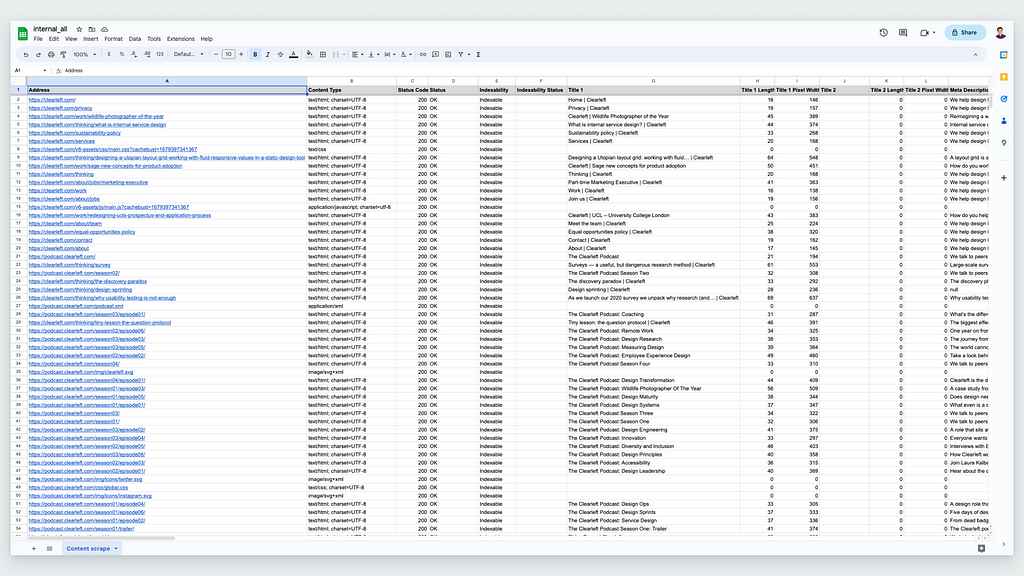
First things first. Let’s clean up the data in the content audit. My first passes are broad sweeps to remove some of the noise. The intention is to swiftly move from drowning in data to being informed by information.
- Sort the data in the content audit by status code and remove all pages with a 404 (not found), 301 (moved permanently) and 302 (found redirected) code.
- Order the spreadsheet by content type and cut and paste anything that isn’t listed as text/html into separate sheets — images, audio files, application files etc.
What templates are on the website?
In analysing an existing website I’m more interested in identifying the variety of page types over the number of individual pages. In taking a systemic approach to the design I’m looking to create reusable components and flexible templates. A content audit can provide a good estimation for the variety of page types being used.
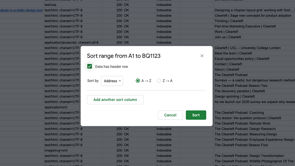
Start by selecting the data in the spreadsheet and alphabetically sorting it by URL.
Then select the cells with URLs that have the same folder name and page depth. For example /news/news_article_01.html and /news/news_article_02.html etc. Use your spreadsheet to give you a count of the pages.
Finally, create a simple table with the name of the page type and the count of pages in the adjacent cell.
Spreadsheets are set up to easily turn cells of data into graphs. Admittedly not often pretty graphs. Yet still useful ones. My aim is to visualise the information to make it easier to understand at a glance.
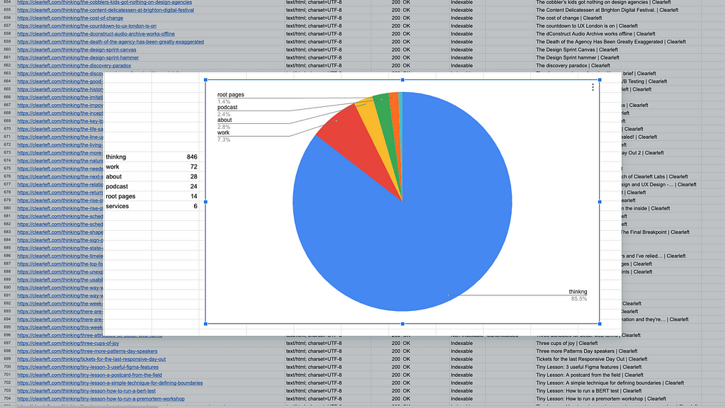
In most cases there is a corollary between location in the site structure and the templates in use. This can be used as a proxy for page types. It is also worth sampling a handful of URLs from your list to do a visual check for similarity.
A spreadsheet gives a 10,000ft guide to the variety of page types in use and quantities of each. This breakdown is a speedy way to kick off and prioritise a backlog of design tasks.
Extra tip: If the URL structure is more chaotic and doesn’t readily help identify page types then let the engineers in your team know. It’s a warning sign that automated content migration might be tricky with little to help map old content to new designs.
What are the longest and shortest page headings?
Setting type styles without working with real content is akin to walking a typographical tightrope whilst blindfolded.
As every battle-scarred and skilled designer knows, design is less about working with idealised examples of content, and more ensuring the integrity of the design can survive the inevitable clash with the extreme edge cases. Nowhere is this more apparent than with H1 page headings.
Using real content provides you with useful constraints to design within. Using real content allows you to show and select typefaces with actual examples rather than just ‘The quick brown fox jumps over the lazy dog’. Using real content enables exploration with meaningful words replacing nonsensical lorem ipsum. Heading lengths are a vital input to informing type styles.
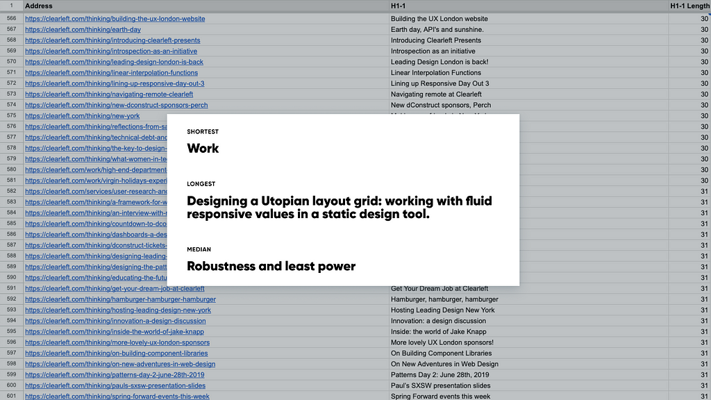
I start by creating a new sheet containing just the H1 title and the H1 length. I then sort by ascending and descending order of character in the title. I’ll note down a couple of examples of the edge cases to use in design exploration.
I then go through the rows of headings to get the median value. The item located in the centre of the distribution. I find this more representative than using the average which can easily be skewed by anomalies in the data set. Again, I note it down to use later when stress testing my designs.
If you want to get more granular you can follow the steps above for each section of the website.
Extra tip: Share the full list of H1 headings with your content colleagues. Having a list of headings will help them spot themes and make suggestions on writing to get a reader’s attention.
What visual styles are used?
Displaying a montage of images in a spreadsheet. That sounds like nonsense. Okay it’s not what anyone tells you to do at design school. But give it a go.
Don’t expect a beautifully displayed grid of images. We’re favouring speed and utility. What we’re after is a sense of what imagery is used on the website and to spot any patterns in visual styles.
Sort the spreadsheet alphabetically by content type. Copy all the rows where the content type is an image (image/jpeg, image/png, image/svg) and then paste them to a new sheet.
You should now have an alphabetically sorted list of URLs for image files. So far not very visual. There are a few tricks to make the display more useful.
Add a cell to the right of the URL of the first entry and add =IMAGE(A2,1). The number 1 in the formula tells the spreadsheet to respect the aspect ratio of the image. If you change this to 2 the image stretches or compresses to fit inside the cell, and using 3 leaves the image at its original size, which may cause cropping.
Select the right corner of the cell and drag down the whole list of URLs. This will add the formula to each cell and reference the URL to the left i.e. A3, A4 etc.
To make the images easier to view, increase the height and width of the cells. To increase the height of all the cells click on a row and select all. Then right click and select resize rows N to N and add in a numeric value for the row height in pixels. Increase the width by dragging row B to the right.
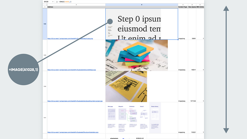
Within a few minutes you have a scrollable list of images to be able to review the variety, quality and image styles in use. If you’ve ordered the list alphabetically by URL and there is a naming structure for images this will cluster together similar images such as icons, avatars, hero banners etc.
Extra tip: If you’re curious about familiar looking images the spreadsheet is a great stepping off point into a reverse image search. Select the URL and open it in Google, right click and ‘Search image with Google’ to see the image source and visually similar images.
How much text?
A content audit is a goldmine for colleagues in content roles. Content audits overflow with useful insights giving readability scores, sentence lengths, text ratios etc. Yet for this activity I’m not interested in the quality of writing. When designing a container for content I’m purely looking for the quantity of characters.
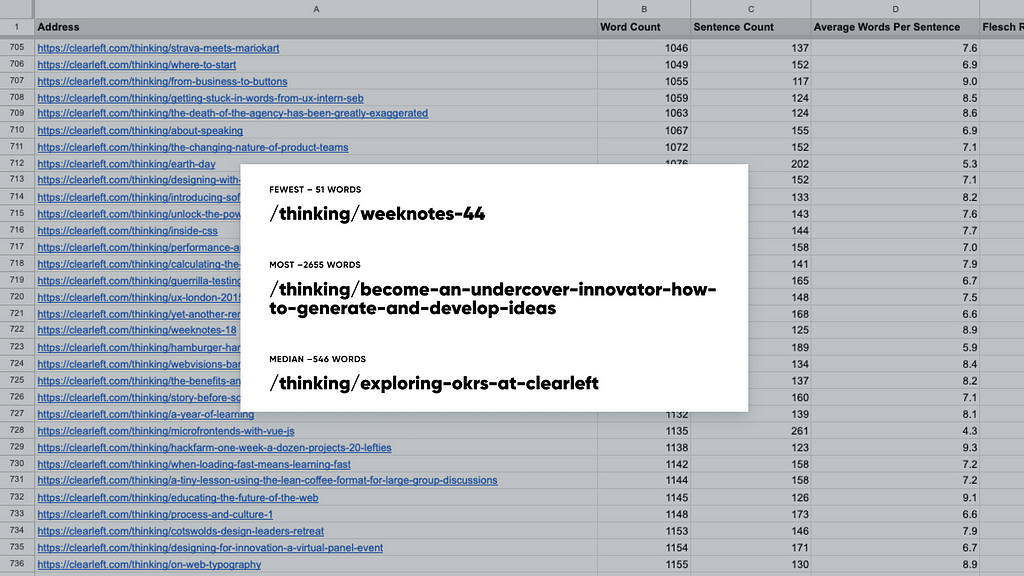
I’m most interested in looking at the page types designed for content consumption rather than hub pages. These typically are found at the end of the URL structure. The pages an information architect would call the leaf nodes or pages with no children.
Firstly sort the URLs alphabetically. Remove the navigation pages to leave just the content rich pages. Then sort the remaining data in the spreadsheet by word count.
With your spreadsheet ordered it’s straightforward to catalogue each section of the site with the pages that contain the fewest, the most, and the median amount of words.
The numbers prove useful in three key ways.
- They help optimise the design of the reading experience. The volume of text guiding decisions on type sizes, line-lengths, and padding.
- They highlight if you need to consider in-page navigation from a scrollspy or skip links.
- And they give real world examples of actual content to stress test design ideas with.
Extra tip: Let your developer colleagues know if you spot page types that routinely have text ratios of less than 25%. These pages will benefit from investigation to see if code bloat is adversely impacting performance and the subsequent user experience.
Spreadsheets before stylesheets
If you’re a designer who’s spreadsheet-averse then you’ve probably stopped reading long before now. For the spreadsheet-curious designer give it a go on your next redesign project.
Knowing the content considerations early in a redesign project can avoid days of wasted design time. And the good news is when you start content auditing for design decisions you’re no more than 30 minutes from Figma.
This article was originally published on the Clearleft website:
https://clearleft.com/thinking/starting-design-work-in-a-spreadsheet
![]()
Starting design work in a spreadsheet was originally published in UX Collective on Medium, where people are continuing the conversation by highlighting and responding to this story.