

Designers should not be mere decorators, but have an understanding of language and microcopy, a crucial design skill, now more than ever.
Look at these two images:
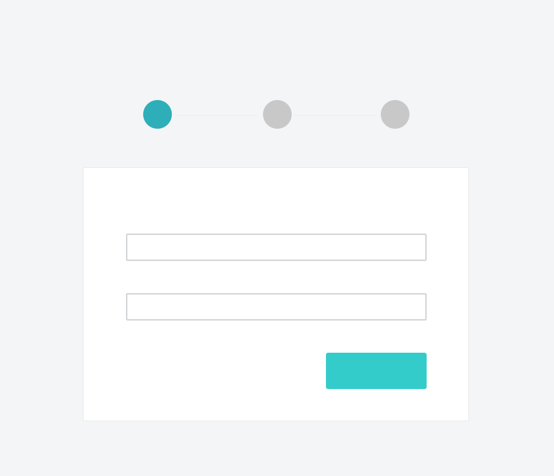
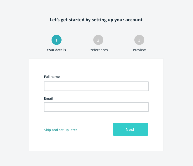
The obvious difference between these two onboarding visuals is that option A is devoid of words and is absolutely useless. No direction, no guidance, or calls to action, nada. This point is so blindingly obvious (I’m yelling at the screen), that it’s impossible to deny.
Over many years, I have noticed designers having a blind spot for words and language, leaving it till the last minute to dollop text unceremoniously from a height onto the beautifully rendered design. Not through any malice of designers, but through the demands and expectations of the job. I have been guilty of doing this myself. We are all sinners and I am now flagellating myself in public.
Make or break the user experience
Microcopy is the small text you find on websites and apps such as button text, section captions, page titles, form labels and error messages. Small words have a big impact, visually and psychologically, but this separation of words and image in our visual mind is an easy trap for designers to fall into.
I like to think of microcopy and textual content as another design element that can make or break a user experience.
Good microcopy helps the user navigate their way through a digital experience, maximising meaning in a condensed manner, and with space at a premium, every word should count.
Don’t be mere decorators, be literate designers
Being a literate designer means paying attention to the text, thinking of microcopy as an essential consideration in the design process, an element that can alter the concept, and influence the solution. Aesthetics and words go hand in hand. It is also a basic skill that all designers should cultivate.
Why don’t we do it? Well, it can be bloody hard work to write good microcopy that serves the user well. If the budget allows, we can bring on UX writers to our team, which is ideal, but in reality, many companies see this as a luxury they can’t afford.
In the absence of those dedicated UX writers out there, we need to become more rounded designers and start crafting better microcopy.
Graphic designer Lucine Robert wrote some time ago that, ‘Designers are not just decorators and aesthetes — pattern-makers using letterforms as their palette of marks — but individuals responsible for the intake of information.’
Examples of microcopy
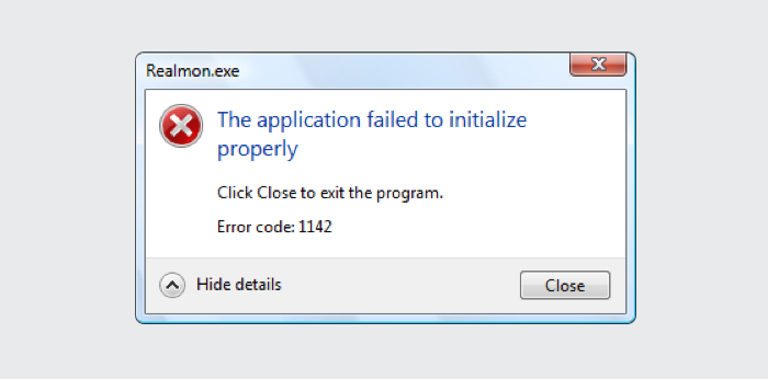
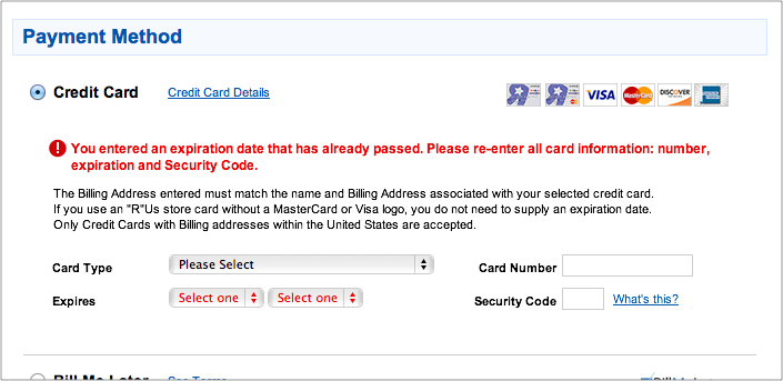
I’m almost fond of these classic and spectacularly awful error messages you see from time to time, even though they cause heartburn.
But let’s not concentrate on the bad. When done correctly, we immediately reposed to well written, clear, and concise microcopy.
Mailchimp signup
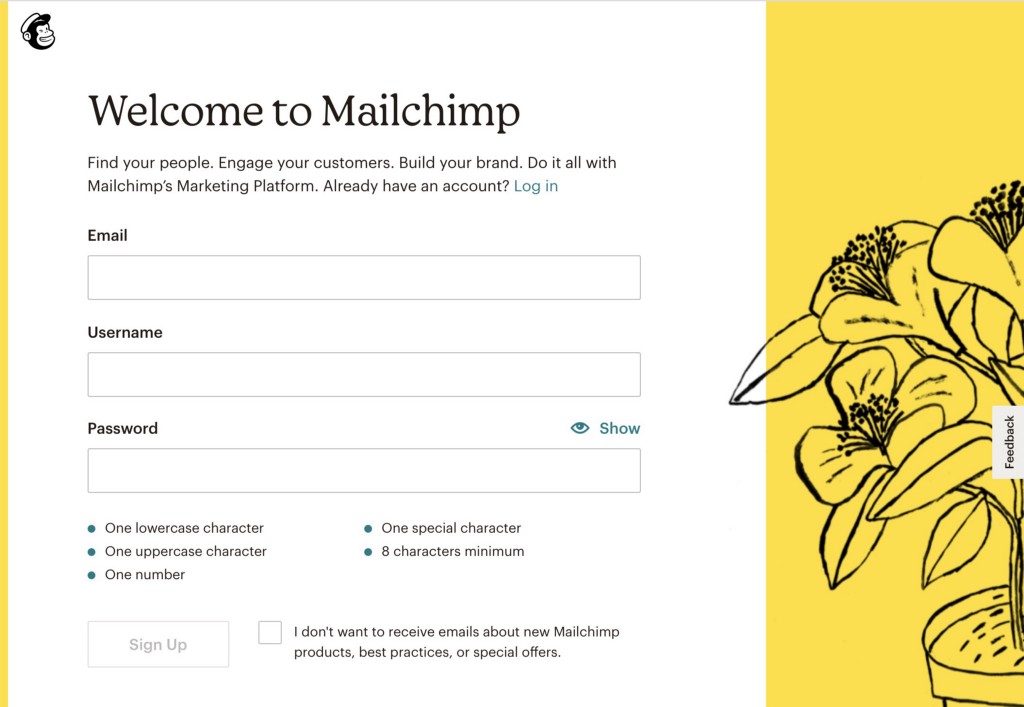
Mailchimp is renowned for its friendly tone using clear titles, unambiguous supplementary text, and clearly presented password rules.
FigJam onboarding
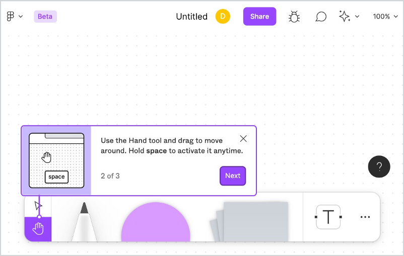
Figma’s whiteboard tool uses attractive tooltip onboarding to guide the user. What works here is the combination of good visuals with clear text.
Asana Messages
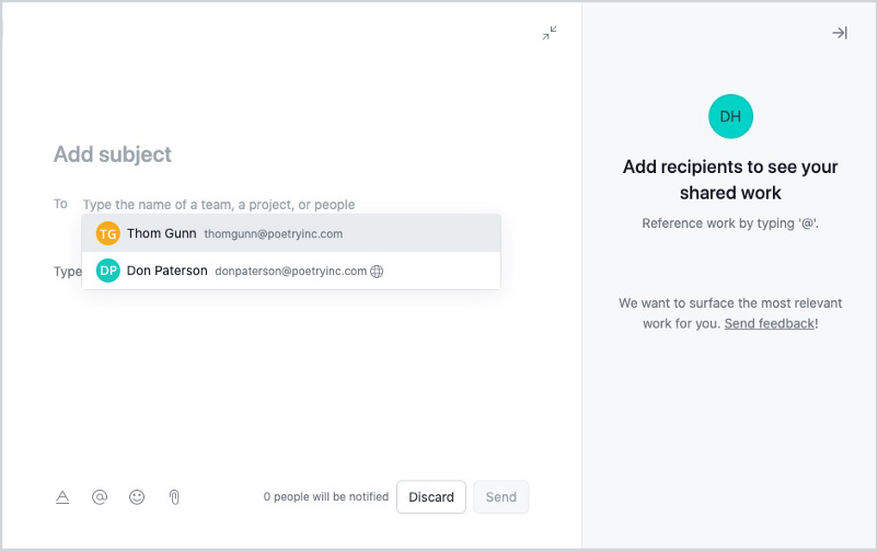
The well-considered input placeholder text guides the user. I like the hint text on the side panel. The well-placed text to the left of the Discard and Send buttons gives reassurance, and alerts the user to the number of people being notified.
The Noun Project password reset
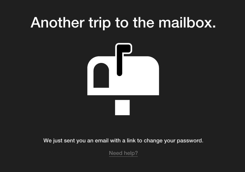
The Noun Project injects a little dry humour in what is an inconvenience, yet it is also clear what will happen next.
What all these screens have in common is clarity, with well-written sentences that tell the user what to do or what will happen. Yet they also have a hint of personality, and don’t feel like an afterthought.
The important roles of microcopy
Microcopy fulfills a wide brief and has many roles
- Letting the user know what to do and minimising uncertainty
- Explaining errors clearly
- Building confidence in the system
- Setting expectations of what will happen next
- Giving positive feedback and easing worries of anxious users
- Building the brand by using a certain tone of voice

Rules for writing good microcopy
These rules are guides to make it easier to craft good microcopy. There are many more, but these will serve as an excellent base to begin with.
1. General rules
Be concise
Use short words and sentences. Avoid unnecessary modifiers.
‘Red’ is unnecessary in ‘Click this red button’. Don’t be over-elaborate for the sake of it.
Be specific
Avoid vague or informal language.
No jargon
No technical terms except if it’s related to the user’s world. We can just use ‘Save’ instead of the robot sounding ‘Save file to database’.
Keep paragraphs short
My unscientific rule of thumb is that paragraphs should be no more than seven long (approximately 70 characters) lines. Nothing looks more daunting than a page full of dense paragraphs.
Spell out numbers
In body copy, spell out numbers up to nine. Use numerals after 10.
Contractions
Do not overuse contractions such as
- aren’t
- can’t
- couldn’t
- don’t
- I’m
- what’s
Contractions can make the text sound informal and feels easier to read, but it can also be a distraction and it looks messy.

2. The case
Sentence case
Sentence case is when you only capitalise the first letter of the first word in a title.
‘This is a sentence case title’
It is more conversational, sounds less formal, and is easier to read than title case as ‘Long Sentences Set In Title Case Can be Very Uncomfortable To Scan’.
Use sentence case for buttons and links such as ‘Select a user’ and ‘Create a new task’.
Sentence case also has the added benefit of being easier for product teams to work with, as there are no formatting rules to remember, unlike title case.
Title case
Title case is when you capitalise the first letter of each word, except for certain small words such as conjunctions and prepositions.
‘This Is A Title Case Title’
Sounds more formal, doesn’t it?
There is a view that title case gives short pieces of text more visual weight, but too many words set in title case can look awkward. Three words and under is a good rule. Titles can be hard to process when the number of words is six or more.
John Saito makes the interesting observation in his excellent article on case that Apple favour title case and Google go for sentence case. Do Apple opt for title case because it’s more symmetrical and aesthetically pleasing than sentence case? You can imagine Steve Jobs weighting up both options in his mind.
As always, title case can be appropriate in the right context.
What about capitalising proper names and terms?
Capitalise proper names, such as Evil Corp and Valley Cryogenics.
Do not capitalise functionality except if they refer to specific or branded functionality such as Instagram Stories or The Flying Enchilada Dashboard.

3. Point of view
The debate over whether to use ‘Your’ and ‘My’ rages on in countless forums. It comes down to what suits your brand and how social and collaborative the product is. There is an argument that using a personal pronoun is a way of making the user feel engaged.
‘Your’ stuff
Using ‘Your’ (the second person pronoun) in an interface implies the product is talking with you. It makes the product feel like it’s a personal assistant. It’s helpful without being too demanding.
‘Your’ is social. An example would be a project management app where a team is creating tasks. ‘Your’ is useful as it differentiates your tasks from all people’s tasks.
Use ‘Your’ if the system has created something for you, like a report or digest.
‘My’ stuff
Using ‘My’ (first person pronoun) suggests that the product is an extension of the user. ‘My’ gives the sense of control and ownership, but as an individual. It is solipsistic. An example would be a tax return site. Since the user is not in an open and sharing mood while calculating their finances, ‘My’ feels appropriate, especially where data is sensitive.
Another example is ‘My profile’, where you do not want to share any data with others. Here, the first person gives a better sense of security. It makes the user understand clearly that they are viewing their information.
Use ‘My’ if you have created something in the system such as a saved search or personalised playlist.
No point of view
You can do this too. There are no rules to say that your product has to speak at all. In my experience, it is not so important to label things ‘Your’ or ‘My’.
Use the proper noun or action, like, ‘Suitcase’ instead of ‘My suitcase’ for example. It sidesteps issues of long line lengths and visual clutter. Using the personal pronoun is unnecessary in most cases except for those I mentioned above, namely distinguishing your own data from that of a team.
4. Be constructive
We can be unaware that we are falling into a negative tone, especially with error messages like ‘Sorry, you can’t do this’. This negative tone can give a sense of finality, effectively blaming the poor user for what has occurred.
If our user encounters an issue, we want them to know that there is a solution.
One of the most useful communication theories that apply to writing is the Feedback Method by David L. Cooperrider and Diana Whitney.
There are four types of feedback we can give the user
1.‘No’ is negative, destructive
2.‘No, because…’ is negative, constructive
3.‘Yes, but…’ is positive, destructive
4.‘Yes, and…’ is positive, constructive
Fashion positive messages by using ‘negative, constructive’ and ‘positive, constructive’ in our sentences.
A ‘negative, constructive’ message
‘You cannot view this task because you are not assigned. Please request access.’
This explains what you cannot do, but at least it tells you that there is a solution in a friendly manner.
A ‘positive, constructive’ message
‘You have been subscribed. View now.’
This is good, as it tells you in very positive terms what has happened and what you can now do.
Avoid destructive feedback
‘You cannot view this task.’
This is unhelpful, depressing, and might remind the user of their own mortality.
5. Voice
Active voice
Active voice describes a sentence where the subject performs the action stated by the verb and sounds stronger than passive voice and can be easier to understand. Always use active voice in your writing.
‘Users love feedback.’
Passive voice
Passive voice is when the focus is on the action, not the subject as the subject comes last. This has the effect of lessening the importance of who or what is doing the action. This can lead to weak sounding sentences.
‘Feedback is loved by users.’
Notification and error messaging
Use active voice when you need to signal who or what caused an action.
‘Thom Gunn created a task.’
is better than
‘The task was created by Thom Gunn.’
Even though we stated that active voice is the ideal, passive voice has its place. Use passive voice when the action is more important than what caused (subject) the action.
‘Results not found.’
is better than
‘The search did not return any results.’

6. Calls to action
It is essential to get your call to action correct. You are prompting the user to take action. Social media scientist, Dan Zarrella discovered verbs generated a higher click-through rate than noun and adjectives on the top social media platforms. His findings suggest that to be a proper call to action, the text should begin with a verb such as ‘Download file’ and ‘Refresh this page’. ‘Account’ is not a verb, so it’s not a call to action.
Let’s get slightly theoretical. There are two actors — the product and the user. They are both involved when an interaction occurs on a call to action. The creators of the product want the user to take action, and the user wants the product to do an action for them. Truly symbiotic.
Without getting into the grammatical concepts of conditional and interrogative moods, a perfect call to action is born when the text makes sense after both:
- what the product wants the user to do by asking ‘Would you like to…?’
- what the user wants the product to do by telling the product ‘I would like to…’
A good example
Button text: ‘Add to basket’
- Would you like to add to basket?
- I would like to add to basket
This works for both.
An example that does not work
Button text: ‘Forgotten password?’
- Would you like to forgotten password?
- I would like to forgotten password?
Both sentences make little sense.
7. Notifications
Notifications such as emails and alerts are an important part of product engagement. As well as conforming to consistent branding and messaging, they also need to be transparent in terms of intent.
Users need to tell where the notifications are from
They must know at a glance that the notification is from your product/company. In an email, the subject is the most important part of the email.
They need to tell that it’s real
It must look trustworthy. The company name must be front and centre. The ‘From’ email address must be displayed with the name of the company in it.
They need to know why they are receiving it
This should be part of the title and subject, e.g. ‘Task: You have been assigned a task’.
They need to know what to do next
This is essential for to provide a trigger for engagement. A link, button or steps for what to do next should be in the notification.

8. The journey
Thinking about microcopy from the very beginning of ideation through to the prototyping stages is essential in creating a unified design. Microcopy, at its very best, can create useful signposts for users travelling on their journey through your product, in a language they can understand and a tone they will respond positively to.
References
- The Guardian, Style Guide
- The University of Oxford, Style Guide
- Jonathan Richards, Grammar of Interactivity
- D. L. Cooperrider and D. Whitney, Appreciative Inquiry: A Positive Revolution in Change, 2005
- Christian Crumlish and Erin Malone, Designing Social Interfaces
- John Saito, Making a case for letter case
- Dan Zarrella, Social Media Marketing Book
- Eye Magazine, Read me! Part 1. Literacy in graphic design, 2000

Microcopy: an essential guide to becoming a more literate designer was originally published in UX Collective on Medium, where people are continuing the conversation by highlighting and responding to this story.