I pretty much discovered UX Design through their UX fundamentals course while working as a Test Automation Engineer. Although the course material was excellent, covering the fundamentals of UX beautifully, the platform itself had some clear usability issues.
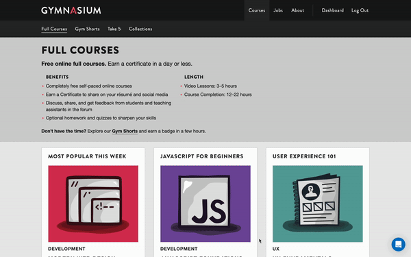
Gymnasium features a clean and simple design with familiar UI patterns that make navigation easy. It breaks down content into clear, manageable chunks with concise text.
However, the clutter-free UI is paired with a confusing UX, including inconsistent visual hierarchy, unclear user flows, and confusing CTAs.
The most frustrating one was that clicking the only button that can be used to go to the course always opens the syllabus instead of taking you to the lessons!

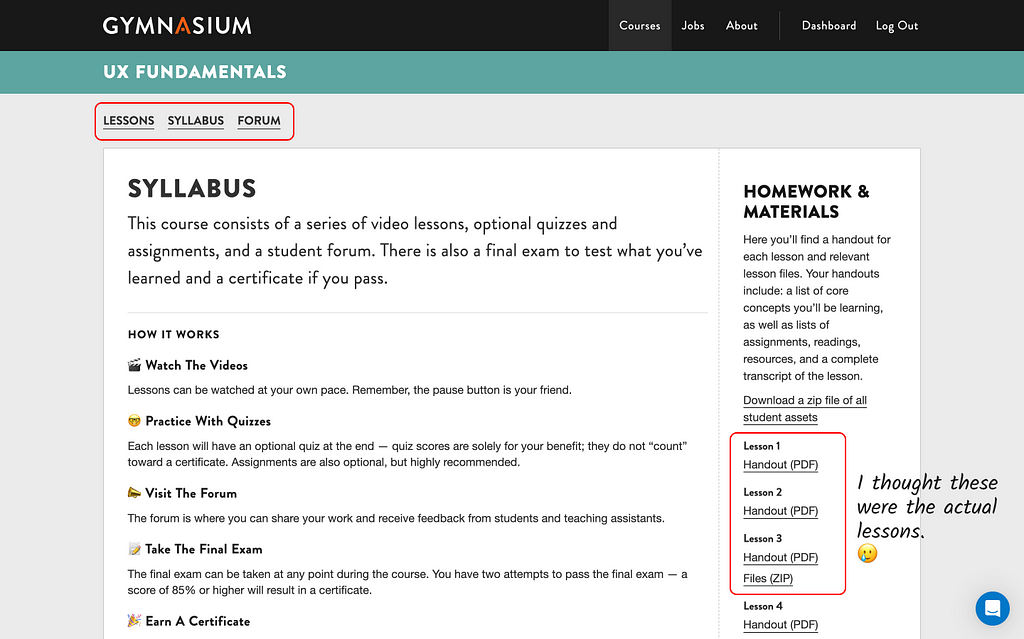
And when you land on this page, you end up getting lost!
Just to confirm that this is an actual issue, I tested it with 4 friends asking them to navigate to the first lesson.
2 clicked on the ‘Download a zip file of all student assets’ and 2 clicked on the Handout hyperlink. But after taking a second look and going through the entire page once, everyone clicked on the ‘Lessons’ hyperlink on top of the page.
🥸 Users are getting lost!
😎 The Fix —
I believe the ideal solution would be to send the user directly to the lessons if it’s not their first time.
However, assuming there’s a good reason for sending the user to the syllabus page, I made some quick changes to the HTML code to address the issue —
- The text colour of the current page is now different from the others, so users can easily see which page they’re on.
- I also added links to ‘Lessons’ and ‘Forum’ in the ‘How it works’ section.
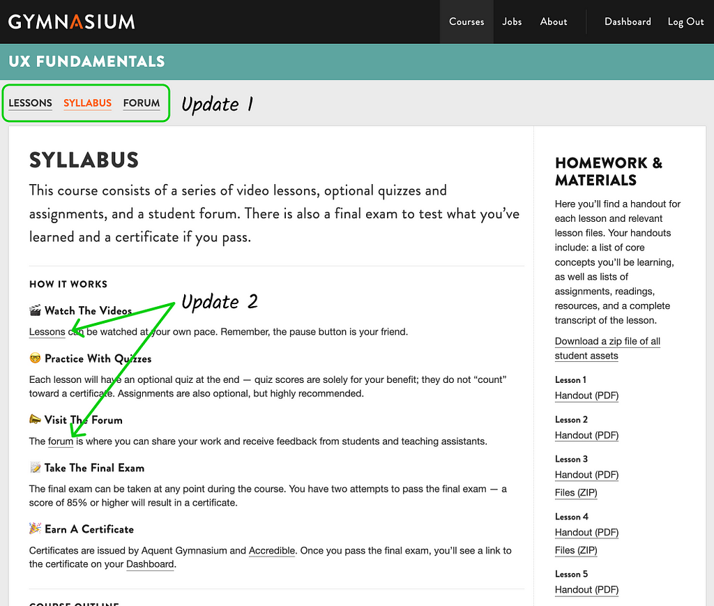
Tested with my friends again, this time 3 clicked on the Lessons link on top and 1 clicked on the hyperlink in the ‘How it works’ section.
➕ One positive aspect I appreciate is how the content is broken down into small, manageable chunks, which helps manage the cognitive load by making it easier for users to process and retain large amounts of information without feeling overwhelmed.
🥸 The next major issue that needs to be addressed—
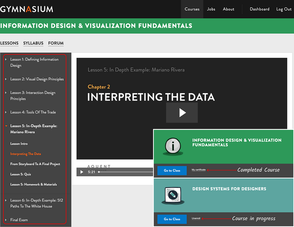
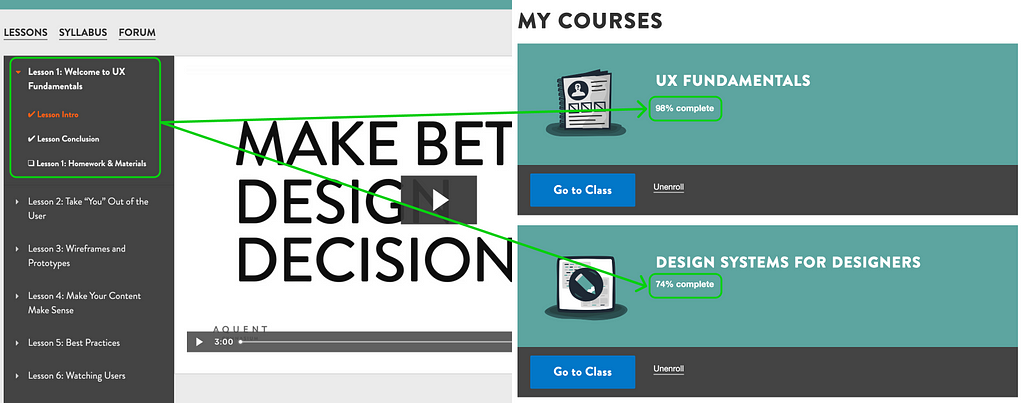
There’s no way to track my progress as a user!
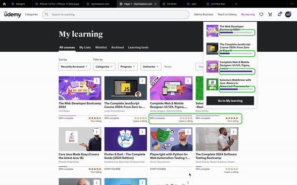
I’ve wrapped up multiple courses on Gymnasium, but the only clue that a course is finished is that tiny link that says ‘My certificate’ —
Here’s a quick comparison with Udemy —
😎 The Fix —
A simple checkbox next to the lesson title automatically toggles when the lesson is completed. Users can also toggle it manually if they wish.
➕ Tracking user progress reduces cognitive load by providing clear visual indicators of completed and pending lessons. This helps users focus on learning rather than remembering their progress, leading to a more organized and efficient learning experience.
🥸 If you take a step back and look at the website’s overall design, you’ll see its Information Architecture is pretty complicated.
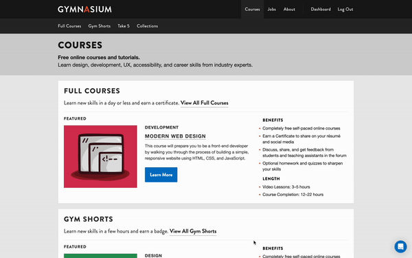
It’s hard for users to find what they’re looking for on the website since there aren’t filters for different types of content. Right now, with not a lot of content, it’s not too bad, but as more content gets added, it’s going to be a big problem.
Just to confirm that this is an actual issue, I asked a friend to find the Javascript Foundation Course starting from the Home Page.
The first thing he pointed out was the lack of a global search on the website. Then he reached the courses page, scrolled around and then abandoned the process.
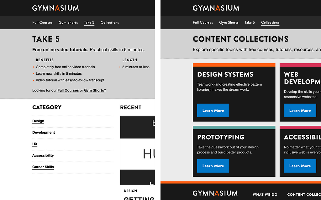
The courses even though tagged as Design, Development, UX & Career, the ‘Full Courses’ and the ‘Gym Shorts’ can not be filtered based on these categories.
Oddly ‘Take 5’ has categories and the ‘Collections’ section acts as a content directory that categorises the content into relevant categories that seem to be pretty helpful for working professionals.
😎 The Fix — Add Global Search & ensure a consistent UX.
One way to achieve this is by adding filters to sections where they are currently absent. Users can easily narrow down their search and find relevant content more efficiently. This will streamline the navigation and improve the overall user satisfaction.
Summary
I’ve pinpointed 3 usability issues — one with navigation, another with the absence of progress tracking, and an overall inconsistency in UX. I believe the solutions I’ve suggested can be implemented with straightforward code updates.
If you’re curious why I haven’t suggested radical changes like overhauling the entire IA or revamping the visual design, it’s because this website doesn’t seem to generate any revenue. Therefore, any investment of time and HR into fixing these issues needs to be justified to its stakeholders in terms of ROI.
I spent about 10 minutes to update the code locally, so I guess it should be pretty easy to implement. I believe the solutions I’ve suggested can be implemented with straightforward code updates.
Just wanted to thank you for reading the whole shebang. Seriously, major props to you for sticking with it. Your thoughts would be pure gold to me, so if anything jumped out at you or you have a different take, please drop a comment & remember to 👏🏽 if you found this helpful, it helps others find it.
Aquent Gymnasium would love to hear your input!
![]()
How do I propose to improve the usability of Gymnasium.com was originally published in UX Planet on Medium, where people are continuing the conversation by highlighting and responding to this story.