

In this tutorial, we’ll create a simple static site with Tailwind CSS and then learn how to preserve its menu state on page load.
The first time we visit the site, the menu will be hidden. However, as soon as we open it and close the browser, we’ll use local storage and JavaScript to keep the menu open the next time we visit the site. In fact, it will stay open until we close it again.
Ready for another challenge?
1. Create the Project
As a first step, we have to set up the project structure and decide where we’ll host it.
One option is to develop it locally and then, once ready, upload it to GitHub Pages. I’ve used this method in the past for different demos. For example, take a look at this one that customizes Bootstrap 4 tabs.
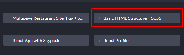
An alternative approach is to use CodePen Projects for both the development and hosting. It’s worth noting that depending on your CodePen plan, you’ll be able to host a different number of projects.
For this tutorial, as we haven’t done it before, let’s create a CodePen Project and take advantage of all the powerful features that come with it.
By default, CodePen provides various starter project templates. Here, we’ll select the most basic one.

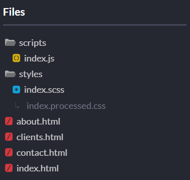
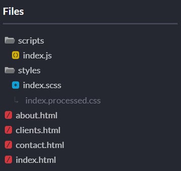
Our project will include four similar HTML files, an SCSS file that will compile to a CSS one, and a JavaScript file, like this:
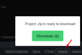
Last but not least, you can export and run it from your local machine.
2. Tailwind CSS
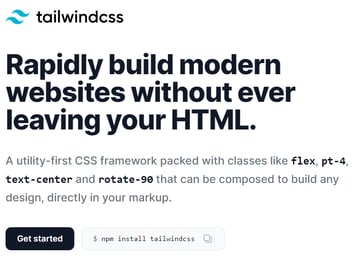
Instead of creating the styles from scratch, we’re going to make use of Tailwind CSS, a popular new utility-first CSS framework that has gained a lot of traction from developers. Created by Adam Wathan, its philosophy is to move all the complexity to the HTML files by adding pre-existing classes to the elements.


As I always liked this concept, I’ve followed it in the past for some demos like this one. Learn more here:


3. The HTML
All HTML files will contain a header and some dummy content.
Inside the header we will place:
- The company logo
- The hamburger icon
- The navigation menu
We’ll also need to include the following required files:
- The Tailwind CSS file
- Our own CSS and JavaScript files
To make the hamburger icon a little more accessible, we’ll use the aria-label, aria-expanded, and aria-controls ARIA attributes. As we’ll see later on, the values of the first two attributes will change depending on the menu state.
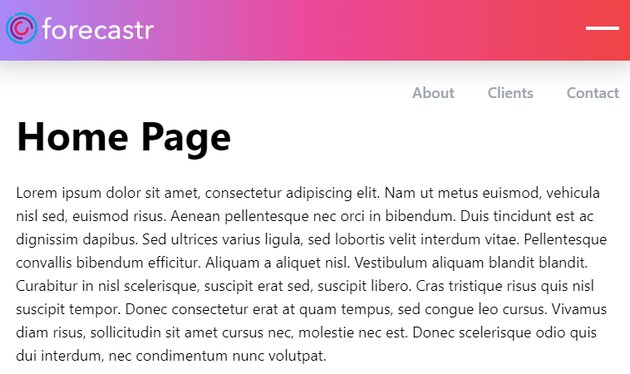
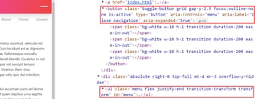
Here’s the markup for the index.html page:
<!DOCTYPE html>
<html lang="en">
<head>
<!-- Meta -->
<meta charset="UTF-8">
<title>Home Page</title>
<meta name="viewport" content="width=device-width, initial-scale=1">
<!-- Styles -->
<link rel="stylesheet" href="https://unpkg.com/tailwindcss@^2/dist/tailwind.min.css">
<link rel="stylesheet" href="styles/index.processed.css">
</head>
<body class="text-lg">
<header class="sticky top-0 bg-gradient-to-r from-purple-400 via-pink-500 to-red-500 p-5 shadow-xl">
<nav>
<div class="flex items-center justify-between">
<a href="index.html">
<img width="178" height="38" src="https://s3-us-west-2.amazonaws.com/s.cdpn.io/162656/horizontal-logo.svg" alt="forecastr logo">
</a>
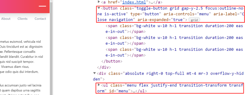
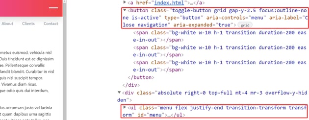
<button class="toggle-button grid gap-y-2.5 focus:outline-none" type="button" aria-controls="menu" aria-label="Open navigation" aria-expanded="false">
<span class="bg-white w-10 h-1 transition-transform"></span>
<span class="bg-white w-10 h-1"></span>
<span class="bg-white w-10 h-1 transition-transform"></span>
</button>
</div>
<div class="absolute right-0 top-full mt-4 mr-3 overflow-y-hidden">
<ul id="menu" class="menu flex transition-transform transform translate-y-full">
<li class="mr-6">
<a href="about.html" class="inline-block font-semibold text-gray-400 hover:text-gray-900 transition-colors duration-300 p-2">About</a>
</li>
<li class="mr-6">
<a href="clients.html" class="inline-block font-semibold text-gray-400 hover:text-gray-900 transition-colors duration-300 p-2">Clients</a>
</li>
<li>
<a href="contact.html" class="inline-block font-semibold text-gray-400 hover:text-gray-900 transition-colors duration-300 p-2">Contact</a>
</li>
</ul>
</div>
</nav>
</header>
<main class="my-20">
<section>
<div class="container max-w-5xl px-8 mx-auto">
<h1 class="font-bold text-5xl mb-8">Home Page</h1>
<p class="mb-5"...</p>
...
<a href="" class="inline-block bg-red-500 hover:bg-red-600 text-white font-semibold py-2 px-4 rounded-lg shadow-md" target="_blank">Read article</a>
</div>
</section>
<!-- more sections here -->
</main>
<!-- Scripts -->
<script src="scripts/index.js"></script>
</body>
</html>
Don’t feel overwhelmed by the amount of helper CSS classes. These are all coming from Tailwind CSS (apart from the toggle-button and menu ones that we’ll use in the JavaScript part to reference the target elements).
As this isn’t a Tailwind tutorial, I’m not going to explain what each class does. Most of these are self-explanatory, but there are some others like text-5xl that aren’t so clear, so you’ll have to dig into the documentation or browser console and see its exact use.
Just to give you an idea, consider the classes that we apply to the .menu element along with the generated CSS:
| Utility Class | Generated CSS |
flex |
display: flex; |
transition-transform |
transition-property: transform;transition-timing-function: cubic-bezier(0.4, 0, 0.2, 1);transition-duration: 150ms; |
transform |
--tw-translate-x: 0;--tw-translate-y: 0;--tw-rotate: 0; --tw-skew-x: 0; --tw-skew-y: 0; --tw-scale-x: 1; --tw-scale-y: 1; transform: translateX(var(--tw-translate-x)) translateY(var(--tw-translate-y)) rotate(var(--tw-rotate)) skewX(var(--tw-skew-x)) skewY(var(--tw-skew-y)) scaleX(var(--tw-scale-x)) scaleY(var(--tw-scale-y)); |
translate-y-full |
--tw-translate-y: 100%; |
4. Toggle the Menu
Each time we click on the menu link, the following actions will happen:
- We’ll toggle its
is-activeclass. If it contains this class, it will be converted smoothly to a minus icon. - We’ll toggle the
translate-y-fullclass of the menu. This is a Tailwind class that will determine whether the menu will appear or not. - Depending on the menu state, we’ll update the
aria-labelandaria-expandedARIA attributes.
Here’s the JavaScript code that will implement this functionality:
const toggleButton = document.querySelector(".toggle-button");
const menu = document.querySelector(".menu");
const activeClass = "is-active";
const hiddenClass = "translate-y-full";

toggleButton.addEventListener("click", function() {
  this.classList.toggle(activeClass);
  menu.classList.toggle(hiddenClass);
  if (menu.classList.contains(hiddenClass)) {
    this.setAttribute("aria-label", "Open navigation");
    this.setAttribute("aria-expanded", "false");
  } else {
    this.setAttribute("aria-label", "Close navigation");
    this.setAttribute("aria-expanded", "true");
  }
});
And the related SCSS styles:
.toggle-button {
  &.is-active {
    span {
      &:first-child {
        transform: translateY(14px);
      }

      &:last-child {
        transform: translateY(-14px);
      }
    }
  }
}
Persist Menu State on Page Load
So far, our menu works great. But let’s go a step further and learn how to preserve its state. That said, the very first time we visit the site, the menu will be invisible. However, as soon as we open it and close the browser, this will remain open the next time we visit the site until we close it again.
This is a perfect case for showing how local storage can solve this kind of request.
Let’s be more specific:
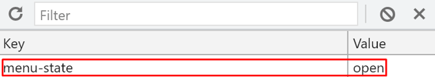
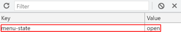
- Upon hamburger icon click, we’ll store on local storage the
menu-statekey. Possible values can beopenandclosed.
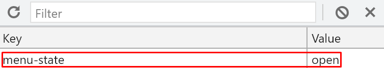
- When the page loads, we’ll check the value of this key. If the user has already opened the menu, the hamburger icon will receive the
is-activeclass, the menu won’t contain thetranslate-y-fullclass, and the ARIA-related attributes will change accordingly.
Let’s look at the JavaScript code that will handle this logic:
...

if (localStorage.getItem("menu-state") === "open") {
  toggleButton.classList.add(activeClass);
  menu.classList.remove(hiddenClass);
  toggleButton.setAttribute("aria-label", "Close navigation");
  toggleButton.setAttribute("aria-expanded", "true");
}

toggleButton.addEventListener("click", function() {
  if (menu.classList.contains(hiddenClass)) {
    localStorage.setItem("menu-state", "closed");
  } else {
    localStorage.setItem("menu-state", "open");
  }
});
Of course, as an improvement, you can prevent the animations from running on page load. But I’ll leave this from now as it’s of secondary importance.
You’ve Learned How to Use Local Storage!
We’ve just finished, folks! Today, we learned to build a CodePen Project that uses Tailwind CSS for its styles and persists its menu state on page load using JavaScript and local storage. I hope you’ve learned one or two new things and you’ll soon be able apply them to your projects.
Feel free to enhance the demo by making the menu even more accessible or adding more Tailwind features. If so, don’t forget to share it with us!
As Tailwind is a hot topic at the moment, I’m planning to write a Tailwind-oriented tutorial that will describe how to customize its default options or combine it with another popular framework like Bootstrap. If you want something specific like this, let us know via social media.
As always, thanks for reading!
More Practical JavaScript Projects
We have a ton of interesting JavaScript tutorials to help you learn. Dig in!


