
In an economy that’s more digital than ever, one statement stands particularly strong:
“Brand consistency is the key to survival in today’s digital economy” – Marketing Week
Brand consistency leads to brand recognition, and brand recognition leads to brand trust. Have you ever trusted a brand you didn’t recognise?
The Challenge of Online Brand Consistency
An online brand is more than the sum of its parts. You achieve online brand consistency when all the elements that appear on all the channels a brand uses, such as email, web and apps are, well, consistent!
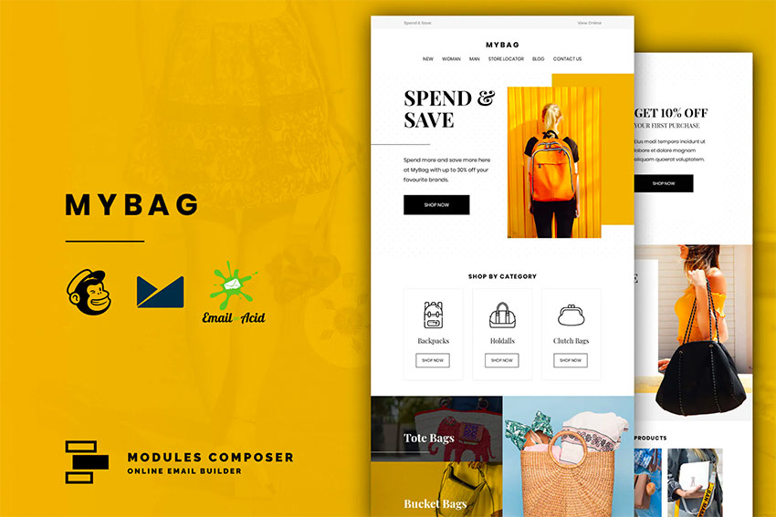
The challenge to achieving online brand consistency comes with the inconsistent way in which you have to create the elements for those channels, resulting in inconsistencies in how those elements look and how those elements behave.
How to Create Online Brand Consistency
Paying attention to those elements helps you ensure online brand consistency across your channels. Some of them are of primary importance to online brand consistency. They include logos, colours and fonts.
 PlaceitHow to Design a Monogram Logo (Using a Monogram Maker)
-
PlaceitHow to Create an Animated Logo

Some of them are of secondary importance to brand consistency, as they enhance brand recognition, but are not key to it. They include things like buttons, links and shapes. In this tutorial, I’ll focus on primary and secondary elements, on two of those channels, email and web.
Designing Primary Online Brand Elements
Logos
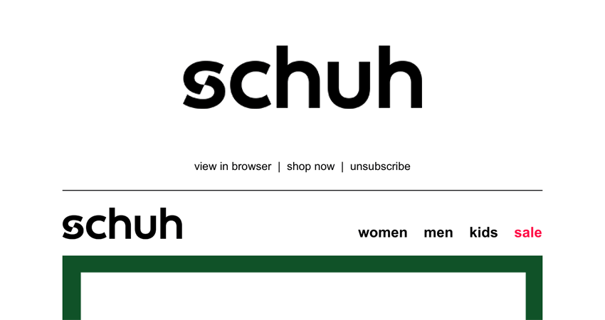
Logos (or logotypes) should arguably be the most recognisable of online brand elements, as they’re unique to every brand. Therefore, they need to be consistent on all brand assets, offline and online, print, email, web and app. To achieve this consistency, you should:
- Use the same version or versions of your logo. You may have one version of your logo that you use for mobile, tablet and desktop. You may have two versions of your logo – one for mobile, which may have less height and more width (landscape), and one for tablet and desktop, which may have more height and less width (portrait).
- Display your logo at a consistent size and proportion across assets.
- Ensure both versions of your logo are high-resolution, so they remain sharp and crisp on high-definition displays, like Apple’s Retina Display. Blurred logos don’t represent brands very well, and the recipient may think the email or website they’re on isn’t authentic.
You can ensure your logos are high-resolution by creating them at a larger width (in pixels), and a larger height (in pixels), and in a suitable image format. GIFs or PNG-8s are suitable for logos with solid colours, JPEGs or PNG-24s are suitable for logos with graduated colours or photography. SVGs are suitable for logos with solid or graduated colours.
Implementation: Email
- Create your logo at 200% of its intended size. Creating your logo at this size will ensure it appears sharp and crisp on high-definition displays, such as the Apple Retina display when reduced to its intended size.
- Save your logo in a suitable image format (GIF or PNG-8 for logos with solid colours, JPEG or PNG-24 for logos with graduated colours or photography).
- Specify the intended size of your logo in your HTML and CSS. In the image attribute HTML, the width and height (e.g.
img width="200" height="100"). In the image inline CSS, the width as 100%, the max-width (its intended width), and the height as auto (e.g.style="width:100%; max-width:200px; height:auto;"). Specifying the CSS in this way ensures the logo will display at its intended size, but will then reduce further in size to fit the width of smaller displays if they’re too small to display it at its intended size.
Implementation: Web
- Save your logo in the SVG image format.
- Specify the intended size of your logo in your HTML and CSS. In the image attribute HTML, the width and height (e.g.
img width="200" height="100"). In the image internal CSS, the width as 100%, the max-width (its intended width), and the height as auto (e.g..logo {width:100%; max-width:200px; height:auto;}). Specifying the CSS in this way ensures the logo will display at its intended size, but will then reduce further in size to fit the width of smaller displays if they’re too small to display it at its intended size. As the SVG image format is a vector image format, as long as the original image is of sufficient quality, it will remain sharp and crisp when increased and decreased in size.
If you ever revise your logo, be sure to update each version on email and web. Creating master versions, and placing them in a master code snippet will enable you to update once, and apply everywhere.
Colours
Ensuring colours are consistent is reasonably straight-forward, as long as you’re using hexadecimal, the supported colour code format for email and web, and applying it using all six characters. On web, for some colours, it’s possible to abbreviate it to three characters, using a shortcut, when the first three characters and the last three characters are the same (e.g. #ffffffff; to #fff; or #ff0ff0; to #ff0;).
On email, CSS should be applied inline, especially on text and links, as there are some email clients, webmail clients and apps that don’t support internal CSS. The exception to this is when you’re styling elements you have to style with internal CSS, such as ghost tables, and elements styled by, or dependent on @media queries, like web fonts. On web, you can apply CSS inline, though it’s best to apply it internally or externally.
Implementation: Email
- Six-character hexadecimal (e.g.
#000000;) - Inline CSS. Internal CSS to style elements within ghost tables and elements dependent on @media queries.
Implementation: Web
- Six-character hexadecimal (e.g.
#000000;). Three-character hexadecimal using a shortcut (e.g.#000;) where possible. - Internal CSS. External CSS.
It’s important to be mindful of how the colours of online brand elements will appear on ‘Dark Mode’ on Apple devices or ‘Dark Theme’ on Android devices. Dark images on transparent backgrounds may disappear, and tightly cropped images on white backgrounds may appear poorly executed and unfinished!
For consistency, I recommend designing online brand elements to display on Dark Mode and Dark Theme, without relying on code, as, as at the time of writing, both Dark Mode and Dark Theme are relatively new, so you’re likely to see varied results across channels.
Fonts
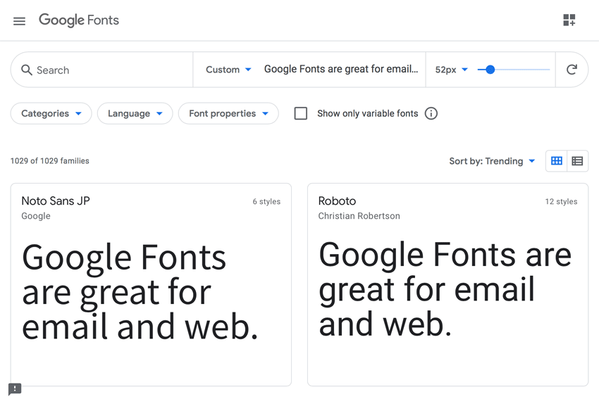
The easiest method of achieving consistency with fonts is to use web-safe fonts, like Arial and Georgia. Web-safe fonts are pre-installed on most operating systems, so it’s safe to assume (hence their name) that they’ll display on them.
However, if you have web-safe fonts on your emails, and web fonts on your website, the online brand experience will be inconsistent. At the time of writing, web fonts can be implemented into email with CSS, using WOFF (Web Open Font Format) web fonts. They’ll display on multiple Apple operating systems, including iOS, iPadOS and MacOS, which in December 2020, accounted for 53% of the global email market share – more than Gmail, Outlook, Yahoo! Mail, Samsung Mail, Google Android, and Outlook.com combined.
Web Fonts on Envato Elements
A subscription to Envato Elements will give you access to thousands of the best web fonts. If you’re a typeface fan, you need to take a look at our selection.
However, your brand may have more than, or less than, 53% of your recipients using these operating systems, so you’ll have to specify a suitable web-safe fallback font in the font stack for when they won’t display. You can implement web fonts more widely on web of course, though you’ll need to ensure they’ll display on the browsers your brand supports.
Implementation: Email
- Web-safe fonts.
- Web fonts (WOFF only) (Limited to iOS, iPadOS, and MacOS) applied with CSS.
Implementation: Web
- Web-safe fonts.
- Web fonts (Select web font available as WOFF to ensure consistency with email) on browsers supported by the brand.Secondary Online Brand Elements
Buttons
While not a branding element per se, you still need to design buttons, so the recipient recognises them and knows what to do with them, wherever they are on their online journey – email or web. Consider their shape (something I cover later in this tutorial) and their symbols, such as their chevrons and arrows.
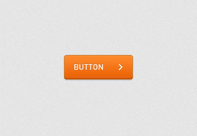
It’s challenging to implement symbols as images in email buttons, so I’d advise using entities instead, like the right arrow (→). As buttons are interactive elements, be mindful of how they’ll look and behave, as a recipient rolls over or selects them. Implementing the styling for this is achieved with CSS on email and CSS and JavaScript on web.
Implementation: Email
- HTML, CSS (Including CSS animation where supported).
Implementation: Web
- HTML, CSS, JavaScript.
Links
In many ways, links are like buttons, so follow the same “rules” for consistency. The difference here is how some email clients, webmail clients and apps force styling onto them, making them inconsistent.
Blue links as they’re known can present themselves when email clients, webmail clients and apps, override any internal CSS with default blue styling, which will undoubtedly not on be on brand! You can resolve this, though it requires different techniques for different email clients, webmail clients, apps and devices. A tutorial in itself! However, here are a few tips to get you started.
Apple Mail
- Insert the following internal CSS:
a[x-apple-data-detectors] {color:inherit !important;}
Gmail
- Insert an
IDofbodyinto the body tag:<body id="body"> - Insert the following internal CSS:
u + #body a {color:inherit !important;}
Samsung Mail
- Insert the following internal CSS:
#MessageViewBody a {color:inherit !important;}
Other Cases
- Insert a
classofblueLinkinto the affected tag:<p class="blueLink">01234 567890</p> - Insert the following internal CSS:
.blueLinks a {color:inherit !important;}
Shapes
Shapes play a part in branding, though achieving consistency can be challenging using HTML and CSS. Creating anything other than a rectangle on email, within a grid of rectangles introduces complexities. It’s possible to create rounded rectangles and even overlap one rectangle over another, but these techniques demand a lot of time and testing.
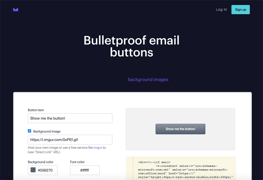
You can create consistently rounded rectangles on buttons if you’re willing to invest the time to develop a Microsoft Vector Markup Language (VML) button. Microsoft Outlook doesn’t support the CSS property border-radius, so using border-radius will result in any elements border-radius is applied to, including buttons, being rectangular on Microsoft Outlook, without using VML.
Thankfully Campaign Monitor has a handy tool for creating VML buttons. However, depending on how many of your brands’ recipients use Microsoft Outlook and your email design and development strategy, you may decide to accept they won’t see rounded rectangles, but only rectangular rectangles! It all depends on how critical that shape is to your branding.
Implementation: Email
- CSS: Rounded corners with border-radius (No support on some email clients, including Microsoft Outlook).
- VML: Rounded corners on buttons can be created easily with VML and border-radius, using Campaign Monitor’s ‘Bulletproof email buttons’ tool.
Implementation: Web
- CSS: Rounded corners with border-radius.Compromising on consistency
As we’ve seen, there are occasions where it may be necessary to compromise on consistency, where the cost of consistency is high in terms of time and effort. The question is, do you, or don’t you accept the compromise? It’s a matter of how much the compromise impacts the integrity of your branding.
If your recipients primarily use Microsoft Outlook, and your branding utilises a lot of rounded rectangles, it may be worth investing the time to create rounded rectangles using VML.
If your recipients primarily use iOS, then it won’t be, and you may have to accept the compromise of having rectangular rectangles for any recipients using Microsoft Outlook.
Finally: Formulate an Email Design and Development Strategy
Understanding HTML and CSS support across email clients, webmail clients, and apps will, in turn, help you achieve tighter consistency across email and web, and help you in any decisions you need to make on compromise. Formulate an email design and development strategy.
Formulating an email design and development strategy will help you understand what email clients, webmail clients and apps your recipients are using, so you can focus your efforts where it matters. Such insight will lead to a consistent online branding experience for your recipients, as they leave your email, and arrive on your website.
Email Development for Beginners
Learn more about email development strategies with our series of email tutorials:


