One of the most effective forms of marketing media, leaflets allow you to reach prospective audiences in-store or through the mail. What makes a good leaflet? To avoid your leaflet being consigned to the trash, use thoughtful leaflet design to give your advertising leaflet templates a more lasting impact.
Here we look at ten tips for what makes a good leaflet design, from experimenting with origami folds to turning your leaflet designs into keepsakes that recipients will want to hang onto for longer. What makes a good information leaflet? Accessible type, adequate color contrast, and helpful extra features such as QR codes, maps and offers are just as important as your leaflet template’s aesthetic features. Scroll down to discover inspirational leaflet tutorials and leaflet examples, to help you create an artful and effective leaflet template for your next marketing campaign.
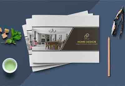
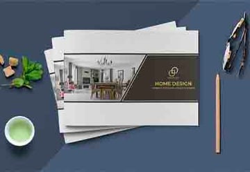
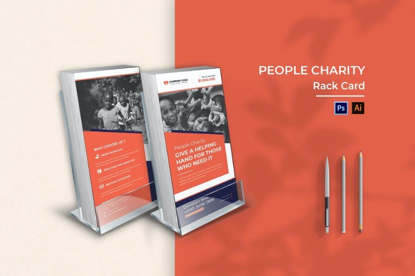
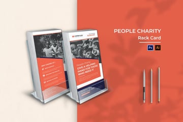
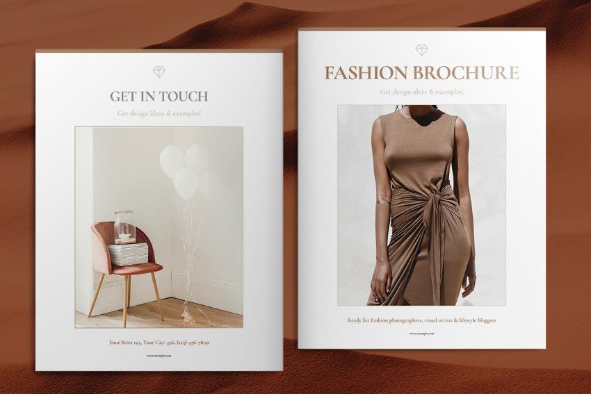
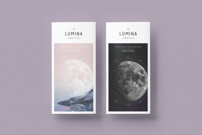
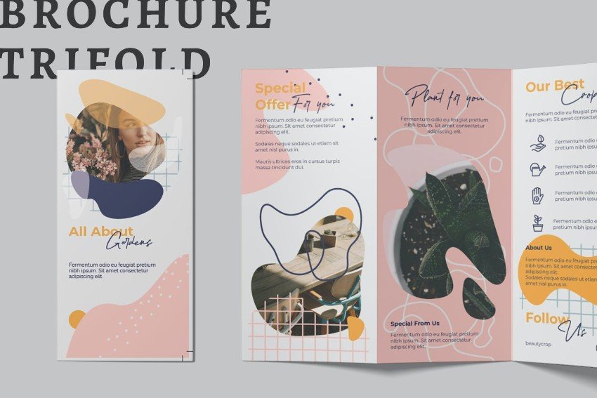
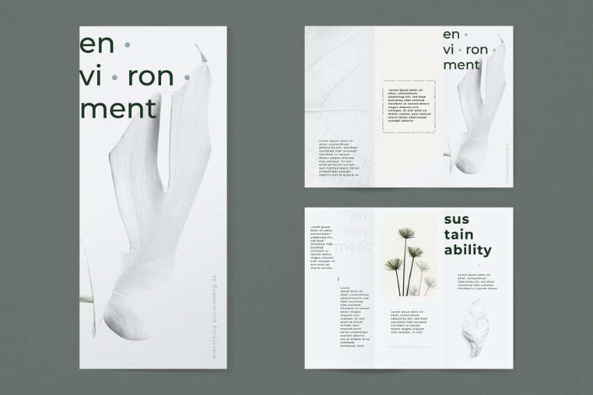
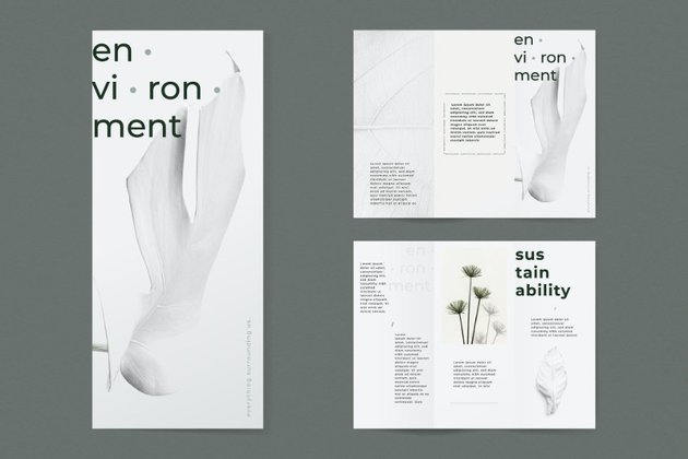
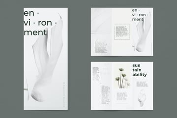
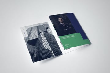
Explore a wide range of leaflet templates, from simple A5 leaflet templates to lengthier six-page leaflets, on Envato Elements.

1. Consider the Size of Your Leaflet
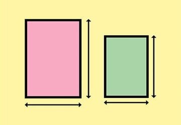
It may seem an obvious first step, but giving careful consideration to the size of your leaflet is vital before you begin designing your leaflet template. Leaflets are printed in a variety of standard sizes, the dimensions of which will vary depending on your chosen printer and territory.
It’s important to design a flyer based on locally accepted sizes for two reasons. Firstly, you want to ensure your printer will be able to print your design (many will only print and fold standard sizes), and secondly, these sizes also ensure your leaflet can be easily stacked on standard-sized display shelves or posted through mailboxes without the risk of crumpling or ripping (see more information about this below).


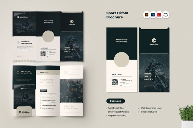
In the US, a good rule of thumb is to size your leaflets based on a sheet of Letter-sized paper, 8.5 by 11 inches (216 x 279.5 mm). This can be used as a stand-alone, non-folded flyer, or folded twice (to create a tri-fold, z-fold or gate-fold leaflet) or three times (to create a four-panel accordion fold leaflet).
Outside of the US and Canada, a wider variety of leaflet sizes tend to be used, but there are a couple of standard sizes that are especially widely used.
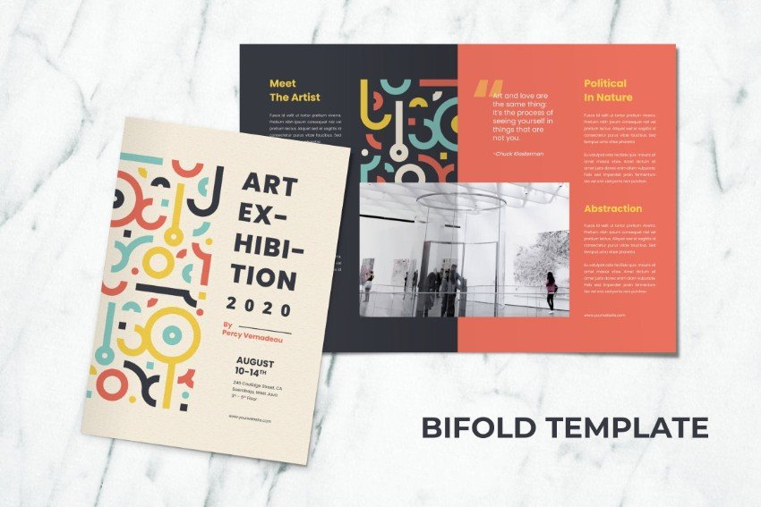
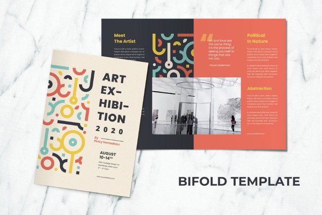
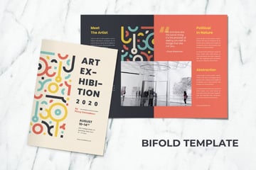
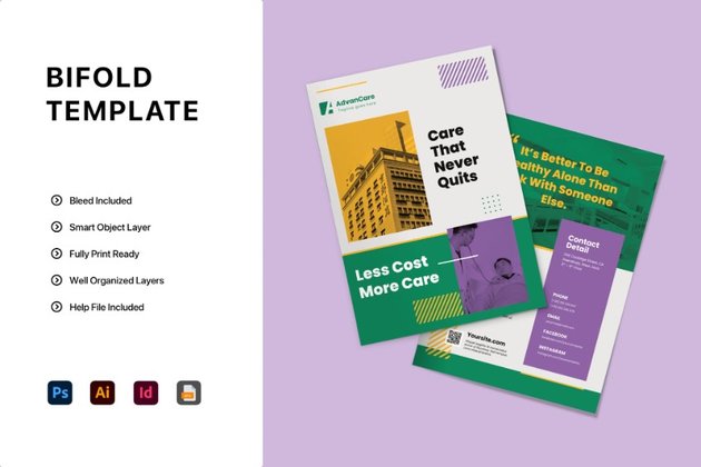
A5 (148 by 210 mm) can be used as a non-folded flyer or folded once to create a slim, compact bi-fold leaflet. A4 (210 by 297 mm) is larger, and can be folded in a variety of different ways to create a bi-fold or tri-fold leaflet.
Refer to the article below for a comprehensive list of standard sizes for both the US and Canada (known as the ANSI standard) and international territories (termed ISO 216):

2. How to Stack
The size and folding format you choose for your leaflet design should depend on the end purpose of your leaflet.
Will the leaflet be posted through the mailbox? In this case, it needs to fit through a standard letterbox width (in the US, this is usually a minimum of 10 inches wide).
Will your leaflet be stacked on a display shelf? If so, the height should be no taller than the height of a standard-sized shelf.

If your leaflet is going to be handed out on the street or placed in a pile for recipients to pick up, you have a bit more flexibility in terms of the size of your design. For example, you could create a leaflet that has a slightly more generous height and/or width because these will not be constraints for how the leaflet is displayed. However, you should still consider how your leaflet will be transported to its destination. If the leaflets are to be delivered in the mail to the point of display, then you will still need to observe standard mailing requirements for leaflet size to avoid crumpling or large postal fees.
Another consideration regarding leaflet distribution is how recipients will respond to the size of your leaflet. A large leaflet that edges towards brochure or magazine size can actually be quite off-putting for individuals, whereas a compact leaflet size is more portable, making it more likely they can put it into a pocket or bag.
In the world of leaflets, while creating bespoke designs can be fun and result in highly creative designs (see below), it’s generally a good rule of thumb to use tried-and-tested sizes and aim for a design that’s small but full of visual impact.


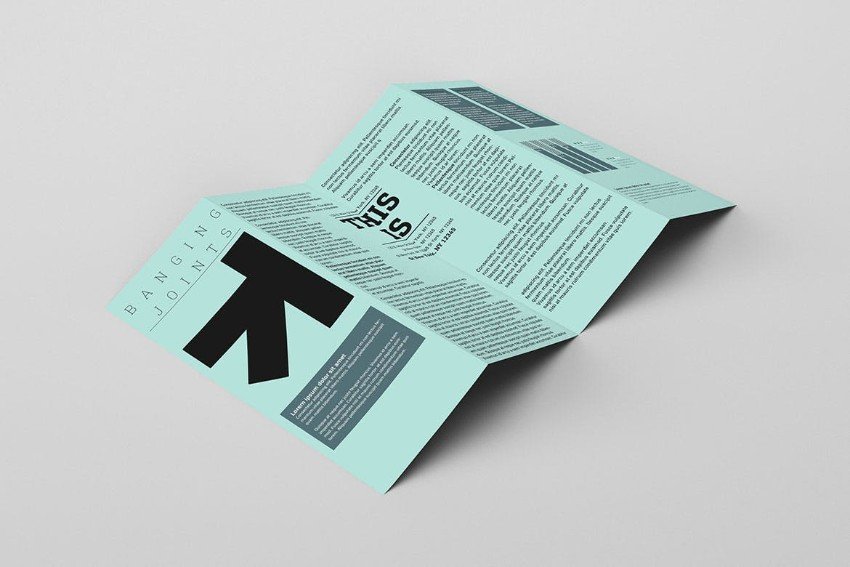
3. Experiment With Origami
You don’t have to create a swan (although if you want to, by all means go for it!), but rethinking how your leaflet design could be folded can give your design a real point of difference.
A simple bi-fold or tri-fold is simple and effective, while an accordion fold (with folds that vary from inwards to outwards) gives a satisfying unfolding action. If you have a large-scale unfolded design, such as a city map, you might want to create a leaflet that folds into a small square to make it compact, or even simply folding over one corner of your design to create a cut-out color effect can be bold and impactful.


Research on Pinterest or Envato Elements for folding leaflet examples and inspiration—you’ll be amazed at the complexity of some of the folded designs that can be achieved.
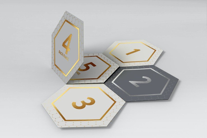

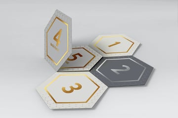
A note of caution—even if your design has unusual folds, still try to create a leaflet design that folds flat. This will ensure you can stack multiple copies without a problem.


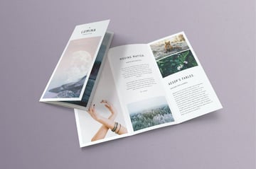
4. Design With the Folded-Out Layout in Mind
Leaflet design can be surprisingly complex, especially when folds are taken into account. A design might look fabulous in 2D form on the screen, but a little lacklustre in its folded reality. When creating a leaflet design, it’s important to keep both the folded and unfolded forms of the design in mind. The folded design is essential for drawing the individual’s attention, but the folded-out design is likely to be the design that converts that individual to take action or to keep the leaflet for longer than a fleeting moment.
When designing your leaflet in layout software like Adobe InDesign, you can pull out guides to mark out the folds on your folded-out leaflet. However, you shouldn’t feel restricted by these fold lines. The best leaflet designs extend elements across fold lines, to give the folded out design more impact. After all, the folded out leaflet offers much more space and flexibility for creating something larger.
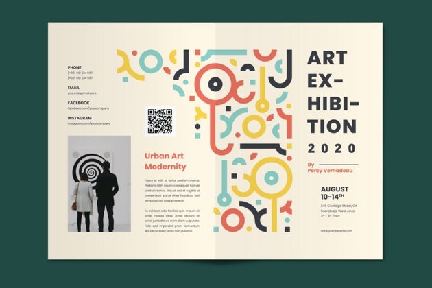
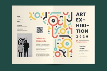
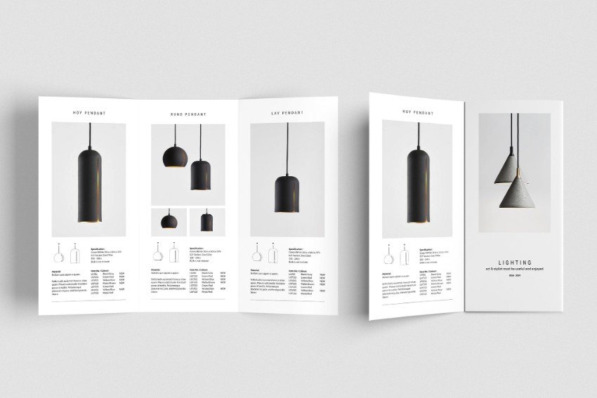
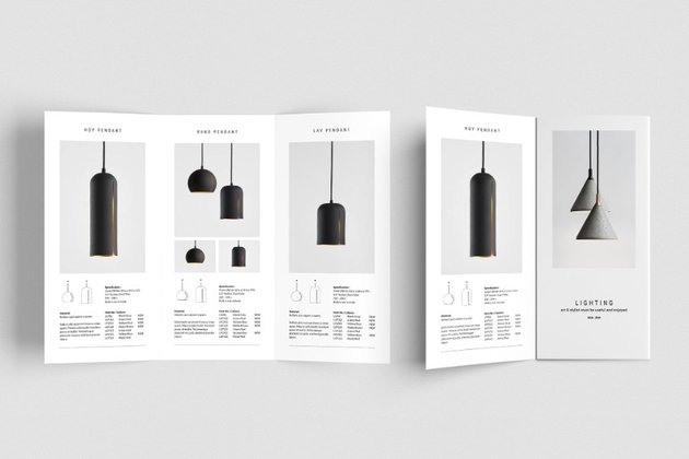
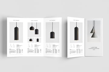
How can you make the most of your folded-out layout? This can be as simple as extending images across multiple sections of your leaflet design, such as in the leaflet example below. This is a no-effort way to visually increase the size of your layout.


Uniform use of color can also help to bring your fold-out design together, and a graphic pattern, such as in the leaflet examples below, can be extended across the page to create a visual flow throughout folded sections.


A good rule of thumb is to allow visual elements, such as images, graphics, and color, to extend across multiple folded sections, while text should generally be confined to individual sections, to avoid any difficulty with reading content when the design is fully or partly folded.
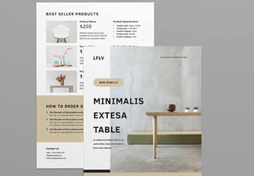
5. Balance Attention and Detail
A leaflet is usually a marketing tool, intended to raise awareness of a brand, product, or event, and as such the leaflet design should serve this purpose. Ultimately, a leaflet needs to be picked up and taken away, for an individual to digest in their own time. In the same way that a book or magazine cover uses attention-grabbing techniques to entice the viewer to pick it up, a leaflet should also have a front page that draws the eye.
The front page of your leaflet template is your sales pitch, the ‘look-at-me’ section of your design. Suggested attention-grabbing techniques include photos of individuals that maintain eye contact with the viewer, a large headline in a contrasting color, or an enticing arrow or corner color that encourages the leaflet to be opened.
The attention-grabbing emphasis of the front page can be balanced with interior sections that go into the detail of the offer. Whether it’s must-know information about an event, a handy map, or useful contact details, the inside sections are where you can place the essential information.
If you can successfully balance attention and detail in your leaflet design, this is where the humble leaflet really comes into its own. At once both an advertising space and a detailed information brochure, it plays the role of a whole website or catalog in an extremely limited page space.


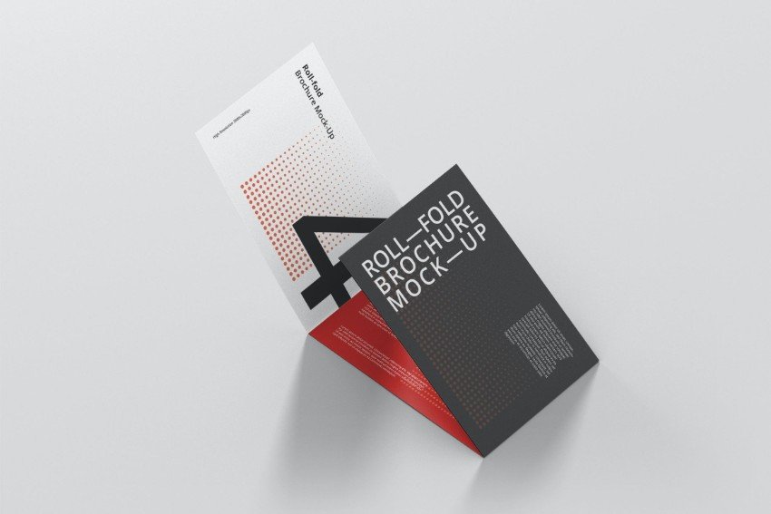
6. Color Is Key
Leaflets often have to compete alongside hundreds of other designs on display shelves. With this in mind, it pays to use techniques that can help your leaflet template to stand out. Color is an especially effective tool for drawing eyes to your leaflet design, as well as having a potential psychological effect on the viewer.


Bright and bold colors, like neon pastels or modernist primary brights, can help your leaflet to stand out in a sea of navy and white. Optimistic, warm colors like yellow and orange not only feel welcoming and vibrant, but also are often associated with warming and alertness (think hazard signs), making them appear instantly more visible on a crowded shelf.


If bright colors don’t feel like the right fit for your subject matter, consider employing color contrast instead. A nearly all-black leaflet design takes on a whole new personality when teamed with a chic dash of white. Pull out geometric shapes in contrasting tones to make a monochromatic leaflet design feel more dynamic, or use a complementary color pairing (such as blue and orange, or yellow and purple) to make viewers feel instinctively more receptive to your leaflet’s message.


7. Proof Your Type Size
By the time your leaflet is folded into increasingly minuscule sections, it can be difficult to know if the majority of readers will find your text legible. For many leaflet designers, one of the greatest challenges is incorporating vast quantities of text onto limited page space. Before you attempt to squash extensive copy onto your design, consider reducing your text length significantly. This will not only improve the overall design of your leaflet template but also make the content more accessible for viewers.


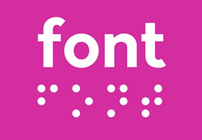
Accessibility is sometimes overlooked when it comes to printed media like leaflets, but sizing your text to a large scale (and certainly greater than a 10 pt size) and in a high-contrast colorway (black text against white being the easiest to see) will help visually impaired users to read the information. Consider also if it is possible to include Braille in your design, or to produce a standalone Braille version.
While you are designing your leaflet using digital software, get into the habit of printing off a rough hard copy at an accurate size on your home or office printer. This will allow you to assess if your text is sized well for legibility and to ensure that your chosen fonts are easy to read. While serifs can look fantastic for headlines and subheadings, a geometric sans serif is normally much easier to read at small sizes.
8. Create a Keepsake
With your leaflet space at a premium, it can be tempting to crowd your layout with everything you have to hand. Exercise restraint—your leaflet design will be more effective if it features areas of white space (areas which include only background color or decorative graphics, or indeed nothing at all), which can help to direct viewers’ attention to essential information.
When your leaflet is unfolded, a viewer will spend more time looking at the unfolded front side of the document, so this is the place to lay out the essentials—event details, product prices, or a QR code for discovering more information or booking tickets online.


On the reverse side of the leaflet is a vast space which can be often overlooked. This is an opportunity to include something genuinely useful for the user, which has the capacity to transform your leaflet from a throw-away disposable to a keepsake item.
For events, hotels, or tourism, the reverse is a natural place to include a map (alongside local advertising spots), but there are other things you could include to boost the longevity of your leaflet. A color-in activity for children, a restaurant or event offer, or a holiday calendar with local events—all of these give your leaflet extra life beyond the initial pickup, ensuring the marketing message stays with your intended audience for longer.


9. Twin Your Media
The humble leaflet design is an incredibly effective marketing tool because it has the power to engage with people who are already interested in the subject or offer. For example, someone who’s interested in family days out will be more likely to pick up a leaflet about a local museum’s events for children. Because your leaflet is a highly targeted form of marketing media, it can be wise to consider your leaflet as part of a wider marketing campaign.
In terms of the designer’s duties, what does this entail? A leaflet isn’t necessarily a stand-alone design. It will often be supported by other types of media, such as a website or app, posters, flyers, or signage. If your leaflet will be a part of a larger marketing campaign, consider how these different types of media could work together to create a cohesive campaign. You may have access to brand guidelines for creating your designs, but if not, using similar imagery, fonts, and colors across all related designs can help users to connect your designs with the event or brand being advertised.


Establishing a brand style for your leaflet design is also helpful if you will need to create leaflet designs in the future for similar events or offers. In this case, creating a leaflet template in software like Adobe InDesign can allow you to return to the bones of your original design and adjust color or images to give the leaflet a different feel.
10. Consider Tactility
What’s the difference between the pages of a book and the pages of a promotional magazine? The paper stock used in books feels more substantial, making the experience of turning pages feel more meaningful and luxurious. A magazine or flyer usually uses much thinner paper stock (which is measured in GSM, grams per square meter) for economical reasons, but the downside of this is that these types of media often feel much cheaper and therefore more disposable.


How your leaflet will feel is almost as important as how it looks, and paper thickness and finish—whether it is coated or uncoated, gloss or matte—will play a subtle but important role in whether users feel more inclined to keep your leaflet to hand rather than dispose of it in a matter of minutes.


Request a slightly thicker paper stock than your printer normally uses for leaflets (although not so thick as to compromise the flat fold of your design), and ask for both gloss and matte paper samples. Leaflets are often printed on gloss or semi-gloss coated paper to embolden colors—perfect for brands looking to stand out—but matte textures can feel more modern and chic, and are usually a better fit for cultural events, for example.
Conclusion: Techniques to Make Your Leaflet Designs More Effective
What makes a good leaflet design? From bold use of color to immersive imagery that crosses foldable sections, there are plenty of ways designers can maximise the visual impact of the humble leaflet template.
Of course, what makes a good visual design isn’t necessarily what makes a good information leaflet. Ensuring your leaflet layout is accessible, with adequate color contrast and large type—and perhaps the inclusion of Braille text—plays an equally important role in making your leaflet design effective and genuinely useful for viewers.
If you’re looking for more print design or marketing design inspiration, don’t miss the following articles, tutorials, and template selections, from fantastic brochure templates to top tips for creating layout designs in Adobe InDesign:
-

How to Make a Digital Brochure
-
42 Best Digital Brochure Templates (For InDesign, Word, PDF, PSD)
-
How to Make an InDesign Catalog Template
-
10 Best Free InDesign Brochure Templates (Download Creative Designs 2021)
-
42 Best InDesign Template Tutorials
-
15 Free InDesign Catalogue Templates With Creative INDD Layouts 2021
-
25+ Best Customizable Marketing Flyer Template Design Ideas for 2021
-
25+ Best New Product Flyer Design Templates (Inspirational Examples 2021)