You’re undoubtedly already familiar with design and prototyping tools like Figma, Adobe XD and Sketch; wireframing tools like Balsamiq, Mockflow and Axure; and flowchart tools like Visio, Miro and Lucidchart.
You’re probably using one or more of these applications right now in your UI/UX workflow. And you might also be paying for a couple of these applications individually.
But what if you could have wireframing, designing, prototyping and flowcharting all together, under the same roof, as part of one single package?



And what if the whole thing was built for collaboration, so you could work cooperatively in real time with your colleagues and clients at any stage of a project?
And what if on top of that, you were given access to a library of over 6,000 ready to use components, widgets, symbols, templates, icons and flowcharts?
At first glance that sounds like a lot to ask, but it is in fact exactly what Wondershare Mockitt, a brand new UI and UX suite, has to offer.
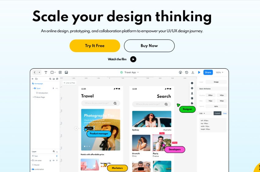

This wide range of functionality and assets in one place, on a unified design platform, is what makes Mockitt one of the most interesting entrances into the UI/UX space in quite some time.
What is Mockitt?
Mockitt is an online design, prototyping, and collaboration platform to empower your UI/UX design journey. It contains three main features:
Prototype
Create wireframes and interactive prototypes with automated animation and exports to PNG / PDF / HTML5 / Android APK.
Design
Vector graphics editing with booleans, masks, artboards, layout constraints and CSS / iOS / Android code generation.
Flowchart
Flowchart and diagram creation, and the extra cool thing is you can import prototype screens and flowchart them together to help with planning.
Let’s Create Something with Mockitt
There’s way too much across three whole apps to cover every single feature and function so instead what were going to do is make something, using all three apps, that gives us a look at some of the coolest parts of Mockitt.
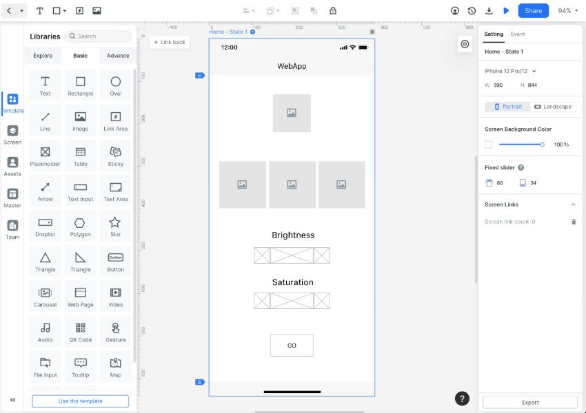
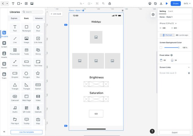
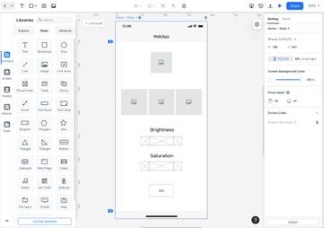
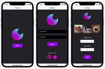
We’re going to wireframe three screens of this bulk image adjustment web app in Prototype:
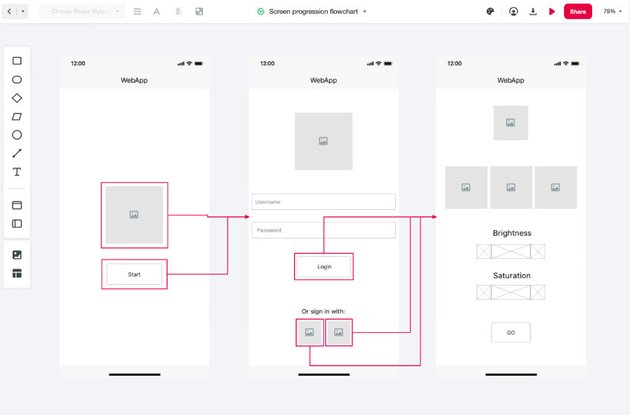
Then chart the progression between screens in Flowchart:

Make a logo in Design:



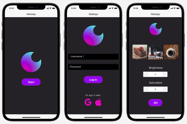
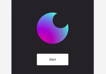
Drop the logo into the prototype, then spice it up with colors, ready made components, transitions and animations:

Let’s go!
How to Make a Wireframe in Mockitt
Everything in this tutorial can be done with the free trial of Mockitt, so head over and grab yourself an account.
Set up New Prototype File
Once you’re signed in create a new Prototype file by hovering over the big blue + button like so:


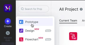
Choose the iPhone size option from the disfigure box that pops up:


Choose the Template vertical tab on the left, then the horizontal tab labeled Basic. Under that tab you’ll find pretty much everything you need for wireframing. We’re going to start by dragging in an image placeholder that will represent the logo.

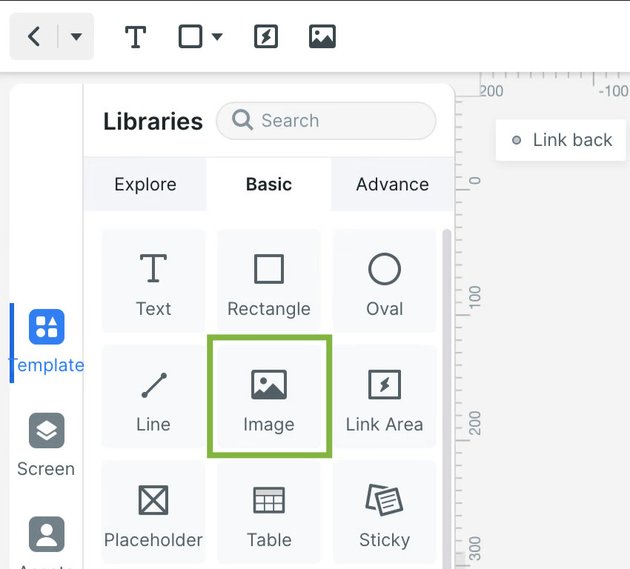
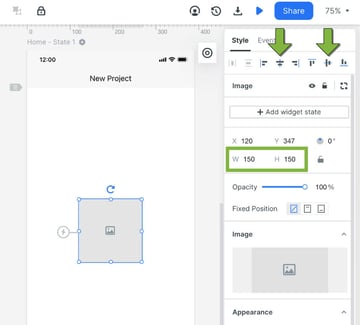
Once the image placeholder is on the canvas set the width and height to 150. Then press the vertical center and horizontal center buttons to align the image:


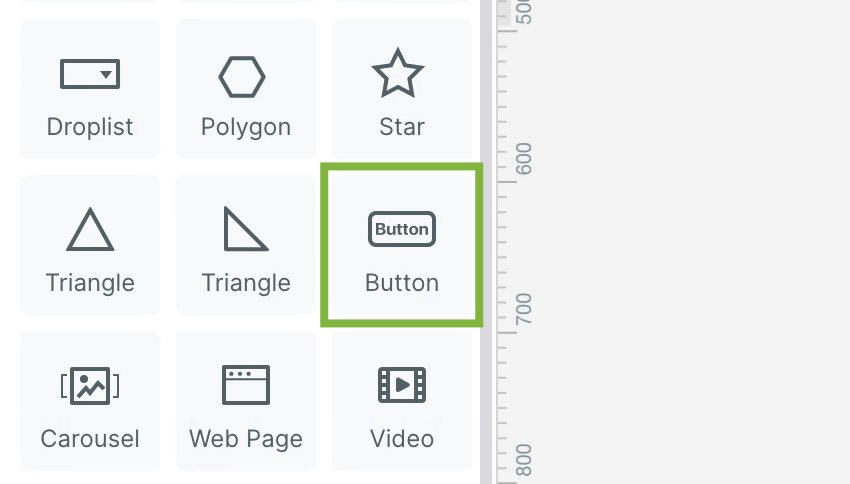
Then drag in a button element:
This first screen is going to be the start screen, so double-click the button text and change it to read “Start”:

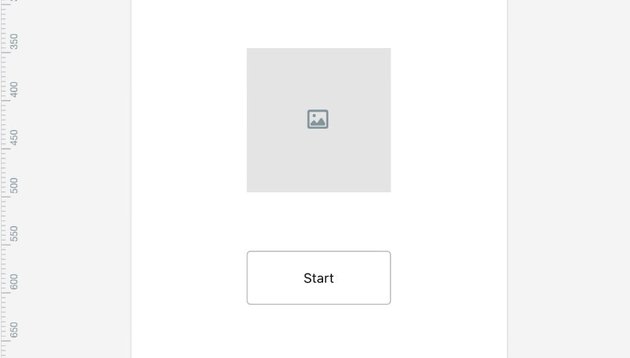
That’s all we need for first screen’s wireframe.
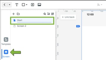
Before we move on, choose the Screen vertical tab, double click the current screen’s name and change it to “Start”:
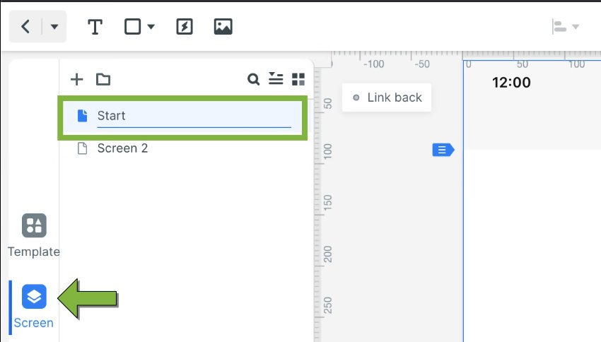
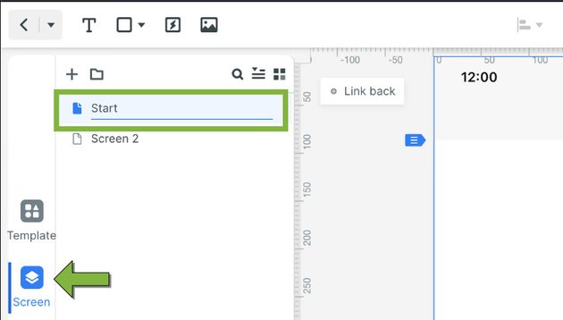
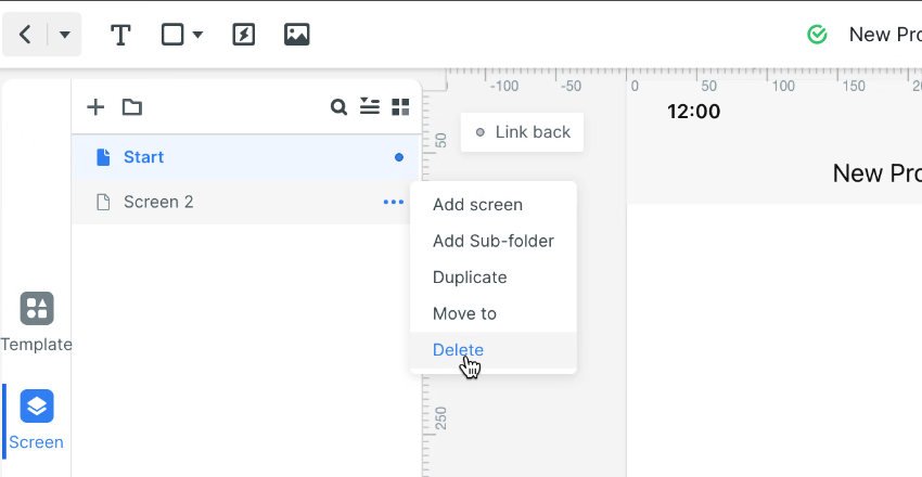
We don’t need the default second screen so delete that, as pictured:
Duplicate the “Start” screen:
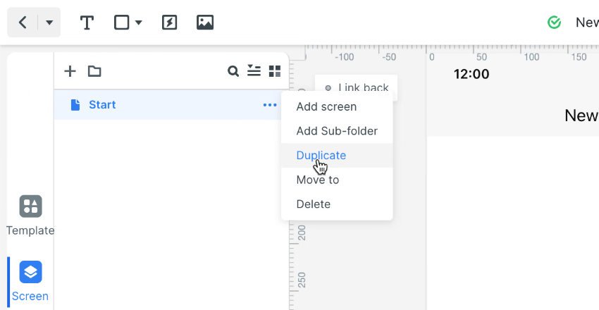
Name the new duplicated screen “Login”. In this screen move the logo up to make some space then drag in two text input fields:


Adjust the fields to be a little wider and higher than they are by default and edit the labels in each to “Username” and “Password”. Also change the button label to “Login”:
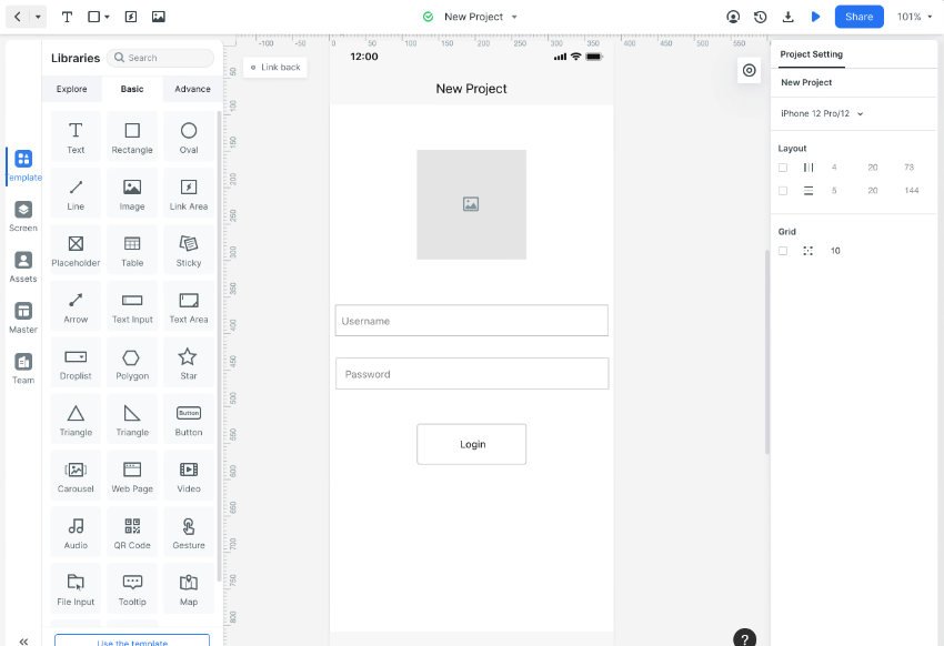

We’re about to use the text tool. You can find it in the top left of the interface:

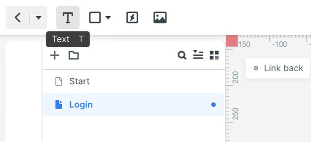
Use the text tool to add some text that reads “Or sign in with:”. Then add two smaller images below the text, (we’ll replace these with social sign in icons later):
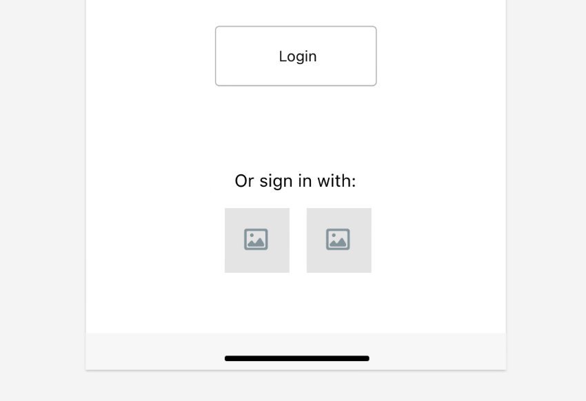
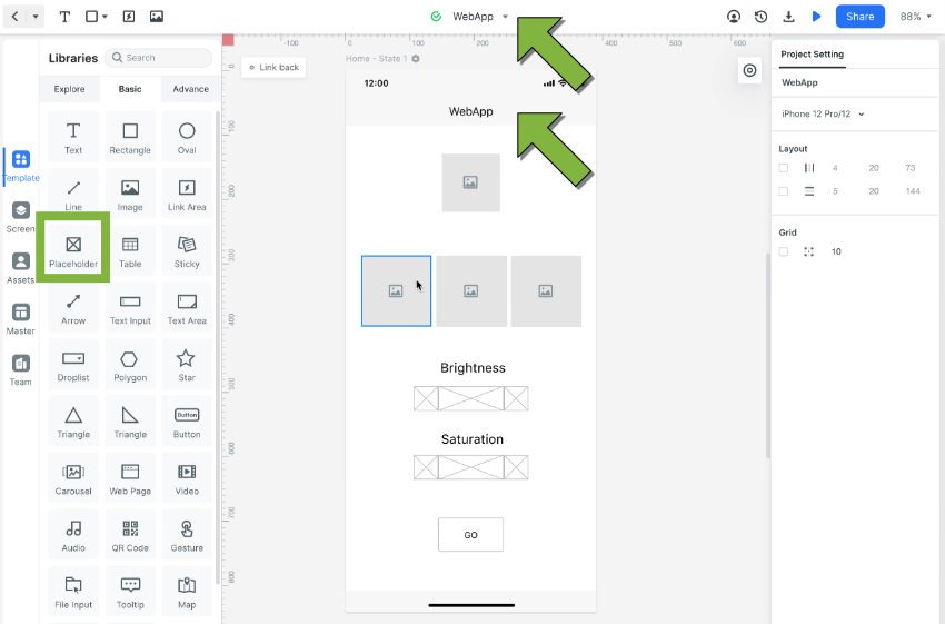
Duplicate the original “Start” page again, and name the new page “Home”. Arrange the screen into the wireframe layout pictured below by doing the following:
- Move the logo up and shrink it
- Move the button down and change the label to read “GO”
- Place a row of three images – these represent the images that will be bulk processed by the app user
- Create two image adjustment modifier controls using text and the Placeholder object from the Basics tab
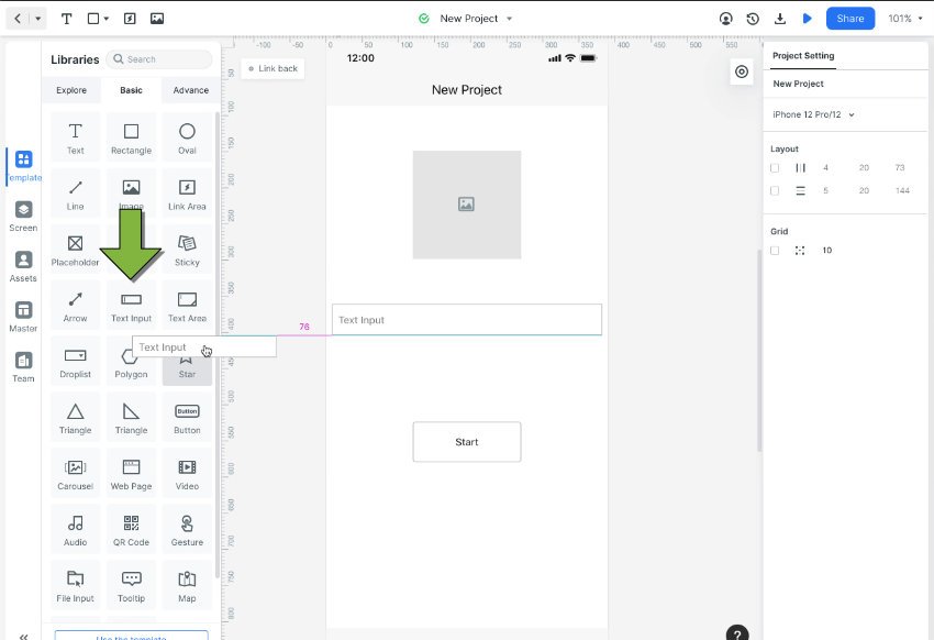
You might also want to give your web app a custom name, which you can do in the area pointed to by green arrows in the image below:


That’s our wireframe done!
How to Create a Screen Progression Flowchart in Mockitt
Now let’s pull the wireframe into Flowchart so we can map how progression between screens will work. If our imaginary app was being made for an imaginary client, we could use this flowchart to consult with them at this stage.
Create New Flowchart Document
Back in the Mockitt dashboard create a new Flowchart document:
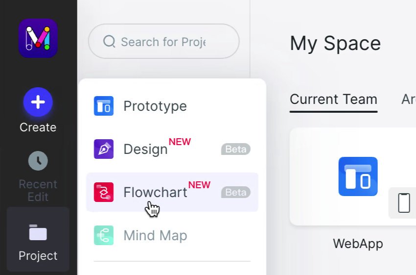
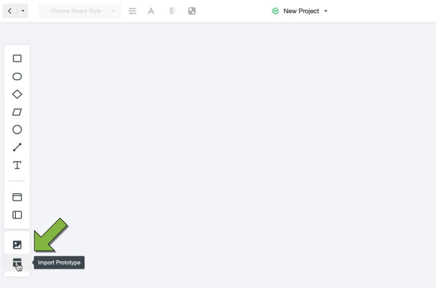
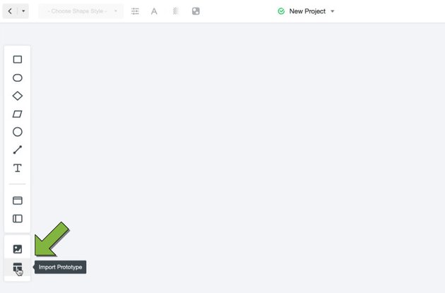
Once in the document, click the Import Prototype button at the bottom of the left toolbar:
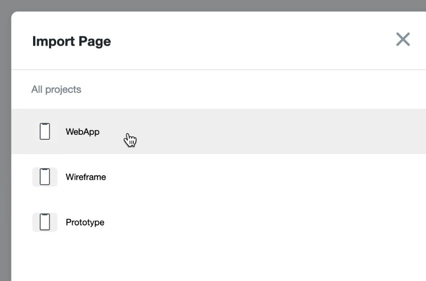
Select your wireframe document:
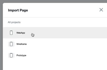
Check the Select all pages box, then click Import in the bottom right corner:

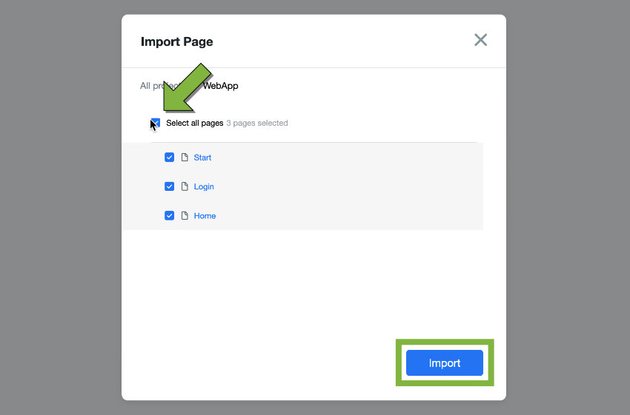
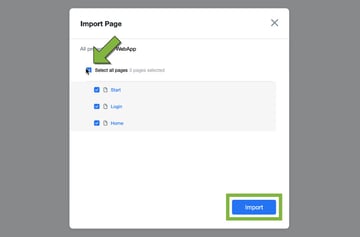
You’ll then see all your wireframe screens, laid out neatly for you:
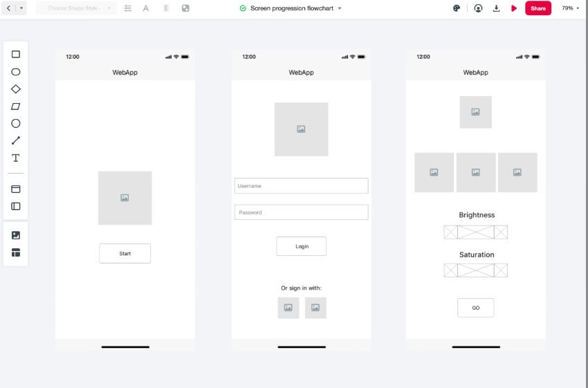
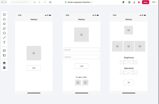
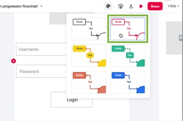
To make sure the flowchart elements stand out from the monochrome wireframe, click the theme button near the top right of the interface and choose the theme pictured below:
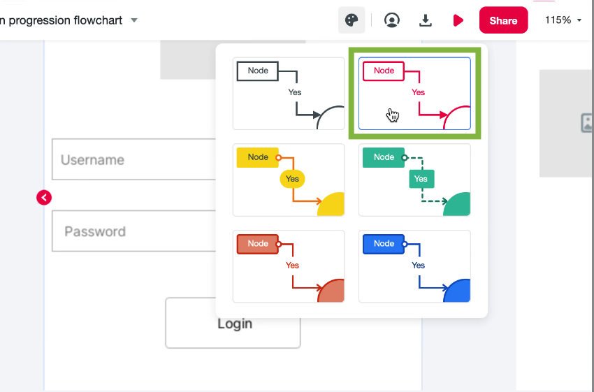
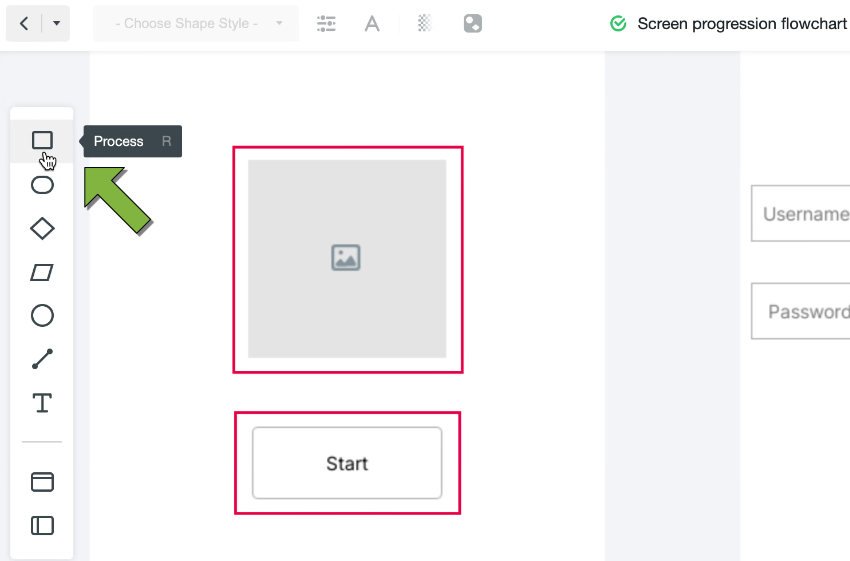
Now, use the rectangular shaped Process tool to draw boxes around the parts of the “Start” screen you’ll be able to click to progress, those being the logo and the button:


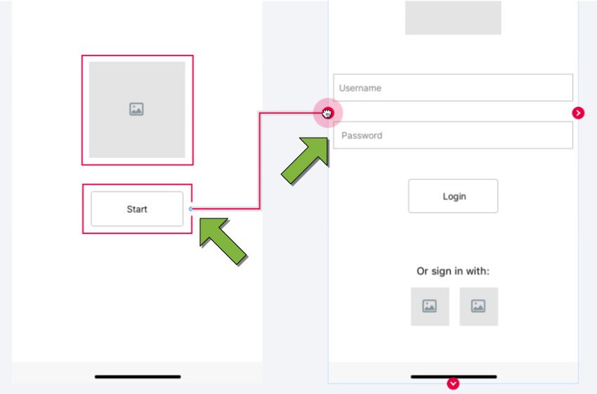
Hover over a box and nodes will appear on all four sides. Drag from one of those nodes to the screen on the right in order to make a connecting arrow:

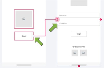
Repeat the process until you end up with a complete screen progression flowchart, like so:


And that’s the flowchart done!
How to Make UI Design with Mockitt
We can assume we’ve consulted with the imaginary client over the flowchart and they’re happy, so let’s move onto adding branding. With Mockitt, we can create professional UI design collaboratively. We’ll begin by making a logo.
Create New Design Document
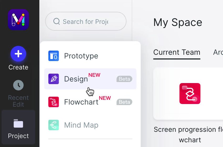
Back in the Mockitt dashboard once again, create a new Design document:

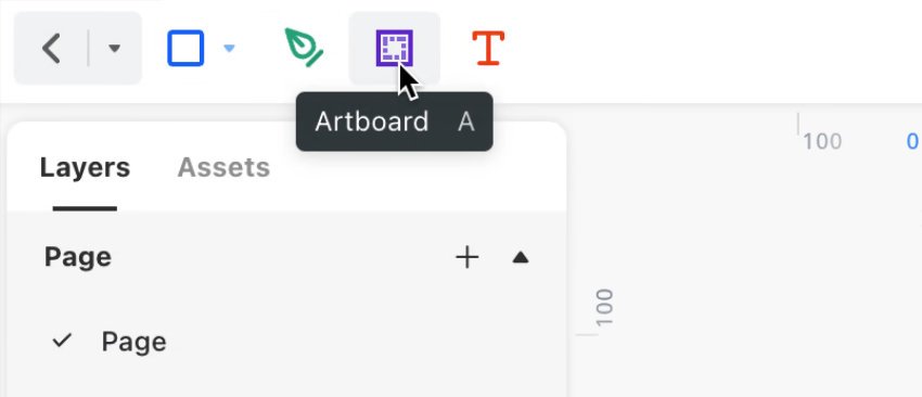
In the new document, select the Artboard tool near the top left of the interface:

Draw out an artboard, set it to 600 width by 600 high, and give it a dark, desaturated purple fill color:


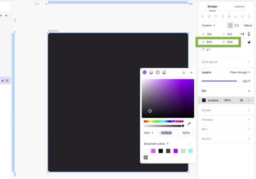
Now click the small arrow to the right of the Rectangle tool, and from the dropdown, select the Ellipse tool:
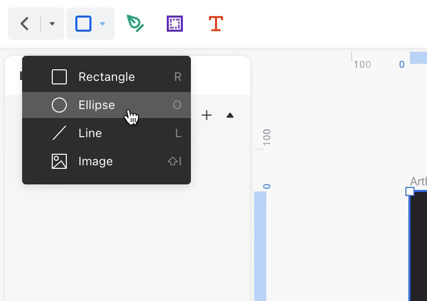
Inside the artboard, draw out a circle at 250 wide by 250 high:
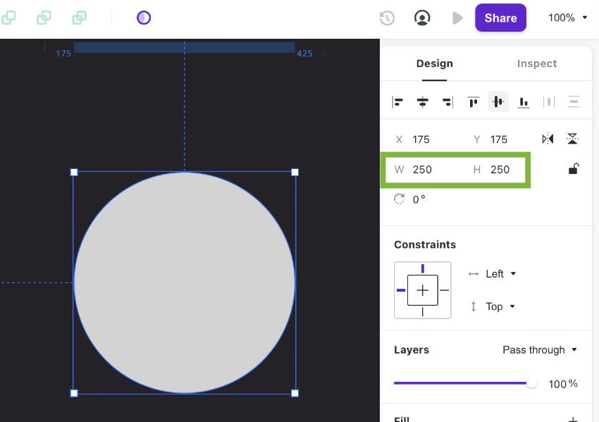
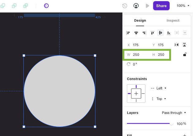

Then create a second circle, this time 125 wide by 125 high, and align it to the top right of the first circle. Design’s snapping will make it easy for you to achieve this alignment by just dragging the small circle into the correct location:
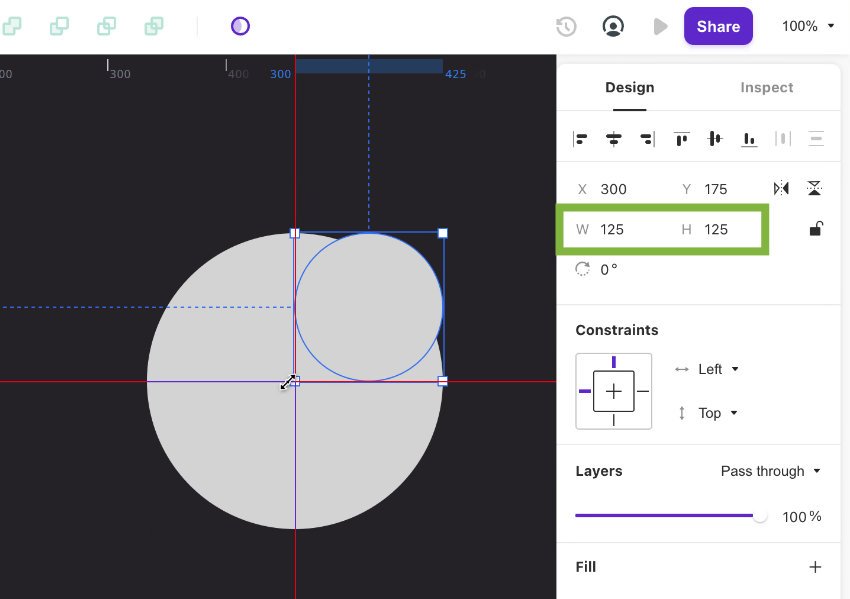
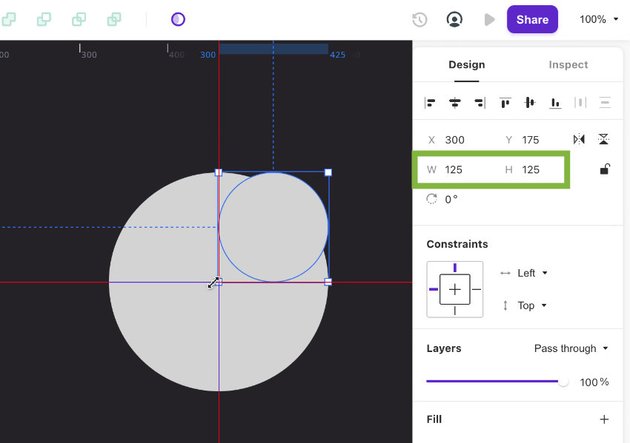
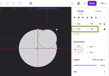
Select both circles by dragging your mouse around them, then in the center of the top toolbar click the Subtract selection boolean operator button:

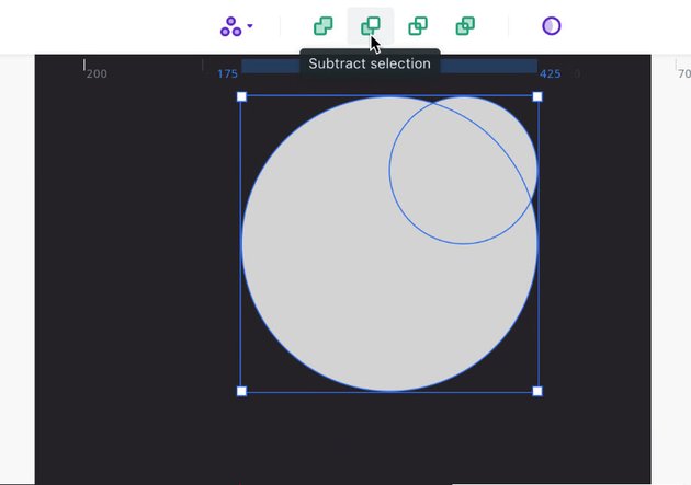
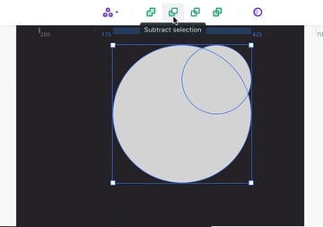
This will cut a piece out of the large circle in the shape of the small circle, giving you this composite shape:



Add Color
Now let’s add some color.
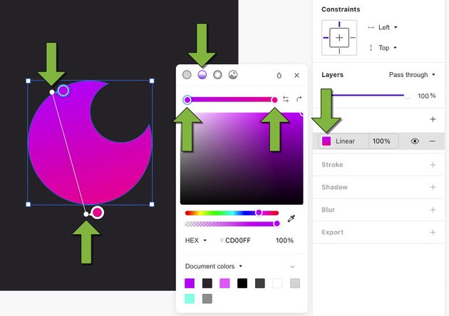
Click the gray swatch of the current fill to open up the color tool box. Then select the second small circle along the top of the color tool box to convert the full into a linear gradient. Create a purple to pink gradient by click the stops at either end and setting a color of your choosing. Then grab the handles at each end of the gradient directly in the shape to tweak its angle:
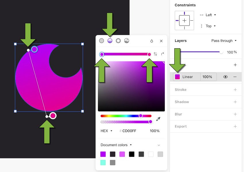

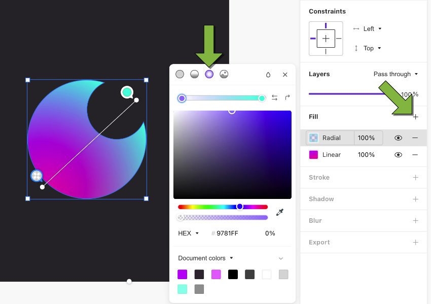
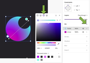
Design allows you to add multiple fills to a shape, and layered gradients can create really rich colors. So click the plus button above the current fill to add another, edit the fill, and this time choose the third small circle on the color tool box to seta radial gradient. This time set it to go from cyan to transparent purple, and tweak its angle and position like so:

Export Logo
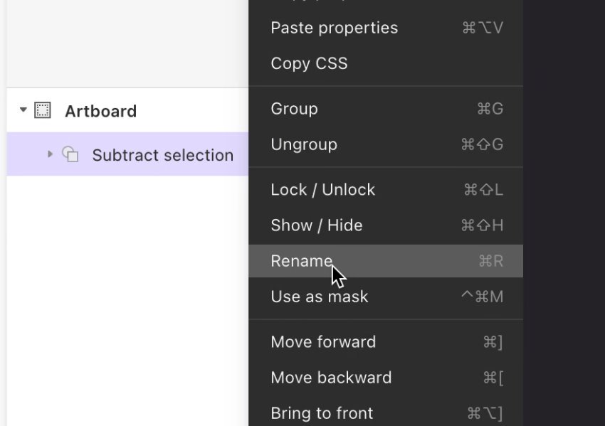
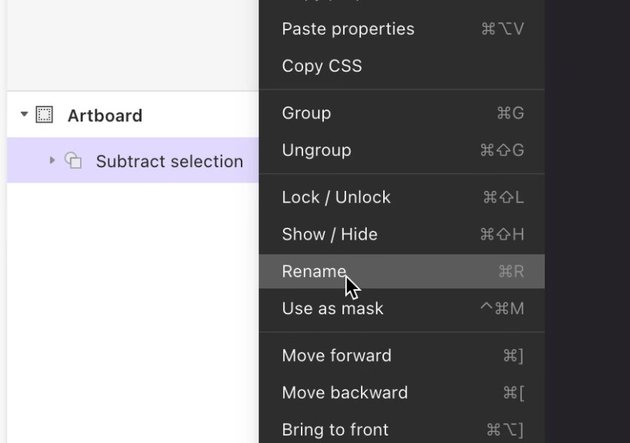
We’re ready to export the logo, so first let’s rename our composite shape, as this will determine the name our file exports with. On the left of the interface you’ll see the shape’s current name, “Subtract selection”. Right-click the shape here and choose Rename, then change the name to “logo”:
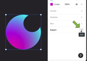
In the right sidebar find the Export box, then with the logo shape selected click the + button:


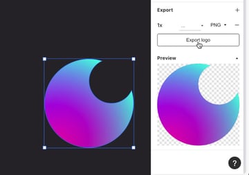
This creates an export for our logo image, and a preview of how it will look. Go ahead and click the Export logo button and save the logo file to your drive:


Our logo is now ready for use!
Create a Prototype: Add the Logo, Colors and Components
Now let’s add some life to the wireframe and convert it into an interactive prototype. Open up your wireframe document in Prototype and let’s edit it some more.
Add Life to Screens
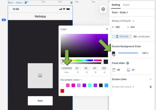
First, select each screen and in the Setting tab in the right sidebar, change their Screen Background Color to the same dark purple you used when creating the logo:


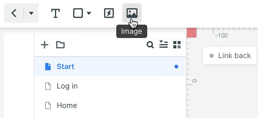
Now let’s replace the logo placeholder with the actual logo. Use the Image tool near the top left of the interface to browse for and add the logo file you just exported:

Set it in the same size and location as the logo placeholders on each of the three screens:

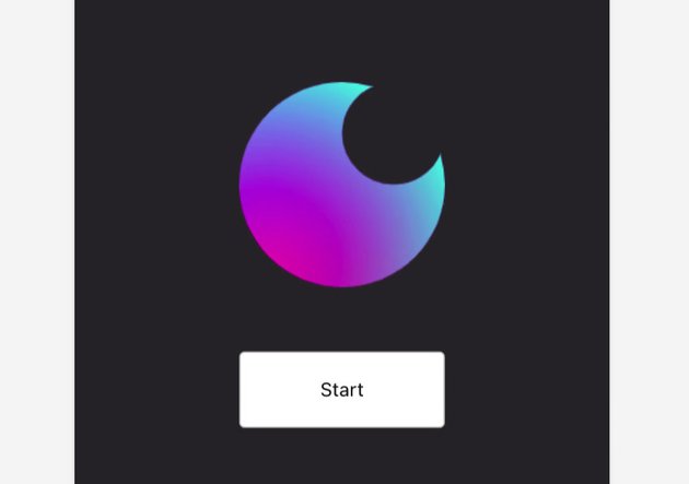
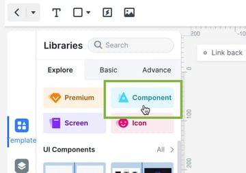
Next up, let’s replace the buttons with something out of the integrated component library. In the vertical Template tab in the left sidebar, go to Explore, then Component:


Select the group of components labeled “Element – Button…”:
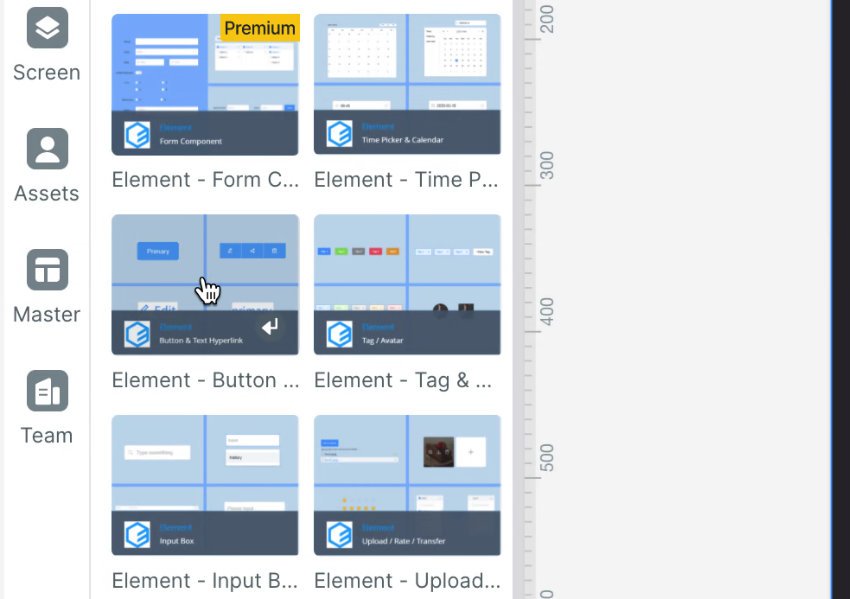

From within that group, drag in the button that looks like this:
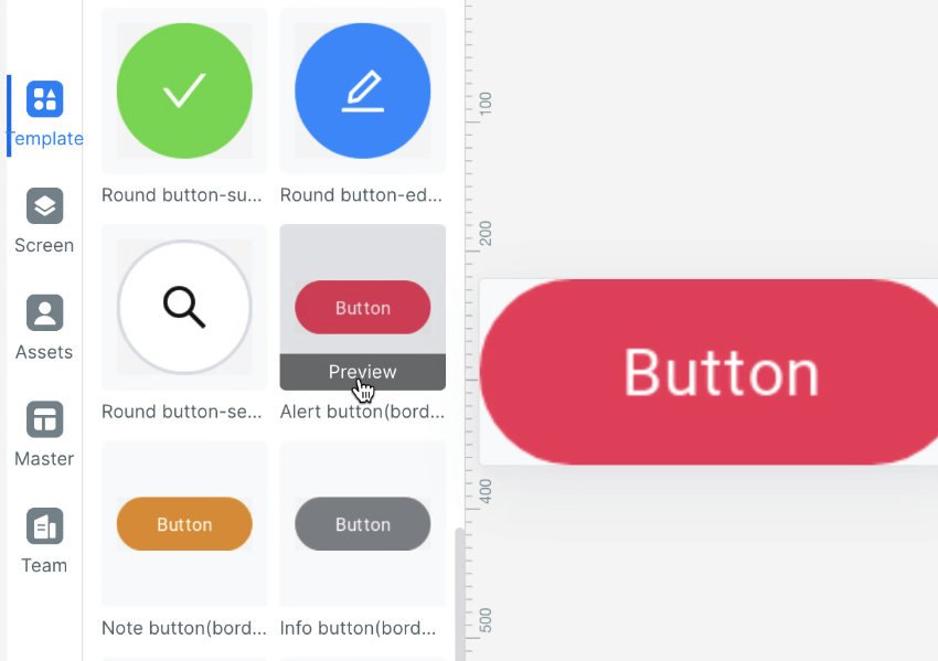


Change the button’s text to read “Start”. The button is a little too small by default, and needs to match our branding colors, so also change its Text and Appearance properties to the following:
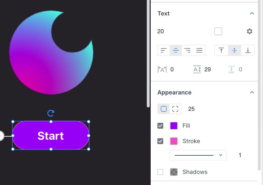
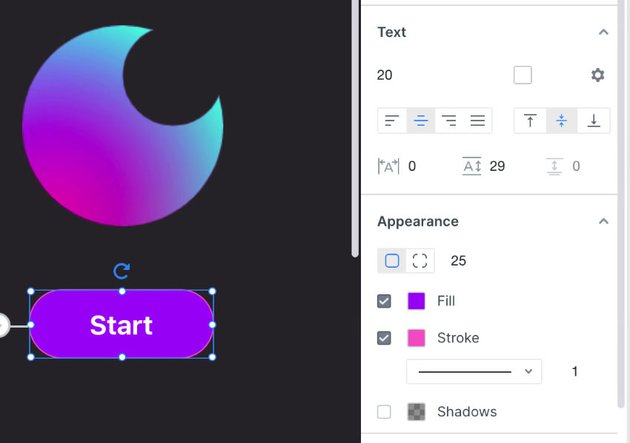

After positioning the button correctly, and deleting or hiding the placeholder button, your “Start” screen will look like this:


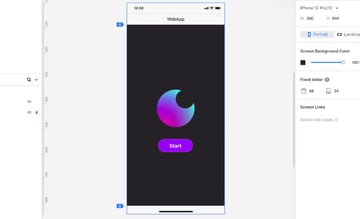
You can then also copy and paste that same button into the other screens, change their labels and reposition them to replace the “Login” and “GO” buttons.
Switching to the “Login” screen, now let’s replace the input fields. From the “iOS 14” group of elements, drag in the “Name Input Dark” component twice and delete / hide the wireframe input forks. Edit the new component white text labels to read “Username” and “Password”, and delete / hide the dark gray text they include:
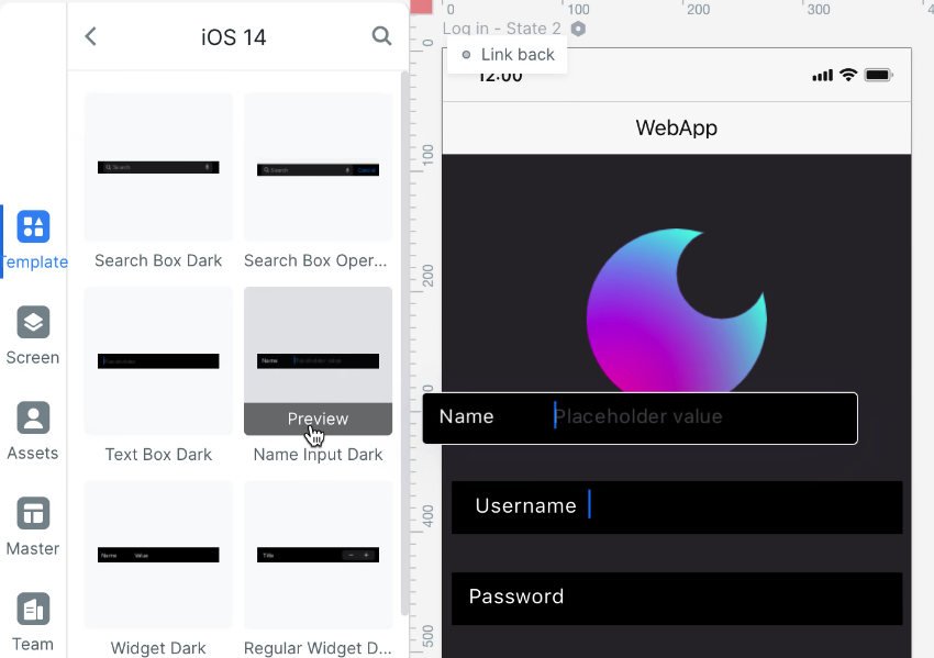
And now the last task for the “Login” screen is to add the social login icons.
Back out of the Components area in the left sidebar and instead select the Icon area:
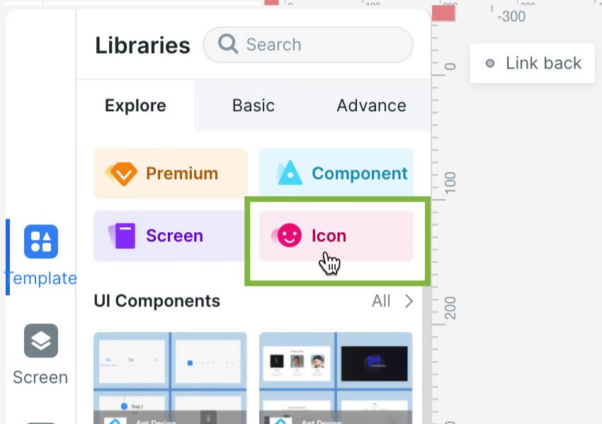


Once there search for “google”, then drag and drop in the icon of your choosing:
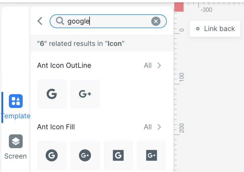
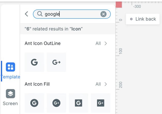
Once added, change the color of the icon to hot pink, and set its size and location to match the placeholder image. Repeat the process for the second icon, searching instead for “apple”. Change the text above to white, hide the placeholders from the wireframe, and your “Login“ screen will look like this:
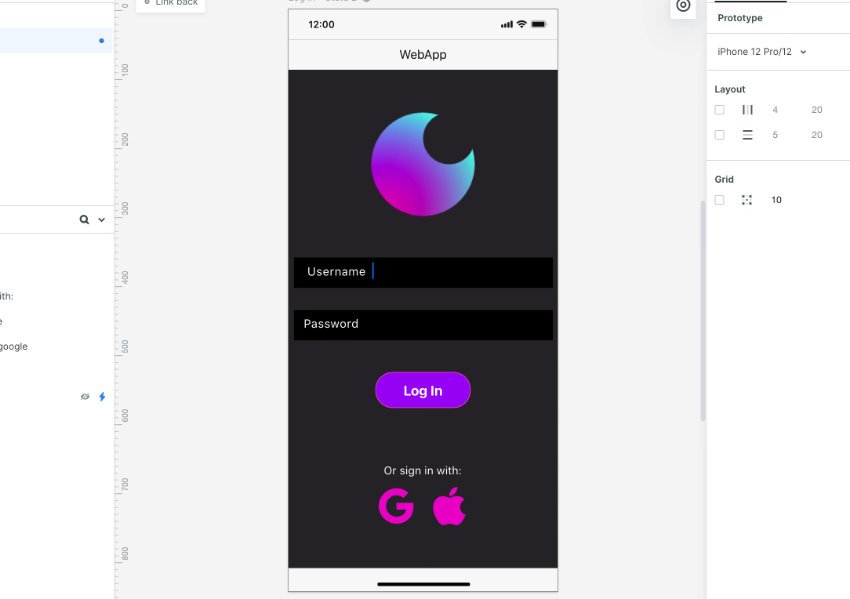


Now let’s finish up our “Home” screen. Go back into the Component library and find the “Element- Upload…” group:

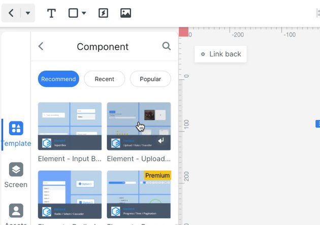

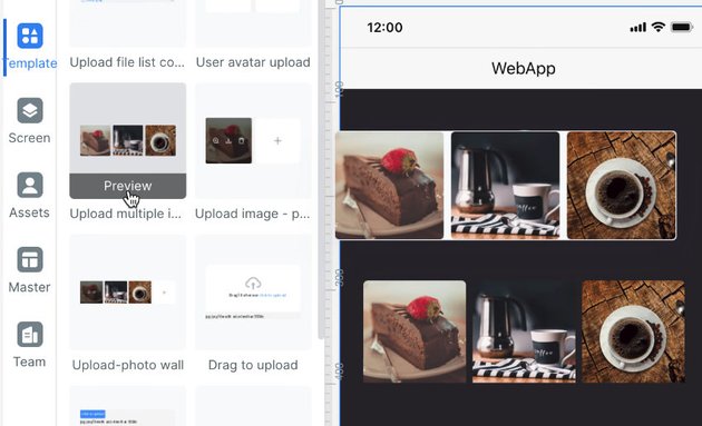
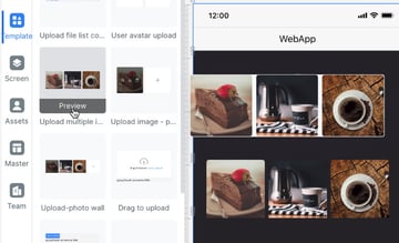
Drag in the “Upload multiple i…” group, and use it to replace the rows of three images from the wireframe:

In the Component library, find the “Element – InputN…” group:
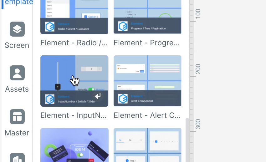
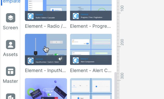
From inside that group, drag in two of the “Inputnumber-def…” components, replacing the image adjustment modifier controls from the wireframe. Then set each of their numbers to something different, and change the label text for each modifier to white:

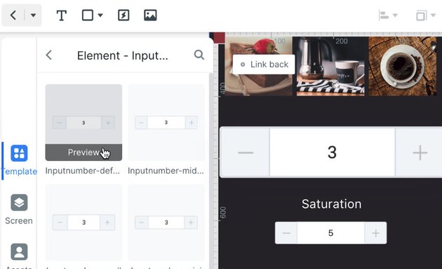
Your completed “Home” page should now look like this:
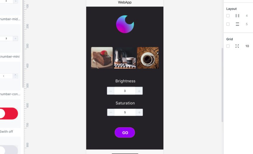


Our design and branding is all in place, now let’s make this act like a real prototype by adding screen transitions and animations.
How to Add Screen Transitions and Animations
To make an on screen element trigger a transition to another screen, select it and you will see a node appear on it with a gray lightning symbol. Just click and drag from that node to the page name you want to switch to.
In this case we’ll begin on the “Start” screen, by selecting the “Start” button and dragging from its node to the login page:

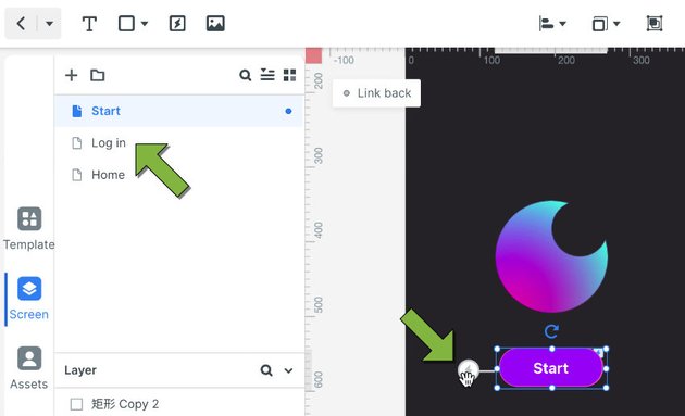
A line between the two will appear to show a connection has been made:
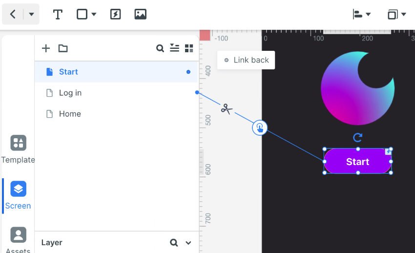


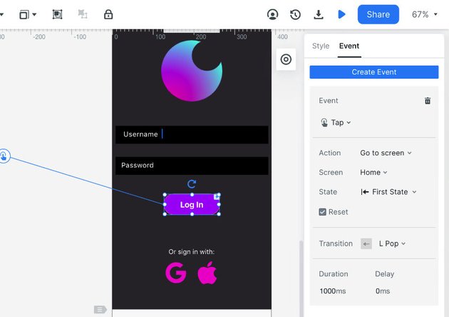
To define exactly what happens when this button is clicked, go to the Event tab in the right sidebar and configure it as pictured:

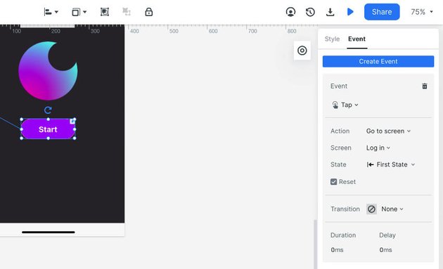
Let’s also add a little style to this page by adding some entry animations to the elements. Select the logo, and at the bottom of the right sidebar enter these animation settings:
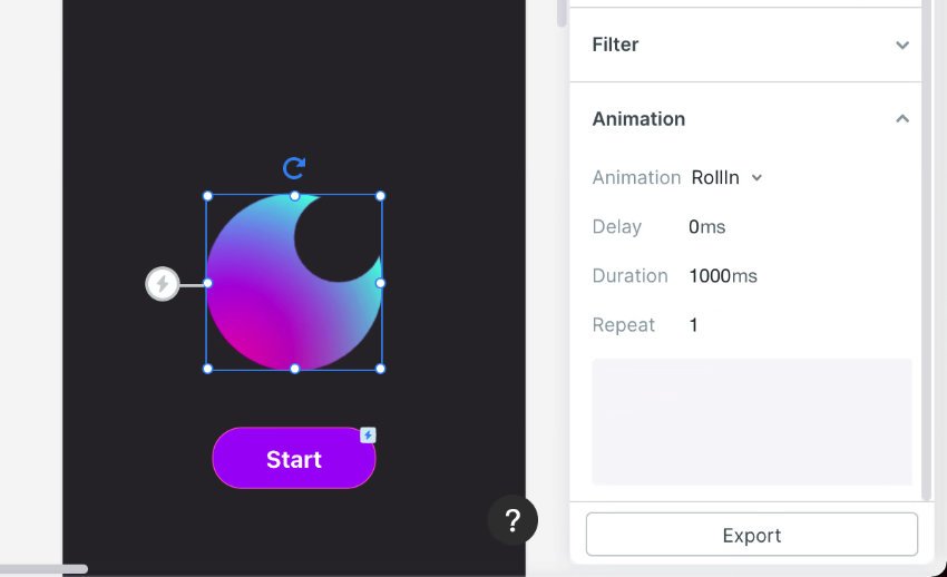

Then select the “Start” button and enter these animation settings:

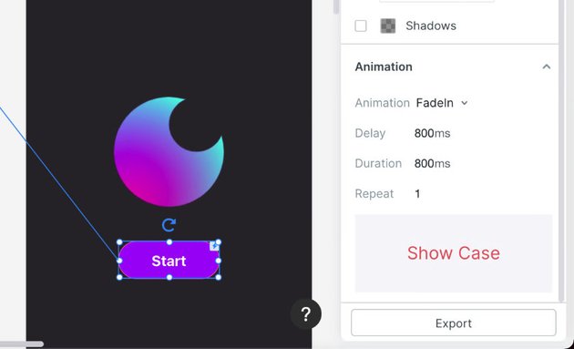
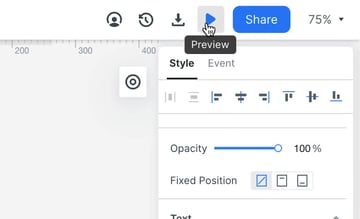
Now let’s see how everything looks by clicking the “Preview” button near the top right of the interface:


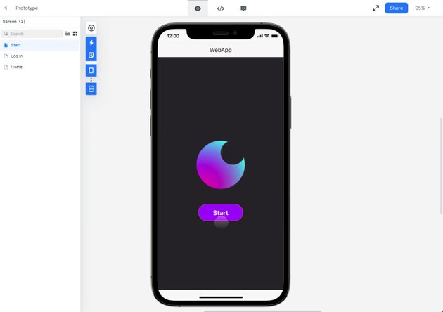
A phone preview will open and you’ll see your logo roll in, then your button fade in shortly after. Click the “Start” button and the screen will switch to the “Login” screen.


Let’s make the transition to the “Login” screen a little more interesting.
Exit the preview, then switch to the “Login” screen for editing. Click the little floating menu near the right sidebar that looks like a target and you’ll see the Screen State box appear. At the top right of that box click the Copy button. With “State 1” selected, delete everything except the logo, then center the logo vertically and horizontally. In the Event tab, add an event and configure it as seen below:
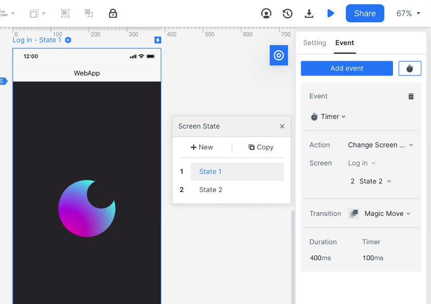

When previewed, the Magic Move transition will automatically animate the position of the logo up to the top of the screen, while also revealing the rest of the elements that form the “Login” screen.
And because the logo in “State 1” is in the same position as the logo on the “Start” screen, when the page changes from ”Start“ to “Login” the logo movement will look like one continuous animation.
Add More Animation!
Speaking of animation, let’s round out the “Login” screen by adding staggered fade in animations to the rest of the elements.
Select the first input fields and set its Animation properties as follows:
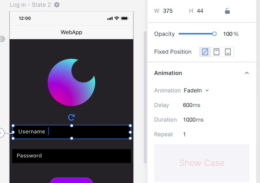


Select each subsequent element and give it the same animation, but add 100ms to its Delay time, until reaching the social login elements which can be configured as follows:
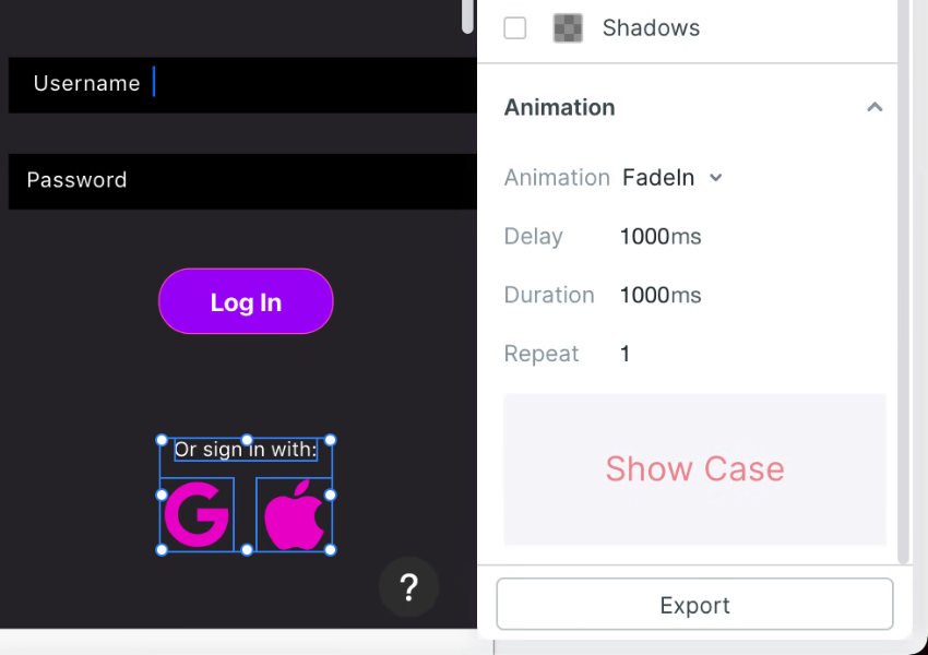
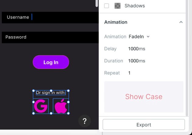

The last step for the “Login” screen is to connect the button to the “Home” page, and configure the page transition event as follows:


Make Other Buttons Functional
We’re just going to do one more cool thing before we wrap up this prototype, and that is to make one of our image controls work to increment and decrement the number it displays.
Edit the “Home” page, select one of the controls, then in the Style tab of the right sidebar click Add widget state:

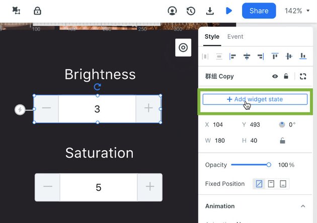
You’ll see the screen dim – this is because you are now in widget editing mode, that lets you create and switch between multiple states within on-screen elements.
Click the little target icon like you did earlier, only this time you’ll see a Widget State box appear instead of a Screen State box. Click the Copy button to duplicate the current state, then with “State 2” selected, change the number on the control to be increased by 1:
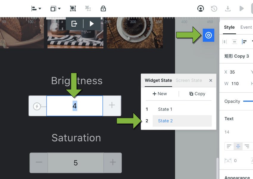


We can now set up transitions between widget states in much the same way as we created screen transitions. Switch back into the widget’s “State 1”, select the rectangle on the right end of the control, and drag from its node to “State 2”:
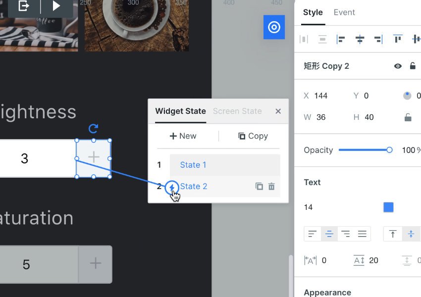
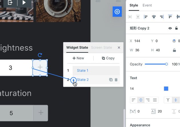

Now when the right end of the control is clicked it will switch into “State 2”, which you set to show a higher number than “State 1”, hence making the control look like it is really incrementing the number it displays.
Note: You may also wish to connect the “+” symbol, to make sure the control area is easy to click.
Then switch into “State 2” and repeat the process, but this time have the “-“ end of the control trigger a switch to ”State 1”, so it looks like the number is decrementing:
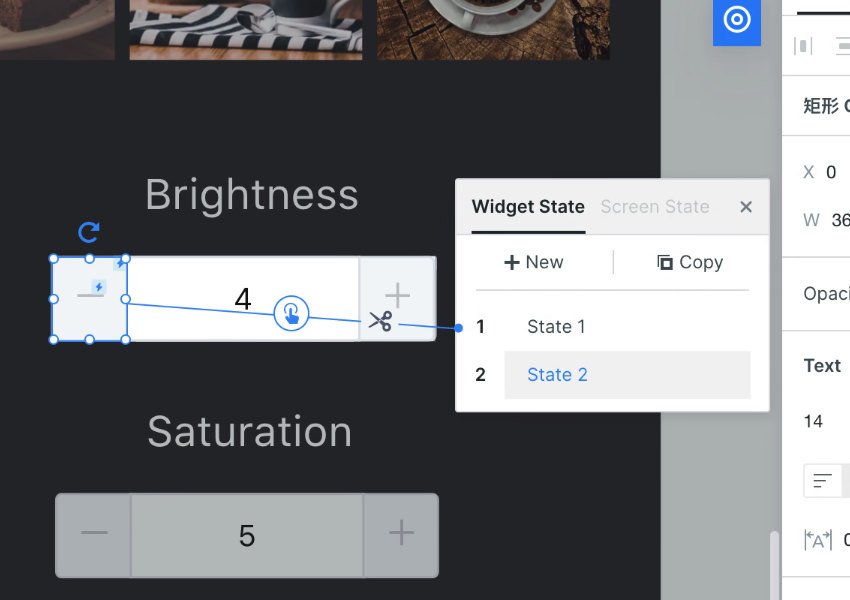

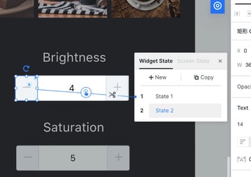
For a real prototype you could set up as many states on the widget as you wanted, simulating a fully functional incrementing and decrementing control.
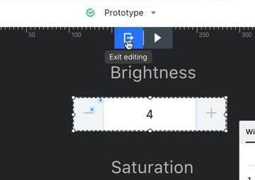
When you’re done, click the Exit editing button at the top of the interface to go back into regular screen editing mode:


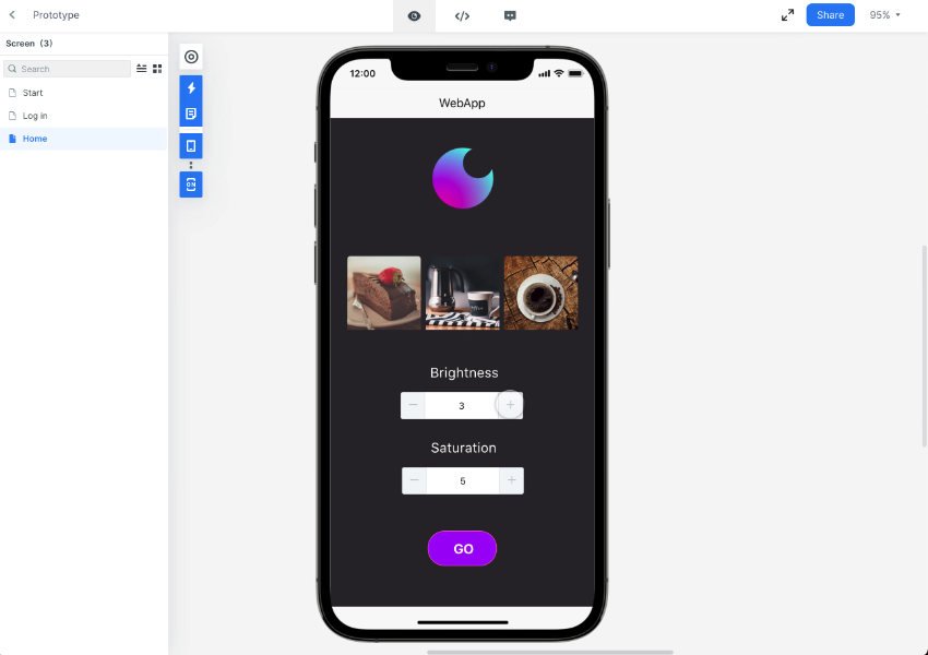
Click the Preview button when you click your control you’ll see the number going up and down:


And We’re Done!
Just as reminder, we’ve just created a wireframe, flowchart, logo and interactive, animated prototype – all on one platform.
That’s all this:


Wondershare Mockitt is still quite new; 2 of the 3 apps are currently in beta, and as to be expected in any beta I did encounter a few bugs.
However the amount of functionality contained in this collection of software is seriously impressive, not to mention all the included assets.
And let’s not forget, all the above is “multiplayer”, with real time collaboration supported, and sharing of documents just by sending a link.
This is what’s in the mix when the platform is just getting started, so it’s very exciting to imagine what the future may hold with the addition of more features and the possibility of further integration between its apps.
Mockitt is already impressive, and is shaping up to have a very promising future indeed.
