Something making its presence known on the web these days is the use of common geometric patterns which we all learned in grade school. Polygons, diamonds, rectangles, triangles, and the occasional rhombus are all an integral part of modern web design. So how does this 10th grade math subject end up affecting the way website visitors consume and engage with content online?
Geometry (at least the Euclidean variety) is defined by straight lines, right angles, and the infrequent circular curvature. These shapes, particularly circles and rectangles, have dominated web design since its earliest conception. Every standard grid is rectangular and it was at one time very rare to see a button or link in any other form. Recently, however, it’s become popular to incorporate more exotic shapes as backgrounds, logos, content blocks, and a number of other on-page elements.
Geometric shapes are primarily put into practice in three distinct ways:
- Navigation: wherein a shape acts as a button which links to a different page in the website.
- Framing: wherein a shape serves as a container to important pieces of content such as text or imagery.
- Visual effect: wherein an atypical shape is used either to diversify or beautify the aesthetics of the webpage and/or application.
In each case, the use of an unusual, or at least infrequently-used geometric element is meant to draw attention—either to the element itself, or to content contained within or around the element. Designers implement geometric patterns to break up the visual uniformity of the site itself.
Shape Meaning and Usage
In general, shapes have their own special usage and meaning. This can lend direction for the proper time and place to use certain shapes for a definitive purpose. The some general guidelines to using different types of shapes are as follows:
Squares and Rectangles
Rectangular shapes represent stability. They are both familiar and reliable, giving the impression of honesty, formality, and rationality. They are by far the most common geometric pattern.
Circles
The circle has a nigh-mystical quality to it, as it has no beginning nor end. Much like the numeral used to calculate its circumference, Pi, the circle is essentially infinite. They suggest a comprehensive quality or fullness. Often identified as feminine, circles can be comforting, sympathetic shapes that remind users of harmony, love, and perfection.
Triangles
Triangles are often considered the “strongest” geometric shape in a design sense. They are used to indicate action and aggression. They can draw attention in the direction they point, and can be representative of progression and purpose.
Rhombus
The Rhombus is a diamond shape, defined by diagonal lines. They can be used to make a design look and feel more vibrant, active, and contemporary in nature.
Hexagons
Hexagons are six-sided shapes which communicate unity and balance. Often associated with honeycombs, suggesting cooperation between individuals, hexagons have become a common trend among tech business websites.
Geometric Web Design Showcase
Now that you’ve gained a passing familiarity with the different types of shapes and what they represent, let’s take a look at some examples of geometric design in today’s showcase. We’ll examine eleven different examples of geometric web design and make some important observations about the different ways in which specific patterns are implemented.
Isaac-Katz
Our first example of geometric design is very subtle. An inspired and viscerally engaging website from visual artist, Isaac Katz.
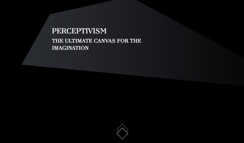
To mirror the breathtaking work that Katz produces, the designers used geometric icons to decry navigation near the bottom of the screen and asymmetrical graphics which serve as material backdrops for text on the page.
By using geometric patterns to indicate which elements are clickable or useful, the design creates a visual hierarchy that’s universally easy to understand among a diverse group of website visitors.
Ultra Design Agency
Design agency Ultra implements a decidedly different take on the traditional slider, using a shield-like pentagon, layered and reflected to display rotating content blocks.
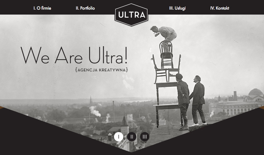
This represents a combination of trends: geometry and subtle animations. Using both together is a powerful way to grab attention and increase user engagement.
Once again, this shows how effective geometric patterns can be in a framing capacity. Moreover, the bottom of the pentagon acts as an arrow, encouraging users to scroll below the fold.
Monument Valley (Mobile Game)
It’s not just websites which can benefit from a geometry-heavy design. Award winning mobile game, Monument Valley, is a visual and visceral treat to traverse.
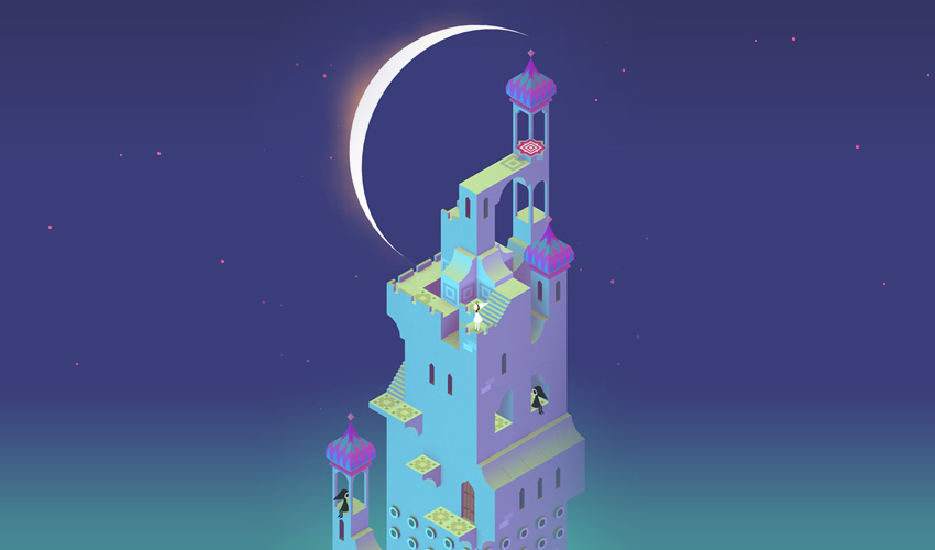
The puzzle game more closely resembles a compendium of artwork than it does a distracting iPhone app, and the geometric perfection of its design is solely responsible for that impression.
Buffalo Design Agency
Digital agency, Buffalo, utilizes a hexagon-shaped word cloud structure to showcase recent projects in a quirky and striking manner.

Taking advantage of both the framing and navigation capacities, each hexagon in Buffalo’s geometric word cloud is clickable. Once clicked, each icon redirects the user to a corresponding page which describes a different portfolio entry.
We Love Noise
Overt movement and subtle visual geometric constructs define the style of the multidisciplinary design agency We Love Noise.
Mouse movements dramatically shift the screen, showing a number of rectangular and circular icons each linking to a different project. The effect can be jarring, but it’s stunning nonetheless.
Mokhtar Saghafi
Designer Mokhtar Saghafi uses an appealing combination of geometry and color to display his portfolio page. Various slanted rectangular and rhombus-like patterns form both background and initials over the top of a gorgeous natural landscape.
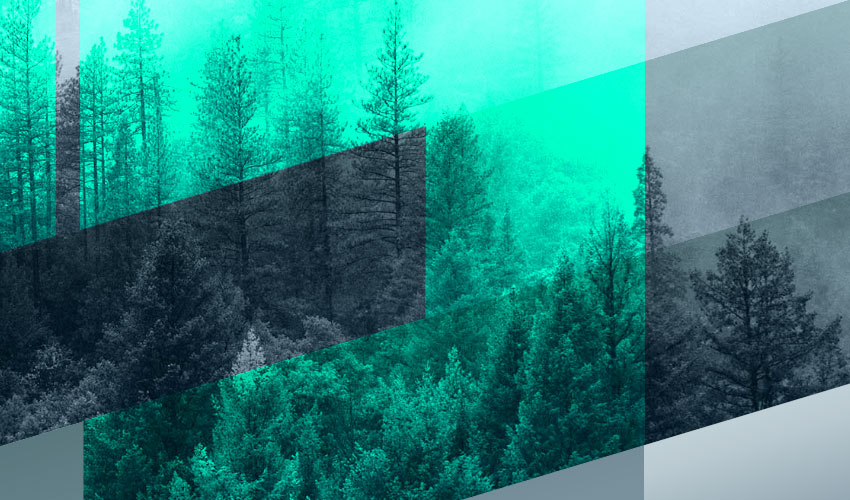
The parallax scrolling effect which covers the background imagery is also pleasing to the eye, and the diagonal lines used throughout create a sense of dynamism and electric activity. The user is encouraged to explore the site without exactly knowing why. This is a fantastic example of the “invisible design” principle. The overall effect is extremely distinctive and certainly provides a good case for his talents.
The Brave
Parallax scrolling, geometry, and a healthy dose of attitude combine to form a miraculous three dimensional visual treat on The Brave digital agency’s homepage.
Through the use of myriad triangles, the interactive and layered background gives an impression of depth that really makes the website pop in the eyes of the visitor.
Boombotix
Boombotix is a portable bluetooth speaker, and it also happens to be hexagonal in shape. Perhaps a savvy move by its designers, seeing as we already discussed how hexagons go hand in hand with advanced tech products.
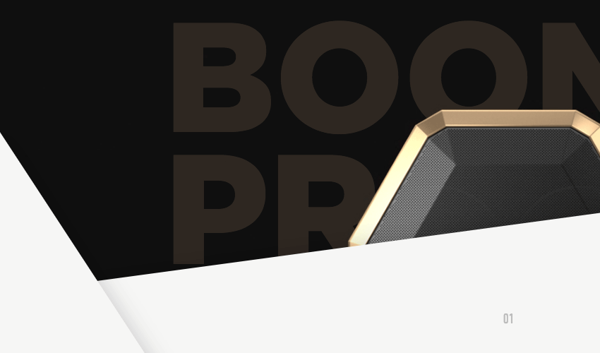
Moreover, the design of the site matches that of the product. Sharp diagonal lines act as framing devices and visual cues wherever you happen to navigate. Combine this with slick animations activated as you scroll, and you have a striking showcase for an intriguing product.
450 GSM
Printing service 450GSM has an eCommerce site that really demonstrates the compatibility of the flat and geometric design trends. The main illustration is an origami-like image built of smaller triangular shapes. The only other imagery on the page consists of rectangles and a single (in the buttons and the logo).
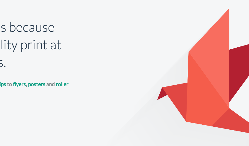
Each shape serves to draw the eye away from the abundant negative space which pervades throughout the screen. The clever use of diagonal lines in the origami bird builds tension and points the user down toward both the CTA and the additional content which resides below the fold.
Akaru
Finishing out our gallery is the animated website of digital agency Akaru.
This website combines many of the elements previously discussed in our list and forms a fantastic geometric smorgasbord for the senses. Triangles, rectangles, and even hexagonal clouds form an unforgettable imprint in the visitor’s mind as they scroll through the highly engaging website.
Conclusion
Thus concludes our review of popular geometric patterns within modern web design! Now that the theory has been explained and you’ve seen some practical applications of the three primary usages of geometric patterns in action, perhaps you’ll feel more comfortable experimenting with geometry in your own designs.
What other examples of geometric design have impressed or astounded you? Sound off in the comment section below!