T-shirts are one of those clothing items we can never get enough of, and that makes them a great vehicle for self-expression and advertising.


If you want to create your very own T-shirt design to support a cause, make people laugh, or promote a service, product, or business, read these helpful tips on how to pick the best font styles for T-shirt design and check out the terrific examples from Envato Elements, GraphicRiver, and Placeit, that accompany each tip.
Top Tips for Picking the Best Fonts for T-Shirt Designs
You’ve probably asked yourself a few times: what is the best font for T-shirts? Read on to find the answer.
1. Legibility Is Key
The most important thing when choosing a font for a T-shirt design is legibility. Given that the wearer of the T-shirt will probably be moving or at some distance from the viewer, the font has to be easy to read under both these conditions. This makes the clean lines of sans serif fonts one of the best fonts for T-shirts.
Sans serifs that are not too thin are also some of the best Cricut fonts for T-shirts because when you are creating a cut file that contains text, you want to choose a font that’s not too difficult to cut out. And don’t worry—that doesn’t mean your font has to be boring. Check out these fonts to get an idea of the best font styles for T-shirt design.
Milk and Wild Font for T-Shirt Design (TTF, OTF, WOFF)


With its stylish, classy design and clear, legible style, Milk and Wild is one of the best T-shirt fonts out there. Use it to give your designs an elegance that your competitors can’t match.
Vantely T Shirt Font (TTF, OTF, WOFF)


Vantely exemplifies the clarity and legibility we were talking about—people will see your T-shirt message from way down the street if you use this one! But it also has a bit of creativity along with the high impact, which is ideal.
GLAMOUR (TTF, OTF, WOFF)


Glamour has the elegance and simplicity of a luxury magazine cover. If that’s the look you want for your T-shirt design, then go for it! For Cricut, though, this one may be a little too thin. So if you want the best Cricut fonts for T-shirts, you’re better off with something like Vantely above.
Gorgeous Serif Font (TTF, OTF, WOFF)


Although I said sans serifs are generally better for T-shirt design, that doesn’t mean you can’t use serifs at all. This is a perfect choice because of its stylish design and easy readability. Download it and try it in your next project!
2. Use Decorative and Cursive Fonts Sparingly
As we mentioned before, when it comes to the best T-shirt fonts, sans serif fonts are the best bet for legibility. However, this doesn’t mean that you need to avoid decorative or cursive fonts altogether.
What it does mean is that the more difficult these fonts are to read, the smaller the amount of text you should use them for. There are, of course, some decorative and cursive fonts that are easy to read, and they would make good fonts for T-shirts.
Symphony Script Font (TTF, OTF)


Script fonts can be a little fussy sometimes, but Symphony is clear and easy to read, making it a great choice for a lettering T-shirt design. It would also be easy to cut, making it one of the best fonts for T-shirts on Cricut.
Nightlife Decorative Neon Font for T-Shirt Design (TTF, OTF)


The classic neon signs of the 20th century were designed to be read from a distance, so it makes sense that a font based on neon signs would make a great vintage T-shirt font too!
Sallowbliss T-Shirt Lettering Styles (TTF, OTF)


This is not the easiest font to read, but it’s OK if you just want to use it for a single word in your design. The beautiful, flowing signature style could make a great impression, so don’t discount script fonts like this when looking for good fonts for T-shirts.
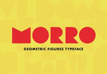
3. Choose Fonts That Match Your Subject
Your font for T-shirt design should match your subject. If the subject is serious, then your T-shirt lettering styles also need to communicate seriousness, but if your subject matter is more playful, then a more fun font is called for. If the subject is romantic, then… you get the drift.
GROTESKA Font for T Shirt Printing (TTF, OTF, EOT, SVG, WOFF)


Are you creating a T-shirt with a serious message about climate change or another important topic? Then a serious, no-nonsense font like Groteska would be a great choice. It just demands to be read and to be taken seriously.
Suga Rush Cool Ronts for T Shirts (TTF, OTF, WOFF)


On the other hand, what if you’re making a fun T-shirt design for kids? In that case, the best font style for T-shirt design would be something more like Suga Rush, a bold, playful font that also comes with 79 bonus vector objects to help with your design.
Swashington (TTF, OTF)


How about bringing a little romance to your design with a vintage T-shirt font like Swashington? It could be the perfect choice for your project, and it’s also one of the best Cricut fonts for T-shirts.
4. Pair Fonts That Complement Each Other
Great font pairings are critical to a successful T-shirt design. And when it comes to font pairings, you want to think of using fonts that are quite different from each other.
So if your main font is a sans serif, then you need to pair it with an opposite style like a cursive to balance the design. If you are using a bold font, then you want to pair it with a thinner font.
Be aware, though, if you’re looking for the best fonts for T-shirts on Cricut, then you can’t go too thin. Thin fonts are difficult to cut cleanly because the cut lines are so close to each other.
California Sunset (TTF, OTF)


Aren’t these two the perfect pair? The combination of a thin, swirly script and a thick, blocky sans serif is so effective. How would you use them in your T-shirt design?
Fantasy Script Font (TTF, OTF)


Here’s a stylish calligraphy font that’s one of the best T-shirt fonts out there, thanks to its 299 glyphs enabling you to make all the changes you want. But when you pair Fantasy Script with the clean Albori Sans-Serif below, that’s when the magic really starts.
Albori Sans-Serif (OTF)


Albori is a new sans-serif font family that’s the perfect complement for Fantasy Script thanks to its simple, clean, understated elegance.
5. Use a Visual Hierarchy
Visual hierarchy refers to the arranging of different parts of the text in your T-shirt design to show the order of importance. Visual hierarchy is the foundation of all good typographical design and the most important strategy you can employ to create a readable message.
When creating visual hierarchy, the most important thing to remember is to use contrast in font styles, font size, and colour to emphasise or de-emphasise text so the viewer knows what elements of the text are the most important and what to look at first.
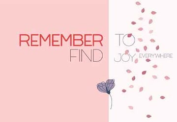
T-Shirt Lettering Styles


In this example from Placeit, the word “faith” is strongest in the visual hierarchy because of its size and the bold, high-impact font. “Fear” is smaller so is lower in the hierarchy, and the joining word “over” is even less pronounced because of the smaller, less legible font and the colour that blends more into the background.
Bonus Tip: Placeit is a great resource for T-shirt fonts because it not only allows you to choose from a range of fonts provided but also helps you create your T-shirt design from right inside your browser using the T-Shirt design generator.
Learn more about Placeit in this video:
… and all about T-shirt design at Placeit in this video:
6. Don’t Crowd Your Design
A T-shirt is a limited space, so you need to pay attention to the amount of white space you use around your design, as well as the amount of text you’re putting on your T-shirt and the font size.
Try to distill your text down to the most important points so that your message is clear and hits the reader in the face… not literally, of course!
Along with this, it is important that the font size for T-shirt printing needs are considered. Scale the text so that there is a good amount of negative space around it, and stay away from slab serifs and extra bold fonts, which tend not to print well when scaled down.
Cool Fonts for T-Shirts


The great thing about this T-shirt design is the eye-catching Gothic font, surrounded by so much negative space and just a simple slogan in smaller, plainer text. The main font choice here is quite adventurous, so you don’t want a complex design around it too.
Vintage T-Shirt Design Maker for Adventurous People


This simple design uses two cool fonts for T-shirts and leaves plenty of space around them. The simple graphics are a nice touch, and overall the design feels spacious and uncrowded.
7. Limit the Number of Fonts in the Design
Limit the number of fonts you use to three different styles at the most. Otherwise, you risk creating text that looks amateurish and confusing because the reader’s eyes don’t know where to look. Don’t be afraid to use one font in your design. One font used well can create a more powerful design than three fonts used badly.
Cool Fonts for T-Shirts


This design uses only two fonts. Remember the font pairings we looked at earlier? This is another excellent example, with the contrast between the strong, bold sans serif and the handwritten font working really well. Notice, too, how the text takes up a lot of space—be sure to choose a large font size for T-shirt printing.
Lettering T-Shirt Design


Here’s a very successful example that uses just one font for T-shirt design. The variation comes in the sizing, spacing, and the switch from black on white to white on black for the middle row.
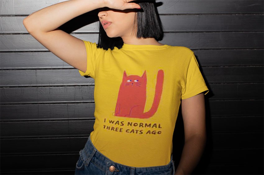
T-Shirt Lettering Styles


Here’s another single-font example using the font Arvo. This time, the variation is in the weight and colour of the font. Really, you can’t go wrong with a cute cat and a funny slogan like this, but the font choice also supports the success of the design.
8. Experiment
Finally, as in all things creative, you need to experiment a lot to really get a feel for what works and doesn’t work when using T-shirt fonts.
In line with experimenting, it also helps to look at T-shirt designs that you like and don’t like and try to figure out what works for you and what doesn’t. Borrow the good and forget the bad.
Cool Cat T-Shirt Font


This example shows that the best font for T-shirt design depends on the type of design you’re working on. This playful, slightly childlike typography works perfectly here, but it might not be good for a more serious design. Similarly, imagine this same design, but with a plain, serious corporate font. It just wouldn’t have the same impact. So keep experimenting until you find just the right font for each particular design.
Choose Your Favourite T-Shirt Fonts Today
Now that you know just what to look for when looking for the best T-shirt fonts, head over to Envato Elements or GraphicRiver and pick up your favourites today. Alternatively, if you’d rather take advantage of the T-shirt design generator to help you create your designs, then head over to Placeit and get started.
And if you’re looking for more information on fonts or T-shirt design, check out these helpful articles below.
 Fonts35 Best Minimalist Fonts (Clean Modern Fonts to Download Now)
-
FontsFonts Similar to Century Gothic
-
FontsFonts Similar to Times New Roman (And Its History)
-
Fonts25+ Best Free Vintage Fonts (Free & Premium to Download!)
-
Fonts36 Best Wild and Crazy Fonts
-
Fonts35 Best Block Fonts (Ready to Download Now)