Are you interested in typography? This complete course covers everything from typography history to the difference between typefaces and fonts, typeface classification, how to choose a font, and more!
Watch the Ultimate Guide to Typography Course
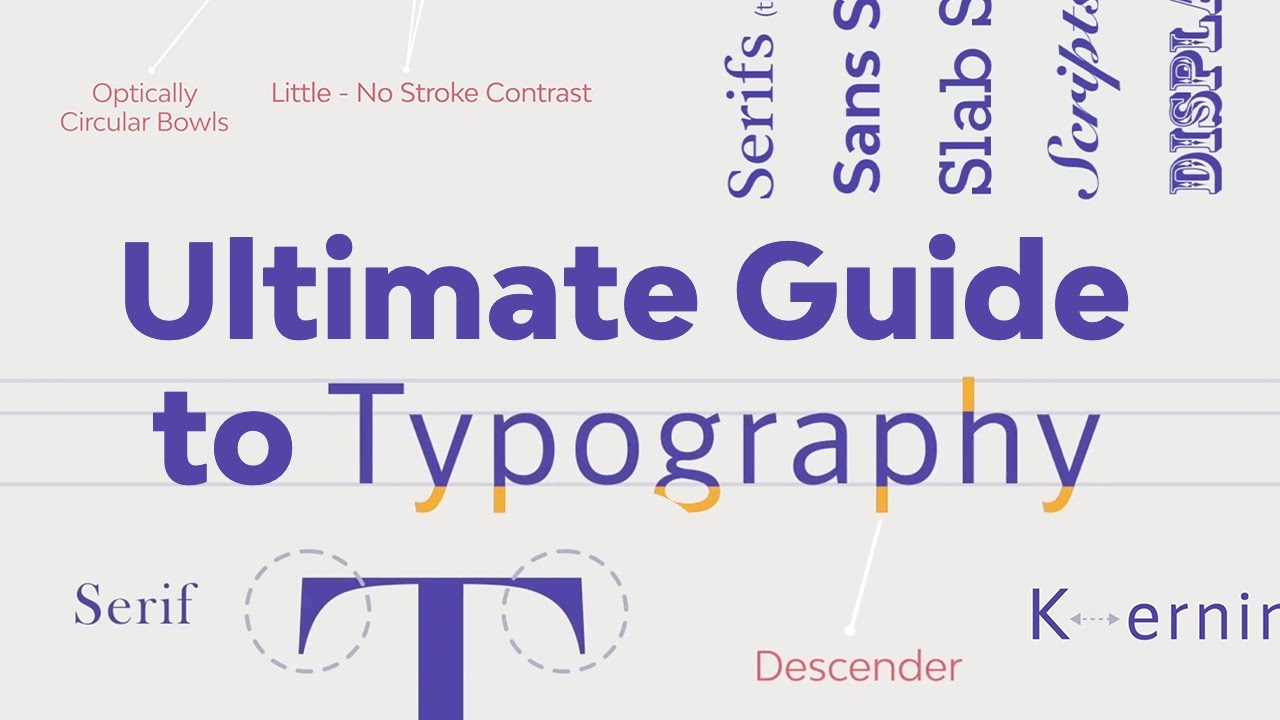
What You’ll Learn
- What is the history of typography?
- What is the difference between a typeface and a font?
- How to classify typefaces
- How to choose a font for a project
- What is a typeface family and its characteristics?
- What are the font file types?
- What are typesetting, legibility, and readability?
- What are the common typesetting mistakes?
- How to combine fonts
About Your Instructor
Laura Keung
I’m a design writer, design mentor, and entrepreneur leading Laura Keung Studio, currently based in Munich, Germany. I had my first design client during the first year of university, and since then I’ve fallen in love with the design process. I studied at the Ontario College of Art and Design University in Toronto before interning at renowned studios in Canada and Austria.
With 12 years of experience in the design industry, I lead my own design studio and collaborate with other creatives on branding and editorial design projects.
Jump to content in this section
1. Introduction to the Course
Typography is one of the most important elements of Design. In this course, you’ll learn everything about it, from its beginning and its evolution to what it is today.
Here we’ll learn the most important concepts and terminology to get you started with typography. If you’ve ever wondered about type classifications and families, why readability is important, and how to combine fonts, this course is for you!
2. Basics of Typography
In the first section of the course, we’ll cover a brief history of typography and why it is so important. Additionally, we’ll answer the question we’ve all had: what’s the difference between a font and a typeface? Let’s begin!
2.1 Brief History of Typography
Let’s start with the history of typography, from early engravings to digital software. Typography has evolved greatly through the centuries. The serifs we see in fonts today can be traced back to Ancient Rome, where serif capital lettering was used to inscribe monuments and buildings.
In the 12th century, Johannes Gutenberg created a machine that could process movable type. This allowed a larger number of sheets to be printed using ink. Gutenberg then developed the first ever typeface: Blackletter.
In the 15th and 16th centuries, Roman typestyles became popular, since Blackletter was difficult to read. Typesetters started to look for ways to produce affordable books, so they came up with space-saving techniques like tracking and leading.
During the Industrial Revolution, printing presses evolved. Designers started to experiment with condensed and stretched type for newspapers and posters. By the 1900s, designers were creating some of the humanist and geometric typefaces we use today, like Futura, Gill Sans, and Helvetica, introduced as the functional and ultra-legible typeface that took over the world.
With computers in the 20th century, typefaces were digitalized. With the evolution of computers, now we can create sophisticated typefaces with specialized software, making fonts available to all computer users.
If you’d like to dive deeper into the history of typography, here’s a great article for you:
Why Is Typography So Important?
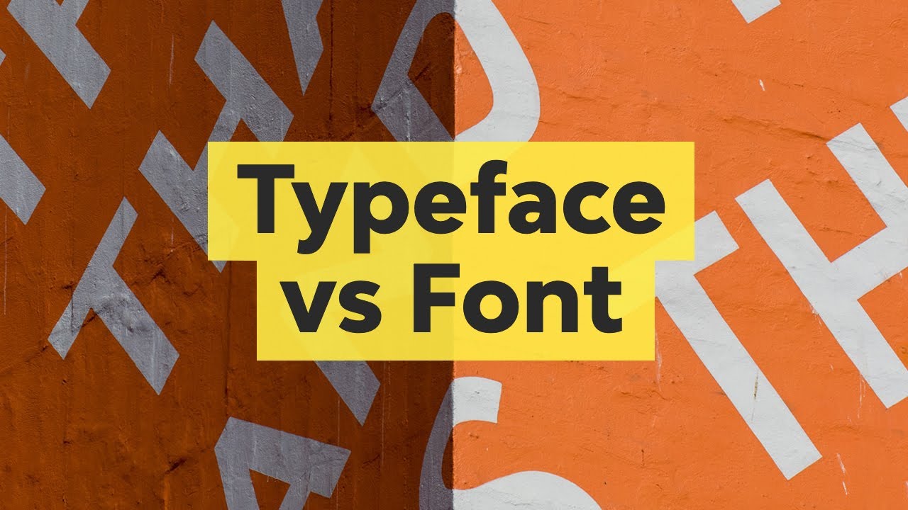
2.2 Typefaces vs. Fonts
If you’ve ever used the terms typeface and font interchangeably, in this lesson we’ll learn they actually don’t mean the same, and we’ll go over their definitions.
The difference between a font and a typeface has its roots in the history of printing.
The word “font” comes from the French “Fonte” which means cast in metal. Printers cast complete sets of metal letters to make up a font. Fonts with a common design made up a typeface.
Fonts were divided by size and upper and lower case. Each was a different font. When digital typefaces came into play, much of the old printing terminology was kept. Computers only need a single file to render an entire typeface, and each letter is completely scalable. On computers, the file contains enough data to scale it.
So a typeface describes characters that share common features. A font is a particular style, weight, and size within a typeface.
If you’d like to look into typography and the font vs. typeface topics in more detail, here are some resources you can’t miss:
3. Typeface Classification
3.1 Classification of Typefaces
Watch video lesson (10 mins) ↗
Now we’ll take a look at the classification of typefaces. This will be a general overview of the different types of fonts. Remember to watch the full video lesson to learn about all the specific details.
Depending on their characteristics and uses, we can classify typefaces into seven big groups, each of them containing subgroups and specific details.
1. Serif Fonts
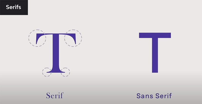
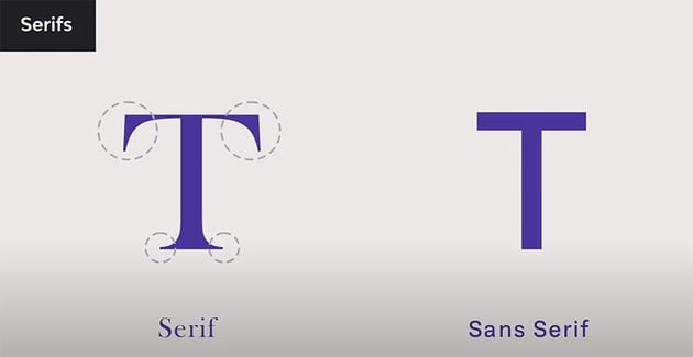
Serifs are small feet at the end of a stroke on the letter. Do you know how they originated? Back in time, characters were created by chiseling on stone. The chisel created small feet at the end of each stroke.
Serifs also help the reader follow the letterforms, making them highly legible. Serif fonts convey a traditional vibe. They are commonly used in long-form copy like books, magazines, and newspapers.
Serif Subgroups
- Old Style: these fonts were developed between the 15th and 18th century to be used as metal type for early printing processes. These feature slightly rounded, cupped, and inclined serifs.
- Transitional: they came into the picture in the 18th century as a transition between old-style fonts and the modern style. The main feature is the sharper serifs.
- Modern Style: these became more refined and detailed thanks to advances in the printing process. They feature completely straight, flat serifs.
- Slab Serif: these are easy to identify from the rest of the serif subgroups. The serifs are heavy and squared, and they have the same stroke thickness.
With the exception of slab serifs, serif fonts can be used as body copy as they’re easy to read and comfortable to the eye.
2. Sans Serif Fonts


Sans is a French word meaning ‘without’. Sans serifs are what the name describes, without serifs. Sans serif is the most versatile category. You can use them as display fonts or for long-form copy. They’re clean, minimal, and modern-looking.
Sans Serif Subgroups
- Grotesque: this style was commercially popular in the 1900s. It features a slight contrast between thick and thin strokes and an open aperture gap in some characters.
- Neo Grotesque: it’s a refined version that came later in the 1900s, intended to be more neutral and legible. It features a uniform stroke and a closed aperture gap.
- Humanist Sans Serifs: They’re based on the proportions of Roman style capitals, and some characters have a calligraphic influence. They feature a higher contrast between strokes and a wide aperture.
- Geometric Sans Serifs: These typically feature characters with optical circular bowls and others with rectangular proportions. They don’t have a stroke contrast and have a complete vertical axis.
With the exception of geometric typefaces, sans serif fonts have high legibility at long distances and in body copy.
3. Script Fonts


These are based on the flow of cursive handwriting and are divided into two main categories: formal and casual.
- Formal scripts are elegant typefaces used on wedding invitations and diplomas. They’re inspired by writing from the 17th and 18th century. They feature connecting tails and flourishes.
- Casual scripts are inspired by brushstrokes from the 20th century. They’re more relaxed and friendly compared to formal scripts.
Script fonts aren’t suitable for body copy. Instead, use them for display text, headlines and titles, and short copy.
4. Calligraphic Fonts


While these fonts try to mimic brush and nib strokes, the letterforms are quite contemporary. As with script fonts, these aren’t suitable for large amounts of copy. Instead, use them for display text, headlines, and titles.
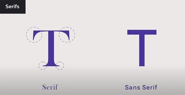
5. Handwriting Fonts


These fonts are fairly new. They lack the clear structure and definition that script fonts have. Handwritten fonts are more informal and laid back.
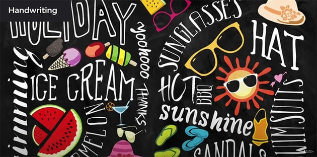
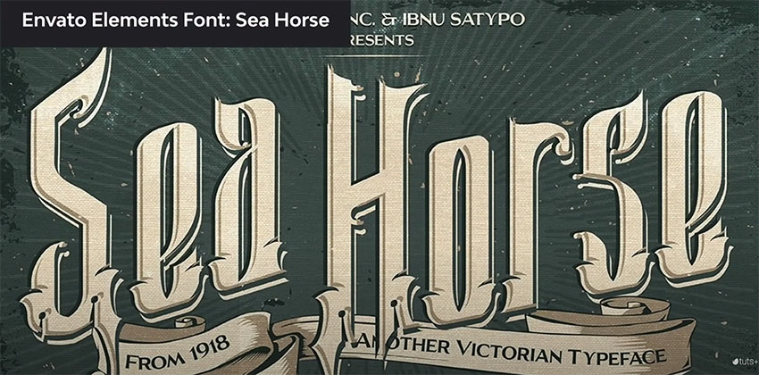
6. Blackletter or Gothic Fonts


They date back to the 1400s and are based on medieval calligraphy—the style evolved from illuminated manuscripts. Blackletter fonts were drawn with a flat-nabbed pen held at an angle and feature a very high contrast between thin and thick strokes.
7. Display or Decorative Fonts

These fonts don’t fit into any of the previous categories. They’re one of the largest and most diverse categories. Display fonts aren’t suitable for body copy and are often experimental. Some examples are graffiti fonts, tattoo fonts, fantasy fonts, and more.
How to Choose the Right Typeface
Now you know that fonts come in all forms and shapes and they can evoke specific feelings. So how do you know which one to use?
Long Copy / Body Copy (Books, magazines, newspapers, etc): Use a serif or a sans serif font since they’re legible at a smaller size.
Display (to attract attention): anything outside the previous two categories can be used as display fonts. Use them sparingly and only to attract attention.
Here’s a fantastic video that goes into further detail:
3.2 Typeface Families and Their Characteristics
In this lesson, we’ll talk about the different typeface families and their characteristics: weights, styles, and proportions.
But first: what is a typeface family? The idea behind the concept of type families was that characters within the family would share a “common DNA” with slight distinctions.
Large type families usually have a wide range of font weights, styles, and proportions. We’ll talk about what each of them means.
Characteristics of Font Families
1
Font Weight
A wide range of font weights gives us the ability to create a hierarchy within a page. The most common weights we see on a page are Regular and Bold. But some fonts include weights like ultra light, thin, light, medium, heavy, black, and extra black.
2
Font Styles: Italics
Italic fonts were introduced in the 16th century, and two centuries later, foundries started pairing them with Roman fonts to emphasize certain points in a text block.
3
Font Styles: Oblique
They’re less organic and calligraphic. They can look like a Roman character with a slight slant.
4
Font Proportion
Refers to the width of the character in relation to its height. Common examples of different font widths are extra condensed, condensed, extra compressed, compressed, regular, and wide.
Large type families can have different weights, styles, and widths, while still sharing the same DNA. With a single large family, you can have enough variation to create a hierarchy.
Here’s a great tutorial that goes into this topic in further detail:
3.3 What Are Font File Types?
In this lesson, we’ll learn about the different font file types, as there are many font files that have been developed over the years. Let’s take a look at some of these files and their differences.
Font File Types
1
PostScript (PS)
They were developed by Adobe in the 80s when two separate files were needed: one for printing and one for rendering on-screen. PostScript files held 220 glyphs.
2
TrueType Font (TTF)
They were developed by Apple and Microsoft in the early 90s. A single file was used for printing and on-screen display. A TTF file can contain up to 65,000 glyphs, and you don’t need two separate files anymore.
3
OpenType Font (OTF)
Developed in the late 90s, they support Unicode technology, meaning that one OTF file can contain more than 65,000 glyphs and multiple languages. This file is also cross-platform.
4
Scalable Vector Graphics (SVG)
These are an innovative new version of the OTF format. Fonts can be displayed in multiple colors and transparencies, and some are even animated. This wasn’t possible with TTF and OTF formats.
5
Variable Fonts
This is an OpenType format developed jointly by Google, Apple, Microsoft, and Adobe. It includes a new technology called OTF variations. A variable font can contain a font’s entire glyph set up to 64,000 variants including weight, width, and slant.
For more details on how to choose the right file format for you, check out this detailed tutorial:
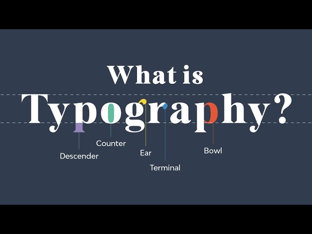
4. What Are Typesetting, Legibility, and Readability?
In this section, we’ll learn about legibility and how typeface anatomy can affect it.
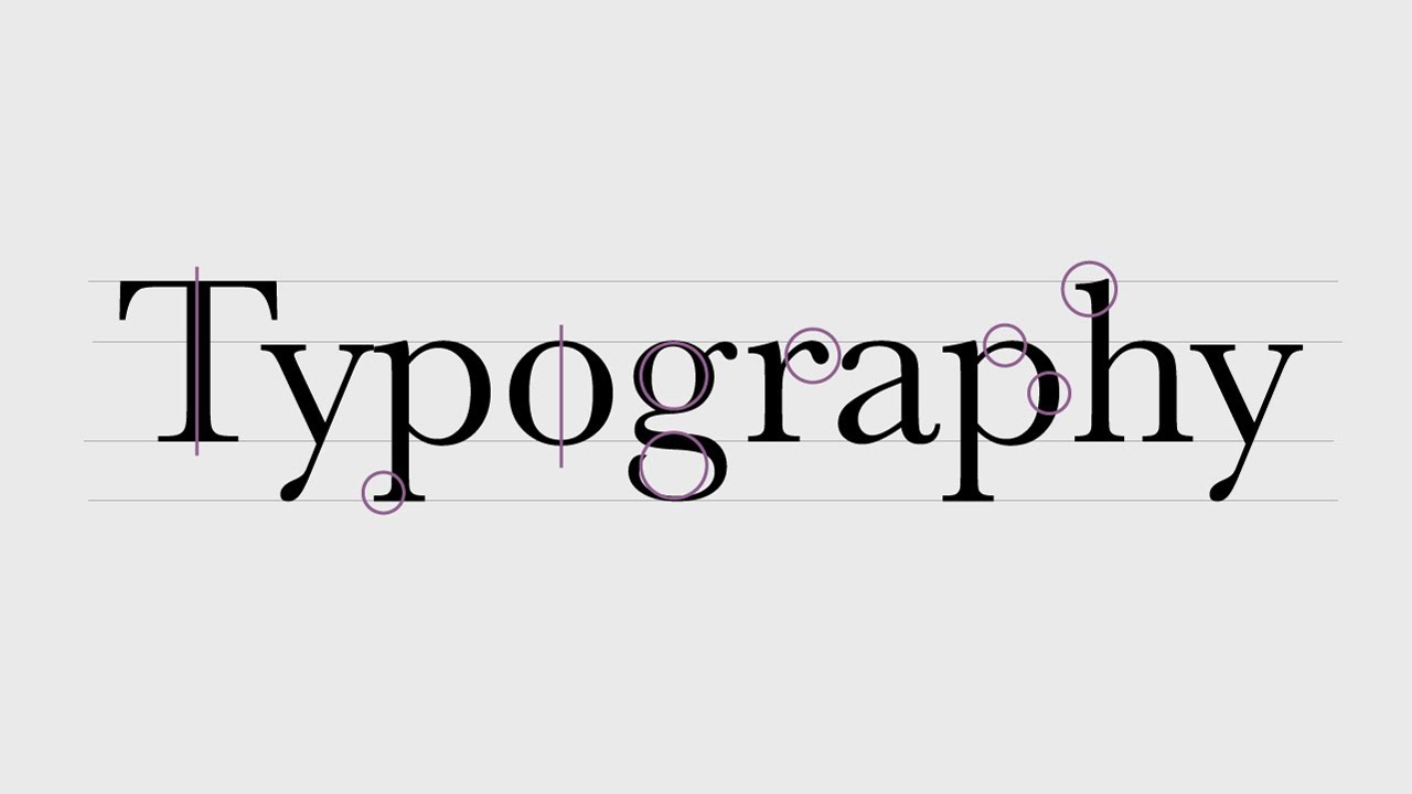
4.1 Legibility and Typeface Anatomy
What Is Legibility?
Legibility is how a typeface functions. It’s a measure of how easy it is to distinguish letters or words from one another, and how easy blocks of text are to read.
There are different factors that contribute to a typeface’s legibility, and we’ll review them:
- X-height: it refers to the height of the lowercase characters in proportion to the capitals. The taller the x-height, the more legible the typeface tends to be.
- Character width: typefaces with an average width are easier to read than those that are condensed or extended, especially for body text.
- Weight: very light or heavy weights are extremely hard to read. It’s better to use a regular weight.
- Design traits: the overall shape of the character design should be something more or less neutral. Nothing too quirky as it can reduce the legibility.
- High stroke contrast: it can reduce the legibility, especially in modern fonts with very thin strokes.
- Serifs or lack of: serifs are believed to enhance legibility because of the small feet, whereas sans serifs are becoming more popular for body text.
Consider all these traits to decide what font to use and how legible it is. And remember, always consider the text you’re designing, the length, and the audience that will read it.
Here are more resources you can read on the topic:
4.2 Readability and Typesetting Basics
Now we’ll cover readability and typesetting. But what exactly is readability?
Readability relates to how type is set on a page. It’s the arrangement of fonts and words in order to make written content flow in a simple and easy-to-read manner.
Factors That Contribute to Good Readability
- Type size: consider who you’re designing the content for. The smaller the type size, the more difficult to read, especially if your audience includes children or elderly people.
- Type Case: all caps text tends to be challenging to read because there isn’t much distinction between the shapes of each character. For long body text, use upper and lowercases as the ascenders and descenders help to distinguish the characters.
- Line Space (Leading): the amount of leading you’ll need in a text box is based on the type size and the x-height of the font you’re using. To maximize readability, make sure there’s enough line spacing.
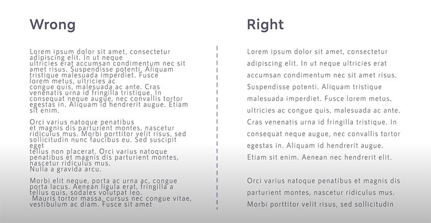
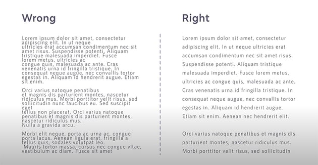
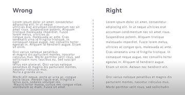
- Line Length (Column Width): when the column width is too narrow, it can result in many hyphenated words, forcing the eyes to jump to the next line too often. On the other hand, long lines can cause confusion for the reader. A rule of thumb is to aim for a number of characters between 45 and 70 per line.
- Kerning and Tracking: Kerning is the adjustment of the space between two individual characters within a word. It’s mostly used in logos or headings. Tracking (or letter spacing) refers to the space between a group of letters in a line of text.
- Color Contrast: refers to the color of the text in comparison to the background. Make sure there’s a good contrast between them and that the colors don’t clash with each other.
More useful articles to expand on this topic:
4.3 Common Typesetting Mistakes
Now let’s take a look at common typesetting mistakes and how to fix them. One of the key differences between a beginner and a professional designer is in the way they set type.
Avoiding the following mistakes will make you a better designer and will help your audience read more comfortably.
- Rags: these are the uneven vertical margins on a block of text. You can fix them by hyphenating words where necessary or doing a soft return for a new line break.
- Rivers: these are gaps that appear to run through a block of text, which usually appear in justified text. A common way to fix this is by unjustifying the text or typesetting each line through hyphenation.
- Orphans and Widows: an orphan is a word or short line at the beginning or end of a paragraph that’s separated from the rest of it. A widow is a single word at the end of a paragraph. These two problems can be solved by adjusting the kerning or tracking, or by adding manual line breaks.
By avoiding these common mistakes, you’ll help your audience to read text more comfortably, which will result in perfect legibility and readability.
5. How to Choose and Combine Fonts
Each font has a different use, function, and personality. Depending on the medium and content, you’ll need to choose specific fonts. So in this lesson, we’ll learn how to choose the right fonts for your needs.
5.1 How to Choose the Right Fonts
If you’re working with brands, the font selection process is done for you—you only need to ask for their guidelines where they specify their fonts, colors, and more.
However, if you’re working on a new project, choose a font based on its personality traits. Just like there’s color psychology, there’s also psychology for typography.
Here’s a concise type classification with their personality traits and examples:
Remember: use a font that communicates the message you want to convey and suits the audience and the content you’re designing.
5.2 Tips to Create the Best Font Combinations
In the last lesson, we’ll talk about font combinations and pairings. This can be difficult even for seasoned designers.
Good font pairing dictates how professional, readable, and aesthetically pleasing your design is. Here are some tips and tricks on how to pair fonts:
6 Quick Tips on How to Combine Fonts
1
Use One Font Family
If you’re unsure about how to pair fonts, go for the safe route and use a single large font family. This will result in a cohesive and minimalist layout. Remember to play with size, color, and weight to create a hierarchy.
2
Keep It Minimal
Combine only two to three fonts and mix fonts with different anatomies, like a serif and a sans serif. The more fonts you mix, the more your text will be confusing for your audience. And avoid mixing two fonts that look too similar.
3
Pay Attention to the Content
Much like humans, fonts have their own personalities and characters. It’s important to always consider the content and purpose of your design. A decorative font works great on a kid’s party invitation, but not on a resume.
4
Combine Fonts From the Same Designer
Using fonts from the same designer is a great tip, since they have a particular vision and style applied to their products. Browse Envato Elements to find some top type designers and font libraries!
5
Try Font Duos
At Envato Elements you’ll find the best font duos, done by professional designers. These duos can be great for invitations, logos, and more, and it’s an awesome way to choose fonts!
6
Trust Your Gut and Practice
Like any skill, font pairing requires practice. Try out and combine fonts on your own to see how they work.
Remember: there’s no science as to what font pairings work best together. It’s all based on content and the mood you want to evoke. Here’s a great video you can watch:
Interested in how to create the best font combinations? Browse through our library of articles and tutorials to find the best inspiration and top font pairings:
6. Let’s Wrap It Up
Typography is one of the most important elements of Design. In this typography course, we learned about its history and its evolution to what it is today.
Typefaces come in all shapes and sizes, so we covered the different categories, type families, and their characteristics and uses.
We also learned about readability, legibility, and more. Lastly, we talked about how to choose the right fonts based on their personality traits and how to combine them.
Typography knowledge is vast and continuously evolving. In this course, we provided you with the concepts that are perfect to get you started and to master as you learn.
Learn More About Typography and Font Design
Typography and font design are some of our favorite topics at Tuts+! You’ll find a great variety of typography courses and videos from the Envato Tuts+ YouTube channel that you can watch to learn even more:
Or if you’re a fan of written tutorials, we’ve got you covered as well: