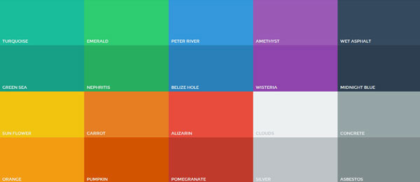
Using the right colours in web design is absolutely vital. Web designers can’t just go out and put together a website for a client based on the colours they like using or like the look of, they have to be right for the project, thought has to go into the selection process. You could say that colour can make or break the success of a website and that it is indeed the most powerful tool a web designer possesses.
It’s been proven scientifically that colour can be used effectively to bring about certain emotions, so this is definitely evidence that when colour is used properly; it can be an extremely powerful weapon. There are steps you have to take and things to consider when it comes to choosing the right colours for a specific project. Each project will be different so each one will require a totally fresh approach.
First of all, you must know the goals that need to be achieved. By knowing the targets, the right colours can be selected. This is because the emotional state of the people visiting the website will be able to be predicted accurately. This will also allow the designer to use the specific colours needed to attempt to change the visitor’s emotional state for the better. This way they are more likely to say buy or take part in something on the website.

It’s imperative that the colours reflect the audience too. So knowing the emotional state they will arrive to the site in is a great advantage but the colours must be suitable for them in terms of cultural background for example. If you have an array of visitors from all over the globe, it’s important that the colours used are the right ones, so not to cause offence for example. Using colours that appeal to everyone, without any being a no-no, will show the customer and audience that time has been taken in the web designing.
If you take an online casino service, Unibet for example, they have visitors from all over the globe. Their audiences are extremely wide ranging. So while their chosen colours are widely accepted, they serve their purpose well too. They’re extremely easy on the eye, sort of smooth in their look, making the websites great for long term viewing. At the end of the day, any online casino wants players to engage with their website for as long as possible and colours can play a key role in making that happen.
It goes to show how knowing what the goals of the website are is key when it comes to selecting the right colours. Yes, everyone wants to see bold and stunning colours but sometimes that simply does not fit when it comes to the audience of the website. Colours can’t be chosen because they look nice or stand out, they must serve a purpose. When the right ones are combined together it can go a long way in making the website, and not only that but the business it is representing, a huge success.