
Designers draw ideas for website design and best user experience (UX) from everywhere – not just the digital sphere. If it annoys in real life, it can hinder user experience online. If it uplifts emotions or forms connections in the outside world, chances are it can be used for inspiration in designing online experiences as well.
What Makes Users Get Mad and Leave
Design features can make users feel frustration that causes them to navigate away and never return, or they can welcome users in and persuade them to stay. Here are some examples from everyday life.
Waiting to be acknowledged – When customers walk up to a check-in counter and the person behind the desk is on the phone or computer and doesn’t take time to greet them, it causes irritation. If the employee is on a personal phone call, the feeling is even worse. The longer the customer must wait, the angrier he or she will be when the employee finally makes time to help them.
Web users feel some of the same frustration when they must wait a long time for a web page to load. You have only one chance to make a good first impression with your website. Minimize page load times to greet customers quickly. When pages appear right away, the user stays immersed in the experience.
Item not found – When customers go to the grocery store, they expect ice cream to be in the freezer section and yogurt to be with the rest of the dairy products. It causes intense frustration when things are not where they should be. If it’s not something they just have to have, they may decide to do without. Sometimes they decide the store must not carry what they’re looking for. Customers are busy. They don’t have all day to look.
Large grocery chains such as Wal-Mart make it easy. They hang big signs overhead and group items by category. Customers know right where to go for crafts, beauty products, or automotive items. With web design, provide the same type of clear directions so customers know where to go. The essence of positive user experience is making users feel comfortable and at home.
If websites are designed with the user in mind, they’ll easily be able to locate common items. Have an easy-to-find search box. Put contact information under a clearly labeled tab, not just in tiny print all the way at the bottom. Optimize your checkout button by making it large and easy to find.
Information not available – When you go to the hardware store for what you hope will be a simple plumbing repair, you might seek out an employee in that department. Since employees work somewhere whose sole business is home improvement, you would expect them to have some basic knowledge. Sometimes you find they know even less than you do. If they can’t give you information on what you need and how to find it, your irritation might lead you to take your business to another store.
When users visit your website and click on a link to specific information, that’s what they expect to find. If it’s not there, it’s even easier to click away than it would be to drive to another hardware store. If virtual users aren’t directed to the right pages, they’ll go somewhere else to find the information they seek. Your website’s bounce rate will reflect traffic that drops by but doesn’t stay.
When you can’t find what you want – Some restaurants offer seasonal items that don’t stay on the menu. Customers find something they absolutely love and look forward to having it again, only to find it’s no longer available on their next visit. Suddenly nothing else on the menu looks good. They flip through the pages but feel mostly confused and dissatisfied.

Sometimes businesses forget to change their signs or menus. When customers ask for what’s advertised, they realize it’s no longer available and hasn’t been for some time.
If you advertise products, services, or information on your website, be sure it’s available. Handle 404 redirects correctly and make sure your sitemap is well organized. Make sure links don’t lead to an error page that leaves users staring at an empty space wondering what to do next.
Lack of consistency – Imagine if every time you visited a retailer, their goods were in a different place and of varying quality. They regularly hired new employees and each one treated customers with a different level of service. It doesn’t matter how attractive their prices were or how trendy they seemed, you wouldn’t keep visiting.
Consistency is important both in retail and in UX design. Menu items on a website should always be organized the same way. The menu itself shouldn’t move. The overall look of the website should be well organized and easy to read.
Cultural differences – Travelers to a foreign country often find themselves surprised by that country’s beliefs, attitudes, and behaviors. The other culture can seem rude and insensitive. Some cultures ask questions that seem too personal. Others have different ideas of what constitutes personal space. Conversation topics, greetings, and behaviors that are acceptable in one place may not be elsewhere.
The internet offers more diversity than anywhere else. People have different communication styles, different attitudes toward conflict, and different decision-making styles. Make sure your website’s language and the information is respectful of your diverse clientele.
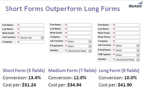
Long forms to fill out – Sometimes at the checkout, the salesperson asks for what seems like an unreasonable amount of information. Customers wonder why the business needs their phone number, backup phone, email address, and zip code to sell them a pair of suspenders. Unless customers are buying a car or a house, they don’t want to have to provide a bunch of personal information.
If your website has popups to collects email addresses for your marketing campaigns, capture email leads without disturbing your visitors. Asking for too much information feels like an invasion of privacy and causes users to navigate away.
That annoying employee who follows you around the store – She greets you with a cheery hello and asks if she can help you find something. Even if you say you’re just looking, she hovers half a step behind so you can’t really enjoy your shopping experience.
Chat windows are helpful when users have questions or need direction. Make sure they don’t become an annoyance. When they float down the page and cover text, they just get in the way. Give users the ability to minimize a window while they browse your site. If they need it later, they’ll know where to go.
What Makes Customers Feel Happy and Convert

Helpful tools that enhance user experience – When everything at the gym helps you get in a good workout, you appreciate the details that enhance your experience. Some gyms provide towels, water bottles, and Wi-Fi so customers can stream music and video. Buying the water and keeping up with laundry costs money, but the customers see it as thoughtfulness and hospitality.
Add features that enhance user experience to your website. Suggest items related to ones they’ve purchased in the past. Capitalize on color to increase conversions. Offer links to helpful information.
Companies that deliver on their promises – Customers tend to be a little suspicious, so when that eye cream actually does lift and brighten they don’t just buy more, they rave about it to friends.
If your site promises the widest selection, best advice, or latest innovation, make sure every element of UX is designed to make good on that promise.
Clear labels – When items have the price clearly marked, customers can judge whether it offers the value they’re seeking. When products are labeled to explain what they do, it simplifies the selection process.
A poorly labeled or cluttered web page is difficult to navigate. A clearly labeled page with a clean, open feel enhances user experience and helps them find key information.
When designers see real-life issues and translate them to enhanced user experiences, they improve connections, deepen relationships, and make good websites even stronger. Support customers on every step of their journey to strengthen your brand and make the experience more memorable for all users.
This post was written by Stephen Moyers, an online marketer, designer and avid tech-savvy blogger. He is associated with Los Angeles web design company SPINX Digital. He loves to write about web design, online marketing, entrepreneurship and much more. Apart from writing, he loves traveling & photography. Follow Stephen on Twitter & Google+.