
Look around the web, and you’ll see that web developers (and their clients) love contact forms. And for good reason: they collect important information about customers cheaply and effectively. But so many of these forms are clumsily designed or poorly implemented, cutting companies off from their customer. Avoid these problems and learn to build better user experiences by following these contact form guidelines.
Is a contact form the right tool for the job?
When your only tool is a hammer, everything starts to look like a nail. Don’t let this be you! Contact forms might be de rigueur, but that doesn’t mean they’re always the best tool for the job.
There’s no doubt that contact forms are a valuable tool for website owners and marketers. They collect crucial information that users often leave out of self-written contact emails, and can encourage users to reach out when they might otherwise have stayed silent. For certain types of uses, they’re absolutely essential. However, it’s not always the perfect tool for the job.
Let’s look at a situation where a contact form is expected by users and useful for the website. If you’re working on the customer support section of a large company’s website, a contact form is probably essential. Users need to be reminded to include important information, like their contact information, software version, account status and issue type. This makes sorting and assigning the huge volume of support requests easier for backend tech support software, freeing up your client from the drudgery of manually sorting material. Users provide the information required at first contact, so they get response faster, and everyone’s happy.
Marketers can also see a huge benefit from contact forms. If you’re trying to collect users emails in exchange for an infographic, ebook or free trial, contact forms are the perfect way to do that. You can dump the information right into your contact database and automatically add folks to your email lists.
But for small- and medium-sized service-based businesses, they might not be so great. If you’re a homeowner that needs plumbing services, there’s a chance that you need those services as close to “now” as is possible. If your bathroom is flooding right this second, you need to speak to someone immediately. In this case, you don’t want a contact form. Users have the perception that contact forms are slow and impersonal, and won’t solve their problem quickly.
Instead, you want a giant phone number plastered at the top of the web page. That doesn’t mean you can’t also have a contact for capture folks that don’t like using the phone, but it must not be the sole method of contact. No doubt, you will get spam as a result of this, but many filtering options exist to reduce that problem.
Contact form guidelines for building better forms
Icons made by Alfredo Hernandez from www.flaticon.com is licensed by CC 3.0 BY
If you do decide you definitely need a contact form, don’t screw it up! Use these contact form guidelines to make sure it’s up to snuff.
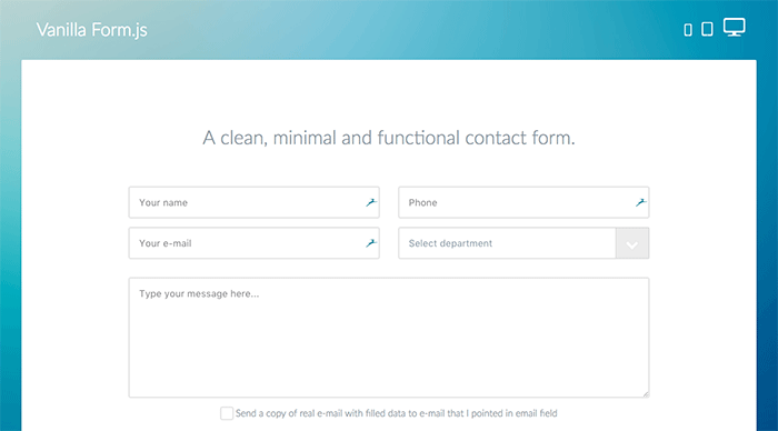
1. Design a clear user interface
Designing a functional and pleasing user interface is harder that it seems, so this tip can be challenging to implement. But by and large, you can follow some basic rules.
- Make fields easy to read. Text should be the right weight and color to read against the background, even for users with slightly impaired vision. Align labels to the left and position them above the field they apply to, and make sure the text is large enough to read without trying.
- Pre-fill forms carefully. If you’re using pre-filled form text as labels, make sure that it’s legible against the background of the text area, and that it contains accurate information. Also, don’t make it real text.
- Implement accessibility options. Make sure all input boxes can be reached by keyboard navigation, and that your
<label>elements are descriptive and accurate. - Keep it brief. Forms with fewer fields are easier for users to fill out, and they’re more likely to submit them. Don’t request information you don’t need (like full address) because it’s “standard.” And don’t ask for information you already have: in most cases, you can determine a user’s city and state from their postal code.
- Animate sparingly. You can do a ton of crazy-cool stuff with jQuery and HTML5 animations, but keep it in check. Don’t drown the user in gimmicky animations or over-the-top invalid response cues.
- Size form fields in relation to their expected input. Email fields need more space than a phone number, and a customer message need more room still.
- Use the generic radio buttons and checkboxes provided by the browser. These are easy to understand and users are used to seeing them in all their states. Plus, they always work!
- Make required fields obvious. Use a red asterisk to denote required fields, or actually write the word “required” next to their label.
- Accept data in any format. If you ask for phone numbers, for example, accept them with or without dashes and parentheses. Don’t reformat the input live either. Having parentheses, dashes and slashes suddenly appear as you’re typing is confusing for users.
2. Use custom branding
Consumers are uniquely attuned to the impersonal and generic. They might not be able to say exactly why, but if your contact form looks the same as every other contact form in the world, they’ll feel it.
To avoid this, implement some custom styling. This can be super simple, like changing field colors, border-radius values and typefaces. You can also get more complicated, restyling the form with scratch with unique interaction methods and live feedback. Whatever you choose, make sure it matches the company’s branding.
3. Make sure it works every time
If the user provides valid input, your form should submit every single time, without exception. But some developers, seeking to sanitize input and save work on the backend, shoot themselves in the foot with complicated filters and schemes.
You obviously need to make sure users can’t execute arbitrary code on your site, but that doesn’t require insanely complicated regular expressions to validate emails. Keep any validation methods as basic as possible to avoid surprise problems.
4. Secure it against common attacks
Anything you build for a client should be secure, but contact forms are especially vulnerable. Users are submitting data directly to your servers, and without checks in place, malicious users can execute scripts against your website.
Be smart about limiting common attacks, and use simple methods that actually work. For example, use HTML entity encoding and escape user submitted data to render code non-functional. You can learn more about this by reading about cross site scripting attacks (XSS) and MySQL injection.
5. Include relevant custom fields
To make your contact form most useful for your client, you need to include relevant custom fields in addition to obvious fields like name and email address. To take the example above, a support form for a software company should have drop down menus that request operating system and software version number. You might also ask users to choose a category for their question, though users sometimes have a hard time selecting this accurately.
6. Don’t ask for unnecessary info
The shorter the form, the better. And the less invasive a form feels, the more likely users are to submit it. If you don’t need personal information, don’t ask for it.
It might even improve your conversion rates. Some surveys have found that users are less likely to fill out a form when a phone number field is present, and shorter forms have higher utilization rates. As a rule, if data isn’t critical to the form’s purpose, don’t ask for it.
7. Try out different button copy
The text on your button is valuable: it should say what the user wants to do. Sure, the user wants to submit the form, but “Submit!” is pretty generic. Try using a call-to-action in the button text itself. For example, if you’re requesting user information to download an ebook, try out a button that says “Click here to download your free ebook!” This can help your conversion rate and reminds the user what will happen when they submit the form.
8. Keep the input process simple and flexible
Users shouldn’t need to think too hard to fill out the form. If your contact form imposes a large cognitive load on users, they’ll likely just ignore it.
Date and time pickers are a great example of imposing a mental burden on users. It seems like every picker is different. Some allow you to type in dates and then apply the correct formatting; others permit you to type in dates, but don’t accept the input as valid. And still others make typing in the date box impossible. All share one universal trait: they’re annoying, and yet necessary. If you must use something like this, make it as flexible as possible.
The perfect date picker would allow the user to use whatever input paradigm they’re most comfortable with. If you type in a date, it should automatically apply the proper formatting to accept the date. If you pick a date from a drop down calendar, that calendar should be easy to navigate, without superfluous animations or slow things down. Of course, it won’t be possible to achieve perfection on every project. Do your best to meet the user where they are, rather than trying to force your input method on them.
9. Use clear confirmation dialogues and error messages
If a form submits correctly, make sure you tell users! And then navigate away from the contact form page. It’s extremely unlikely that a contact form will be filled in twice, and users expect to be navigated to another page when they’re done with the form. Leaving users at the form will make it hard to tell if they were successful or not.
If something is wrong with the user’s input, make sure you tell them what’s wrong and why. Just indicate a generic problem isn’t enough: highlight the field with problematic input, and explain exactly what the problem is and how to fix it. Just make sure you’re only validating when the user submits the form! It’s stupid to have a form pedantically correct you on how to type an email address when you haven’t even finished typing.
10. Make it mobile-friendly
Contact forms that look awesome on a desktop browser might not so hot on mobile. Make sure that your form is reflowing as necessary for mobile users, and text extensively Use an actual mobile device to test it, confirming that form fields are all easily tappable and the submit button is large enough to hit accurately.
And make sure you’re giving users the right keyboard! By specifying your input type, you can automatically trigger context-sensitive keyboards on iOS and Android. For example, if you use <input type="tel">, you’ll trigger a phone number keyboard that makes typing in numbers easier for users.
You might also like: