Improve the adoption of your design system through components flexibility

This is not a recipe for success or a know-it-all article. Here I’m focusing on the most constant and significant challenge when building design systems — reaching a balance and compromising between flexibility and rigidity of components standards.
The components in the design system support all the use cases in the platform. Although this article focuses explicitly on Figma components, I have to say that every component that exists in Figma also needs to be documented in the component library. Otherwise, it’s just a style guide. But when designing components in Figma, design systems designers have an additional responsibility — taking into account how designers operate, utilize, and want their components to behave. This responsibility also carries over during the collaboration between designers and developers. If components are appropriately named, it makes the devs’ process much easier, and it minimizes the friction and level of support needed from designers during development. Ultimately, this results in more time to design and focus on pure user experience.
Figma does not replace rapid prototyping
As much as we love Figma, it still has limitations. You might want a single component to have specific breaking points — and although, thanks to responsive layouts, this can be achieved, a collaborative rapid prototyping session with developers can be quicker and more productive. Think about the scope, the deliverable, and what is the best environment to achieve your goal.
What everyone wants
Designers are meticulous about their craft and love to have variety. The design system needs to be well documented but not hinder the designers’ creativity. Throughout the years, I found that the most common asks from developers are focused on the spacing between components and sections of the page.
Grid systems
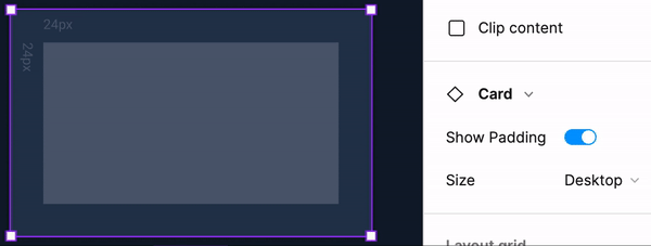
Just because people ask for every space to be defined in your design system, that doesn’t mean you should do it. Instead of defining margins for every individual component, create a spatial system. That means limiting the space values for every component based on a 4-point or 8-point grid system (or other points as long as it’s based on rationale).
Define spacing in patterns and between page sections
If you follow Brad Frost’s atomic design framework, your design system will have a mix of tokens, atoms, molecules, organisms, templates, and pages. You can also simplify this approach and go with a less complex framework — think about tokens, components, patterns, and templates. This type of approach allows you to define the relationship between the components on your page.
And if you don’t have patterns yet, define the margin between areas of your page. In the example below, Frame is dedicated to navigation, while the Content Area is dedicated to Page Layouts. Page Layouts can have multiple Sections, and each can have a different hierarchy. The overall Viewport comes with different variants for multiple sizes (desktop, tablet, and mobile). While we didn’t define the margin for each atom, we have margins defined for pages across multiple viewports. This brings designs one step closer to achieving consistency.
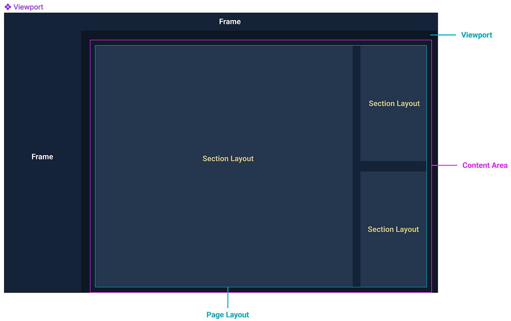
Margins and grids can be defined in the Layout grid area in Figma. However, if you want something more complex, you can manually add the margins and assign an on/off property value. This approach works well for nested components rather than hierarchy and spacing at the page level.
Trust your designers
The temptation to use auto-layout on everything is real — but it’s not always necessary.
As every component has acceptance criteria, Figma usability should become part of it. Define in the acceptance criteria if the component should follow auto-layout rules or if the designers should define the length of the component based on the environment they work in. Treat your designers as you would treat any other user — understand their habits and needs, and craft the components with them, for them.
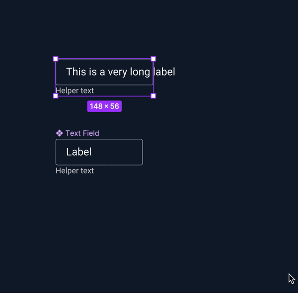
Auto-layout should be utilized only when the component changes its size based on the content rather than the environment. For instance, cards and buttons. Don’t use auto-layout to constrain the designers.
Using building blocks
As I mentioned above, Figma is not actual code, and sometimes it can be challenging to account for every use case. Some components might not always have the same numbers of columns or rows or the same nested sub-components.
When creating the component, think about how you can give designers the flexibility to adapt a data table to multiple scenarios. If you work in an enterprise organization, data tables are likely to be present all over your platform — but not every data table has the same number of columns or the same component in each cell. Building blocks can save the day, allowing designers to swap and nest various components inside each cell.
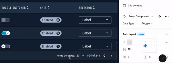
Building blocks allow designers to have flexibility and design components for the appropriate use case. In the example of the data table, each row represents a building block with multiple variants for style (header vs alternative row) and size (accounting for multiple columns for giant data tables). The building block comes with placeholder cells and sub-components, where designers can change the nested component and all its properties.
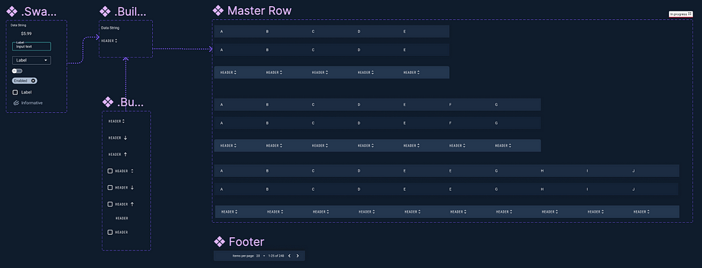
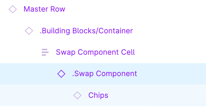
There are other sub-components that are utilized to build the main building block (in the case above, the Master Row). If there are components that you don’t want designers to use in the designs, you can place an underscore “_” or a period “.” and these sub-components will not be published to the main library.
Measure detachments and see it as an opportunity
When thinking about the success of the design system, adoption is one of the key metrics that can highlight issues with the system. Figma has great analytics to help teams understand how designers utilize the system. One of those data points focuses on detachments. Detachments can highlight that components don’t meet the needs of designers — for instance, if a component is too rigid and designers struggle with its usage, most likely, they will detach. Detachments are not great because the component doesn’t receive the necessary updates published in the library anymore. However, detachments should be seen as an opportunity to understand how to improve a component’s Figma usability.
Train your designers
Most designers worked within a design system environment, but not all of them. Take the time to understand each designer’s experience level using a design system. As you publish components, create training resources where designers can practice and learn to work with the components. Run interviews with each designer to dive deeper into past struggles when using the system so you can avoid them. Documentation comes in handy as well — as you have use cases and accessibility documentation, you can create Figma library resources for every designer that joins newly in your team and beyond.
A few additional resources to help you build great systems:
- How to understand your Design System’s health, and eventually, its success.
- Space, Size & Style
- How much is a design system worth?
- Design Systems For Figma | Creating Components For Mature Design Systems
Thank you.
Why designers don’t use your design system was originally published in UX Collective on Medium, where people are continuing the conversation by highlighting and responding to this story.