An analysis of Uncertainty Avoidance and Amazon’s website in various countries

What do Switzerland, the US, Sweden, the UK, and the Netherlands have in common?
They are all rich, protestant, relatively cold countries where a big part of the population consists of (former) immigrants. They also form the top 5 of the Global Innovation Index.
These countries invest greatly in R&D, infrastructure, regulations (and intellectual property protection) and education. The countries are known for their excellent universities. This is partially the result of governmental policies. These countries can afford to invest in the future because they have flourishing economies. Or did the economy flourish because they took a bet and invested?
This article is not about innovation. There are a number of theories that might contribute to how innovative cultures can be. One of them is related to the cultural roots of being at ease with taking risks.
The people who built the countries I just mentioned, hundreds of years ago, were exposed to harsh conditions. They didn’t know if there would be enough food in winter. They didn’t have a strong protector, like a Roman ruler, that would shield them from the big bad outside world.
The cold weather forced these people to live in nomadic tribes. They were constantly looking for a better life but didn’t know what they would find at the end of their journey. Many (now) Americans even risked crossing the ocean to find new opportunities. This migrating risk-taking behaviour can also be seen in countries like Israel and Singapore. Also high on the innovation index.
Let’s compare this life to those of the Spanish, Italians, or Greeks. They had emperors and religious institutions protecting and guiding them. They could stay in one place and pick olives, oranges, and garlic whenever they were hungry, and they didn’t freeze to death during the winters.
Some cultures have learned to embrace uncertainty and quickly adapt, others could rely on a predictable and stable life.
Our ancient habits affect today’s behaviours significantly. This can be captured in a number of cultural dimensions. The relevant one for this article is uncertainty avoidance (UA).
We can describe this as:
The extent to which people feel threatened by ambiguous or unknown situations. Should we try to control the future or just let it happen?
It’s good to know that all cultural dimensions are spectrums. Some countries gravitate more towards uncertainty avoidance than others. Countries are positioned somewhere on this spectrum.
Innovation brings ambiguity. No one knows how new ideas will turn out. Disruptive products will make life an experiment. This might contribute to low-UA countries often being better innovators. They have a tolerance for the unknown.
Rules and procedures can structure our lives. They are used to avoid the unknown. This is why high-UA cultures tend to have more explicit laws than the minimal Anglo-Saxon common law.
High-UA companies also rely much more on established processes. Agile is a typical low-UA concept.
France is a high-UA country. It mainly uses nuclear power and is comfortable with it. This is because it relies on its strict protocols. These are reassuring to society.
High-UA cultures prefer specialists with degrees and experience. This gives the confidence an employee will do the job adequately.
In low-UA countries, more people are generalists, which means they can do many different tasks. Even if they aren’t experts in those areas. They are not limited to just one specific domain of expertise.
You can not say that either high-UA or low-UA societies are better. They both have their strengths. They simply excel in different aspects of life. High-UA cultures are good at manufacturing and precision. Low-UA countries cope better with a changing world.
You can find the complete uncertainty avoidance index to see how your country ranks.
Let’s continue to investigate how UA impacts UX design.
Navigation — how to find info
Exploration comes with uncertainty. Finding your way on a website is diving into the unknown. A user doesn’t know where a link leads to, and what information is available afterwards.
Ensuring users reach the right information is approached differently across cultures.
High-UA cultures tend to design more complete and complex navigations. This allows a user to better analyse all the available options before making a choice.


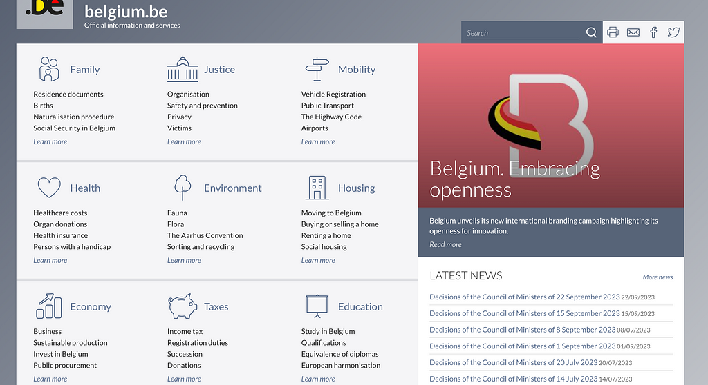
We see this on the websites of the governments of Belgium and Portugal. All content domains are well structured and are supported with sub-items.
The visitors can review all main sections and sub-items before clicking.


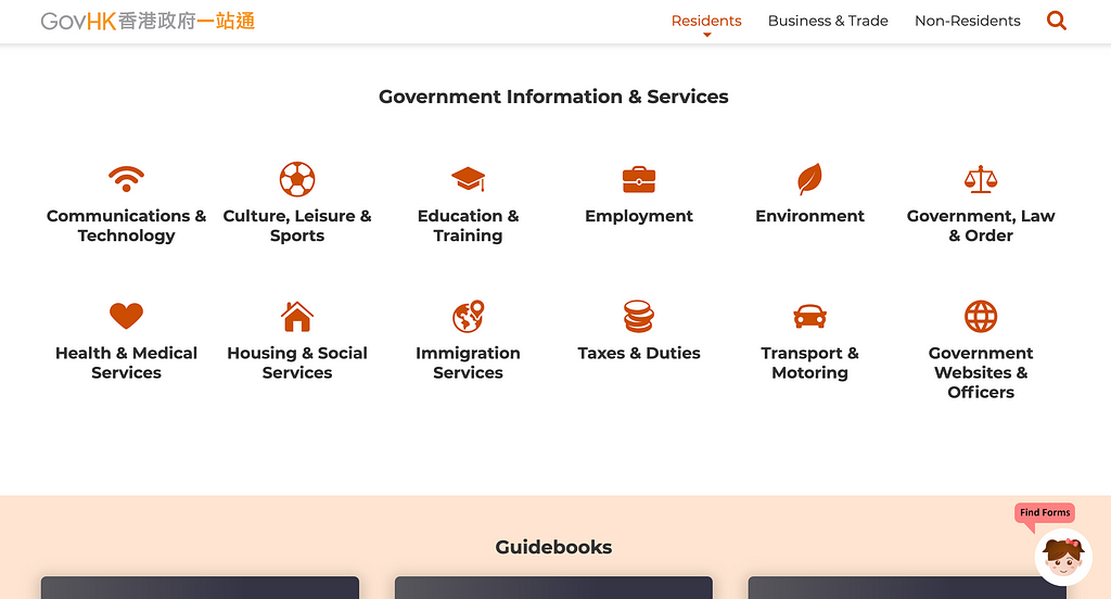
Low-UA countries Hong Kong and the UK take a different approach. They show the main domains but not what’s behind these sections.
Low-UA users are comfortable exploring, so will be more at ease with more abstract navigation structures.
Scientists from two Universities in Berlin analysed data taken from the logfiles of a sizeable international website in the field of public health care. They reviewed the navigation behaviour of users from 187 countries.
They found clear evidence that high-UA cultures collect more information on average:
Members of high UA cultures tend to explore all available options in order to minimize the number of unknown situations and locations.
Members of high UA cultures collect more information on a given website than members of low UA cultures.
The more a country is considered to be uncertainty avoidant, the more information is collected by members of these countries.
– Source
Complex navigation design allows for easier toggling between pages and collecting extensive information. This serves high-UA cultures.
Low-UA cultures feel more at ease with going down a new path and making a choice with less complete information.
Information design — content
A study done by the Canadian Simon Fraser University investigated how details-pages of websites provide information.
They found evidence that members from low-UA cultures Canada, the United States, and India are more easily satisfied with the content of pages than members from medium-UA countries, Germany and China, or high-UA cultures: Chile, Mexico, and Japan.
How this manifests in real life is brilliantly illustrated by Jenny Shen.
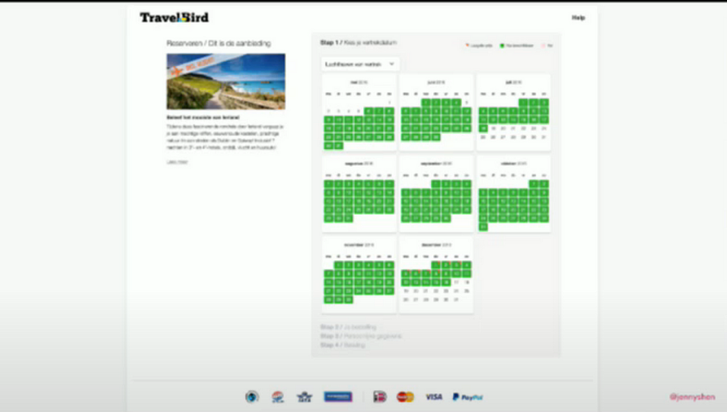
She studied why German users were less successful in booking trips on a travel website than Dutch users.


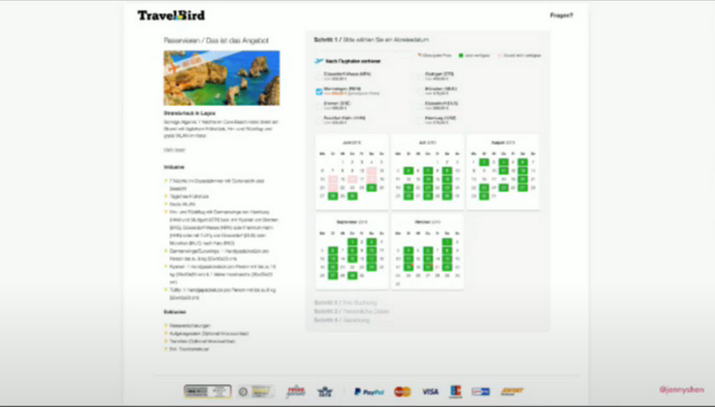
Travelbird is a platform that was developed in the low-UA Netherlands. When they opened this website to German users, few deals were sold. Only after adding extensive information on the German website, sales increased.


We see the same trend when we compare the Italian and British Amazon search results pages. The Italian version contains much more details about the product.
Visual design
The aesthetics of digital products are highly subjective. They relate to emotional appeal.
Measuring preferences for visual elements is almost impossible, but the Fraser University study also investigated the impact of visual design on the user’s experience. They concluded that low-UA countries are more at ease with less pleasant designs than high-UA countries.
Members from low uncertainty avoidance cultures (Canada, the United States, India) will provide higher ratings for visual design than members from medium uncertainty avoidance cultures (Germany, China) or high uncertainty avoidance cultures (Chile, Mexico, Japan).
When combining various aspects of UI design, clear patterns arise. The scientists conclude that members of high-UA countries find the quality of information content, information design, navigation design and visual design more important when making online decisions than low-UA people.
Trust
Uncertainty and trust go hand in hand. The cultural Uncertainty Avoidance divide is clearly visible in society. In Northern Europe, most supermarkets rely on customer self-checkout, something uncommon for Mediterranean countries.
A study looked at how people from the United States, Brazil, and other Latin American countries behave when shopping online. The scientists found that Latin Americans and Brazilians, high-UA countries, considered the appearance of credit card symbols on websites more important. In contrast, Americans didn’t place as much importance on these symbols.


This is precisely what we can see if we compare the Brazilian and Canadian Amazon product pages. The Brazilian version has many more elements added to reassure its users, including symbols and links about payments and security and the return policy.


Showing more symbols can also be observed in the German and Dutch travel website screenshots. The German version has many more logos of established and trustworthy payment providers.
The Simon Fraser University study, I already mentioned, also found evidence that members from low-UA cultures will provide higher ratings for website trust than members from high-UA cultures.


The Mexican version of Amazon deals with this by adding a number of elements on its homepage to put the user at ease. Similar to the Brazilian design, it contains a fair few symbols to help the user understand their policies.
So what happens if you visit a website tailored to a specific culture and a conflicting user visits the website?
This has been examined in a collaboration between various international universities.
The researchers proved that the willingness to pay decreases for high-UA Korean consumers when they use a website that is not aligned with their cultural expectations. This effect was significantly less for U.S. consumers.
We found that when Korean consumers experience cultural incongruence, they feel a need to exert increased effort in order to process information, which mediates their willingness to pay. However, cultural congruence does not have a significant effect on U.S. consumers.
Similarly, the Kookmin University in Seoul researched how comfortable Chinese (low-UA) and Korean people are with online payments.
They confirmed the assumptions we might find logical at this stage of this article. Chinese people adapt quickly to new payment methods, but Koreans must be carefully convinced.
In China, as long as users’ basic security information is ensured, the operation and pages should be simplified, more and more businesses should be linked to mobile payments, the experiential sense of using mobile payments should be enhanced, and marketing should focus on highlighting the convenience of mobile payments […].
However, in […] South Korea […] attention should also be paid to user privacy, reducing the risks associated with security issues, and reducing South Korean consumers’ concerns about mobile payment risks.
How reliable is UA as design guidance?
Uncertainty avoidance is absolutely the hardest concept of all the cultural dimensions I’ve been investigating.
I discussed this dimension in a previous article but mostly used examples taken from marketing and communication.
The cultural differences in real-life behaviours are very apparent but manifest less in digital worlds.
I’ve worked a fair bit with people from high-UA countries. They tend to have a strong desire for clearly defined processes and job/role descriptions. I and my Anglo-Saxon colleagues had a preference for more blurry job responsibilities. We believed our employees would sort out their challenges with mutual comprehension and flexibility.
One study surveyed whether young people would prefer to work in civil service. These jobs are often for life and thus reduce concerns about the future. 75% of Spanish respondents said yes, whereas only 17% were appealed by this idea in the USA.
This article provides a few cultural preferences and examples but don’t take them as gospel. I selected examples that illustrate the differences well.
Sometimes countries can show inconsistencies with their placement on the UA scale.
India (low uncertainty avoidance) tended to cluster with Mexico and Chile (both high uncertainty avoidance), which based on Hofstede’s classifications would be unusual.


That India is a good example of how countries can be outliers, can be seen on their Amazon website. There are plenty of elements incorporated to reduce uncertainty. The product category page is full of visual reassurances, and the product page contains even more policy explanations and symbols than the Brazilian design.
The Fraser Study concludes with a caveat.
A final interesting outcome is the complete commonality in the results between English Canada and French Canada. It appears that in a website context, commonality based on institutions, economics, and societal norms and practices is a stronger predictor of user perceptions than culture.
What counts for all the cultural dimensions I’m investigating… they give an understanding of one aspect of countries, but they have to be used more holistically.
There is no simple recipe to adjust your UX to that of various countries. Of course, a good understanding of cultural differences helps. You should be aware of your audience’s behaviour when designing multicultural platforms.
A good starting point when designing for various cultures is to aim to reduce the user’s uncertainty. A few more extra logos, lines of text, or a more complete navigation structure won’t significantly harm your low-UA audience. However, not offering this reassurance can make people from high-UA countries leave your platform directly.
You don’t have to show your logos and extra info too prominently, but it should be there. It’s, of course, a good practice to refine your design when conducting user tests.
You can’t just copy/paste your designs from other platforms. They might serve different audiences. However, you might, bit by bit, come to an original and inventive solution yourself. To be an innovative designer, you don’t have to be Swiss, Swedish, or American.
Risk tolerance: why some countries prefer more complex UIs was originally published in UX Collective on Medium, where people are continuing the conversation by highlighting and responding to this story.