Welcome to the ultimate guide to serif fonts! Whether you’re new to the subject or a bit more experienced, this guide will help you out. We’ll start by explaining what a serif font is and when you’d want to use one, and then we’ll look at some different types of serif fonts and introduce you to some great examples.
What Is a Serif Font?
First things first: what is a serif font? And what is the difference between serif and non-serif fonts?
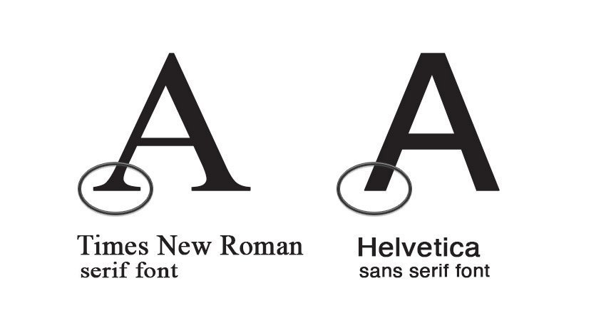
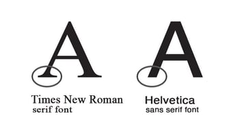
The answer is simple. Just look at the example below, and you’ll see that Times New Roman on the left has little strokes at the end of each letter, whereas Helvetica on the right doesn’t.
Those strokes are called “serifs”, so Times New Roman is a serif font, whereas Helvetica is a sans-serif font (meaning “without serifs”).
Easy, right? Learn more in this video:
Serif vs. Sans-Serif Fonts
Knowing the ins and outs of different font styles is essential for any budding graphic designer. In this quick video, you’ll learn the major differences between serif and sans serif fonts.
Examples of Serif Fonts
What are some serif fonts that are good to use in your designs? Check out the examples below. As you can see, there’s quite a range of different types of elegant serif fonts. We’ll look at some of those different types later on.
Discover more about serif and sans-serif fonts in this article:
When to Use a Serif Font
So why would you want to use a serif font? What kind of impression does it give? We’ll answer those questions in this section, as well as giving some examples of serif fonts in use.
Here are some great reasons to use serif fonts:
1. To Look Authoritative
Serif fonts often have a more traditional look than sans-serif fonts. This medical newsletter template, for example, uses a serif font both for the headline and body text to give it an authoritative, trustworthy appearance.
2. To Make It Easy to Read
Books with large amounts of body text, like long novels, often use serif fonts because the serifs help readers recognise each letter, especially at small sizes. See how this elegant book template uses a serif font for its body text?
3. For a Retro Appeal
Old posters and newspapers often used serif fonts, so if you want to create a retro or vintage look, a serif is a great choice. Check out the use of serif fonts in this vintage poster template.
Types of Serif Fonts
As we mentioned earlier, serif fonts come in a variety of different styles. Generally, they’re split into four different types:
- Old-style
- Transitional
- Didone
- Slab
In this section, we’ll look at these four different types of serif fonts and explain the differences between them.
Old-Style Serif Typefaces
First, let’s look at old-style serif fonts. One of the key characteristics is a diagonal, wedge-style serif instead of the flat serifs seen in other types of serif fonts. Old-style serifs tend to have a classy, timeless aesthetic that makes them perfect for books, magazines, or other formal contexts.
Transitional Serif Typefaces
As the name suggests, transitional serifs are a “transition” between old-style serif fonts and more modern serif fonts, like Didones. They have more contrast than old-style serifs, but not as much as Didones.
Some of the most popular serif fonts, like Times New Roman, are transitional serifs. They’re usually highly legible and are a great choice for the body text in formal documents.
Didone Serif Typefaces
The name “Didone” comes from a combination of two classic serif fonts: Didot and Bodoni. Didone fonts tend to have a high contrast, meaning that there’s a lot of variation between thick and thin stroke weights. You’re likely to see them used in fashion magazines, high-end advertising, and luxury product designs.
Use a Didone font if you want to give your brand a luxury vibe. Here are some elegant serif fonts from this category:
Slab Serif Typefaces
Again, the clue’s in the name here. Slabs are thick and blocky, and that’s what the serifs on these bold serif fonts are like. These typefaces tend to be very consistent and are often high-impact fonts used for display purposes. Classic serif fonts like Rockwell and Roboto are slab serifs.
What is a good serif font for headlines? Try one of these wonderful slab serif font examples:
Still want to know more about the types of serif fonts? Check out this great article:
And if you want to learn more about typeface classification in general, watch these two free courses:
Famous Serif Fonts
Is Times New Roman a serif font? Of course it is! It’s a famous serif font, but there are also plenty of others, like Georgia and Rockwell. We’ll look at some popular serif font examples in this section.
Because these fonts are so familiar, you may want to use a slightly different font for your designs. So we’ve also linked to articles recommending some of the best serif fonts that share some of the key characteristics of these classic typefaces.
Times New Roman
One of the most famous serif fonts out there is Times New Roman. It was the default font in Microsoft Word for many years, and it’s been used in a wide range of projects.
Learn more about Times New Roman and discover some alternative fonts to Times New Roman in this article:
Rockwell
When you’re looking for classic slab serif font examples, Rockwell is the obvious choice. It’s a high-impact display font with a clean, uniform style. Here are some great fonts to consider if you want a slight twist on the old classic:
Didot
Elegant and classy, Didot is ideal for use in fashion, branding, and other luxury design projects.
Key characteristics to look for in this thin serif font are the high contrast in stroke widths and the thin, hairline serifs.
Garamond
The Garamond serif font features elegant strokes and open negative spaces.
Garamond is also highly legible, making it a great choice for setting large amounts of body text. So if you’re planning a book or designing a magazine, read the article below to find some great Garamond-style fonts to use.
Georgia
Another easy-to-read thin serif font that’s popular for body text, Georgia is popular for websites and other digital design projects. Learn more here:
Trajan
Based on the classical Roman letterforms found on Trajan’s Column in Rome, the Trajan typeface is a beautiful display serif font to use for headlines, movie titles, and much more. Read this guide to Trajan and its alternatives:
Popular Serif Fonts
We’ve covered a lot of the best serif fonts in this article, but there are still plenty more out there. Whether you want bold serif fonts or a condensed serif font, you can find what you need. For example, here’s a selection of six of the most popular serif fonts on Envato Elements:
Find more wonderful serif font examples on Envato Elements.
