It is estimated that 15% of the population has Dyslexia. In absolute numbers this means that 30 million adults in the USA alone are dyslexic and a lot of them don’t even know — because it is often not diagnosed. Dyslexia is a cognitive disability where the brain has difficulties to manipulate the sounds and letters of language — as a child I knew it as “Reading and spelling disability” which describes it in easier language.
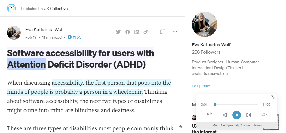
I’m a Product Designer vouching for accessible software and I think that cognitive disability is often forgotten. I got my Dyslexia diagnosis as a child, and not long ago, I was diagnosed with another cognitive disability: ADHD. I already wrote an article about Software accessibility for users with Attention Deficit Disorder (ADHD). In this article, I want to dive into my other disability that is often forgotten in design for accessibility: Dyslexia.
How does Dyslexia manifest itself?
To design for a disability, I think it is crucial to understand the disability and to empathize. Dyslexia is a disability that accompanies affected individuals from childhood on —in rare cases, it occurs in adulthood due to brain injury or dementia. In the past, the term “reading blindness” was used for it. The symptoms vary from person to person and there isn’t a universal definition, but usual difficulties for adults are:
- Reading is slow and labor-intensive, which leads to avoiding to read at all and spending an unusually long time completing tasks that involve reading
- Problems with spelling, making writing a slow and labor-intensive task as well
- Mispronouncing of words e.g. when reading out loud or using unknown words
- Problems retrieving words, which can for example lead to trouble learning a foreign language or remembering new words as well as names
There is no medical treatment for dyslexia, but individuals can undergo training, which is especially helpful if the diagnosis is made early in life and the person has a supportive environment.
Empathizing with dyslexic people
I think that empathizing is our superpower in UX Design and one of the most important steps. So let’s give you some material to empathize with Dyslexia. I will tell you my story and feelings about it and link a few other journeys as well.
I was diagnosed with Dyslexia in 6th grade. I never felt any different than other kids, but I did struggle with learning how to read and write and my mother got concerned. I once overheard my teacher of the subject German (my native language) telling my mother that I just wasn’t that smart. But my mother didn’t listen to her and took me to a test and in fact I was and am dyslexic.
As a child, I was ashamed of my Dyslexia and tried to hide it. Even though I went to private training sessions every week, I never told any of my friends about it. In school, I didn’t get any special treatment (like more time for exams) and I tried to hide it from my classmates. The worst situations were reading cycles in class, where everyone had to read one passage out loud in front of the whole class. I would start to get really nervous and especially in these situations I also made a lot of mistakes in reading: wrong pronunciations, reading a completely different word and just taking a lot of time. My spelling was really bad as well and I didn’t get good grades in my German classes for a long time because of it. Additionally, when teachers gave us the task of reading a text silently on our own, I was usually only somewhere in the middle when the others had already finished and the teachers wanted to know if “anyone needs more time” — to which I never dared to say yes. So the class did just move on and I was missing half of the information of the text.
My proudest day was when I got my Abitur (German equivalent to A-Levels) and at that time I had a German teacher at a new school that never knew about my Dyslexia. So I asked her if she had suspected anything and she said no. I considered myself “healed” but now I know that I just got good at masking Dyslexia. My spelling really got a lot better and after school I barely ever had to write anything in handwriting, so I use spell checks. But I still read very slowly and have problems focusing on complicated reading. In university when we had to read big textbooks for every class, I just couldn’t do it. I usually read a few chapters, gave up and searched for a summary. In my computer science classes this worked fine, in psychology I got bad grades because I didn’t know the details. After university the symptoms got even easier for me to handle because I simply stopped reading for a long time. By now I finally managed to accept the fact that I’m a slow reader and I do read novels, but I still can’t read textbooks and if a text includes a lot of technical terms and abbreviations it’s really problematic for me as well.
I only understood how much Dyslexia still affects me as an adult, when I read through the experiences of other dyslexic people — probably because I’m used to it by now. I can only recommend reading about the experiences of other people with Dyslexia, for example Cliff Weitzman’s article “What it’s like to have dyslexia & ADD + Why I still love school” and Lisa Wood Shapiro’ s “How Technology Helped Me Cheat Dyslexia”.
UX Design for Dyslexia
When first hearing of it Dyslexia may sound like a disability that doesn’t have that many accessibility issues in software, but I think there is quite a lot we can do to improve accessibility for people with Dyslexia and I want to provide you with a whole lot of tips to do so — some of them come from my own experience, others are gathered from the Internet, I will mention sources whenever the tips are not mine.
Don’t overwhelm the user
I often feel quite anxious when having to accomplish a long reading task. This is probably not a direct symptom of Dyslexia but something that results from living many years with it. I also get easily overwhelmed by specialist terms and abbreviations. Here are a few tips on how to not overwhelm the user:
- write short and simple sentences
- avoid bigger chunks of text instead use paragraphs, subheadings and if possible bulleted lists
- avoid specialized terms and try to use easy language whenever possible
- use only really common abbreviations like “e.g.” or try to avoid them altogether
If you want to dive deeper into writing for people with Dyslexia, I can recommend the article “How to Write With a Dyslexic Audience in Mind” by Trisha Dunbar (She/Her).
Enable native computer functionalities
There are some functionalities that are normally enabled by the browser or the operating system. Make sure that you don’t block these or provide them if they are not available for your software already:
- Zoom: it can help a lot to zoom into text to increase the readability with a bigger font
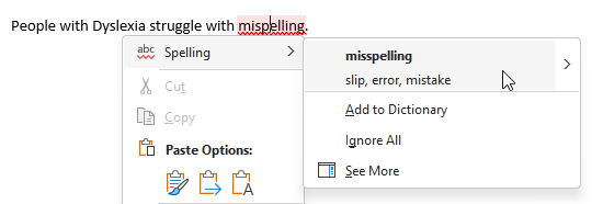
- Spell check: if the application provides a possibility to write text, there should be a spell check available
- Copy: never block the “Copy” feature which also includes that it needs to be possible to select text (e.g. in Instagram this isn’t possible in the descriptions of a post). This enables the user to use Bionic Reading (see below in the features paragraph) and spell check of other apps. I for example always copy my Medium articles into Google Docs and discover many spell and grammar mistakes there.
Consider slow reading speed
In texts the slow reading speed is usually not that big of a problem, because I can take as much time as I like when reading a text. But there are some situations where time is limited, e.g. when watching videos with subtitles. Subtitles usually give me anxiety because I can never read fast enough — and I need subtitles quite a lot e.g. when I watch a professional video in English — which isn’t my native language and therefore it’s sometimes hard for me to understand — or when I’m in a environment that doesn’t allow me to watch videos with sound. My ideas would be the following:
- if possible slow the subtitles down in speed
- show more than one line of the subtitle for example 2 or 3 at the same time, this allows readers to be a little bit behind in reading
- provide a transcript that is detached from the video or has a good integration
Features to help people with Dyslexia
I know of two Dyslexia-friendly features that I would love to have in any application that involves reading texts like articles or smaller junks of texts like descriptions on social media. You as a UX/ Product Designer or any person working in software development could consider integrating them into your application e.g. as a user-related setting to be switched on and off or simply integrate it into the UI.
Text-to-speech
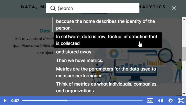
On Medium I discovered Speechify which is one possibility to convert text to audio and make it available to the user. Every Medium article can be read out loud by simply clicking on the “Play” feature at the top of the article. The voice is pleasant and neither too slow nor too fast — but the speed can also be configured. The founder of Speechify has Dyslexia himself and actually one of the articles I linked above to empathize with dyslexic people is by him. I also know a few blogs that provide their articles as podcasts as well and I guess there are also other extensions available that provide audio for text. Whichever way you choose: providing a text-to-speech feature can be a real game changer for people with Dyslexia.
And for all the dyslexic people reading this: there is by the way also a Speechify browser plug-in.
Bionic Reading
Have you ever heard of Bionic Reading? This is a technique — created by Renato Casuut, a Swiss developer — where certain characters of words are highlighted. With these highlights, the eyes are guided through fixation points. This actually makes reading easier and faster — especially if you are distracted or neurodivergent. But it’s not Dyslexia specific, it also helps non-neurodivergent people and is mentioned as quite a game changer in the ADHD community. If you want to read more about Bionic Reading have a look at the article “What Is Bionic Reading, and How Do You Use It?”. There is a Bionic Reading app, where text or files can be pasted and the app automatically does the highlighting. I would love to have this integrated into Medium. But even if you don’t integrate this feature in your application, the least you can do is enable the copying of text (which is also helpful for spell check like mentioned above).
UI Design for Dyslexia
The British Dyslexia Association published a style guide on UI Design for people with dyslexia: “Dyslexia friendly style guide — British Dyslexia Association”. I encourage you to read their whole guide, but I will give you a quick summary of the most important points:
Fonts
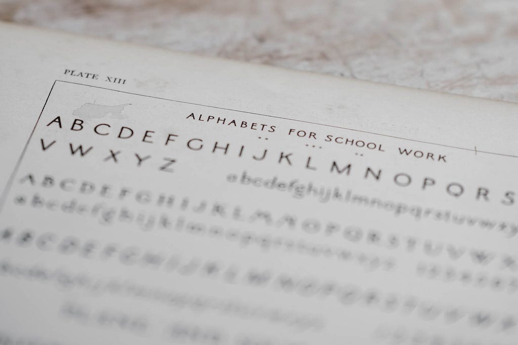
- Use sans-serif fonts, in a big enough font (16–19px) — for headings at least 20% larger than normal text. There are quite a few Dyslexia fonts out there, but research shows that they actually don’t help that much, as long as you use a clean sans-serif font it will be fine.
- Make sure you have good spacing: between characters, words, and lines. A bit more spacing than usual helps reading, but it should not be too much either
- Avoid italic and underlining formats and writing whole words or texts in uppercase
Color
- Pay attention to the contrast between background and text, e.g. black text on a white background (this also helps people with low vision)
- White backgrounds can appear dazzling, therefore consider integrating a dark mode or using a cream or soft pastel color — but never use any pattern or other distracting backgrounds
Layout
- Align text left (for western cultures) and avoid multiple columns for text (newsletter style)
- Use white space and headings for a good structure in the text and to declutter it
![]()
Software accessibility for users with Dyslexia was originally published in UX Collective on Medium, where people are continuing the conversation by highlighting and responding to this story.