
2. Focus
Focus is one of the most important accessibility features that enables users to use a computer with only a keyboard without the need for a mouse. Most reset stylesheets have this one line of code that causes major accessibility failure –
:focus {
outline: 0;
}
This is an anti-pattern that needs to be avoided like the plague. Keyboard only users know what elements on the page they are interacting with the help of focus styles.
Focus highlighting should be used only for interactive components within a page such as form elements, buttons etc.
There are websites out there, in the attempt to make their content more accessible, the heading and body text is tweaked programmatically to highlight on focus. This is absolutely unnecessary effort as screen readers would read the content out by default and directing focus to such content particularly does not help in any way. There are a few caveats to this rule which will be discussed later with examples.
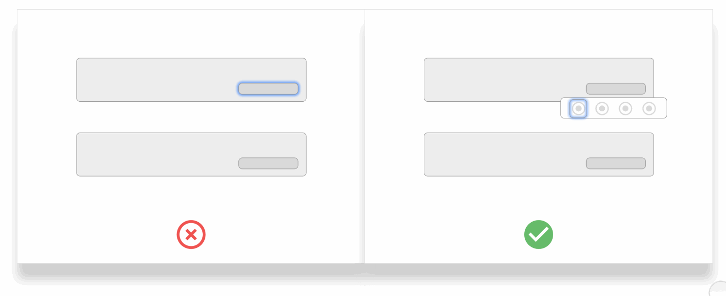
Focus Contrast
As a rule of thumb, it is necessary to have the focus color as distinct as possible from your background color.
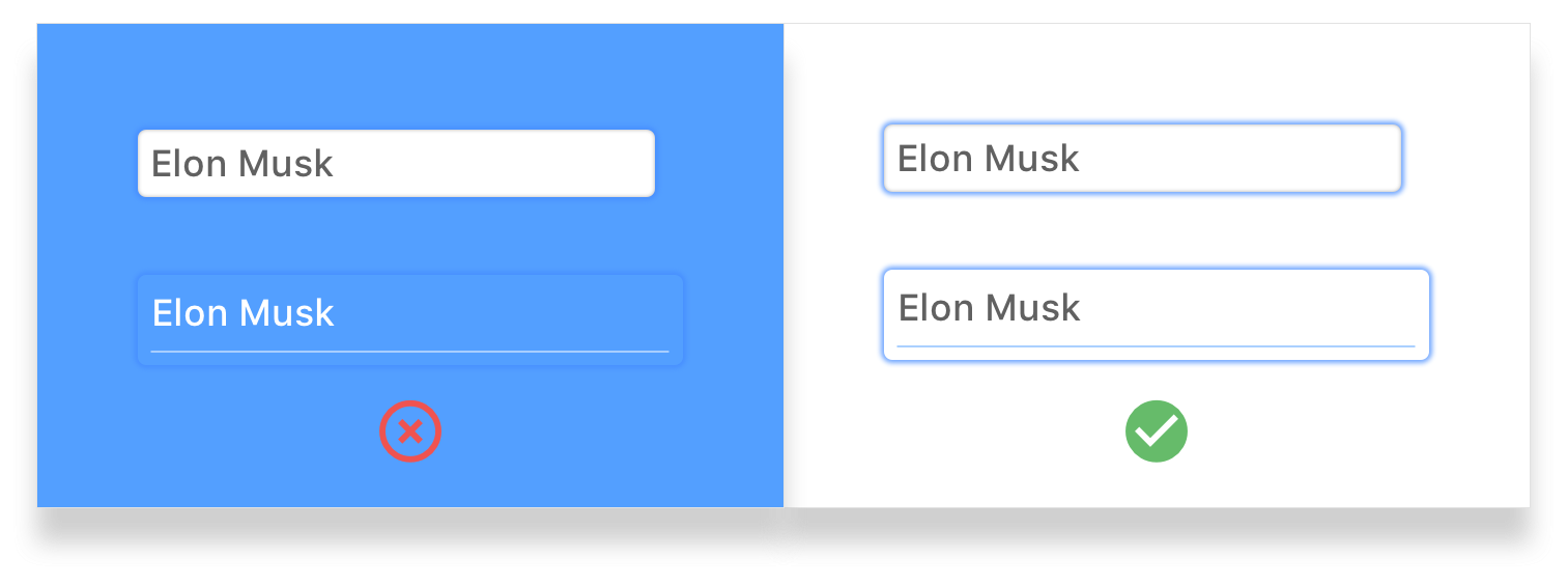
Left: The contrast is poor and competes with the background hence making it difficult to spot the elements being focused . Right: The contrast is clear enough to differentiate the focus elements.
Off-screen content
When off-screen content hidden from the viewport exists in the form of hamburger menus, modals etc, it is likely that when a user is tabbing through focus points, they would lose track of the focus as it is highlighting something that is off the working area. This can cause confusion and make users lose track of their current position on the screen.
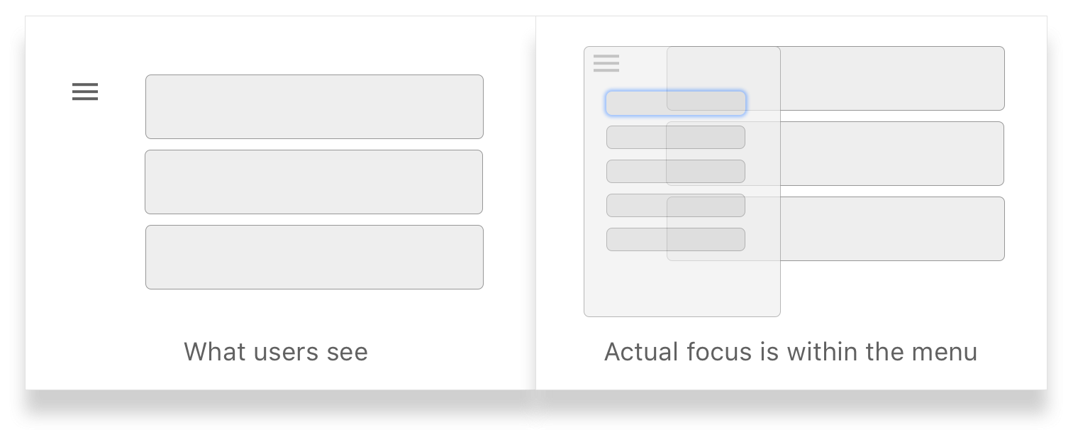
Left: What users see when they are tabbing through off-screen elements. Right: The actual position of the focus. When the menu is closed, the flow of focus is obfuscated to the user.
Recommended Solution: One way to tackle this issue is by either hiding the elements when the menu is closed with CSS with display: none, or making sure the focus does not enter the menu when collapsed by programmatically altering the flow of focus with JavaScript.
Modals
Modals are another type of off-screen elements that can be a huge accessibility disaster when not executed fittingly. When a user is navigating within the modal, it is necessary for the focus to remain within the modal and not move through points behind the modal.
This is one of those rare use-cases where it is okay to programmatically force the focus to get to the title of the modal window to ensure that users are not deviating from the intended flow.
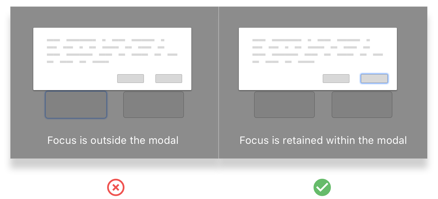
Left: The focus is outside the modal after tabbing through a few times. User loses control of actions within the modal. Right: The focus alternates between the two available options until the user decides to close the modal.
Hover States and Focus
Hover states and focus have different functionality. Many products have actions hidden under hover states. A good example is Facebook’s hover states for reactions.
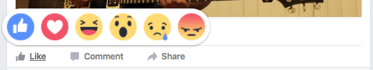
Facebook has actions within hover states. They do a great job of highlighting it on focus as well, making it navigable for keyboard only users.
A bad example is Product Hunt’s cards. They show multiple actions that become visible only on hover which is not keyboard-only accessible.

Product Hunt, on the other hand, has specific actions (highlighted above) that show up on hover. These actions are not visible on focus and makes it hard for keyboard only users to perform those actions.
Left: Focus ignoring on hover actions and jumping to the next focus element. Right:Focus states allowing users to perform actions that are hidden within a mouse-hover state.
Scenarios to “re-focus”
When an UI element on the page is removed from a user’s action, it is important to refocus to an element within the context of the current working area. A good example to this is when a user decides to delete an item — the focus disappears from the current element and moves to the top of the page. There is a clear need to bring the focus back to an element after the deleted item.
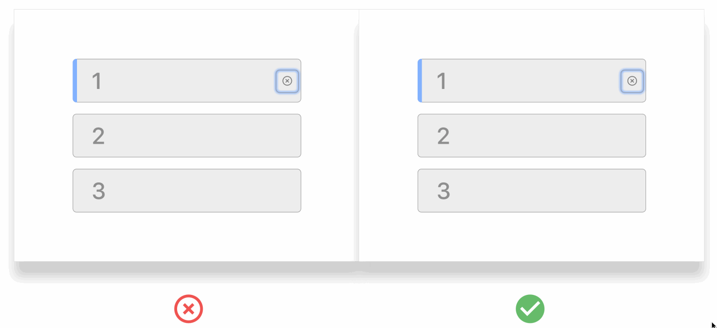
Left: After deleting the list item, the focus is lost. The user might have to tab through all the way again to reach this point. Right: The focus is shifted to the next element on the list thereby making the browsing experience more continuous.