In this beginner’s accessibility tutorial we’re going to learn what ARIA is, why it is necessary to write our HTML with ARIA in mind, what ARIA roles, properties, and states are, and (very importantly) the 5 rules of ARIA use.
What is ARIA?
ARIA stands for Accessible Rich Internet Applications and it was created by the World Wide Web Consortium (W3C). Nowadays, as a best practice, web developers use semantic HTML when building websites and web pages. Semantic HTML is where the most appropriate and descriptive HTML elements are used, helping robots, services, and those who rely on assistive technologies (AT) understand the meaning of the content.

ARIA goes one step further, adding a set of attributes which help define the content of a page beyond what HTML can do on its own. These ARIA attributes add things like accessible navigation, form hints, error messages and other useful power ups.
Here’s an example of semantic HTML, done badly and then properly:
Bad Semantics
<body>
<div>Welcome to my Website.</div>
<span>This article is about ARIA in HTML.</span>
<div>
Lorem ipsum dolor sit amet consectetur, adipisicing elit. Qui odit dolore placeat voluptatem fugit nam alias quasi repellendus recusandae fugiat nulla numquam, minus, quod sapiente similique tenetur
illum neque voluptate!
</div>
<div>© 2020</div>
</body>
Here, we can see a body element that contains text nested using either div or span tags. Although this page can be styled to look perfectly good using CSS, it would be difficult for people that rely on screen readers to fully understand this content because it isn’t properly constructed.
Good Semantics
<body>
<header>
<p>Welcome to my Website.</p>
</header>
<main>
<h1>ARIA in HTML.</h1>
<p>
Lorem ipsum dolor sit amet consectetur, adipisicing elit. Qui odit dolore placeat voluptatem fugit nam alias quasi repellendus recusandae fugiat nulla numquam, minus, quod sapiente similique tenetur illum neque voluptate!
</p>
</main>
<footer>© 2020</footer>
</body
In this example we’ve made the same content more accessible by using the right HTML elements in the structure of the page.
- The
headercontains the introductory content. - The
pelement serves as a logo. -
mainindicates that the user is entering the main content of the page. - An
h1element indicates the title of the content. - Another
ptag indicates a paragraph. - A
footerindicates that the user has reached the end of the page; it contains things like copyright information and extra links.
With semantic HTML it’s easier for users that rely on screen readers to understand the content of the page; screen readers can interpret well-used semantic HTML elements.
Another common example that involves the use of bad semantics involves the use of divs as buttons in HTML, styling them to look like an actual button with CSS.
What Are ARIA Roles?
Native semantic HTML should always be used where possible, but ARIA roles can be used to fill in any gaps. ARIA roles are applied to HTML elements using the role attribute, and can be used:.
- to describe newer or conceptual elements that might not have full browser support or be understood by screen readers, for example
<button role="tab">Tab</button>. - to “fix” (as best as possible) incorrectly implemented HTML where semantics haven’t been used, for example
<div role="button">Button</div>.
With these examples non-visual users, with the help of screen readers, will be able to identify the elements as we intend.
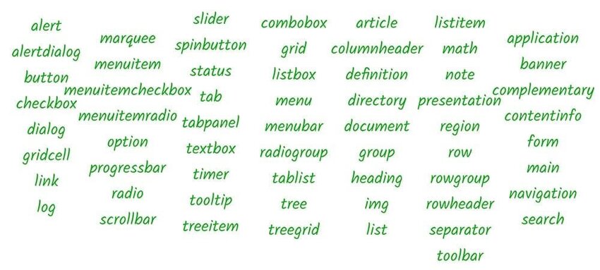
Classification of ARIA Roles
ARIA roles can be classified into 4 types;
-
Abstract Roles: According to W3C official documentation, these are roles used by the browser. They are the foundation upon which all other WAI-ARIA roles are built. Content authors must not use abstract roles because they are not implemented in the API binding. Examples of abstract roles include
widget,landmark,window,command, etc. -
Widget Roles: Widget roles are used to define a UI element when semantic HTML is not being used. According to W3C, some widget roles serve as standalone user interfaces or act as part of a larger composite widget. Examples of widget roles include
alert,dialog,checkbox,marquee, etc. Other widget roles serve as containers that manage other contained widgets. Examples of these widgets aretree,tablist, menu,menubar, etc. -
Document Structure: These are roles that describe structures that organize content on a page and they are not usually interactive. Roles like these help assistive technologies identify and classify the different sections of a page. Examples are
article,toolbar,row,list, etc. -
Landmark Roles: Landmark roles that identify large content areas. This help assistive technologies define these sections to users that rely on them. Examples of landmark roles are
application,form,main, etc.
Taking roles even further, we can also add ARIA states and properties to elements.
What Are ARIA States and Properties?
ARIA states and properties provide support for ARIA roles that exist on a page. When combined with roles, they can supply assistive technologies with extra user interface information. Whenever there are changes in states or properties, assistive technologies are notified of this change so they can alert the user that a change has occurred.
ARIA properties are different from states in that the value of a property (such as aria-labelledby) is often less likely to change throughout the application life-cycle, while a state (for example aria-checked) is likely to change quite often due to user interaction. ARIA properties and states can be classified as:
- Widget Attributes
- Live Region Attributes
- Drag-and-Drop Attributes
- Relationship Attributes
Widget Attributes
These types of attributes are used for common user interface elements which receive user input and process user actions. They are also used to support widget roles. Examples include aria-readonly, aria-required, aria-checked.
Live Region Attributes
These attributes are used to indicate to a user that a specific content might change or update (or simply put, live regions). They are applied directly on the element that changes so assistive technologies can notify users of the change in such document/page. For instance, it would be important to make use of aria-live on an element that displays live data from an endpoint like the Stock exchange. Examples of attributes like this are aria-live, aria-atomic, aria-busy, and aria-relevant.
Drag-and-Drop Attributes
They are used for elements that are either draggable or are drop targets. Forms that require upload of any form of file (image, pdf document, etc.) often make use of drag-and-drop as a means of uploading such file. It is important that users that rely on assistive technologies are not left out, and this type of attribute can help with that. Examples are aria-dropeffect for elements that receive drop event and aria-draggable for elements that are draggable.
Relationship Attributes
These types of attributes help connect two elements that are difficult to otherwise identify using the HTML document’s structure. An example of this type of attribute is the aria-labelledby attribute. This attributes helps connect an input field to a label in a form (but can be used for less obvious relationships):
<form>
    <label for="name" id="nameLabel">Name</label>
    <input type="text" aria-labelledby="nameLabel">
</form>
Other examples of relationship attributes are aria-colspan, aria-controls, aria-owns, aria-flowto, etc.
5 Rules of ARIA Use
When using ARIA, there are some dos and don’ts that must be followed in order to ensure that your site or the project you’re working on is accessible to users that rely on screen readers and other assistive technologies. These are known as the Rules of ARIA Use and they are five in number:
ARIA Rule #1
The first rule of ARIA use goes as follows;
If you can use a native HTML element or attribute with the semantics and behaviour you require already built in, instead of re-purposing an element and adding an ARIA role, state or property to make it accessible, then do so..
This means it’s best to use semantic HTML where it is available as much as possible and not resort to using elements like div in place of button element and adding ARIA roles, states, or properties to make such elements accessible. There are some instances in which this might not be possible and they include:
- The feature is currently not available in HTML
- If the visual design constraints rule out the use of a particular native element because the element cannot be styled as required.
- When the native HTML element does not have accessibility support.
ARIA Rule #2
The second rule of ARIA use warns against the changing of native HTML semantics with ARIA roles, states, or properties. For example;
Do not do this
<nav role="header">
    <p>My awesome website</p>
</nav>
Do this
<header>
    <p>Welcome to my Website.</p>
</header>
ARIA Rule #3
The third rule of ARIA use states that all interactive ARIA controls must be accessible via the keyboard. This means that whatever action (drag, drop, click, etc) elements on a page requires to perform an action, users must also be able to perform the equivalent using just the keyboard.
An example of this would be submitting a form using a button. A user must be able to submit the form by clicking on the enter or return button, which must also be capable of receiving focus.
ARIA Rule #4
The fourth rule of ARIA use warns against the use of the role attribute with presentation and aria-hidden='true' on elements that are visible and focusable to the user. Doing either of these would result in the user focusing on nothing in the end. Only use aria-hidden='true' on elements that aren’t visible or cannot be interacted with (but are interactive).
ARIA Rule #5
The fifth and final rule of ARIA use states that all interactive elements must have accessible names, i.e the name of a user interface element. Take this example:
<label>Email</label>
<input type="email" />
This is wrong because assistive technologies would not be able to connect the label value to the input field and its users would also struggle to understand that the field is meant for their email address. Instead, do either of the following;
<label for="email">Email</label>
<input type="email" name="email" id="email">
or
<label>
    Email
    <input type="email">
</label>
You Now Understand ARIA!
This introduction has given you a basic knowledge of ARIA. Next time you’re writing HTML or JavaScript think about whether ARIA would improve what you’ve built and help those with accessibility impairments. And Don’t forget the 5 rules of using ARIA roles, properties, and states!
More Accessibility Tutorials
Accessibility is an oft-overlooked but essential part of web development. Sami Keijonen’s article about its importance will motivate you to think about web accessibility more:

Learn more about accessibility right here at Tuts+:
 CSSCSS Tips for Better Color and Contrast Accessibility
-
AccessibilityHow to Use the Contrast Checker in Chrome DevTools
-
AccessibilityHow to Make Custom Accessible Checkboxes and Radio Buttons
-
AccessibilityDesigning Accessible Content: Typography, Font Styling, and Structure
-
AccessibilityAccessible SVG: Methods for Adding Alternative Content
-
AccessibilityAccessibility Basics: Designing for Visual Impairment
-
AccessibilityDesigning for Color Blindness With Chrome DevTools (in Just 4 Clicks)


