
8 practical tips, with examples.
Good UI design is the thoughtful application of whitespace at all scales of an interface, from component to page, micro to macro. When whitespace is used well, the result is an interface that is harmonious, legible, and, above all, effective and easy to use.
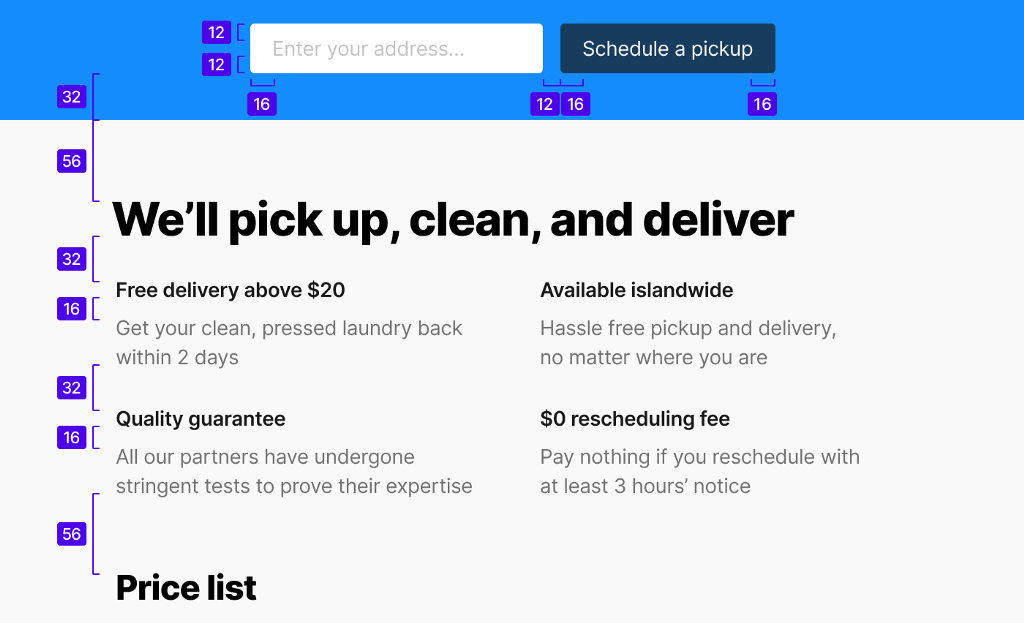
1 / Follow the Law of Proximity.
The amount of whitespace between elements in the UI indicate how the elements relate to one another. The Law of Proximity suggests that:
- Related elements should be spaced closer together. Conversely, unrelated elements should be spaced further apart.
- Elements of the same “type” should be spaced evenly apart.
Follow these basic rules to help users readily organize and perceive logical groupings in your UI.
2 / Start from a baseline of generous whitespace.
Let your design breathe. A reliable way to improve the usability of an interface is to ensure that there is a generous amount of whitespace between all its elements.
There are exceptions, of course (see the last tip below), but for most UIs, having a generous amount of whitespace is usually better than having too little.
3 / Use whitespace to focus attention on particular design elements.
Having less information and fewer elements on the page can help bring clarity and focus, and draw attention to the information and elements that are on the page.
Whitespace can also be an effective way to add emphasis to text. It can be used in combination with — and even as an alternative to — bumping up the text size, or changing the color, case, or weight of the text.
̇
̇
̇
This sentence, surrounded by whitespace, is a case in point.
̣
̣
̣
Making an element bigger or brighter isn’t the only way to draw attention to it. Consider that when everything is bigger and brighter and important, nothing actually is.
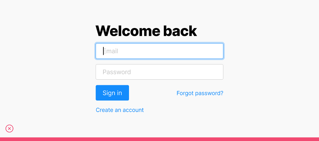
4 / Use the same method for measuring space in both design and implementation.
The space between adjacent text elements can be measured in one of two ways.
Between adjacent “bounding boxes”
This method is how most UI rendering engines (eg. the Document Object Model on a webpage) measure space. However, this method is not particularly precise because there is excess space that is “unaccounted” for at the top and bottom of each bounding box.

Between adjacent cap heights
This method is more precise, but could complicate implementation.

Both methods are reasonable, but have different trade-offs. What is important here is that the same method for measuring space is used in both design and implementation. This is to ensure that the design can be accurately translated into code.
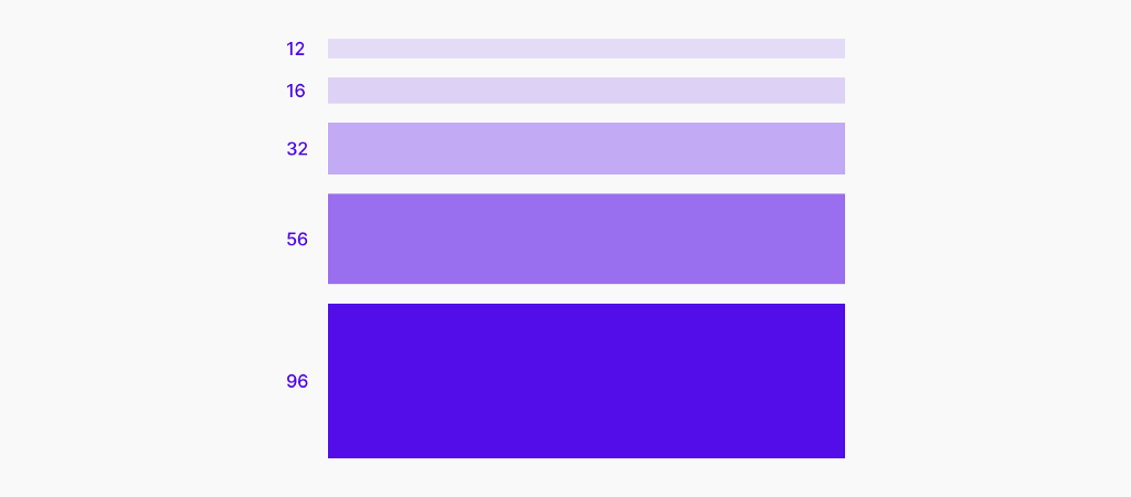
5 / Use a spacing system.
A spacing system specifies the set of possible spacing values to be used in a design. Using a spacing system can help bring about a sense of consistency and harmony to a UI.
A spacing system is to whitespace what a color palette is to color. Just like a color palette, a spacing system forces you to make UI design decisions from a constrained set of options. With a spacing system in place, you need only consider the handful of spacing values from the system during the UI design process. This makes design iteration faster and more systematic.
6 / Avoid using spacing values that are visually too similar.
When spacing values are mathematically different but visually too similar, the way that users perceive logical groupings in the UI could become ambiguous. Contrast matters. If your intent is for two spacing values to be different, then make it readily obvious that they are in fact different.
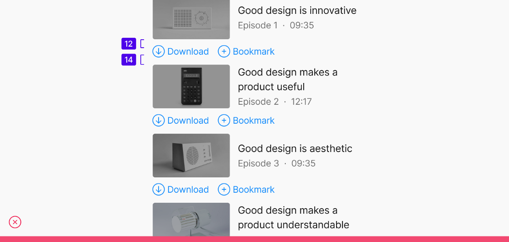
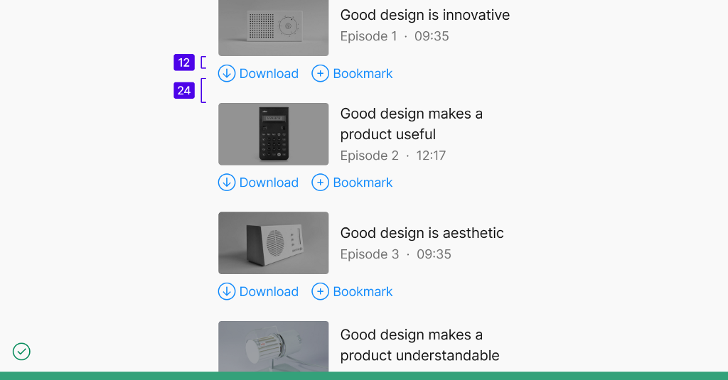
Consider having a wider “spread” of values in your spacing system, with a visually obvious difference between adjacent spacing values.
7 / Reduce the line-height (ie. leading) as text size increases.
Increasing the text size while keeping the same proportional line-height will result in there being too much whitespace between each line of text. Relative to the text size, the proportional line-height of headings should generally be less than the line-height of the body copy.


8 / In an information-dense UI, rely on other techniques besides whitespace to convey how elements in the UI relate to one another.
For example:
- Adding a subtle fill or border around a group of related elements.
- Using a line to separate adjacent elements that are closely-packed vertically. Or, using an interpunct character (“·”) to separate adjacent elements that are arranged horizontally.
- Changing the size, case, weight, or color of the text as a way to associate or differentiate UI elements.
Making an interface more information dense could help to make it more efficient to use. Remember that an interface that is information dense does not necessarily need to feel cluttered or overwhelming.
An effective way to learn about whitespace — and, indeed, UI design in general — is to create a “master copy”: pick one or more screens from any app or website with an interface that you admire, and recreate it in its entirety, from scratch. You will gain an insight into the many small design decisions that were made, discover interesting patterns, and see how the above tips about whitespace actually play out in well-crafted UIs.
There are reasons for why an interface “looks right”. Through experience and practice, you can hone your visual sense and intuition about how to apply whitespace in your designs. Your users will thank you for it.
If you enjoyed this article, follow me on Twitter, LinkedIn, or Medium.

Applying white space in UI design was originally published in UX Collective on Medium, where people are continuing the conversation by highlighting and responding to this story.