Considering the availability of modern tools and recent advancements in governance (design systems), one might think designers could relax and enjoy some leisure time. Surprisingly, that’s not the case. In fact, it feels like designers have even less time than before. As we’re frantically pushing towards an auto-governed future, we ought to stop and think about our purpose as designers.

An Analogy
Imagine the design process as a well-oiled factory floor. We’ve optimized every machine and process for maximum output and efficiency, aiming for uniformity and precision. However, in this relentless pursuit of productivity, we might find ourselves churning out products that, while impeccably crafted, are a bit boring.
It’s akin to a factory producing rows upon rows of identical widgets. Each one is flawless, but they all look and function the same. In this environment, designers can feel like skilled factory workers, dutifully churning out designs to meet quotas.
Becoming risk averse

It still feels like yesterday when we were designing mobile apps and complaining over rounded corners. Those days are long gone. The reality today is that the market has matured and shifted towards more complex projects, typically associated with larger companies. This shift has had some interesting effects on our mindsets and workloads.
Working in the enterprise space used to be quite rare; most designers focused on websites and small apps. As the industry matured, design became less of an afterthought. A whole generation was exposed to better experiences and expected the same from enterprise software. Eventually, peer pressure made big corporations prioritize UX.
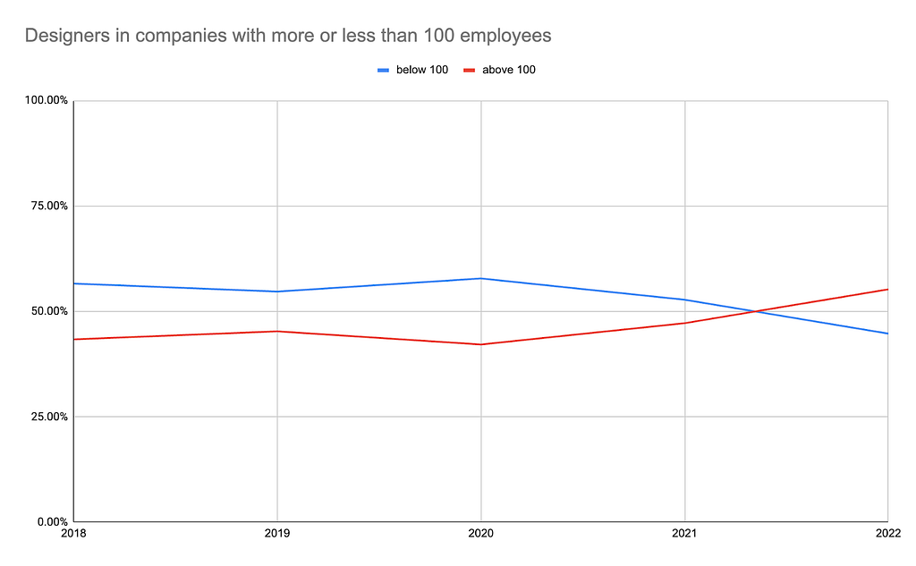
With design being less of an afterthought, large companies began establishing design organizations, bringing designers on board, aligning their once-rebellious minds with the risk-averse, process-loving, and output-oriented ways of corporations. There is a slow, but noticeable increase visible in the last few years. There’s nothing wrong with people working at corporations. On the contrary, everyone should be able to choose where and how they wish to spend their time. However, I have a reason for providing all this exposition.
You see, I believe that this development (due to a more mature industry, economic and demographic factors) has the potential to affect our collective mindsets. Bigger companies have different values than smaller companies, they’re risk-averse, prioritize control, and do not like change. Not saying you should run and join a startup tomorrow–I’m merely ringing the bell before it becomes a problem.

Meanwhile, the increase in complexity led to a surge in the number of considerations designers had to deal with. Our workloads went nuts. We went from building shacks to building the Burj Khalifa practically overnight. Projects became interconnected, shared modules, and presented varying appearances based on permissions. For the average designer, these were not everyday challenges. At that time, encountering such complexity was relatively rare.
We were not prepared.
The result was chaos. Five different design languages living in one product, identifying the current design file was a guessing game (Should I use the dropdown from File1 or File42?), and colleagues unintentionally altered colors, leading to ripple effects throughout designs — only to be discovered by an intern three years later. Scaling a product often necessitated redesigns and substantial resources, inevitably resulting in design debt, with a decade-old design language coexisting alongside the freshly released one. Redemption came in the form of tool innovations that finally addressed fundamental issues we were seeing with designing such intricate products, but more on this later.
Recently, design has been expanding into more mature, enterprise verticals like legal, medical, finance–which come preloaded with even more baggage than your average tech-enterprise. This was naturally, followed by an uptick in the amount of work for designers.
Tools reflect what we care about

Companies tend to care about different things when they’re small vs. large. Smaller startups optimize for speed and innovation (value creation), while larger companies tend to stick to what works and manage risk (value preservation). Progressive and conservative. Conservative systems tend to establish rules and ways to enforce them, while the progressive approach tends to be more lenient (guidelines) in favor of speed.
As mentioned before, our industry is maturing and that comes with exposure to big, conservative businesses, and as mentioned before–we could be internalizing some of their practices by osmosis. This means we really care about process, regulation, and enforcement–while exploration tends to be given a set amount of time before it has to move into execution.
Our tools reflect what we care about. If we’re trying to address consistency and scalability issues, you better believe we’ll raise a stink until the challenges we face are in some shape or form addressed by the tools we use. Else, we look for better tools. Right now we really care about collaborating, regulating, and scaling design so our tools are evolving to address that.
Consistency and scalability being such an issue for us for so long–we’ve left out a crucial component of the product design puzzle. Exploration. Trying things. Having multiple solutions. As we stand now, our tools are amazing at delivering a finished product, while the messy process of untangling the problem isn’t really addressed–all we get is a blank canvas and words of encouragement.
As our roles adapt to a more conservative and automated landscape, a divergent mindset will become increasingly sought after.
I know you have like five different white-boarding apps on your mind now, and no, that’s not what I mean. I mean the divergent thinking that needs to happen after the problem has been identified, flowcharted and documented. The phase when the designer needs to come up with a solution or even better–solutions.
I don’t know about you, but the way I approach it is by trying out lots of different solutions and analyzing them. This quickly shows if I’m barking up the wrong tree or not. This also means my files end up looking like a mess. They’re heavy and slow because I don’t want to lose my progress (the way I got to a specific solution), and honestly 90% of the time I’ll never need them again, but I’ll keep them just in case I need to remind myself or my colleagues on “how we got to here”.
With AI and automation on the horizon, there’s a real possibility that most (~60%) execution work gets automated in the next 5 to 10 years. In short, with headless design systems and AI models capable of interpreting basic interaction flows, we could be looking at the advent of extremely sophisticated templates. The ‘Reacts’ of product design. I am violetly speculating here and this is a can of worms we’re not opening at this time, maybe in a separate article.
In the scenario described above, we aim to tackle the daily tasks that consume designers’ time. As our tools continue to evolve, incorporating automation and AI for greater efficiency, it becomes increasingly crucial to shift our focus towards exploration. It’s high time we strike a balance between exploration and execution, and our tools should align with this objective.
Regulation, but not at the expense of creativity

The design industry loves governance (regulation). We love to build systems, (to a lesser extent) write documentation, and hound anyone who dares to misuse it. It’s understandable, we’ve been through hell and back and governance is how we got out of that dark place. Regulations, standards and guidelines.
Entire departments have emerged to oversee these systems, responsible for their creation, maintenance, and enforcement. These are the individuals to whom we owe modern software’s increased cohesiveness compared to the past. Creating a design system benefits not only the design and development teams but also the business itself. As time goes on, scaling design becomes increasingly vital.
There is however, a darker side to governance. Something we should pay attention to very closely if we care about creativity.
Motivation and governance are in an inverse relationship. The more oppressive it gets, the less motivated the people subjected to it will be. To put it more academically: “Promotion focus positively predicts intrinsic motivation, which, in turn, positively predicts creativity. The opposite is true for prevention focus.“ (source, regulatory focus theory).
Good systems allow for interpretation. They behave more like coaches than bouncers.
An emerging conservative mindset, exacerbated by a growing workload, might lead us further down a path where the systems we create transform into unquestioned laws. When we rigidly “prevent” or overly “prescribe” what is acceptable, we risk stifling creativity. It’s crucial to consider how we enforce these rules, as it greatly impacts the outcome.
A complete absence of governance would be problematic, especially if we want to create cohesive products. It’s essential to strike a balance between regulations, standards, and guidelines. Picture a set of “guardrails,” with a playground within those boundaries.
Stay away from the factory

Let’s pull this octopus together.
The industry is maturing, and we are encountering increasingly intricate sectors. To add to the challenge, quality standards are on the rise. We are now tasked with creating more complex designs with greater attention to detail within the same time. This surge in workload coincides with a noticeable shift towards a more conservative mindset.
As our roles gradually transform, it becomes crucial to prioritize exploration and creativity, especially as we embark on building AI systems that will eventually automate governance. Therefore, it’s time for us to advocate for tools that optimize and facilitate creativity.
However, it’s not just our tools that need adaptation; our mindsets must evolve as well. We need to shift our focus from governance and rule-setting to nurturing creativity and innovation. It’s essential that we begin developing tools that prioritize creativity, rather than mere efficiency.
Ironically, efficiency plays a pivotal role in enabling creativity. The automation of routine and repetitive tasks will grant us the time and space needed to properly explore challenges.
Rage against the monotony.
How does this affect you? All this extra work has no doubt made it tempting to just comply and follow instructions. It might seem the easier, less bumpy road, and it is–until it becomes an AI generated cliff. The moment you settle for mere execution, you’ve become part of the factory. Replaceable, unimportant. Be the creative force your team needs. Push until you start feeling resistance, then push some more.
Further reading
- AI and automation of work — https://www.ben-evans.com/benedictevans/2023/7/2/working-with-ai
- Figma, you’re bringing me down — https://uxdesign.cc/figma-i-love-you-but-youre-bringing-me-down-fd2ca26c89c4
- Designers are spending too much time designing UI variations — https://uxdesign.cc/designers-are-spending-too-much-time-designing-ui-variations-manually-ad665d8d5e40
- A simple tool for designing the future — https://uxdesign.cc/a-simple-tool-for-designing-the-future-286375ac4f2d
- When our tools hold us back — https://matthiasott.com/notes/the-new-css?ref=bestwebsite.gallery
- Designing for the infinite canvas — https://youtu.be/aHUtMbJw8iA?t=422
We’re turning designers into factory workers was originally published in UX Collective on Medium, where people are continuing the conversation by highlighting and responding to this story.